SOLD! A Minnie Evans Work on Paper Sold For (Scroll Down to See)

Update: The circa 1960s Minnie Evans work sold for $8,000.
What you see: Beautiful Portrait Surrounded by Vivid Flora, a circa 1960s work on paper by self-taught African-American artist Minnie Evans. Slotin Folk Art estimates it at $5,000 to $8,000.
The expert: Steve Slotin of Slotin Folk Art in Buford, Georgia.
I’d like to start by talking about Evans herself, and how she became a self-taught artist, and how her story matches other people who became self-taught artists. She seemed compelled to make art. Is that true of many other self-taught artists? It’s very typical. We like to say our artists are untrained and unschooled in art, but something happens and they’re driven to create art. She was definitely driven to create art, and create garden-like drawings that came from her surroundings as a gatekeeper for a garden. [Evans worked as the gatekeeper for Airlie Gardens in Wilmington, North Carolina from 1948 until she retired in 1974.]
She started making art at the age of 43. Is that unusually late for a self-taught artist to embark on a career? It’s hard to say what’s typical. Most artists don’t have the opportunity [to make art] until later in life. Evans created art as the gatekeeper because she had the time to do it.
Was she prolific? She was very prolific. She did a lot of drawings. Like a lot of these artists, she was somewhat obsessed with making art.
Has anyone come up with a conservative number of works that she made over her lifetime? I don’t know if there’s an actual number. She did a lot as the gatekeeper of the garden, selling them for 50 cents. There’s probably an untold number out there.
Was Evans discovered and recognized in her lifetime? She was. There was a folk art show at the Corcoran in the 1980s of self-taught African American artists [Black Folk Art in America, 1930-1980]. The show kicked off outsider art mania. It woke people up to what incredible artists we have in this country who are not influenced by academic or European masters.
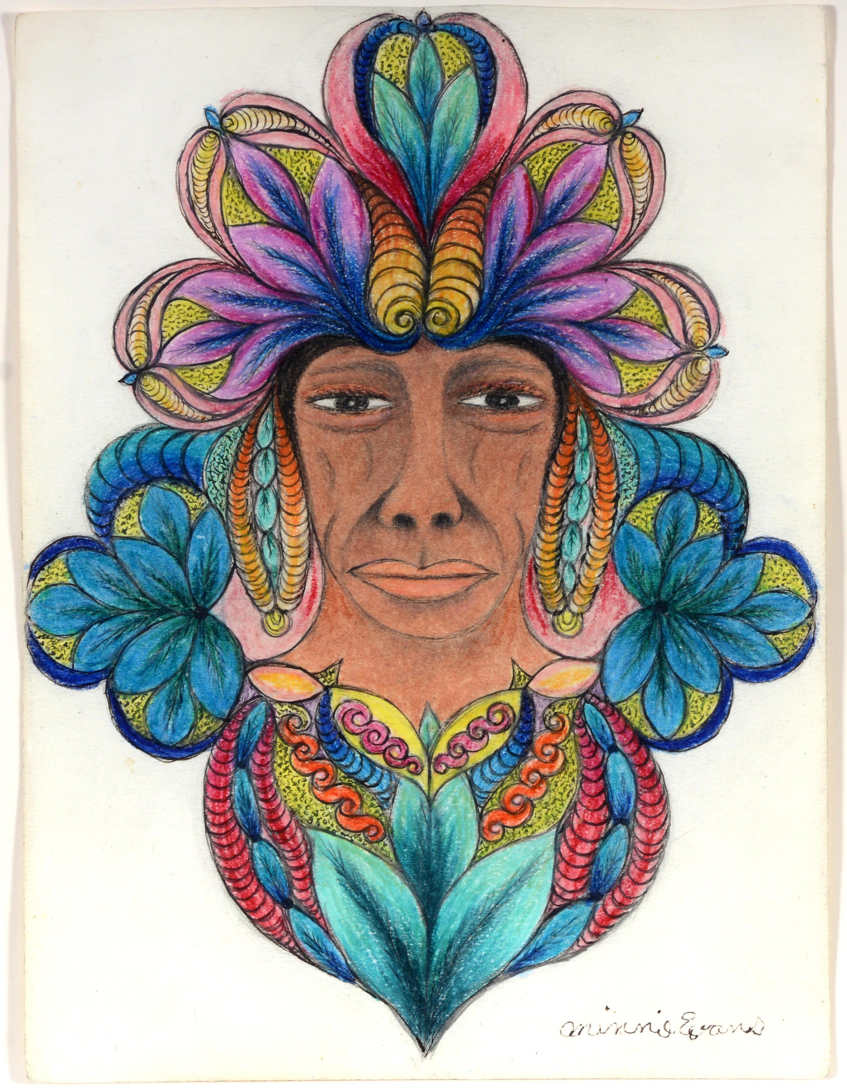
Is this piece typical of Evans’s work? It’s very typical and very desirable. It’s got a central face with flora around it, and the colors are beautiful and strong, with one color bleeding into the next. It’s a really good indication of what her work looks like.
Is this a self-portrait? I don’t think it’s a self-portrait. It doesn’t look like her. She had a rounder face. I think there’s one distinct facial type that she does, and like the colors, the faces range the gamut from Caucasian to Native American to African-American depending on the individual piece.
How is she producing the effect of colors bleeding into the next–by mixing crayon and colored pencil? Back in the day I’m sure no one thought this would be as important as it is. [She worked with] everything she could get her hands on. That’s how most folk artists worked. Because no one considered them artists, they didn’t have the means to buy the best materials. I don’t know how she did it [the effect], but she did the best with what she had.
This is undated, but it has a circa date of the 1960s. Is that the period of her career that collectors prefer? Her strongest periods were the 1950s and 1960s. The look of it is really powerful and detailed. People like this period because the colors are strong and vivid and just beautiful. This is what they want to live with. In the 1970s, she was older, and not as strong, and may have spent less time on [each work].
The lot notes describe the piece as being in excellent condition. What does that mean here? I’m looking at the condition of the paper and the work. There’s no tears, no holes, and if it had paint on it, it means there’s no cracking or crazing or flaking off. Overall it’s in great condition.
Is that unusual for an Evans, given that she sold them directly to visitors to the garden where she worked as a gatekeeper? Remarkably, her paintings did well over time. We typically find them in really good condition. It would have been easy just to discard it if it was bought as a fluke. People saved them. Even if you didn’t know what it was, it’s very likable. You’d enjoy having it in your house and looking at it.
What’s the provenance for this work? This is from a longtime collector who had a fabulous collection [they’re] selling most of in this auction.
What is the work like in person? Are there aspects of it that the camera doesn’t quite pick up? The only thing you don’t see in the photo when you look at it in person is how the colors bleed into each other and how calming it is to be around the piece. It’s a wonderful piece.
How many Minnie Evans works have you handled at Slotin over the years? I’ve sold between 50 to 70 pieces, with her highest being over $30,000.
Would that be the auction record for Minnie Evans? That is the auction record. It was a larger piece, maybe two times the size of the one here. It was from the Rosenak collection, Chuck and Jan, who wrote the Museum of American Folk Art Encyclopedia of Twentieth Century American Folk Art and Artists. It had a lot of detail in it, faces and flowers and birds. I sold it 10 years ago. Maybe now it would go for $50,000 to $60,000. Prices have jumped so much on her work, if I had it back, it might have doubled by now.
How to bid: The Minnie Evans portrait is lot 0161 in the Spring Masterpiece Sale at Slotin Folk Art in Buford, Georgia on April 27 and 28, 2019.
How to subscribe to The Hot Bid: Click the trio of dots at the upper right of this page.
Image is courtesy of Slotin Folk Art Auction.
Steve Slotin previously spoke to The Hot Bid about a sculpture by Ab the Flag Manwhich ultimately sold for $1,200. He also discussed a painting by African-American artist Sam Doyle that later commanded $17,000.
Minnie Evans died in 1987 at the age of 95, but her memory lives on at Airlie Gardens through a sculpture garden that bears her name.
Would you like to hire Sheila Gibson Stoodley for writing or editing work? Click the word “Menu” at the upper right for contact details.


![The Poisoned Apple, a study by Wanda Gág [pronounced 'Gahg'] for an illustration in a 1938 edition of Snow White and the Seven Dwarfs.](https://thehotbid.com/wp-content/uploads/2018/11/m38702-7.jpg)