A Tamara de Lempicka Portrait Could Set Yet Another New World Auction Record for the Artist (Update February 6: It Did!)

Update: Portrait de Marjorie Ferry (Portrait of Marjorie Ferry) by Tamara de Lempicka sold for £16,280,000, or $21.1 million–easily a new record for the artist at auction, and the third painting of hers to break her auction record in a span of 15 months.

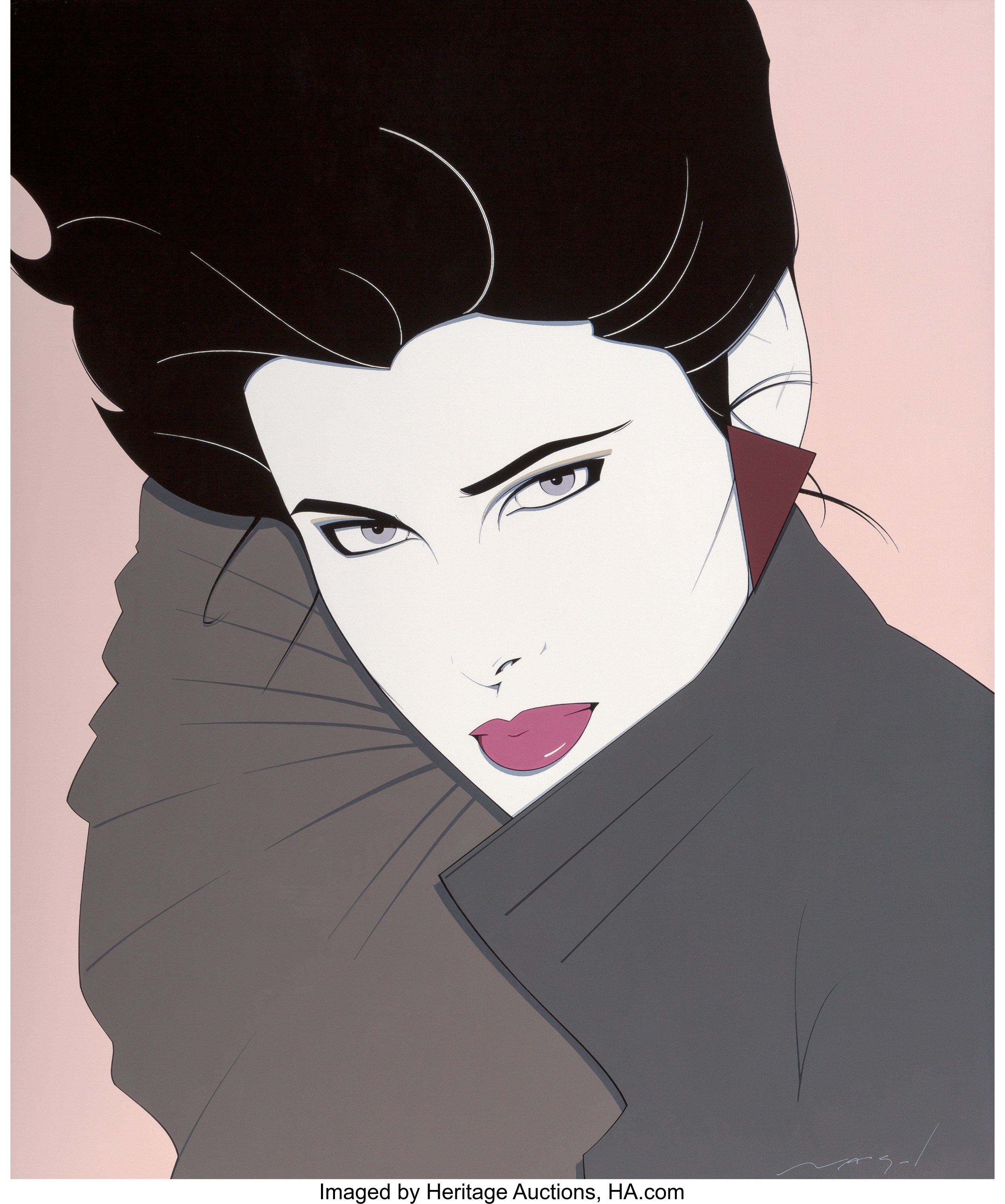
What you see: Portrait de Marjorie Ferry (Portrait of Marjorie Ferry), a 1932 oil on canvas by Tamara de Lempicka. Christie’s London estimates it at £8 million to £12 million, or $10.4 million to $15.6 million.

The expert: Keith Gill, head of the Impressionist and Modern art evening sale held at Christie’s London.

Who was Tamara de Lempicka, and why does her work still speak to us today? She was a famous female artist of the 1920s and early 1930s, and very much in the celebrity mold of her time. She was probably almost ahead of her time in terms of her approach to things. I don’t think her art has dated as such. Her aesthetic appeals to people today as in the 20s and 30s. Her art has become timeless.

Aside from a six-month trip to Italy that she took as a 13-year-old with her grandmother, what art training did she have? She undertook some art studies in Saint Petersburg, and when she came to Paris in 1918, she went to classes as often as she could. She studied at the Académie de la Grande Chaumeière, and enrolled with Maurice Denis at the Académie Ranson, and she traveled to Italy quite frequently. And she sat in cafes in Montparnasse and discussed art and fashion with the avant-garde. 

So, no traditional art studies that ended with a degree, but more than sufficient… I can’t say she was self-taught, but she didn’t take a formal qualification. She took every single opportunity to be taught.

How prolific was Tamara de Lempicka? Is there a catalogue raisonné? Yes. There are 218 recorded works on paper, and in terms of oils, there are 520 in the book. It’s worth pointing out that it includes works from the 1940s into the 1970s, where really, the key period is the late 1920s and early 1930s.

What happened in the 1940s? She did far fewer commissions, and more still lifes. She didn’t paint identified individuals. There’s a mix of imagery.

So she didn’t just do portraits, but she’s most famous for her portraits? She’s most famous for her portraits, and they’re the most highly valued works she did.

At what point in her career do her paintings start looking like the Portrait of Marjorie Ferry–the imagery we think of when we think of Tamara de Lempicka? I’d say she finds her way very early in the 1920s. I would argue her style evolved to what we recognize in 1925, and by 1927, she has her mature style, the style that propelled her to fame and fortune.

How did Tamara de Lempicka’s social life shape her business life? How did it help her attract clients and commissions? It’s incredibly difficult to say which way around it worked. Really, the two very much related to each other. The paintings built her social life. Her portraiture was almost instantaneously successful. She became a celebrity, and she got more commissions and became someone people wanted to have at parties. She wouldn’t have been invited to parties or have become famous if people didn’t like her work.

Where was Tamara de Lempicka in her career in 1932? She was very much the toast of Paris. She was absolutely at her peak. Her top 10 [works at] auction all date from 1925 through 1932, the year of this work.

I’ve seen Tamara de Lempicka’s work described as Art Deco in its style. What makes it Art Deco? The stage-like lighting and the very stylized backdrops it has. In a picture like this, it’s the greys, whites, and blacks in the background, and it’s [Ferry’s] very Art Deco hairstyle as well. The haircut is very much of that time.

How did the commission for Portrait of Marjorie Ferry come about? Did she know Ferry or her husband or both? The balance of probability is she knew them both. Around 1933, she did a portrait of Suzy Solidor, one of her lovers who was a cabaret singer. It’s likely she met Marjorie Ferry through her relationship with Solidor, and probably, Ferry’s other half, a wealthy banker who commissioned the portrait, was part of her circle at the time.

I understand one reason that Ferry’s husband commissioned the portrait was to immortalize a cabochon ring that he’d given her. Can you talk a bit about how Tamara de Lempicka structures the composition to showcase both the sitter and her jewelry? She does it through a very interesting device. You’re drawn to her face and hair, and the red of her lips. Then you have the very vertical line of her arm, drawing your eye down to her other hand, and the red in her nails. If you drew a straight line from the center of her lips, you’d land on the light in her ring. It’s very clever.

Does this work represent the only time that Marjorie Ferry appears in a painting by Tamara de Lempicka? Yes. It was a one-off commission. The only people she paints a number of times are her family or her lovers.

What do we know about how Tamara de Lempicka worked? Would she have had Marjorie Ferry pose in her studio, or would she have shot photographs of her and worked from those? The balance of probability is Ferry sat for the portrait in an old-fashioned sense. The background is very much in line with the design of the artist’s studio in Paris. It wasn’t exactly like this, but it was a very stripped-down steel interior with lots of reflections.

De Lempicka described her style of painting as “clean”, and credited her style with her success. Could you talk about what she meant when she said “clean”? In this work, the “clean” aspect is around the simplicity of it, a fundamental focus on the sitter and the simplistic background. It’s a stripped-back, minimalist aesthetic, both in the backgrounds and in the way she paints her figures. This work has a very flat surface, but the variation is all in the color and the paint, not in the surface. You can see the link between this and photography.

I’m not sure I understand what you mean when you say you see the link between this and photography. It’s not going out of its way to look like a painting. It’s not painting for painting’s sake. It’s more about the subject and the use of light and dark rather than the physical surface of the painting.

A story about Tamara de Lempicka on the Christie’s website describes her work as “conspicuously luxurious pictures for conspicuously luxurious times”. Do you agree? What, in your opinion, makes them “conspicuously luxurious”? The look of the fabric, the dresses you see on the sitters–it’s a very luxurious, satin type of fabric. It creates a very luxurious feeling. And the ring Ferry has, the perfect nails, the perfect hair, it very much illustrates the wealth of the time.

And it’s very Old Masters-y to revel in the details of luxurious fabrics… Exactly. It goes back to the Medicis, and commissioning portraits as status symbols.

What’s the painting like in person? Are there any aspects that the camera fails to pick up? Not really. I think it’s incredibly striking in person. It feels almost lifelike, life-size. When it’s on the wall, you appreciate the incredible shades of light and dark.

What’s your favorite detail of this painting? It’s her hand with the ring and the nails, because it’s very much an intrinsic part of the story of the picture, the sitter, and the fiance. And one of the hardest things for artists to do is to paint hands, and Tamara de Lempicka paints hands incredibly well. She’s drawing attention to her prowess.

No fear. It’s very much in your face, “Look how good I am”. She wants to be compared to the Old Masters in terms of technical ability.

In 2018, Christie’s sold the artist’s La Musicienne for a record price. Last November, Sotheby’s sold La Tunique Rose for a new record. Is it a coincidence that the record for a work by Tamara de Lempicka has broken twice in the span of 18 months, or do the sales represent an acceleration in her market? We often find strong prices when we bring other works by the artist to market. There is that result we had in 2018, which was a record then. When you achieve a record for the artist, the market talks about the artist. Maybe it started people thinking more about Tamara de Lempicka. What’s nice is a lot of her works are in private collections. Clients see the price and think about parting with a certain painting.

How does Portrait de Marjorie Ferry compare to the two recent record-holders? I know it once held the world auction record for a Tamara de Lempicka work… It held the record for one day, and it was broken the following night by Portrait of Madame M. But I think it’s very comparable to both of them in terms of quality, technique, and composition, and arguably more comparable to the 1929 work [La Musicienne], which has the second highest price. Her style evolves. In 1927, she wasn’t quite at her peak, but in 1929, she was absolutely at her peak in terms of style.

How long has Tamara de Lempicka been a feature of Impressionist and Modern evening sales? Is that recent? It goes back a long way. We had a strong piece in an evening sale in 2004 and others in 2006. What’s different here is we featured Portrait de Marjorie Ferry on the cover, and that’s the first time a female artist has been on the cover of the catalog for an Impressionist and Modern evening sale [at Christie’s London]. Everyone is saying how incredible it is as a catalog cover.

Is Portrait de Marjorie Ferry the first work by Tamara de Lempicka with an estimate that edges into the double-digit millions? Yes. The one that made a big price in New York [La Tunique Rose] had an estimate of $6 million to $8 million, and before that [La Musicienne] was $6 million to $8 million. This one is £8 million to £12 million, very much the highest starting price for the artist.

What are the odds that Portrait de Marjorie Ferry will break the record on February 5? All I would say is it has a very good chance.

Why will this painting stick in your memory? I like it because it has a very strong… almost insight into the strength of her [Ferry’s] personality. She looks directly at you, and she has grey eyes, which tie into the greys in her clothes and in the background. And I’m proud to be somebody who put a female artist on our cover.

How to bid: Tamara de Lempicka’s Portrait de Marjorie Ferry is lot 8 in the Impressionist and Modern Evening Sale taking place at Christie’s London on February 5, 2020.

How to subscribe to The Hot BidClick the trio of dots at the upper right of this page. You can also follow The Hot Bid on Instagram and follow the author on Twitter.

Christie’s is on Twitter and Instagram. 

Image is courtesy of Christie’s.

Gill also speaks in an article about Tamara de Lempicka on the Christie’s site.

Would you like to hire Sheila Gibson Stoodley for writing or editing work? Click the word “Menu” at the upper right for contact details.

RECORD! An Original Calvin & Hobbes Sunday Strip Sold at Heritage Auctions in 2012 for $203,150

Original Sunday comic strip art for Calvin & Hobbes, drawn by Bill Watterson. It depicts Calvin and Hobbes leaping into a pile of raked leaves.

During the summer, when auction schedules slow down, The Hot Bid showcases world auction records.

What you see: Original hand-colored art for a Sunday strip for Calvin & Hobbes, inscribed by artist-writer Bill Watterson. Heritage Auctions sold it in 2012 for $203,150, a record for an original Calvin & Hobbes strip.

The expert: Todd Hignite, vice president of comics and comic art at Heritage Auctions.

How often does original artwork for Calvin & Hobbes come to auction? They’re very rare. I think within the last 17 or 18 years, there have been about 15 to come to public auction, and we’ve sold all of those. There were possibly one or two in Europe before that, but they’re extremely rare. In terms of comic art in general and in terms of scarcity, it’s the first.

Even more so than original artwork for The Far Side? Yeah. Yeah. The reason for the scarcity of Calvin & Hobbes–Bill Watterson never sold the art. He donated–I don’t know the exact terms, maybe it’s a long-term loan–his originals to the Billy Ireland Cartoon Library and Museum at Ohio State University.

The date on this original Calvin & Hobbes Sunday strip is 10-19-1986, which is early in its run. Do collectors have a clear preference for earlier or later Calvin & Hobbes art, or does that not apply here? With Calvin & Hobbes, it doesn’t matter. The strip ran for a relatively short period.  It came out of the gate fully formed, and it did not decline. It was great from beginning to end. There are no periods that are less desirable.

Is this the only original Calvin & Hobbes Sunday strip to come to auction? It is. It’s the only Sunday strip that has a public auction record. The majority that have come up have been black-and-white dailys. The only ones that ever come out–He’d occasionally trade artwork for other artwork, or would give artwork to people associated with the syndicate or the production of the strip. The vast majority of originals have been dedicated to someone specific, someone he had some relationship with.

How did Watterson meet and know Brian Basset? Do we know when he gave the strip to him? I think it falls in the category we just talked about–it was a professional association.  We don’t know the date when he gave him it, but it was definitely during the run of the strip.

How good an example is it of an original Calvin & Hobbes Sunday strip? Does it have everything a collector would want? Or does it not matter, because collectors can’t afford to be picky? I think it’s both. If you’re paying hundreds of thousands for it, you want Calvin and Hobbes on it. The bonus is that Watterson hand-colored it. When he handed it to the syndicate, it was black and white. It’s pretty special by any measure, a very strong example.

So he didn’t typically color the Sunday strips himself? Correct. Sundays were like dailys–99 percent were not colored. He only would have done this because he was giving it to somebody. They were all black and white unless he chose to color it for a specific reason.

Does the inscription on the original Calvin & Hobbes Sunday strip add value? I would say it did not add any monetary value, but it’s also not irrelevant. It’s part of its history and collectors love that. They love to know the situation, especially with Watterson. How did it come out? He gave it to this person.

And it went from Watterson to Basset to you? Exactly right. Basically every example that has come to market has been in that situation.

Original Sunday comic strip art for Calvin & Hobbes, drawn by Bill Watterson. It depicts Calvin and Hobbes leaping into a pile of raked leaves.

What condition was it in? It was in great condition. There were no condition issues. What you may see in comic art is a condition problem–the paper has toned to yellow, it’s sunstruck because it was in a frame, the watercolors have faded–this had none of that. It’s as nice as you could hope for.

What was its estimate? In our comic and comic art auctions, we don’t have public estimates, but we do put internal estimates on things. The estimate on this was $100,000 to $150,000.

What was it like in person? It’s considered larger than what was printed, but Watterson didn’t draw that much larger than the printed dimensions. It was definitely larger, but not twice as large. There was not that big a discrepancy.

What was your role in the 2012 auction? Were you on the phone with a bidder? Yeah, I’m always on the phone, helping bidders in some way. I don’t recall if I was on the phone with the winning bidder.

And this was not just an instant record for an original Calvin & Hobbes Sunday strip, it was a record for any original Calvin & Hobbes strip? Yes, it was a world auction record for any Watterson art. The number under that is a Calvin & Hobbes watercolor for a calendar cover that we sold earlier that year for $107,000. The calendar art was definitely a benchmark for the Sunday strip.

What do you think it would sell for if it was consigned to you today? It’s hard. I definitely think it would be more than the person paid for it, but it was a huge price. It sold for a really, really strong price then. I think it would sell for a really, really strong price now, but I don’t know how much.

How long do you think this record will stand? What could beat it? If another Sunday strip came out. It would have to be another really good one, like this one. We do a lot of business in Europe and Asia. The market is a lot bigger now than it was then. If another came out, it would beat it. I don’t think this one will be back to market. He [the winning bidder] was very happy to get it.

Not coming back to market? Not even when the current owner dies? Probably, but he’s a young guy. [Laughs]

Why will this piece stick in your memory? Watterson, in my mind, was the most important comic strip artist after Schulz. It was a thrill to sell this. It was kind of a perfect storm with his art–someone at the very top of his art form, and his art basically doesn’t exist on the market. It was special for us to be able to handle it.

How to subscribe to The Hot BidClick the trio of dots at the upper right of this page. You can also follow The Hot Bid on Instagram and follow the author on Twitter.

Heritage Auctions is on Twitter and Instagram.

Never heard of Calvin & Hobbes? You have the biggest treat of your life ahead of you. Place your order and start reading.

Also, if it’s not at this link, it’s almost certainly not legitimate Calvin & Hobbes merchandise. Please don’t buy it, whatever it is.

And in case you missed it above, check out the Billy Ireland Cartoon Library & Museum at Ohio State University. Also, here are links to a daily Calvin & Hobbes strip and a truly legendary Sunday strip. You can follow the museum on Twitter and you can donate funds to it as well.

Image is courtesy of Heritage Auctions.

Would you like to hire Sheila Gibson Stoodley for writing or editing work? Click the word “Menu” at the upper right for contact details.

RECORD! Mavis Pusey’s Painting, “Nuvae”, Sold for $42,500 at Rago

Nuvae, a 1968 abstract canvas by Mavis Pusey, features large blocks of royal blue, milk chocolate brown, red, and white paint.

During the summer, when auction schedules slow down, The Hot Bid showcases world auction records.

What you see: Nuvae, a 1968 oil on burlap canvas by the late Jamaican-born artist Mavis Pusey. Rago Arts and Auctions sold it in May 2019 for $42,500, a world auction record for the artist.

The expert: Meredith Hilferty, fine art director at Rago Arts and Auctions.

Could we start by talking about Mavis… how do you pronounce her last name? Poo-SAY.

Can we talk about who she was, and her contributions to art? She was a Jamaican-born artist who came to New York at the age of 18. She decided to enroll with the Art Students League and fell into painting. She was firmly an abstract expressionist artist, which was unusual for a woman and for a black artist. She decided she was an abstract expressionist and she did not waver, though it wasn’t highly accepted. It was important that she did not waver. She didn’t let someone push her in a direction that she didn’t want to go.

Was she prolific? She was prolific, but not insanely prolific. This is the first work of hers we’ve ever handled, and I’ve been at Rago for 13 years. She painted a lot, but her work doesn’t come out on the market very often. I wouldn’t be surprised if more paintings come to market because of the recent sale.

Do collectors just love her work and hang onto it for decades? I think so. I think that’s one factor. Another is while she’s always had significant four- and five-figure prices, people weren’t faced with the decision, “Do I want to cash in on this?” A lot of times they love them as works of art, but there’s a personal connection there–they got it directly from the artist. Selling it was not necessarily on their minds.

Do we know why she named this painting Nuvae? We don’t know what it means. We certainly tried to figure it out, but we hit a dead end. She did title her work. We found other works with similar titles–one word, and they’re not words anyone would recognize. She also used titles that were very descriptive. She was inspired by urban landscapes, and some titles reflect that and are descriptive of that. This title doesn’t lead you in any particular direction. I kind of like that. [Laughs] It’s an abstract expressionist work of art in every sense of the word.

Is Nuvae part of a series, or is it a stand-alone work? I’d say it stands alone, but she did works in a similar style in the late 1960s. All stand-alone major paintings from that period relate to each other, but they’re not a series in that there’s no direct connection to each other.

She painted this on burlap. Is that typical for her? She did do quite a few paintings on burlap in this period, but she also painted on canvas. We don’t know why she used burlap. There’s not enough information to know the answer. It could have been that she’d run out of canvas, or it could have been that she wanted to try something else. It was purposeful. I think she was successful with it, and she used burlap for a good period of time.

Nuvae measures 30 inches by 40 inches. Is that a standard size for her? No, she actually would work bigger than this, oftentimes. It’s a big painting, but in the same period, she did 40 by 50, 50 by 60. The scale is significant, for sure.

Is Nuvae typical or atypical of her work? It’s very typical of her work from the late 1960s. A good part of her work is simply abstract and not representative. Others seem to reference urban landscapes, or the figures are much more direct. This has a more curving form that reminds the viewer of a figure..

Nuvae, a 1968 abstract canvas by Mavis Pusey, features large blocks of royal blue, milk chocolate brown, red, and white paint.

Is that central blue passage meant to be a figure? It kind of looks like it has a leg and an arm… I don’t know. There’s certainly a suggestion of a figure there, but I think it’s very loose. I think she was more highly focused on shape and color. She’s not making a direct enough connection for us to say it’s a reclining figure.

Pusey included Nuvae in her application for the Pollock-Krasner Foundation award, and she won it. Does that sort of thing affect a painting’s appeal to collectors? I think it does, absolutely. It’s a great honor for an artist to receive the Pollock-Krasner Foundation award. The appeal to collectors is the artist thought enough of the painting to include it in her application, and she won the award based on that application. It’s hard to say how much it affects the value of the piece, but it appeals to buyers.

What condition is the painting in? For a painting from the late 1960s, it’s in good condition. The things it needs are easily fixed by a good conservator. It’s a little loose on its stretcher.

Would that have anything to do with the burlap canvas? It could be. I’m not a conservator, but burlap is a heavier fabric, and it would certainly put more tension on the stretchers. It’s not really a major issue, but if it’s going to be hung in a museum exhibit or a collector’s home, you’d want it to be at its best, and part of that is having the burlap brought back to a taut configuration.

What is the painting like in person? It goes back to scale. When you stand in front of it, the canvas pulls you in and takes up your vision. The shapes play off each other and almost vibrate. You get the impression of a subtle palette, and it keeps your eye moving around the composition.

What was the previous world auction record for a Mavis Pusey painting? It was the same painting, when it sold at Swann in October 2013 for $33,750. You can see very directly how her market has changed in five and a half years. Before that, her record was set a year before, also at Swann, by Recarte, a larger 1968 painting that sold for $31,200. Not only is her work more and more desirable, but her late 1960s work has held records. That’s what people want.

Mavis Pusey died on April 20, 2019, and the Rago auction took place on May 4, 2019. What role, if any, did the timing of her death play in the new world record? I couldn’t say that it didn’t play a role. Certainly there was a little bit more buzz. But there was serious interest before her death was announced. The catalog came out before that, it was in our advertising and press releases and marketing before that. People were interested in the painting. If [her death] pushed it over…I’m not really convinced it was a major factor. I think this [interest in Pusey] has been building up, and she’s been getting more attention. I don’t think there’s a direct connection there. I don’t think it broke the record because she had just died.

What was your role in the auction? Generally, I put these sales together. Typically, during the day of sale, I’m in my office, talking to buyers about bids. This particular lot had a lot of action. I was called out to the phone table [the table where the auction house manages phone bidders]. I got to watch from the floor and see it break the record. I was glad I was pulled from the office to come out. It was really exciting.

How long do you think this world auction record for Mavis Pusey will stand? What else is out there that could meet or beat it? I think other paintings from the 1960s of the same quality [could do it]. She did also paint larger paintings, so, potentially, you could say they could sell for more, but they haven’t been on the market. We really have to wait and see. We find that when a record is set or an artist dies, more works come on the market. I think it really hinges on that.

Why will this piece stick in your memory? I always like to see an artist who hasn’t gotten the recognition they deserve get recognition. I’ve handled works that have set records for many women artists. It’s a satisfying part of the job.

How to subscribe to The Hot BidClick the trio of dots at the upper right of this page. You can also follow The Hot Bid on Instagram and follow the author on Twitter.

Rago Auctions is on Twitter and Instagram.

Image is courtesy of Rago Auctions.

Would you like to hire Sheila Gibson Stoodley for writing or editing work? Click the word “Menu” at the upper right for contact details.

SOLD! A George Sosnak Grantland Rice Baseball Fetched (Scroll Down to See)

A baseball transformed by self-taught artist George Sosnak. This angle showcases the words "First World Series Aircaster Writer Grantland Rice."

Update: The baseball George Sosnak dedicated to Grantland Rice and the 1921 World Series sold for $2,396.

What you see: A baseball transformed by the late self-taught artist George Sosnak. SCP Auctions estimates it at $5,000 to $7,000.

The expert: Dan Imler, vice president of SCP Auctions.

How prolific was Sosnak? Has anyone done a count or a census of how many balls he decorated? I’ve read in the past that he completed roughly 800 to 1,000 baseballs, but he started roughly 3,000. And he was definitely prolific in the sense of his following and his admirers. His baseballs have been exhibited in many museums, including folk art museums.

He was born in 1922 and died in 1992. Do we know how long he was active as an artist? I definitely think he was most prolific in the 60s and the 70s. In fact he donated some of his work to Cooperstown [The National Baseball Hall of Fame in Cooperstown, New York] in the early 70s.

What do we know about his creative process? How did he choose his subjects, and how did he create these baseballs? He was definitely focused on notable figures and milestones. He was not confined to players, as you can see by the Grantland Rice baseball we have. He celebrated figures from all facets of the game. In most cases, he started with an autographed ball and built around that–stats, historic data, combined with colorful scenes.

Did Rice autograph it? That’s not the case with this ball, but many Sosnaks I’ve seen have autographs on them.

If a Sosnak has an autograph, how does that factor in to its value to collectors? I think most people collect Sosnak balls for the artistry. That’s where the value is. If the autograph was Babe Ruth or Ty Cobb, it might be more valuable, but it’s looked at for its artistic value more than anything else.

Do we have an idea of how long it would take Sosnak to complete a baseball, and how long it might have taken him to finish this one? We can only make an assumption by looking at the detail of his work, the thoroughness of it. If you look at the Grantland Rice ball, every centimeter of the ball’s surface is covered and well thought out and almost tells a story. I imagine it took many hours of work to produce the typical Sosnak ball.

A baseball transformed by self-taught artist George Sosnak. This angle shows how Sosnak crammed a recap of the 1921 World Series within the borders of this seam of the ball.

Do we know what media he used to produce this–markers? Paint? From what I’ve read, the media was India ink.

Do we know why he chose Grantland Rice to showcase on this ball? Sosnak was an aficionado of baseball and all baseball facts. He himself was a minor league umpire. He had a lot of experience in the game, and a lot of passion for it. What inspired this ball is appreciation for the great historical figures of the game. Grantland Rice was as prolific as it gets in his field.

Did Grantland Rice commission this ball, or ever see it? We don’t know that, but Sosnak was known to give balls to subjects as gifts. We’ve done a lot of athletes’ estate sales, and we see Sosnak balls received as gifts.

A baseball transformed by self-taught artist George Sosnak. This angle showcases his portrait of Grantland Rice broadcasting the 1921 World Series over the telephone system.

How might the fact that Grantland Rice appears on this ball affect its value to collectors? Or does the … decorative intensity matter more? All the factors combine to contribute to the value–subject matter, graphic quality. This one in particular has a dual subject, a dual purpose. It acknowledges Grantland Rice and also memorializes the 1921 World Series.

Forgive me as I don’t know off the top of my head, but why was the 1921 World Series significant? The 1921 World Series might be acknowledged as the first broadcast World Series.

Is that why Sosnak uses the word “Aircaster”–a word I’ve never encountered before? I think it’s a primitive term for “broadcaster”. Grantland Rice telephoned the play-by-play. It was a very primitive broadcast via telephone over four New England radio stations. That ground-breaking aspect is being celebrated on this ball.

Is there a date on this ball? Do we know when Sosnak made this? There’s no date. The only thing we have to go by is a very faint Rawlings stamp on the baseball. It looks like it was probably late 1970s, based on the type of ball it’s on.

What details do Sosnak collectors want in a baseball, and does this one have them? First, I would say great imagery. One panel has a wonderful image of Grantland Rice broadcasting, and you have the Yankees logo and the Giants logo, the two World Series combatants. It has great titling, and a complete, complete play-by-play of the game. It’s just covered. The decorative quality and historical content is just fabulous.

A baseball transformed by self-taught artist George Sosnak. This angle showcases how tightly Sosnak crammed the ball's surface with information about how the 1921 World Series played out.

Where does this Sosnak ball rank on the scale of information-density? It’s on the higher end of the scale, I would say. But there are many like it.

And collectors prefer Sosnak balls that are thoroughly jammed with text? Absolutely. The greater sampling of his work, the better.

Do we know about the provenance of this ball? We really don’t. There’s no long chain of custody here prior to our consigner. He’s had it for many years and we can’t trace it beyond that.

What condition is it in? This one is in relatively high grade for a Sosnak ball. They are susceptible to wear and chipping. This one shows very little of that. He’d typically put a coat of shellac over the ball to protect the ink.

That has to be a problem with Sosnak balls–you want to pick them up and turn them over, to see everything on them. Yeah, there’s something to see on all sides. If you want to fully digest it, there’s a lot of reading to be done.

Another angle on the baseball transformed by self-taught artist George Sosnak, showing statistics and facts about the 1921 World Series between the Yankees and the Giants.

How many Sosnak balls have you handled? How often do they tend to come up? We’ve had probably a dozen in our history. In various auctions, half a dozen to a dozen per year come up. They’re very collectible, and there’s not a lot of turnover. When collectors acquire them, they tend to hang onto them for a while.

Have you handled it? What’s it like in person? I have. It’s stunning, it’s gorgeous. The colors are very, very vibrant. They don’t seem to have faded or changed much since it was created. He used high-quality materials and on top of that, it’s very well-preserved.

What’s the world auction record for a Sosnak? The highest price I could find is $15,500, a Stan Musial, part of his personal collection, sold in 2013.

Why will this piece stick in your memory? Sostak balls are all unique. Every time you see one, you have to be in awe. It will stick in my mind because I got a history lesson about Grantland Rice and the 1921 broadcast. I not only appreciate the artistry of the ball, I got an education as well.

How to bid: The George Sostak Grantland Rice baseball is lot 10 in SCP Auctions‘s current sale, which opened June 5 and closes on June 22.

How to subscribe to The Hot BidClick the trio of dots at the upper right of this page. You can also follow The Hot Bid on Instagram and follow the author on Twitter.

SCP Auctions is on Twitter and Instagram.

Images are courtesy of SCP Auctions.

Would you like to hire Sheila Gibson Stoodley for writing or editing work? Click the word “Menu” at the upper right for contact details.

George Sosnak Dedicated a Baseball to Grantland Rice and the 1921 World Series. It Could Achieve $7,000 at SCP Auctions

A baseball transformed by self-taught artist George Sosnak. This angle showcases the words "First World Series Aircaster Writer Grantland Rice."

What you see: A baseball transformed by the late self-taught artist George Sosnak. SCP Auctions estimates it at $5,000 to $7,000.

The expert: Dan Imler, vice president of SCP Auctions.

How prolific was George Sosnak? Has anyone done a count or a census of how many balls he decorated? I’ve read in the past that he completed roughly 800 to 1,000 baseballs, but he started roughly 3,000. And he was definitely prolific in the sense of his following and his admirers. His baseballs have been exhibited in many museums, including folk art museums.

He was born in 1922 and died in 1992. Do we know how long he was active as an artist? I definitely think he was most prolific in the 60s and the 70s. In fact he donated some of his work to Cooperstown [The National Baseball Hall of Fame in Cooperstown, New York] in the early 70s.

What do we know about his creative process? How did he choose his subjects, and how did he create these baseballs? He was definitely focused on notable figures and milestones. He was not confined to players, as you can see by the Grantland Rice baseball we have. He celebrated figures from all facets of the game. In most cases, he started with an autographed ball and built around that–stats, historic data, combined with colorful scenes.

Did Grantland Rice autograph it? That’s not the case with this ball, but many Sosnaks I’ve seen have autographs on them.

If a George Sosnak baseball has an autograph, how does that factor in to its value to collectors? I think most people collect Sosnak balls for the artistry. That’s where the value is. If the autograph was Babe Ruth or Ty Cobb, it might be more valuable, but it’s looked at for its artistic value more than anything else.

Do we have an idea of how long it would take Sosnak to complete a baseball, and how long it might have taken him to finish this one? We can only make an assumption by looking at the detail of his work, the thoroughness of it. If you look at the Grantland Rice ball, every centimeter of the ball’s surface is covered and well thought out and almost tells a story. I imagine it took many hours of work to produce the typical Sosnak ball.

A baseball transformed by self-taught artist George Sosnak. This angle shows how Sosnak crammed a recap of the 1921 World Series within the borders of this seam of the ball.

Do we know what media George Sosnak used to produce this–markers? Paint? From what I’ve read, the media was India ink.

Do we know why he chose Grantland Rice to showcase on this ball? Sosnak was an aficionado of baseball and all baseball facts. He himself was a minor league umpire. He had a lot of experience in the game, and a lot of passion for it. What inspired this ball is appreciation for the great historical figures of the game. Grantland Rice was as prolific as it gets in his field.

Did Grantland Rice commission this ball, or ever see it? We don’t know that, but Sosnak was known to give balls to subjects as gifts. We’ve done a lot of athletes’ estate sales, and we see Sosnak balls received as gifts.

A baseball transformed by self-taught artist George Sosnak. This angle showcases his portrait of Grantland Rice broadcasting the 1921 World Series over the telephone system.

How might the fact that Grantland Rice appears on this ball affect its value to collectors? Or does the … decorative intensity matter more? All the factors combine to contribute to the value–subject matter, graphic quality. This one in particular has a dual subject, a dual purpose. It acknowledges Grantland Rice and also memorializes the 1921 World Series.

Forgive me as I don’t know off the top of my head, but why was the 1921 World Series significant? The 1921 World Series might be acknowledged as the first broadcast World Series.

Is that why George Sosnak uses the word “Aircaster”–a word I’ve never encountered before? I think it’s a primitive term for “broadcaster”. Grantland Rice telephoned the play-by-play. It was a very primitive broadcast via telephone over four New England radio stations. That ground-breaking aspect is being celebrated on this ball.

Is there a date on this George Sosnak baseball? Do we know when Sosnak made this? There’s no date. The only thing we have to go by is a very faint Rawlings stamp on the baseball. It looks like it was probably late 1970s, based on the type of ball it’s on.

What details do Sosnak collectors want in a baseball, and does this one have them? First, I would say great imagery. One panel has a wonderful image of Grantland Rice broadcasting, and you have the Yankees logo and the Giants logo, the two World Series combatants. It has great titling, and a complete, complete play-by-play of the game. It’s just covered. The decorative quality and historical content is just fabulous.

A baseball transformed by self-taught artist George Sosnak. This angle showcases how tightly Sosnak crammed the ball's surface with information about how the 1921 World Series played out.

Where does this George Sosnak baseball rank on the scale of information-density? It’s on the higher end of the scale, I would say. But there are many like it.

And collectors prefer George Sosnak baseballs that are thoroughly jammed with text? Absolutely. The greater sampling of his work, the better.

Do we know about the provenance of this George Sosnak baseball? We really don’t. There’s no long chain of custody here prior to our consigner. He’s had it for many years and we can’t trace it beyond that.

What condition is it in? This one is in relatively high grade for a Sosnak ball. They are susceptible to wear and chipping. This one shows very little of that. He’d typically put a coat of shellac over the ball to protect the ink.

That has to be a problem with George Sosnak baseballs–you want to pick them up and turn them over, to see everything on them. Yeah, there’s something to see on all sides. If you want to fully digest it, there’s a lot of reading to be done.

Another angle on the baseball transformed by self-taught artist George Sosnak, showing statistics and facts about the 1921 World Series between the Yankees and the Giants.

How many George Sosnak baseballs have you handled? How often do they tend to come up? We’ve had probably a dozen in our history. In various auctions, half a dozen to a dozen per year come up. They’re very collectible, and there’s not a lot of turnover. When collectors acquire them, they tend to hang onto them for a while.

Have you handled it? What’s it like in person? I have. It’s stunning, it’s gorgeous. The colors are very, very vibrant. They don’t seem to have faded or changed much since it was created. He used high-quality materials and on top of that, it’s very well-preserved.

What’s the world auction record for a Sosnak? The highest price I could find is $15,500, a Stan Musial, part of his personal collection, sold in 2013.

Why will this George Sosnak baseball stick in your memory? Sostak balls are all unique. Every time you see one, you have to be in awe. It will stick in my mind because I got a history lesson about Grantland Rice and the 1921 broadcast. I not only appreciate the artistry of the ball, I got an education as well.

How to bid: The George Sostak Grantland Rice baseball is lot 10 in SCP Auctions‘s current sale, which opened June 5 and closes on June 22.

How to subscribe to The Hot BidClick the trio of dots at the upper right of this page. You can also follow The Hot Bid on Instagram and follow the author on Twitter.

SCP Auctions is on Twitter and Instagram.

Images are courtesy of SCP Auctions.

Would you like to hire Sheila Gibson Stoodley for writing or editing work? Click the word “Menu” at the upper right for contact details.

SOLD! Ben Austrian’s White Hen with Chickens Flew Away With (Scroll Down to See)

Ben Austrian's "White Hen with Chickens" shows a mother hen at left, with 13 yellow chicks clustering near her on a bed of straw. One of the chicks perches on her back.

Update: Ben Austrian’s White Hen with Chickens sold for $6,875.

What you see: White Hen with Chickens, painted in 1913 by American artist Ben Austrian. Freeman’s estimates it at $7,000 to $10,000.

The expert: Raphaël Chatroux, associate specialist in the fine art department at Freeman’s.

Who was Ben Austrian? What do we know about him and his work? He’s a local boy, born and raised in Reading, Pennsylvania. He had a lonely childhood, and he was sick very often. The air in Reading was quite polluted, so he had to spend his summers outside the city at a relative’s farm. He called it his vacation home. He went there for many years, from his early childhood until his mid-teens.

And he was self-taught, yes? Yes. Not by choice, but by necessity. Austrian’s family was very poor, and they didn’t have the means to send him to art school. At the age of five, his parents gave him a box of watercolors. During the summer, he was by himself and experimented with it. At an early age, he knew he wanted to become an artist. His mom was supportive, but his dad was wary. It was hard for a local artist to break through. He wanted him to work in the family business, which started as a dry-goods shop and evolved into a steam laundry. Austrian always painted on the side.

How did his career evolve? The first phase is from his early years until his father dies when Austrian is 27. He did have a few successes. He was very persistent in trying to show his art, though he wasn’t able to devote himself to it full time. His dad dying was a wake-up call to sell the family business and devote himself to art.

Did he paint hens and chicks exclusively? No, but it’s what he started painting in the very beginning–he painted what he knew. The first things he painted were chickens and landscapes. He painted other animals, such as ducks and horses, and at one point, his cat paintings were as popular as his chicken paintings. As he aged, he turned solely to landscapes.

And when he was a kid on the farm in the summer, he would feed the chickens? Exactly. He grew up surrounded by them. In a letter, he said, “I paint chickens because I love them.”

Was Austrian prolific? Do we have a count of how many works he made? There’s no catalogue raisonné. It’s hard to estimate the number of paintings he did, but he was prolific. It’s in the thousands. It’s difficult, too [to get a more precise count], because he wasn’t so good at keeping track of all of them, especially the early ones. A lot of the paintings are very similar, with similar names, like Mother Hen and Chicks. It’s tough to establish a chronology and an exhaustive summary of what he did. In the 1900s, he started putting dates on paintings.

Was he well-known in his time, or did his reputation grow later? He was well-known while he was alive. He was considered a Reading celebrity and he was smart about it–he was able to create a business out of it. When he worked for his dad, he knew to paint an original before meeting one of his dad’s clients. He was very strong-headed, and he did everything possible to break through. His partnership with the Bon Ami Company helped a lot. It assured his legacy, and it’s part of why he’s famous today. They made reproductions [of his works] that people could have on their fridge or in their wallet.

In reading about Austrian, I came across a claim that he taught his chickens to pose for him. Is that true? It seems crazy, but it’s true. You can find a lot of pictures of Austrian in his studio, surrounded by hens and chicks. He loved them. He talked to them every day, and he gave them names–some were elaborate. He raised them all on his own, so they only knew him. There was a special bond between the animals and Austrian. He had an incubator as well. [He did] whatever he needed to study their behavior and be as accurate as possible.

How did he teach chickens to pose for him? He always started by painting the hen first, and alone, because the chicks will always harass the mom. He’d put her in something like a nest, so she’d be quiet. With the chicks, the key to catching their attention was speaking to them–he could imitate their mom’s cackle. Or he’d use an object, like a piece of raw meat hanging from a stick. They’d gather round, infatuated with it, and that would give him a minute to catch the overall composition. Cigars would hypnotize them. They would freeze when they saw the light of a cigar. That would keep them quiet for a few moments.

In looking at the catalog for the sale, it’s clear that 100 years ago or so, there was a market for paintings of chicks and hens. I see several works by Austrian, and paintings of chicks by Mary Russell Smith and Arthur Fitzwilliam Tait. Who was the audience for these works when they were new? Who bought and collected them? I’ll start by saying Austrian was not the first one [to paint chicks and hens] and not the only one. He was late in the game. When Mary Russell Smith died, he was very much a kid. Because Austrian was self-taught, he didn’t copy from other artists, but it [scenes of chickens] was a popular genre of the time. There were lots of dealers who handled these paintings, and Austrian often chased private collectors himself. He sold a lot to department stores and jewelry stores, which saw art as a way to get people to feel comfortable and spend more money. Wanamaker’s [a Philadelphia department store] had a lot of Austrians, and John Wanamaker bought directly from him–he bought for himself and for his stores. It was a good source of income.

What detail of White Hen with Chickens do you like best, and how does it speak to Austrian’s mastery? It’s quite a good painting because you have a lot of chicks, which is what matters, and an imposing motherly figure that anchors it all. What I like is the composition itself. I like the contrast between the quiet mom and the undisciplined children. They’re running around, some are on her back, and some are about out of the picture frame, but mom doesn’t move. She’s self-composed. That’s what I like, the organized chaos in the painting.

Have Austrian’s paintings always been collected, or was there a fall-off after his death? I think he’s always been steadily collected. There was never really a fall-off.

How often do Austrians come to market? And is it unusual to have this many in a single sale? What’s unusual here is the collection provenance. They’re from the Bon Ami Company itself, which helped shape his legacy and his image. It’s never sold works by Austrian before. It’s an event for them to come up for sale. Bon Ami is a golden provenance for a Ben Austrian painting.

Why are they selling the paintings now? They’re reshaping their collection and taking a more curated approach. They’re not trying to get every painting linked to Ben Austrian. And it’s a good way to raise brand awareness of the company, through Ben Austrian.

So this is the first time the Bon Ami Corporation has sold any of its Austrians? They’re fresh to market.

And that’s why you’re comfortable selling several in the same auction–because of the Bon Ami provenance? Exactly. The Bon Ami name helps because it ties the collection together.

White Hen with Chickens measures 20 inches by 26 inches. Is that an unusual size for Austrian? I wouldn’t say it’s typical, but it’s on a larger scale. It’s the largest devoted to chickens. At 20 inches by 26 inches, the birds are pretty much life size, which was something Austrian was well aware of. When hens are in the paintings, the paintings tend to be larger. When it’s just chicks, they tend to be smaller. It has to do with the emotions you’re supposed to feel. A small work with two chicks fighting over a bug is cute, and you can hold it in your hand. A hen is more serious. It has to be bigger, and it has to hang on the wall. He was very well aware of those visual tricks.

What’s the world auction record for a Ben Austrian painting? It’s a painting of a dog and a cat–no chickens–that sold at Pook & Pook in 2011 for $80,000. I dug a bit deeper and found the fourth-highest auction record is very similar to the White Hen with Chickens painting. It sold in 2004 for $40,000.

What is White Hen with Chickens like in person? What’s very nice about the painting is on one hand, you have a subject that’s very whimsical and cute–the children are agitated and the mom is quiet. It’s not a hen with chicks, it’s a mother and her children. That’s why you like it–he’s able to put humanity into the painting without being versed in sentimentalism. He’s very naturalistic in style, but he’s able to give some warmth to it, so it’s not kitsch. And if you look up close, the technique is perfect. The colors are not at all muddy or dark. They’re very pure, very bright, even though [the scene] takes place in a barn. For the chicks, he wanted something light and fuzzy, so he drew an outline and created a soft, sfumato-like blur, which gave that effect. You think it’s whimsical, but you can see the skills there. His technique is spot-on, and he learned it by himself.

How to bid: White Hen with Chickens is lot 48 in the American Art & Pennsylvania Impressionists auction at Freeman’s on June 9, 2019.

How to subscribe to The Hot BidClick the trio of dots at the upper right of this page. You can also follow The Hot Bid on Instagram and follow the author on Twitter.

Freeman’s is on Twitter and Instagram as well.

Image is courtesy of Freeman’s.

Would you like to hire Sheila Gibson Stoodley for writing or editing work? Click the word “Menu” at the upper right for contact details.

SOLD! A Roberto Montenegro Painting from the 1920s Commanded (Scroll Down to See)

Update: Roberto Montenegro’s Untitled (Tehuanas in Traditional Huipil Grande Headdresses) sold for $81,250.

What you see: Untitled (Tehuanas in Traditional Huipil Grande Headdresses), painted in the 1920s by Roberto Montenegro. Christie’s estimates it at $70,000 to $90,000.

The expert: Virgilio Garza, head of Latin American art for Christie’s.

How prolific was Montenegro? He was very prolific. He worked for five decades. He continued to paint into his sixties. He died in 1968.

Why hasn’t he received the scholarly attention that some of his peers have gotten? He’s a very well-known artist, and he’s always included in surveys of Mexican art. The market likes him. What’s missing is a volume that captures the depth of his career and really studies his accomplishments.

How do we know that he painted this sometime in the 1920s? It’s not dated, but stylistically, it’s related to a Montenegro painting of Maya women that the Museum of Modern Art (MoMA) owns, and that dates to 1926.

When–on what occasions–do Tehuanas [women native to the Tehuantepec area of Mexico] don this distinctive ceremonial garb? Weddings and funerals? To me, in this particular painting, because they’re holding flowers and almost appear to be compressed in a tight space, almost stacked against each other, it appears to be a processsion. Their demeanor is serious. It’s more an expression of reverence. The faces are not laughing or smiling. Do you remember the Diego Rivera painting from the Rockefeller collection? That picture was Tehuanas too. That’s a feast, a very different atmosphere, celebrating. This seems to be a little more serious. A religious offering, maybe a funeral, but we can’t tell.

What is mexicanidad, and how is it reflected in this painting? It’s a term that refers to putting elements of Mexican culture in the forefront of a painting or an artistic expression. A lot of artists reflect mexicanidad in different ways. Frida Kahlo was a master of mexicanidad. Everything she did or said or wrote deeply embraced her Mexican identity. She took it to another level in dress and in how she expressed herself.

The lot notes say that Montenegro traveled in Europe almost continually from 1905 to 1920, looking at historic and contemporary European art. Do we know how soon he painted this after he returned to Mexico? I wish we could, but sadly, no. His sister [who owned the painting] has passed away. She would have known.

This looks really Cubist to me. Do we know if he looked at Cubist works during his travels? I think he had seen avant-garde art in Europe, like Diego Rivera had. Montenegro obviously knew the work of other artists like Rivera, who had a Cubist period.

Is this the first time he plays with the geometric potential of these Tehuana outfits? I think Diego did it too. What’s different about this treatment in this particular painting–it’s very graphic, very frontal. It seems to confront the viewer. That’s what’s attractive about the painting. And it’s very sculptural.

Sculptural? Is the paint piled up on the surface of the canvas? No, no, the painting is flat. When I say sculptural, the shapes almost appear to be 3-D in the way that Montenegro overlaps the headdresses with the faces in the back. There’s a sense of transparency, almost.

Are his other depictions of Tehuanas this geometric? No, they’re not. If you look at his murals, the Tejuanas are soft and others don’t have headdresses. I think this is one of the few that do.

Do we know anything about his working style? Did he pose models for this, or take reference photos, or did he imagine this scene? I think these women are archetypes.

From memory? Yeah, from memory.

Why is this painting so effective? I think it’s very striking. Part of that is you’re looking at this very frontally. It’s almost them looking at you rather than you looking at them.

Is this typical or atypical of his work? I think it’s an outlier. He used a lot of Mexican motifs, but it’s an outlier in the way the picture is constructed.

What is the painting like in person? What’s interesting about the painting is it’s very tight. It’s effective in that you feel this is a group of women in a small procession. They’re very strategically placed in the picture plane, but they have their own personalities.

How often do Montenegros appear at auction? Normally there’s one every season. They don’t circulate too much. He’s not an artist people are trading constantly. When collectors find a Montenegro, they tend to keep it for generations.

From the looks of the lot notes, this has never been to auction before–correct? No, never.

How rare is it to have a Montenegro that’s fresh to market? Every two years, there’s a surprise. This was a total surprise. We didn’t know about the picture until [the heirs] contacted us. It was owned by his sister. She lived in California. Montenegro gave it to her on one of his trips to visit, and it’s been in the family all these years. I don’t know if it’s been published. It’s really the first time it’s been seen. It’s really great. It’s one of my favorite things in the sale.

What condition is it in? Very good shape. We cleaned it superficially, but it’s in great shape.

What’s the auction record for a Montenegro? It was set at Christie’s. It was one of his self-portraits in a sphere, from 1955. It sold in 2017 for $187,500.

So this could set a new record for the artist, maybe. Let’s just say it’s conceivable.

Why will this painting stick in your memory? It is a memorable painting. It’s very graphic. And it’s lovely in the flesh, really, really lovely. Sometimes, if you’re lucky, you get a rediscovered artwork. This example has never been seen or published in color. Now the image is out there, and people can refer to it. We love to sell things, and we love to contribute to the understanding of an artist by presenting something that’s so good and special.

How to bid: Untitled (Tehuanas in Traditional Huipil Grande Headdresses) is lot 13 in the Latin American Art sale taking place at Christie’s New York on May 22 and 23, 2019.

How to subscribe to The Hot BidClick the trio of dots at the upper right of this page. You can also follow The Hot Bid on Instagram and follow the author on Twitter.

Christie’s is on Twitter and Instagram. 

Image is courtesy of Christie’s.

Virgilio Garza has appeared twice before on The Hot Bid, speaking about a record-setting Diego Rivera painting from the Rockefeller family and a Fernando Botero circus painting.

Would you like to hire Sheila Gibson Stoodley for writing or editing work? Click the word “Menu” at the upper right for contact details.

SOLD! A Minnie Evans Work on Paper Sold For (Scroll Down to See)

A circa 1960s portrait by Minnie Evans shows a copper-colored face of indeterminate gender crowned with an elaborate, colorful headdress and surrounded by flourishing plants.

Update: The circa 1960s Minnie Evans work sold for $8,000.

What you see: Beautiful Portrait Surrounded by Vivid Flora, a circa 1960s work on paper by self-taught African-American artist Minnie Evans. Slotin Folk Art estimates it at $5,000 to $8,000.

The expert: Steve Slotin of Slotin Folk Art in Buford, Georgia.

I’d like to start by talking about Evans herself, and how she became a self-taught artist, and how her story matches other people who became self-taught artists. She seemed compelled to make art. Is that true of many other self-taught artists? It’s very typical. We like to say our artists are untrained and unschooled in art, but something happens and they’re driven to create art. She was definitely driven to create art, and create garden-like drawings that came from her surroundings as a gatekeeper for a garden. [Evans worked as the gatekeeper for Airlie Gardens in Wilmington, North Carolina from 1948 until she retired in 1974.]

She started making art at the age of 43. Is that unusually late for a self-taught artist to embark on a career? It’s hard to say what’s typical. Most artists don’t have the opportunity [to make art] until later in life. Evans created art as the gatekeeper because she had the time to do it.

Was she prolific? She was very prolific. She did a lot of drawings. Like a lot of these artists, she was somewhat obsessed with making art.

Has anyone come up with a conservative number of works that she made over her lifetime? I don’t know if there’s an actual number. She did a lot as the gatekeeper of the garden, selling them for 50 cents. There’s probably an untold number out there.

Was Evans discovered and recognized in her lifetime? She was. There was a folk art show at the Corcoran in the 1980s of self-taught African American artists [Black Folk Art in America, 1930-1980]. The show kicked off outsider art mania. It woke people up to what incredible artists we have in this country who are not influenced by academic or European masters.

Is this piece typical of Evans’s work? It’s very typical and very desirable. It’s got a central face with flora around it, and the colors are beautiful and strong, with one color bleeding into the next. It’s a really good indication of what her work looks like.

Is this a self-portrait? I don’t think it’s a self-portrait. It doesn’t look like her. She had a rounder face. I think there’s one distinct facial type that she does, and like the colors, the faces range the gamut from Caucasian to Native American to African-American depending on the individual piece.

How is she producing the effect of colors bleeding into the next–by mixing crayon and colored pencil? Back in the day I’m sure no one thought this would be as important as it is. [She worked with] everything she could get her hands on. That’s how most folk artists worked. Because no one considered them artists, they didn’t have the means to buy the best materials. I don’t know how she did it [the effect], but she did the best with what she had.

This is undated, but it has a circa date of the 1960s. Is that the period of her career that collectors prefer? Her strongest periods were the 1950s and 1960s. The look of it is really powerful and detailed. People like this period because the colors are strong and vivid and just beautiful. This is what they want to live with. In the 1970s, she was older, and not as strong, and may have spent less time on [each work].

The lot notes describe the piece as being in excellent condition. What does that mean here? I’m looking at the condition of the paper and the work. There’s no tears, no holes, and if it had paint on it, it means there’s no cracking or crazing or flaking off. Overall it’s in great condition.

Is that unusual for an Evans, given that she sold them directly to visitors to the garden where she worked as a gatekeeper? Remarkably, her paintings did well over time. We typically find them in really good condition. It would have been easy just to discard it if it was bought as a fluke. People saved them. Even if you didn’t know what it was, it’s very likable. You’d enjoy having it in your house and looking at it.

What’s the provenance for this work? This is from a longtime collector who had a fabulous collection [they’re] selling most of in this auction.

What is the work like in person? Are there aspects of it that the camera doesn’t quite pick up? The only thing you don’t see in the photo when you look at it in person is how the colors bleed into each other and how calming it is to be around the piece. It’s a wonderful piece.

How many Minnie Evans works have you handled at Slotin over the years? I’ve sold between 50 to 70 pieces, with her highest being over $30,000.

Would that be the auction record for Minnie Evans? That is the auction record. It was a larger piece, maybe two times the size of the one here. It was from the Rosenak collection, Chuck and Jan, who wrote the Museum of American Folk Art Encyclopedia of Twentieth Century American Folk Art and Artists. It had a lot of detail in it, faces and flowers and birds. I sold it 10 years ago. Maybe now it would go for $50,000 to $60,000. Prices have jumped so much on her work, if I had it back, it might have doubled by now.

How to bid: The Minnie Evans portrait is lot 0161 in the Spring Masterpiece Sale at Slotin Folk Art in Buford, Georgia on April 27 and 28, 2019.

How to subscribe to The Hot BidClick the trio of dots at the upper right of this page.

Image is courtesy of Slotin Folk Art Auction.

Steve Slotin previously spoke to The Hot Bid about a sculpture by Ab the Flag Manwhich ultimately sold for $1,200. He also discussed a painting by African-American artist Sam Doyle that later commanded $17,000.

Minnie Evans died in 1987 at the age of 95, but her memory lives on at Airlie Gardens through a sculpture garden that bears her name.

Would you like to hire Sheila Gibson Stoodley for writing or editing work? Click the word “Menu” at the upper right for contact details.

A Minnie Evans Work on Paper Could Sell for $8,000

unnamed

What you see: Beautiful Portrait Surrounded by Vivid Flora, a circa 1960s work on paper by self-taught African-American artist Minnie Evans. Slotin Folk Art estimates it at $5,000 to $8,000.

The expert: Steve Slotin of Slotin Folk Art in Buford, Georgia.

I’d like to start by talking about Evans herself, and how she became a self-taught artist, and how her story matches other people who became self-taught artists. She seemed compelled to make art. Is that true of many other self-taught artists? It’s very typical. We like to say our artists are untrained and unschooled in art, but something happens and they’re driven to create art. She was definitely driven to create art, and create garden-like drawings that came from her surroundings as a gatekeeper for a garden. [Evans worked as the gatekeeper for Airlie Gardens in Wilmington, North Carolina from 1948 until she retired in 1974.]

She started making art at the age of 43. Is that unusually late for a self-taught artist to embark on a career? It’s hard to say what’s typical. Most artists don’t have the opportunity [to make art] until later in life. Evans created art as the gatekeeper because she had the time to do it.

Was she prolific? She was very prolific. She did a lot of drawings. Like a lot of these artists, she was somewhat obsessed with making art.

Has anyone come up with a conservative number of works that she made over her lifetime? I don’t know if there’s an actual number. She did a lot as the gatekeeper of the garden, selling them for 50 cents. There’s probably an untold number out there.

Was Evans discovered and recognized in her lifetime? She was. There was a folk art show at the Corcoran in the 1980s of self-taught African American artists [Black Folk Art in America, 1930-1980]. The show kicked off outsider art mania. It woke people up to what incredible artists we have in this country who are not influenced by academic or European masters.

Is this piece typical of Evans’s work? It’s very typical and very desirable. It’s got a central face with flora around it, and the colors are beautiful and strong, with one color bleeding into the next. It’s a really good indication of what her work looks like.

Is this a self-portrait? I don’t think it’s a self-portrait. It doesn’t look like her. She had a rounder face. I think there’s one distinct facial type that she does, and like the colors, the faces range the gamut from Caucasian to Native American to African-American depending on the individual piece.

How is she producing the effect of colors bleeding into the next–by mixing crayon and colored pencil? Back in the day I’m sure no one thought this would be as important as it is. [She worked with] everything she could get her hands on. That’s how most folk artists worked. Because no one considered them artists, they didn’t have the means to buy the best materials. I don’t know how she did it [the effect], but she did the best with what she had.

This is undated, but it has a circa date of the 1960s. Is that the period of her career that collectors prefer? Her strongest periods were the 1950s and 1960s. The look of it is really powerful and detailed. People like this period because the colors are strong and vivid and just beautiful. This is what they want to live with. In the 1970s, she was older, and not as strong, and may have spent less time on [each work].

The lot notes describe the piece as being in excellent condition. What does that mean here? I’m looking at the condition of the paper and the work. There’s no tears, no holes, and if it had paint on it, it means there’s no cracking or crazing or flaking off. Overall it’s in great condition.

Is that unusual for an Evans, given that she sold them directly to visitors to the garden where she worked as a gatekeeper? Remarkably, her paintings did well over time. We typically find them in really good condition. It would have been easy just to discard it if it was bought as a fluke. People saved them. Even if you didn’t know what it was, it’s very likable. You’d enjoy having it in your house and looking at it.

What’s the provenance for this work? This is from a longtime collector who had a fabulous collection [they’re] selling most of in this auction.

What is the work like in person? Are there aspects of it that the camera doesn’t quite pick up? The only thing you don’t see in the photo when you look at it in person is how the colors bleed into each other and how calming it is to be around the piece. It’s a wonderful piece.

How many Minnie Evans works have you handled at Slotin over the years? I’ve sold between 50 to 70 pieces, with her highest being over $30,000.

Would that be the auction record for Minnie Evans? That is the auction record. It was a larger piece, maybe two times the size of the one here. It was from the Rosenak collection, Chuck and Jan, who wrote the Museum of American Folk Art Encyclopedia of Twentieth Century American Folk Art and Artists. It had a lot of detail in it, faces and flowers and birds. I sold it 10 years ago. Maybe now it would go for $50,000 to $60,000. Prices have jumped so much on her work, if I had it back, it might have doubled by now.

How to bid: The Minnie Evans portrait is lot 0161 in the Spring Masterpiece Sale at Slotin Folk Art in Buford, Georgia on April 27 and 28, 2019.

How to subscribe to The Hot BidClick the trio of dots at the upper right of this page.

Text is copyright Sheila Gibson Stoodley. Image is courtesy of Slotin Folk Art Auction.

Steve Slotin previously spoke to The Hot Bid about a sculpture by Ab the Flag Manwhich ultimately sold for $1,200. He also discussed a painting by African-American artist Sam Doyle that later commanded $17,000.

Minnie Evans died in 1987 at the age of 95, but her memory lives on at Airlie Gardens through a sculpture garden that bears her name.

Would you like to hire Sheila Gibson Stoodley for writing or editing work? Click the word “Menu” at the upper right for contact details.

SOLD! An Antonio Jacobsen Schooner Portrait Sailed Away with (Scroll Down to See)

Antonio Jacobsen's 1911 portrait of the schooner dubbed Goldfield depicts the white-bodied vessel in profile, prow to the left. Its four masts are topped by, respectively, an American jack, a line flag, a flag with the ship's name, and the American flag.

Update: The Antonio Jacobsen portrait of the Goldfield sold for $8,400.

What you see: A portrait of the Goldfield, a four-masted schooner, painted in 1911 by Antonio Nicole Gasparo Jacobsen. Eldred’s estimates it at $8,000 to $10,000.

The expert: Joshua Eldred, president of Eldred’s and head of its fine arts department.

How prolific was Jacobsen? Extremely prolific. It’s estimated that he painted over 6,000 works. He had a long career, and he was also good and reasonable, so he was popular.

Did he only paint portraits of ships? Pretty much. 99 percent of what we see are ship portraits.

Do we know how many of his ship portraits depict schooners? I’m not sure, but what’s interesting about Antonio Jacobsen’s career is it follows the development of American naval history. Earlier paintings are more likely to be traditional sailing ships.

This is a schooner, and he painted it in 1911. Is that unusual for him? It’s pretty classic for him. It’s a little late for him. After 1905, you start to see yachts and racing scenes and more interesting things. He had achieved success in his career [by then]. He was financially sound. The captain or the lead engineer might have commissioned it. If there were multiple owners, he might do multiple portraits of the same ship.

What do we know about the Goldfield? We don’t know too much about it.

Do collectors have a preference for an era or phase of his career? Every collector is different. Certain Antonio Jacobsen collectors only want certain lines of steamships. Some like to collect family ships–their great-grandfather might have invested in a certain ship, and they want that. Generic collectors prefer them to 1890 to 1895. When you start to get to the early 1900s, unless it’s a great example, they don’t pay quite as much.

What details mark this as an Antonio Jacobsen? The treatment of the ship is very typical, and the water is very typical. For post-1905 paintings, Jacobsen employed his kids sometimes to do the water and the sky. With this one, and it’s more of a feeling, he did the water rather than his kids. In my opinion, and there’s no way to tell for sure, his kids might have played a part in the sky in this one, but I think the water and the ship are all him.

What points to the waves being typical of him? It’s more the way he painted the waves. They have a wonderful modulation of colors, and [it’s in] the way the boat touches the water.

Could you explain the meanings behind the pennants that top some of the masts? Obviously one is the American flag and one has the ship’s name. What are the second and the first ones? The line was part of WW. They co-owned the ship. The pennant on the foremast [the one with a blue background and white speckles] is the American jack. It represents it as an American ship. A lot of times it was on when the ship was moored. Above the American flag, there’s a wind indicator.

How did he do this? Would he have worked from a template, or did he view the ship in person? Most likely, he observed it in person and created a sketch. Generally what would happen is the ship would come into port and the captain or the owner would ask [would commission a painting from Jacobsen]. He’d sketch it and would deliver it the next time they were in town.

What condition is it in? This one is in pretty good shape. There’s a little inpainted sky. At one point in its life it suffered some sort of paint loss or damage, and the restorer carefully fixed it.

How did you arrive at the estimate? We’ve been in business since 1948, and we’ve sold hundreds of Jacobsens over the years. When you have 6,000, 7,000 paintings, there’s a lot of art out there. A lot of the paintings are owned by New England people.

What is it like in person? It’s a pretty fair representation. It’s a vibrant picture in person. The sails have a little air in them. It’s in movement. One of the things I like about it is the activity on the deck. It’s a nice detail to have.

How to bid: Jacobsen’s portrait of the Goldfield is lot 423 in the Spring Sale at Eldred’s on April 5 and 6, 2019.

How to subscribe to The Hot BidClick the trio of dots at the upper right of this page. You can also follow The Hot Bid on Instagram and follow the author on Twitter.

Eldred’s is also on Twitter and Instagram.

Image is courtesy of Eldred’s.

Would you like to hire Sheila Gibson Stoodley for writing or editing work? Click the word “Menu” at the upper right for contact details.

WOW! Emma Amos’s Let Me Off Uptown Set a New World Auction Record for the Artist

Emma Amos's mixed-media work Let Me Off Uptown is a large, square piece that showcases a dancing couple who hold hands. The black, besuited gentleman dancer tips his hat to the light-skinned woman, who has black stiletto heels and a spaghetti-strap red dress that falls to the knee. A green circle behind the couple draws the eye to them. Tiny figures appear across the background. All are jubilant. Most are dancing. All races and ages are represented, and there's at least one dancing dog.

Update: Let Me Off Uptown sold for $125,000, more than tripling the previous world auction record for the artist at auction. Hooray!

What you see: Let Me Off Uptown, which measures 80 inches by 78 7/8 inches and was created by African-American artist Emma Amos between 1999 and 2000. It incorporates several media, including oil and photo transfer on linen canvas, metallic paint, glitter, collage, and African fabric borders. Swann Auction Galleries estimates it at $40,000 to $60,000.

The expert: Nigel Freeman, director of Swann’s African-American fine art department.

The lot notes say Let Me Off Uptown is “a significant work from Emma Amos’s important series of paintings on fabric from the late 1990s that celebrate African-American women”. How big is the series? Is it still ongoing? She did a large group of work in the 90s where images of women were painted on canvas not on stretcher bars [a traditional treatment for paintings] but on hanging cloth. It extended to the mid-2000s. She’s not working on it now.

What do we know about how Amos made the mixed media work? Artists like Emma Amos and Faith Ringgold, when they came up in the 1960s and 1970s, the gallery system was very difficult for women to get any representation. Male abstract painters predominated. There were few spaces in the art world for empowering images of African-American women. She was very much a part of the African-American movement and the women’s movement. She took all those elements in the 1980s and 1990s and found a way to paint the imagery and make it her own–large figurative subjects about women, the bodies of women, and the roles women had in society. This is more celebratory. It’s about African-American culture and about jazz. It shows how jazz brings different people together.

Is the woman in red a self-portrait? Is she Amos? I don’t believe so.

Why did she name the work Let Me Off Uptown? It’s a reference to Harlem. That was where you got off the train to listen to jazz music.

Did she use models for the main figures or any of the smaller figures? I don’t know precisely her practice, but I would think it’s a variety of sources. [The man] could be someone she knows, I really can’t say, but it’s not portraiture. It’s not important who these people are–it’s what they represent. For centuries, images of African-Americans in art were either put on the sidelines, completely secondary, or they were caricatures. Since the Harlem Renaissance, [African-American artists have] taken over the representation of their figures and made a viable language. Like other contemporary artists, Amos has focused on the figure, and has embraced making figurative art that shows African-Americans doing things. In her case, they have larger symbolic meanings. They speak to a larger discourse about how we view African-Americans and African-American figures in our art. She wants to change the way we look at art.

The lot notes say Amos “has long sought to deconstruct traditional representations of beauty”. How does she do that here? With these images of celebratory figures and dancers [she asks] what is a beautiful figure? Can an African-American woman stand in for other figures that traditionally represent women and ideals of beauty? That is where she’s coming from. The classical models from art history are Eurocentric. Black bodies, shapes and colors and the way they look, are not necessarily considered ideal in art. She makes ordinary people heroic. These [the two main figures] are painted six feet high, at a scale and size that are almost lifelike, if not lifelike. She says they are people we should celebrate.

Do any of the smaller figures carry meanings that might not be immediately obvious? When you first look at it, it looks like lots of fun, dancing figures, but a lot of them are subversive. Some are unclothed. Different races and genders together. Music and freedom. At the beginning of the 20th century, jazz was revolutionary. It represented freedom and improvisation. She’s definitely tapping into that here. It’s a great party of twirling figures, having a great time.

What details stand out to you? The fun thing about her work is the different levels it works on. It’s a really strong image of a dancing couple, but as you look at it, little details show her sense of humor and intelligence. Look at her [the main female figure’s] dress. The bodice is covered with smiling lips. [laughs] It’s a cheeky, fun thing. You don’t notice it at first, and it’s all very seamless. She really integrates everything well. It comes from her great sense of material–from her fabric and printmaking and painting, which she brings together in works from the 1990s and 2000s.

Amos included this work in her 2000 application for a Pollock-Krasner Foundation fellowship, which she won. Does that affect collectors’ interest in the work, or its value, at all? I think it’s a nice plus. It certainly shows the reputation of her work strongly.

I’d been calling her a fabric artist but it seems like “mixed media artist” is better… She’s really a painter, a collage artist, and a printmaker. It’s a bit simplistic to call her a fabric artist. That’s one element of her work. Sometimes she paints on textile, but she’s a multimedia artist, absolutely.

What is Let Me Off Uptown like in person? It has a human scale to it. It’s about six feet high. What you can’t necessarily see in the catalog is there’s a wonderful variety of texture. The surface has a wonderful shimmer. There’s a richness to it. It doesn’t just have a flat, uniform surface.

Are her works usually this colorful and lively? Let Me Off Uptown is not an anomaly. Her works are often dynamic and brightly colored, with large figures taking up the whole picture plane.

How rarely do pieces by Amos appear at auction? We’ve been selling her work in our auctions since the start of our African-American Fine Art auctions in 2007. Primarily they were prints and works on paper. Then last year [in October 2018], we sold Arched Swimmer, the first large, unique painting we had of hers. It was estimated at $10,000 to $15,000 and, with the buyer’s premium, sold for $40,000 and set an auction record for her. That painting set the stage for this one. It’s quite possible this work will set a new record. Her work is in people’s minds. That’s why it felt like a good time to bring this to auction now.

Why might Let Me Off Uptown beat the sum achieved by Arched Swimmer? First of all, it’s a larger, more complex piece. Arched Swimmer was 30 inches by 32 inches, and it was a stretch canvas. It was not one of the larger hanging pieces, and it’s a quarter of the size of the work we’re selling now. I think we’ll have a lot of interest in it.

Why will this piece stick in your memory? I think it’s a fantastic image of dance and jazz. It’s a joyous image, and it’s what her work is all about.

How to bid: Let Me Off Uptown is lot 163 in the African-American Fine Art sale taking place at Swann Auction Galleries on April 4, 2019.

How to subscribe to The Hot BidClick the trio of dots at the upper right of this page. You can also follow The Hot Bid on Instagram and follow the author on Twitter.

Swann Galleries is on Instagram and Twitter.

Nigel Freeman has appeared on The Hot Bid many times before, talking about a set of Emperor Jones prints by Harlem Renaissance artist Aaron Douglas, a story quilt that Oprah Winfrey commissioned Faith Ringgold to make about Dr. Maya Angelou, an Elizabeth Catlett painting, and a Sargent Johnson copper mask. The Ringgold and the Johnson set records for the respective artists.

Emma Amos has a website. She’s represented by the Ryan Lee Gallery.

Image is courtesy of Swann Auction Galleries.

Would you like to hire Sheila Gibson Stoodley for writing or editing work? Click the word “Menu” at the upper right for contact details.

An Antonio Jacobsen Schooner Portrait from 1911 Could Command $10,000

Antonio Jacobsen's 1911 portrait of the schooner dubbed Goldfield depicts the white-bodied vessel in profile, prow to the left. Its four masts are topped by, respectively, an American jack, a line flag, a flag with the ship's name, and the American flag.

What you see: A portrait of the Goldfield, a four-masted schooner, painted in 1911 by Antonio Nicole Gasparo Jacobsen. Eldred’s estimates it at $8,000 to $10,000.

The expert: Joshua Eldred, president of Eldred’s and head of its fine arts department.

How prolific was Jacobsen? Extremely prolific. It’s estimated that he painted over 6,000 works. He had a long career, and he was also good and reasonable, so he was popular.

Did he only paint portraits of ships? Pretty much. 99 percent of what we see are ship portraits.

Do we know how many of his ship portraits depict schooners? I’m not sure, but what’s interesting about Antonio Jacobsen’s career is it follows the development of American naval history. Earlier paintings are more likely to be traditional sailing ships.

This is a schooner, and he painted it in 1911. Is that unusual for him? It’s pretty classic for him. It’s a little late for him. After 1905, you start to see yachts and racing scenes and more interesting things. He had achieved success in his career [by then]. He was financially sound. The captain or the lead engineer might have commissioned it. If there were multiple owners, he might do multiple portraits of the same ship.

What do we know about the Goldfield? We don’t know too much about it.

Do collectors have a preference for an era or phase of his career? Every collector is different. Certain Antonio Jacobsen collectors only want certain lines of steamships. Some like to collect family ships–their great-grandfather might have invested in a certain ship, and they want that. Generic collectors prefer them to 1890 to 1895. When you start to get to the early 1900s, unless it’s a great example, they don’t pay quite as much.

What details mark this as an Antonio Jacobsen? The treatment of the ship is very typical, and the water is very typical. For post-1905 paintings, Jacobsen employed his kids sometimes to do the water and the sky. With this one, and it’s more of a feeling, he did the water rather than his kids. In my opinion, and there’s no way to tell for sure, his kids might have played a part in the sky in this one, but I think the water and the ship are all him.

What points to the waves being typical of him? It’s more the way he painted the waves. They have a wonderful modulation of colors, and [it’s in] the way the boat touches the water.

Could you explain the meanings behind the pennants that top some of the masts? Obviously one is the American flag and one has the ship’s name. What are the second and the first ones? The line was part of WW. They co-owned the ship. The pennant on the foremast [the one with a blue background and white speckles] is the American jack. It represents it as an American ship. A lot of times it was on when the ship was moored. Above the American flag, there’s a wind indicator.

How did he do this? Would he have worked from a template, or did he view the ship in person? Most likely, he observed it in person and created a sketch. Generally what would happen is the ship would come into port and the captain or the owner would ask [would commission a painting from Jacobsen]. He’d sketch it and would deliver it the next time they were in town.

What condition is it in? This one is in pretty good shape. There’s a little inpainted sky. At one point in its life it suffered some sort of paint loss or damage, and the restorer carefully fixed it.

How did you arrive at the estimate? We’ve been in business since 1948, and we’ve sold hundreds of Jacobsens over the years. When you have 6,000, 7,000 paintings, there’s a lot of art out there. A lot of the paintings are owned by New England people.

What is it like in person? It’s a pretty fair representation. It’s a vibrant picture in person. The sails have a little air in them. It’s in movement. One of the things I like about it is the activity on the deck. It’s a nice detail to have.

How to bid: Jacobsen’s portrait of the Goldfield is lot 423 in the Spring Sale at Eldred’s on April 5 and 6, 2019.

How to subscribe to The Hot BidClick the trio of dots at the upper right of this page. You can also follow The Hot Bid on Instagram and follow the author on Twitter.

Eldred’s is also on Twitter and Instagram.

Image is courtesy of Eldred’s.

Would you like to hire Sheila Gibson Stoodley for writing or editing work? Click the word “Menu” at the upper right for contact details.

SOLD! Original Art from Neil Gaiman’s The Sandman Sold For… (Click to See)

Original artwork for page 33 of the Volume 2, Number 14 issue of The Sandman, which was released in March 1990. It was penciled by Mike Dringenberg and inked by Malcolm Jones III. At the top we see a splash page featuring Rose Walker and Dream. Fun Land appears in some of the lower panels. The page depicts Dream planting dreams in the characters' heads, and we see the dream he planted in Fun Land's head. The page is rendered in black and white.

Update: The page sold for $14,278–a new record for artwork from the original series of The Sandman.

What you see: Original artwork for page 33 of the Volume 2, Number 14 issue of The Sandman, which was released in March 1990. Penciled by Mike Dringenberg and inked by Malcolm Jones III, Hake’s Americana & Collectibles estimates it at $5,000 to $10,000.

The expert: Alex Winter, President of Hake’s Americana & Collectibles.

How often do original pieces of art from the Sandman series of comic books come to auction? The Sandman is its own universe at this point. The basis of The Sandman is the 75 [issues] plus one special that ran between 1989 and 1996. [There are also two later series.] Upwards of 2,000 original pieces of art could come from that series. We don’t know how many have come on the market, but we’ve had two. It’s safe to say it’s a fraction of what was created for the comic book.

I see three images with the lot. Is that what the winning bidder gets, or are some of the images there solely for context? You just get the first piece [the piece on the left of the three shown with the lot]. The next image is a detail of the panel, and the next is the cover of the comic book it was published in.

The lot notes says there are seven panels in the original art, but I only see five. Where are the two that I missed? The middle panel of the bottom three panels, the Fun Land panels, has three different narrative scenes in it. [It looks like one panel, but it counts as three.]

The lot notes say the artwork contains a “splash panel.” What is a splash panel, and why might the artist have used one here? In the beginning stages, it meant a full page of art. As it evolved [it came to mean] a bigger than normal panel. A true splash is one full page, one scene, almost like a cover.

The illustration at the top, of Dream holding Rose Walker, is the splash panel? Yes.

Why might Dringenberg have used a splash panel here? That’s a question for the artist, but what’s interesting about The Sandman is the different artists he [Neil Gaiman] used, and their styles are all incorporated with the comic book. He worked closely with the artists and co-created with the artists. The Sandman series let them do different things no one had seen in comic books before. It was a groundbreaking series. Gaiman picked artists with very different styles for different story lines. There were no rules. Every artist was very distinct, and not every artist did a complete story line. The Doll’s House story line [depicted in this panel] ran from issues nine to 16.

The art comprises two boards that together measure 11 inches by 17 inches. Is that typical for art created for comic books? No, it’s never been a typical practice. Usually there’s one sheet and that’s that. It’s not like it’s never been done by anybody before, but it’s not the norm, no.

Why might Dringenberg have done that here? I guess it’s his artistic process. Maybe it was easier for him to do this and put it on the page. I would think the effect [of the splash page] is the reason why it was done the way it was done.

And Dringenberg did the watercolor effect we see behind Dream and Rose Walker? It’s all him. It’s not penciled in by anybody else. This is a guy who did many different things, unlike a comic book artist. Usually, comic book artists who paint just paint, and those who draw just draw. He mixed media together, which is why his art is well liked. It’s different and quite striking. What makes the page so nice is that top panel.

Could you explain why most comic books have a pencil artist and an ink artist? Many times an artist does pencil and another does ink. Sometimes one does it all. You look for a team that works together and makes a page look cohesive. Here, Dringenberger did the penciling and Malcolm Jones III came in over the top of the penciling [with ink] and made it more detailed.

What is happening on this particular page? What is happening in the story? The Sandman is a very tough series to describe. It’s very deep, very literate. It won awards that no comic book had won before. It’s on another level in many different ways. There might have been stand-alone issues, but most were multi-story arc issues, with three to four [storylines] in an issue. Some comic books can be summed up as “Batman beats Superman.” With The Sandman, you can’t say that.

The page shows three characters from The Sandman–Dream, Rose Walker, and Fun Land. Which one do collectors most want to see? Dream is the lead character of the series. His official name is Morpheus, but he’s also called Dream and The Sandman. Every time you have the Sandman, it’s desirable. The top splash panel makes it unique. As a collector, it’s what you look for.

Dream is depicted planting dreams in the other characters’ heads. Does that make the original artwork more interesting to collectors than panels or pages that show Dream doing other things? It’s something he was known to do, yes. It’s more interesting. As a Sandman fan, it’s an element that I like.

Did Neil Gaiman have veto power over the artwork that was created for The Sandman comic book? I don’t know his work process, but I think he would have been right there with the artist every step of the way. I think he picked artists who he knew would work well. It was a collaborative process.

Is there any indication that Gaiman asked for changes or edits to the artwork that we see in this panel? No, there’s no indication of it here.

Do collectors of original comic book art for The Sandman have a preference for a specific era within the series, or do they go after everything and anything because so little has come to auction? It’s a combination of it being so rare, and I don’t think you’ll find Sandman fans who don’t like the entire run. It had a definite story line. It didn’t go on and on. It was very much Neil Gaiman’s creation. People who love Neil Gaiman love everything he did. Some fans of Sandman go for one page from every artist associated with the series. Then it comes down to the fact that relatively few pages have come to market.

Where are the rest of the hundreds of pieces of art used to create the original 75-plus-one-special series of The Sandman? Are they with the artists who made them, or with DC Comics, which published the series, or with Neil Gaiman…? That’s a question probably everybody is asking, because there are so few pages that have come up. One of the other artists on the series, Jill Thompson, she had some Sandman art herself and sold it. It’s a combination of Neil Gaiman probably kept some art and the artists certainly kept some art. DC, I don’t know. It’s one of the great questions–where is it, who has it.

The owners have generally been closed-mouthed? Typically, if the artist has the art, it’s not a big secret. I don’t know if it’s a well-kept secret or if the question has never really been asked of the right people. There could be plenty in the hands of private collectors that we don’t know about, either.

How did this panel come to you? This and another killer piece, the Rob Liefeld Deadpool, came from the same person. He passed away, and the family liquidated. The story from the family is he bought it at a comic book convention in the early 90s. I don’t know if he bought it from a dealer or the artist. It’s been off the market since it was created. That makes it more desirable. It is, as they say, fresh to market.

The lot notes describe the panel as “clean.” What does “clean” mean here, when we’re talking about a functional piece of art that wasn’t created to be collected? It’s a term that lets you know it was well cared for. The art has no notable defects or blemishes.

What’s the current auction record for an original piece of comic book art for The Sandman? It’s a hard thing to track down because some auction houses don’t track results. Heritage Auctions sold the paperback cover art to Sandman: Preludes & Nocturnes for $26,290 in 2017, but it’s technically not from the original run. The next result Heritage had happens to be from page 30 of Number 14, the same issue we have. It sold for $13,145 in 2014. That was five years ago, and the market has changed dramatically. I’d love to say we’ll exceed what they got. The fact that it’s already at $6,000 bodes well, but it’s hard to predict where it will end up. [The Heritage example] didn’t have a splash, but it had Dream in every panel, and it’s very distinct.

Yes, let’s talk about how the lot is doing. We’re conducting this interview on February 26, 2019. The online bids are just above $6,000, with 15 days to go until the auction closes. Is that meaningful? To have a piece jump off to where it is already does bode well. I personally like to see an item take off early. Usually, it translates to more action in the later days, but not always. A lot of art guys are used to bidding feverishly in the final hours.

What is this piece like in person? You definitely get the impact of it. The splash takes it to a different dimension.

How does this panel from The Sandman compare to the other two sold at Hake’s? The other two we had were very nice. The Jill Thompson brought $7,000 in 2014, and the Sam Kieth featured a character, John Constantine, who existed [In the DC Comics world] previous to The Sandman. There was no Sandman character, but it still brought $3,500 in 2015.

Why will this piece stick in your memory? The splash art at the top makes it different from the run of the series. This one you look at and boom, you focus on the top panel. Even if you’re a fringe comic book person, if you see it hanging somewhere, you think, “Oh, that’s Sandman.” There was stunning art through the whole run. As much as The Sandman was about the writing, the artwork is spectacular. With comic books, sometimes the art is great but the story is just ok, or the art is just ok but the story is great. With this, all 75 issues plus the special are great. It never jumped the shark. I’m a lifelong comic book geek. If someone came in and asked me, “What should I read?” I’d hand them The Sandman.

How to bid: The original comic book art from The Sandman is item 1112 in Hake’s Americana & Collectibles Auction #226, which ends on March 14, 2019.

How to subscribe to The Hot BidClick the trio of dots at the upper right of this page. You can also follow The Hot Bid on Instagram and follow the author on Twitter.

Hake’s Americana & Collectibles is on Twitter and Instagram. Neil Gaiman is on Twitter and Instagram as well.

Image is courtesy of Hake’s.

Alex Winter spoke to The Hot Bid previously about a record-setting 1978 Obi-Wan Kenobi action figure and a 1939 copy of Batman’s comic book debut, which ultimately sold for almost $570,000.

Learn more about The Sandman comic book on the DC Vertigo site.

Would you like to hire Sheila Gibson Stoodley for writing or editing work? Click the word “Menu” at the upper right for contact details.

Emma Amos’s Let Me Off Uptown Could Sell for $60,000

Emma Amos's mixed-media work Let Me Off Uptown is a large, square piece that showcases a dancing couple who hold hands. The black, besuited gentleman dancer tips his hat to the light-skinned woman, who has black stiletto heels and a spaghetti-strap red dress that falls to the knee. A green circle behind the couple draws the eye to them. Tiny figures appear across the background. All are jubilant. Most are dancing. All races and ages are represented, and there's at least one dancing dog.

What you see: Let Me Off Uptown, which measures 80 inches by 78 7/8 inches and was created by African-American artist Emma Amos between 1999 and 2000. It incorporates several media, including oil and photo transfer on linen canvas, metallic paint, glitter, collage, and African fabric borders. Swann Auction Galleries estimates it at $40,000 to $60,000.

The expert: Nigel Freeman, director of Swann’s African-American fine art department.

The lot notes say Let Me Off Uptown is “a significant work from Emma Amos’s important series of paintings on fabric from the late 1990s that celebrate African-American women”. How big is the series? Is it still ongoing? She did a large group of work in the 90s where images of women were painted on canvas not on stretcher bars [a traditional treatment for paintings] but on hanging cloth. It extended to the mid-2000s. She’s not working on it now.

What do we know about how Amos made the mixed media work? Artists like Emma Amos and Faith Ringgold, when they came up in the 1960s and 1970s, the gallery system was very difficult for women to get any representation. Male abstract painters predominated. There were few spaces in the art world for empowering images of African-American women. She was very much a part of the African-American movement and the women’s movement. She took all those elements in the 1980s and 1990s and found a way to paint the imagery and make it her own–large figurative subjects about women, the bodies of women, and the roles women had in society. This is more celebratory. It’s about African-American culture and about jazz. It shows how jazz brings different people together.

Is the woman in red a self-portrait? Is she Amos? I don’t believe so.

Why did she name the work Let Me Off Uptown? It’s a reference to Harlem. That was where you got off the train to listen to jazz music.

Did she use models for the main figures or any of the smaller figures? I don’t know precisely her practice, but I would think it’s a variety of sources. [The man] could be someone she knows, I really can’t say, but it’s not portraiture. It’s not important who these people are–it’s what they represent. For centuries, images of African-Americans in art were either put on the sidelines, completely secondary, or they were caricatures. Since the Harlem Renaissance, [African-American artists have] taken over the representation of their figures and made a viable language. Like other contemporary artists, Amos has focused on the figure, and has embraced making figurative art that shows African-Americans doing things. In her case, they have larger symbolic meanings. They speak to a larger discourse about how we view African-Americans and African-American figures in our art. She wants to change the way we look at art.

The lot notes say Amos “has long sought to deconstruct traditional representations of beauty”. How does she do that here? With these images of celebratory figures and dancers [she asks] what is a beautiful figure? Can an African-American woman stand in for other figures that traditionally represent women and ideals of beauty? That is where she’s coming from. The classical models from art history are Eurocentric. Black bodies, shapes and colors and the way they look, are not necessarily considered ideal in art. She makes ordinary people heroic. These [the two main figures] are painted six feet high, at a scale and size that are almost lifelike, if not lifelike. She says they are people we should celebrate.

Do any of the smaller figures carry meanings that might not be immediately obvious? When you first look at it, it looks like lots of fun, dancing figures, but a lot of them are subversive. Some are unclothed. Different races and genders together. Music and freedom. At the beginning of the 20th century, jazz was revolutionary. It represented freedom and improvisation. She’s definitely tapping into that here. It’s a great party of twirling figures, having a great time.

What details stand out to you? The fun thing about her work is the different levels it works on. It’s a really strong image of a dancing couple, but as you look at it, little details show her sense of humor and intelligence. Look at her [the main female figure’s] dress. The bodice is covered with smiling lips. [laughs] It’s a cheeky, fun thing. You don’t notice it at first, and it’s all very seamless. She really integrates everything well. It comes from her great sense of material–from her fabric and printmaking and painting, which she brings together in works from the 1990s and 2000s.

Amos included this work in her 2000 application for a Pollock-Krasner Foundation fellowship, which she won. Does that affect collectors’ interest in the work, or its value, at all? I think it’s a nice plus. It certainly shows the reputation of her work strongly.

I’d been calling her a fabric artist but it seems like “mixed media artist” is better… She’s really a painter, a collage artist, and a printmaker. It’s a bit simplistic to call her a fabric artist. That’s one element of her work. Sometimes she paints on textile, but she’s a multimedia artist, absolutely.

What is Let Me Off Uptown like in person? It has a human scale to it. It’s about six feet high. What you can’t necessarily see in the catalog is there’s a wonderful variety of texture. The surface has a wonderful shimmer. There’s a richness to it. It doesn’t just have a flat, uniform surface.

Are her works usually this colorful and lively? Let Me Off Uptown is not an anomaly. Her works are often dynamic and brightly colored, with large figures taking up the whole picture plane.

How rarely do pieces by Amos appear at auction? We’ve been selling her work in our auctions since the start of our African-American Fine Art auctions in 2007. Primarily they were prints and works on paper. Then last year [in October 2018], we sold Arched Swimmer, the first large, unique painting we had of hers. It was estimated at $10,000 to $15,000 and, with the buyer’s premium, sold for $40,000 and set an auction record for her. That painting set the stage for this one. It’s quite possible this work will set a new record. Her work is in people’s minds. That’s why it felt like a good time to bring this to auction now.

Why might Let Me Off Uptown beat the sum achieved by Arched Swimmer? First of all, it’s a larger, more complex piece. Arched Swimmer was 30 inches by 32 inches, and it was a stretch canvas. It was not one of the larger hanging pieces, and it’s a quarter of the size of the work we’re selling now. I think we’ll have a lot of interest in it.

Why will this piece stick in your memory? I think it’s a fantastic image of dance and jazz. It’s a joyous image, and it’s what her work is all about.

How to bid: Let Me Off Uptown is lot 163 in the African-American Fine Art sale taking place at Swann Auction Galleries on April 4, 2019.

How to subscribe to The Hot BidClick the trio of dots at the upper right of this page. You can also follow The Hot Bid on Instagram and follow the author on Twitter.

Swann Galleries is on Instagram and Twitter.

Nigel Freeman has appeared on The Hot Bid many times before, talking about a set of Emperor Jones prints by Harlem Renaissance artist Aaron Douglas, a story quilt that Oprah Winfrey commissioned Faith Ringgold to make about Dr. Maya Angelou, an Elizabeth Catlett painting, and a Sargent Johnson copper mask. The Ringgold and the Johnson set records for the respective artists.

Emma Amos has a website. She’s represented by the Ryan Lee Gallery.

Image is courtesy of Swann Auction Galleries.

Would you like to hire Sheila Gibson Stoodley for writing or editing work? Click the word “Menu” at the upper right for contact details.

Fans of Neil Gaiman and Comic Books, Rejoice. Hake’s Has an Original Page From The Sandman That Could Fetch $10,000

Original artwork for page 33 of the Volume 2, Number 14 issue of The Sandman, which was released in March 1990. It was penciled by Mike Dringenberg and inked by Malcolm Jones III. At the top we see a splash page featuring Rose Walker and Dream. Fun Land appears in some of the lower panels. The page depicts Dream planting dreams in the characters' heads, and we see the dream he planted in Fun Land's head. The page is rendered in black and white.

What you see: Original artwork for page 33 of the Volume 2, Number 14 issue of The Sandman, which was released in March 1990. Penciled by Mike Dringenberg and inked by Malcolm Jones III, Hake’s Americana & Collectibles estimates it at $5,000 to $10,000.

The expert: Alex Winter, President of Hake’s Americana & Collectibles.

How often do original pieces of art from the Sandman series of comic books come to auction? The Sandman is its own universe at this point. The basis of The Sandman is the 75 [issues] plus one special that ran between 1989 and 1996. [There are also two later series.] Upwards of 2,000 original pieces of art could come from that series. We don’t know how many have come on the market, but we’ve had two. It’s safe to say it’s a fraction of what was created for the comic book.

I see three images with the lot. Is that what the winning bidder gets, or are some of the images there solely for context? You just get the first piece [the piece on the left of the three shown with the lot]. The next image is a detail of the panel, and the next is the cover of the comic book it was published in.

The lot notes says there are seven panels in the original art, but I only see five. Where are the two that I missed? The middle panel of the bottom three panels, the Fun Land panels, has three different narrative scenes in it. [It looks like one panel, but it counts as three.]

The lot notes say the artwork contains a “splash panel.” What is a splash panel, and why might the artist have used one here? In the beginning stages, it meant a full page of art. As it evolved [it came to mean] a bigger than normal panel. A true splash is one full page, one scene, almost like a cover.

The illustration at the top, of Dream holding Rose Walker, is the splash panel? Yes.

Why might Dringenberg have used a splash panel here? That’s a question for the artist, but what’s interesting about The Sandman is the different artists he [Neil Gaiman] used, and their styles are all incorporated with the comic book. He worked closely with the artists and co-created with the artists. The Sandman series let them do different things no one had seen in comic books before. It was a groundbreaking series. Gaiman picked artists with very different styles for different story lines. There were no rules. Every artist was very distinct, and not every artist did a complete story line. The Doll’s House story line [depicted in this panel] ran from issues nine to 16.

The art comprises two boards that together measure 11 inches by 17 inches. Is that typical for art created for comic books? No, it’s never been a typical practice. Usually there’s one sheet and that’s that. It’s not like it’s never been done by anybody before, but it’s not the norm, no.

Why might Dringenberg have done that here? I guess it’s his artistic process. Maybe it was easier for him to do this and put it on the page. I would think the effect [of the splash page] is the reason why it was done the way it was done.

And Dringenberg did the watercolor effect we see behind Dream and Rose Walker? It’s all him. It’s not penciled in by anybody else. This is a guy who did many different things, unlike a comic book artist. Usually, comic book artists who paint just paint, and those who draw just draw. He mixed media together, which is why his art is well liked. It’s different and quite striking. What makes the page so nice is that top panel.

Could you explain why most comic books have a pencil artist and an ink artist? Many times an artist does pencil and another does ink. Sometimes one does it all. You look for a team that works together and makes a page look cohesive. Here, Dringenberger did the penciling and Malcolm Jones III came in over the top of the penciling [with ink] and made it more detailed.

What is happening on this particular page? What is happening in the story? The Sandman is a very tough series to describe. It’s very deep, very literate. It won awards that no comic book had won before. It’s on another level in many different ways. There might have been stand-alone issues, but most were multi-story arc issues, with three to four [storylines] in an issue. Some comic books can be summed up as “Batman beats Superman.” With The Sandman, you can’t say that.

The page shows three characters from The Sandman–Dream, Rose Walker, and Fun Land. Which one do collectors most want to see? Dream is the lead character of the series. His official name is Morpheus, but he’s also called Dream and The Sandman. Every time you have the Sandman, it’s desirable. The top splash panel makes it unique. As a collector, it’s what you look for.

Dream is depicted planting dreams in the other characters’ heads. Does that make the original artwork more interesting to collectors than panels or pages that show Dream doing other things? It’s something he was known to do, yes. It’s more interesting. As a Sandman fan, it’s an element that I like.

Did Neil Gaiman have veto power over the artwork that was created for The Sandman comic book? I don’t know his work process, but I think he would have been right there with the artist every step of the way. I think he picked artists who he knew would work well. It was a collaborative process.

Is there any indication that Gaiman asked for changes or edits to the artwork that we see in this panel? No, there’s no indication of it here.

Do collectors of original comic book art for The Sandman have a preference for a specific era within the series, or do they go after everything and anything because so little has come to auction? It’s a combination of it being so rare, and I don’t think you’ll find Sandman fans who don’t like the entire run. It had a definite story line. It didn’t go on and on. It was very much Neil Gaiman’s creation. People who love Neil Gaiman love everything he did. Some fans of Sandman go for one page from every artist associated with the series. Then it comes down to the fact that relatively few pages have come to market.

Where are the rest of the hundreds of pieces of art used to create the original 75-plus-one-special series of The Sandman? Are they with the artists who made them, or with DC Comics, which published the series, or with Neil Gaiman…? That’s a question probably everybody is asking, because there are so few pages that have come up. One of the other artists on the series, Jill Thompson, she had some Sandman art herself and sold it. It’s a combination of Neil Gaiman probably kept some art and the artists certainly kept some art. DC, I don’t know. It’s one of the great questions–where is it, who has it.

The owners have generally been closed-mouthed? Typically, if the artist has the art, it’s not a big secret. I don’t know if it’s a well-kept secret or if the question has never really been asked of the right people. There could be plenty in the hands of private collectors that we don’t know about, either.

How did this panel come to you? This and another killer piece, the Rob Liefeld Deadpool, came from the same person. He passed away, and the family liquidated. The story from the family is he bought it at a comic book convention in the early 90s. I don’t know if he bought it from a dealer or the artist. It’s been off the market since it was created. That makes it more desirable. It is, as they say, fresh to market.

The lot notes describe the panel as “clean.” What does “clean” mean here, when we’re talking about a functional piece of art that wasn’t created to be collected? It’s a term that lets you know it was well cared for. The art has no notable defects or blemishes.

What’s the current auction record for an original piece of comic book art for The Sandman? It’s a hard thing to track down because some auction houses don’t track results. Heritage Auctions sold the paperback cover art to Sandman: Preludes & Nocturnes for $26,290 in 2017, but it’s technically not from the original run. The next result Heritage had happens to be from page 30 of Number 14, the same issue we have. It sold for $13,145 in 2014. That was five years ago, and the market has changed dramatically. I’d love to say we’ll exceed what they got. The fact that it’s already at $6,000 bodes well, but it’s hard to predict where it will end up. [The Heritage example] didn’t have a splash, but it had Dream in every panel, and it’s very distinct.

Yes, let’s talk about how the lot is doing. We’re conducting this interview on February 26, 2019. The online bids are just above $6,000, with 15 days to go until the auction closes. Is that meaningful? To have a piece jump off to where it is already does bode well. I personally like to see an item take off early. Usually, it translates to more action in the later days, but not always. A lot of art guys are used to bidding feverishly in the final hours.

What is this piece like in person? You definitely get the impact of it. The splash takes it to a different dimension.

How does this panel from The Sandman compare to the other two sold at Hake’s? The other two we had were very nice. The Jill Thompson brought $7,000 in 2014, and the Sam Kieth featured a character, John Constantine, who existed [In the DC Comics world] previous to The Sandman. There was no Sandman character, but it still brought $3,500 in 2015.

Why will this piece stick in your memory? The splash art at the top makes it different from the run of the series. This one you look at and boom, you focus on the top panel. Even if you’re a fringe comic book person, if you see it hanging somewhere, you think, “Oh, that’s Sandman.” There was stunning art through the whole run. As much as The Sandman was about the writing, the artwork is spectacular. With comic books, sometimes the art is great but the story is just ok, or the art is just ok but the story is great. With this, all 75 issues plus the special are great. It never jumped the shark. I’m a lifelong comic book geek. If someone came in and asked me, “What should I read?” I’d hand them The Sandman.

How to bid: The original comic book art from The Sandman is item 1112 in Hake’s Americana & Collectibles Auction #226, which ends on March 14, 2019.

How to subscribe to The Hot BidClick the trio of dots at the upper right of this page. You can also follow The Hot Bid on Instagram and follow the author on Twitter.

Hake’s Americana & Collectibles is on Twitter and Instagram. Neil Gaiman is on Twitter and Instagram as well.

Image is courtesy of Hake’s.

Alex Winter spoke to The Hot Bid previously about a record-setting 1978 Obi-Wan Kenobi action figure and a 1939 copy of Batman’s comic book debut, which ultimately sold for almost $570,000.

Learn more about The Sandman comic book on the DC Vertigo site.

Would you like to hire Sheila Gibson Stoodley for writing or editing work? Click the word “Menu” at the upper right for contact details.

SOLD! Kenneth Nolan’s Songs: Yesterdays Fetched (Scroll Down to See) Also! Happy Birthday to The Hot Bid

Kenneth Noland's Songs: Yesterdays, a large 1985 acrylic on canvas, features a large chevron at the top of the canvas, pointing down. It's colored in bands of silver, black, red, and yellow. All four are textured. The pink backdrop is smooth.

Update: Kenneth Noland’s Songs: Yesterdays, a large 1985 acrylic on canvas, sold for $550,000 at LAMA–just over five times its low estimate.

And a special note: Today is the second anniversary of the debut of The Hot Bid. The first post featured LAMA’s Peter Loughrey talking about an Alma Thomas oil on canvas that went on to set an auction record for the artist.

What you see: Songs: Yesterdays, a large 1985 acrylic on canvas from the late Kenneth Noland. Los Angeles Modern Auctions (LAMA) estimates it at $100,000 to $150,000.

The expert: Peter Loughrey, founder of LAMA.

How prolific was Noland? He was very prolific. He quickly became a prominent figure in the Color Field school. Of all the artists who emerged from that movement, he became one of the most celebrated, with the target series in the late 1950s and early 1960s. By 1963, he was fairly well-established.

How often do his works come up at auction? Fairly often. There’s a lot of material out there. It trades hands with good regularity.

Is Songs: Yesterdays a one-off, or part of a series? It’s part of a series from the 1980s, when he returned to the chevron shape. He started it in the 1960s and he revisited it. The [1980s] works were named after songs. I don’t think this one was named after the Beatles song. I think he named it after an older song called Yesterdays. He not only revisited the shape of the icon, but he goes back to his own history, the music of his youth.

Los Angeles Modern Auctions (LAMA), February 17, 2019 Modern Art and Design Auction

Chevrons are a recurring theme in Noland’s work. Is there a ranked order to the popularity of specific themes in his work? Do collectors prefer his circles/targets to his chevrons, for example? If you asked the artist that, he would say “Absolutely not,” but the market has spoken. Circles/targets sell for the most. The chevrons are a very iconic part of his work. If you ranked [the themes] by their price in the market, the place of chevrons seems to be second.

I understand that Noland stained his canvases rather than brushing the color on with paints. Has he done that here? His earliest works, yes, were part of the stained canvases. Many artists were disengaging with the brush after [Jackson] Pollock. In this case, in the 1980s, Noland returned to the brush and palette knife.

How did he produce the texture on the chevrons? Did he use a palette knife? Definitely with a scraping device. A palette knife is typically how an artist would get this type of texture. If not a palette knife, a variation on the palette knife. A trowel, for example.

The pink area doesn’t show any evidence of brush strokes. Do we know what Noland did there? I looked for the technique in anticipation of your call. I didn’t find something that proved how he got it. The pink area is very flat. He’s playing with texture with paint. He contrasts an area where there’s no sign of the artist’s hand to an area with overt sign of the artist’s hand.

Songs: Yesterdays measures 88.5 inches by 69.1 inches. Is that a typical size for Noland? It’s a typical size from the 1980s. His 80s works tend to be fairly robust in scale.

Did Noland name the painting? He would have.

He painted this in 1985 and died in 2010. Is this considered a late work for him? It’s a late period work. I spoke to him in 2008 or 2009 on a very early abstract piece I was selling, and he was very quick to point out that he was busier now than ever. Past his mid-career, he still had a fairly long, strong output. He returned to the circles after the chevrons. It’s interesting that when he returned to the old icons, he returned to the chevrons first.

Los Angeles Modern Auctions (LAMA), February 17, 2019 Modern Art and Design Auction

Has the market for Noland works changed over time? Are there things collectors want now that they didn’t want as much ten years ago? It comes down to supply and demand. Paintings from 1963 are just rarer. There are not many opportunities [to bid], so they tend to sell for much higher. Works from the 1980s are much more available. In the last two or three years large 1980s chevrons have come up on the market. On December 3 in France, one estimated at $70,000 to $90,000 sold for $272,000. It was a chevron that was an almost identical-looking picture, and it was the same size [as this one]. There’s definitely a trend where the prices tend to be going upward. I imagine this last one selling for $272,000 is going to trigger a lot of people to sell, if they’ve been paying attention to the market.

How often have you handled works by Noland? Not very often. This is probably the first major painting I’ve had. I’ve certainly sold a lot of his prints and graphics. I think most of his material has likely surfaced in New York and Washington, D.C. L.A. is not one of the obvious places where people collect his work.

What is it like in person? It’s vibrant. It’s really quite impressive. It’s in flawless condition, which is always nice. It almost vibrates right in front of your eyes. It’s not subtle like some of his chevrons. This is really bold, and pops out.

Are there any details that elude the camera? Not really. The subtlety of the pink area, which we discussed as being devoid of the sign of the artist’s hand, is definitely much more obvious in person. There’s a stark contrast between the purity of the color field and the texture of the stripes of the chevrons.

Los Angeles Modern Auctions (LAMA), February 17, 2019 Modern Art and Design Auction

Why will this painting stick in your memory? I tend to like colorful, bright, optimistic works. It’s sort of who I am. If you look at the chevron work up for sale, it’s one of the brightest and most optimistic. In others, I think the colors tend to be more muted and a little darker.

How to bid: Songs: Yesterdays is lot 197 in the Modern Art & Design Auction at LAMA on February 17, 2019.

How to subscribe to The Hot Bid: Click the trio of dots at the upper right of this page. You can also follow The Hot Bid on Instagram and follow the author on Twitter.

Los Angeles Modern Auctions (LAMA) is on Twitter and Instagram.

Peter Loughrey has appeared on The Hot Bid since the beginning–literally. The blog’s first post was on an Alma Thomas painting that LAMA ultimately sold for a world auction record. He has also discussed works by Jonathan Borofsky and Wendell Castlean exceptional 1969 dune buggy, an Ed Ruscha print that set a world auction record at LAMA, and a hyperrealistic sculpture by Carole Feuerman that ultimately set an auction record for the artist.

Image is courtesy of Los Angeles Modern Auctions.

Would you like to hire Sheila Gibson Stoodley for writing or editing work? Click the word “Menu” at the upper right for contact details.

Will a 1985 Chevron Painting by Kenneth Noland Point to a $150,000 Result at LAMA?

Kenneth Noland's Songs: Yesterdays, a large 1985 acrylic on canvas, features a large chevron at the top of the canvas, pointing down. It's colored in bands of silver, black, red, and yellow. All four are textured. The pink backdrop is smooth.

What you see: Songs: Yesterdays, a large 1985 acrylic on canvas from the late Kenneth Noland. Los Angeles Modern Auctions (LAMA) estimates it at $100,000 to $150,000.

The expert: Peter Loughrey, founder of LAMA.

How prolific was Noland? He was very prolific. He quickly became a prominent figure in the Color Field school. Of all the artists who emerged from that movement, he became one of the most celebrated, with the target series in the late 1950s and early 1960s. By 1963, he was fairly well-established.

How often do his works come up at auction? Fairly often. There’s a lot of material out there. It trades hands with good regularity.

Is Songs: Yesterdays a one-off, or part of a series? It’s part of a series from the 1980s, when he returned to the chevron shape. He started it in the 1960s and he revisited it. The [1980s] works were named after songs. I don’t think this one was named after the Beatles song. I think he named it after an older song called Yesterdays. He not only revisited the shape of the icon, but he goes back to his own history, the music of his youth.

Los Angeles Modern Auctions (LAMA), February 17, 2019 Modern Art and Design Auction

Chevrons are a recurring theme in Noland’s work. Is there a ranked order to the popularity of specific themes in his work? Do collectors prefer his circles/targets to his chevrons, for example? If you asked the artist that, he would say “Absolutely not,” but the market has spoken. Circles/targets sell for the most. The chevrons are a very iconic part of his work. If you ranked [the themes] by their price in the market, the place of chevrons seems to be second.

I understand that Noland stained his canvases rather than brushing the color on with paints. Has he done that here? His earliest works, yes, were part of the stained canvases. Many artists were disengaging with the brush after [Jackson] Pollock. In this case, in the 1980s, Noland returned to the brush and palette knife.

How did he produce the texture on the chevrons? Did he use a palette knife? Definitely with a scraping device. A palette knife is typically how an artist would get this type of texture. If not a palette knife, a variation on the palette knife. A trowel, for example.

The pink area doesn’t show any evidence of brush strokes. Do we know what Noland did there? I looked for the technique in anticipation of your call. I didn’t find something that proved how he got it. The pink area is very flat. He’s playing with texture with paint. He contrasts an area where there’s no sign of the artist’s hand to an area with overt sign of the artist’s hand.

Songs: Yesterdays measures 88.5 inches by 69.1 inches. Is that a typical size for Noland? It’s a typical size from the 1980s. His 80s works tend to be fairly robust in scale.

Did Noland name the painting? He would have.

He painted this in 1985 and died in 2010. Is this considered a late work for him? It’s a late period work. I spoke to him in 2008 or 2009 on a very early abstract piece I was selling, and he was very quick to point out that he was busier now than ever. Past his mid-career, he still had a fairly long, strong output. He returned to the circles after the chevrons. It’s interesting that when he returned to the old icons, he returned to the chevrons first.

Los Angeles Modern Auctions (LAMA), February 17, 2019 Modern Art and Design Auction

Has the market for Noland works changed over time? Are there things collectors want now that they didn’t want as much ten years ago? It comes down to supply and demand. Paintings from 1963 are just rarer. There are not many opportunities [to bid], so they tend to sell for much higher. Works from the 1980s are much more available. In the last two or three years large 1980s chevrons have come up on the market. On December 3 in France, one estimated at $70,000 to $90,000 sold for $272,000. It was a chevron that was an almost identical-looking picture, and it was the same size [as this one]. There’s definitely a trend where the prices tend to be going upward. I imagine this last one selling for $272,000 is going to trigger a lot of people to sell, if they’ve been paying attention to the market.

How often have you handled works by Noland? Not very often. This is probably the first major painting I’ve had. I’ve certainly sold a lot of his prints and graphics. I think most of his material has likely surfaced in New York and Washington, D.C. L.A. is not one of the obvious places where people collect his work.

What is it like in person? It’s vibrant. It’s really quite impressive. It’s in flawless condition, which is always nice. It almost vibrates right in front of your eyes. It’s not subtle like some of his chevrons. This is really bold, and pops out.

Are there any details that elude the camera? Not really. The subtlety of the pink area, which we discussed as being devoid of the sign of the artist’s hand, is definitely much more obvious in person. There’s a stark contrast between the purity of the color field and the texture of the stripes of the chevrons.

Los Angeles Modern Auctions (LAMA), February 17, 2019 Modern Art and Design Auction

Why will this painting stick in your memory? I tend to like colorful, bright, optimistic works. It’s sort of who I am. If you look at the chevron work up for sale, it’s one of the brightest and most optimistic. In others, I think the colors tend to be more muted and a little darker.

How to bid: Songs: Yesterdays is lot 197 in the Modern Art & Design Auction at LAMA on February 17, 2019.

How to subscribe to The Hot Bid: Click the trio of dots at the upper right of this page. You can also follow The Hot Bid on Instagram and follow the author on Twitter.

Los Angeles Modern Auctions (LAMA) is on Twitter and Instagram.

Peter Loughrey has appeared on The Hot Bid since the beginning–literally. The blog’s first post was on an Alma Thomas painting that LAMA ultimately sold for a world auction record. He has also discussed works by Jonathan Borofsky and Wendell Castlean exceptional 1969 dune buggy, an Ed Ruscha print that set a world auction record at LAMA, and a hyperrealistic sculpture by Carole Feuerman that ultimately set an auction record for the artist.

Image is courtesy of Los Angeles Modern Auctions.

Would you like to hire Sheila Gibson Stoodley for writing or editing work? Click the word “Menu” at the upper right for contact details.

Contemporary Artist Pae White’s Widow of a King Could Command $25,000 at Heritage Auctions

Widow of a King, a 2006 work by artist Pae White

What you see: Widow of a King, a 2006 work by artist Pae White. Heritage Auctions estimates it at $15,000 to $25,000.

The expert: Brent Lewis, director of design at Heritage Auctions.

Is this piece unique, or part of a limited edition? From what we understand, three versions were made, and each of those is unique.

How do the other two differ? From a few images I’ve seen, they’re very similar, but slightly different in the design of the faux carving.

Do we know why Pae White named this piece Widow of a King? I don’t know the story on that. I think she uses an evocative title to suggest a background for it that could not be immediately obvious. This is very atypical of her oeuvre. Pae White is an artist in the true sense of the word. She is not a designer. She typically does not make functional objects.

Do we know why Pae White made Widow of a King predominantly white? The material she used, Corian, is produced in various colors, but its primary color is white. She’s been quoted as saying she wanted to source blue Corian, but it wasn’t available, so she used white. She worked up the conceptual side of the piece in white, and she has said, “I wanted the “look” of something that might have been carved in the Black Forest but by an albino alien and I think we came pretty darn close.” If you look at it from a distance, it looks like it may be a traditional four-poster bed that’s carved and may be painted white. As you approach, you see the way it’s carved is different. The carving itself is off and almost degraded. You can tell there’s something else going on with the piece once you begin to examine it.

Why is one of the headboard posts taller than the other? It’s part of what I described of her intentionality. It [the work] is an object that has an inherent unbalance. She talked about wanting to subvert the viewers’ relationship with everyday objects.

Do the symbols on the footboard have any particular meaning? Not to my knowledge.

Do we know why Pae White used Corian? And how involved was she in its creation–did she do the physical work of producing the bed, or did she delegate it? I didn’t see anything [that explained why she used Corian]. She’s a mixed-media artist who doesn’t typically work in this manner. I’m not aware of other works in Corian. Everything was done under her watchful eye. It was made with the assistance of sophisticated machinery.

Widow of a King is an actual bed, but what size is it? And did the consigner use it as a bed? I think it’s a king-size. And yeah, the owner did use it as a bed.

Widow of a King has signs of use. Will that matter? No. I think that any of that can be conserved quite easily.

Is Widow of a King among the earlier pieces by Pae White to reach the secondary market? Not a great deal of her work has come to auction. I count 25 auction records on Artnet, with the record being $20,000 in 2013, sold at Christie’s, and titled Skygazing #6: Blue Nebula. It’s a large cotton and polyester work.

Is that record work anything like Widow of a King? No. Nothing like this by Pae White has sold at auction.

What is Widow of a King like in person? It’s incredible. It’s extraordinary, it’s complex, it’s multi-layered, and it has extraordinary physical presence.

We’re seeing the work as an incomplete bed frame, with no mattresses or sheets. Does the artist have any recommendations for finishing it? I don’t think there are any, but it was created to be a functional bed. Its impact would be complete when it’s installed in a domestic setting.

Are there details that don’t show up well in the photo? The fine carving on the posts. I think there is an intangible quality to the carving on the headboard and the footboard.

How does the carving hold your attention? It’s beguiling. It’s beautiful, but in an unexpected way. As I explained earlier, when you first come upon it, it’s traditional. As you approach it, you look for the carving techniques you’re accustomed to. When you get up close, the carving may be sharper and more asymmetrical where you would expect a more balanced pattern. It throws you off balance, but allows you to enjoy the object itself.

Widow of a King is a work of contemporary art, but you decided to put it in a design sale. Was that a tough call? There was debate, but in the end we felt it was pretty clear-cut where this piece should be positioned. Pae White is an artist who doesn’t make design objects and is not known for making functional objects. Because of the functionality, it may have a stronger market in design than in contemporary art, where you normally see her work. From time to time, contemporary artists make works that have a functional aspect, like this bed. Sometimes they’re successful from a design standpoint, and sometimes they’re less successful. I think this is very successful. The quality of the material used and its production is very high, but the intentionality that’s prevalent in it clearly comes from the place of the artist. It’s what makes this piece stand apart. It’s an accomplished piece of furniture, but you can look at it as a work of art.

How to bid: Pae White’s Widow of a King is lot 79038 in the Design Signature Auction at Heritage Auctions on October 21, 2018.

How to subscribe to The Hot BidClick the trio of dots at the upper right of this page. You can also follow The Hot Bid on Instagram and follow the author on Twitter.

Heritage Auctions is on Twitter and Instagram.

Image is courtesy of Heritage Auctions.

Would you like to hire Sheila Gibson Stoodley for writing or editing work? Click the word “Menu” at the upper right for contact details.

RECORD! A Harold Dunbar Cape Cod Scene Sold for $78,000

A Young Woman and a Captain on an Evening Stroll, Likely Chatham, Massachusetts, an undated but probably circa 1920s oil on board by Harold Dunbar. Eldred's sold it in August 2017 for $78,000 against an estimate of $3,000 to $5,000--stomping the artist's previous auction record several times over.

What you see: A Young Woman and a Captain on an Evening Stroll, Likely Chatham, Massachusetts, an undated but probably circa 1920s oil on board by Harold Dunbar. Eldred’s sold it in August 2017 for $78,000 against an estimate of $3,000 to $5,000–stomping the artist’s previous auction record several times over.

The expert: Joshua Eldred, president of Eldred’s and head of its fine arts department.

First, let’s talk about the artist who made this work, Harold Dunbar. What can you tell me about him? There are two distinct parts of his career. When he was younger he lived in Canton, Massachusetts. He was a gifted Impressionist painter, and if he stayed that course, he might be better regarded than he is today. In the 1910s, he moved to Chatham, Massachusetts, and he started to work for the tourist trade. He could paint local scenes of Chatham fairly quickly, and he sold them to tourists and locals for a tidy sum. Lore says he had quite the alcohol issue. We see a real variety of quality in his later era–some paintings where he didn’t give his all, and others that are much better.

Did this work have a name when it came to you? No, it did not have a name. We applied the name.

This has been described as Harold Dunbar’s best work. What makes it so? Obviously it’s a very subjective thing to say. In my opinion it’s in the top five. It’s certainly the best we’ve ever handled. The thing that really grabs people is the woman. She’s looking right at you and she’s almost talking to you, like she’s trying to draw you into the painting. Her pose, the way her head is cocked, the way she’s looking toward the viewer, it’s really dramatic.

How do we know the landscape shows the Cape Cod town of Chatham? There’s a bit of debate about that now. Some feel it might be Truro instead. We can’t say it’s an exact point in Chatham. There’s a bit of a debate about exactly where it is on the Cape, but we’re fairly sure it’s Truro now.

Do we know if Harold Dunbar used models for this, and if so, do we know who the models were? I don’t know. I suspect he did. He didn’t do an awful lot of figurative work.

What makes this painting stand out among Harold Dunbar’s works? The prominent figures, the work is a fairly large size for him, and the quality is outstanding. He obviously puts a lot of time and effort into it. On the quality scale of his Cape Cod works, it’s a 10.

How many Dunbars have you handled? How have you seen his market change over time? We’ve handled probably 500 Dunbars. The market for him has been pretty steady. There’s always been pretty solid demand, particularly on the cape. They’re bright, cheerful, and fairly easy and popular sells.

How did the Harold Dunbar painting find its way to you? It came in to an art dealer in a shop in Denver, Colorado last summer. The dealer called us to refer the consigner, and shipped the painting out. It was not where you expect to find a Dunbar. My suspicion is someone who was probably here originally left the area. We didn’t see a public record of it being sold. None of the local dealers and collectors recalled seeing it on the market before.

Did that prompt a concern that it might be fake? Are fakes a problem with Dunbar’s work? That didn’t concern us at all. There actually have been a few fakes out there, but they’re pretty easy to spot. A lot of the “fakes” that we see are not intentionally faked, but people thinking, “If I put a signature on it, I can make a couple hundred bucks.”

© Robert C. Eldred Co., Inc.

What was it like to see the Harold Dunbar painting show up? It was exciting. We looked at it and said, “Wow, this is the best Dunbar we’ve ever seen.” It was a nice moment to unpack it. I put it on the cover of the catalog not thinking it would bring that kind of money, but because I thought it was a powerful image.

How did you arrive at the estimate of $3,000 to $5,000 for the Harold Dunbar painting? Estimates are always a tricky thing. As an auctioneer, you want the estimate to be fair but conservative. In this case, the Dunbar auction record up to that point was $5,000. It was a very nice harbor painting that we sold about 10 years before. Only about five percent of his works had broken the $3,000 barrier. Conservative estimates are better, but a lot of people get caught up in the moment and bid what they want to bid. I thought if they got caught up, on a great day, the Dunbar might sell for $10,000 to $15,000.

When did you get a notion that the Harold Dunbar painting might do better than $5,000? We had a preview two weeks before the sale, and it was very, very well-received. Dunbar collectors loved it. Even those who didn’t care about Dunbar loved it.

What was your role in the auction? I am one of the principal auctioneers, but I did not auction the Dunbar. I was a bystander.

What do you remember of the sale? I think it started around $5,000. There were two very active people in the room, and it quickly got around $15,000. After $15,000, there was one bidder on the phone and one in the room who bid it up to the final price. The person who bought it was in the room, and the underbidder was on the phone.

What was your reaction when you saw the Harold Dunbar painting glide past $15,000? I would have been pleased with $15,000. Once it got to $20,000, I was shocked. It was a surprise to everybody. Two people desperately had to have it, and it became a battle.

© Robert C. Eldred Co., Inc.

Why do you think they fought so hard for it? I think the painting just spoke to them. This is just my analysis of it–I haven’t spoken to either of them. This is a wonderful Cape Cod painting. Everyone was taken in by the female figure. It’s a pleasing painting, a relaxing painting. You can picture yourself walking on a Cape Cod evening and passing her. It was one of those moments. And there’s mystery around the painting, too. The man is much older. Is it her father? Her husband? People had fun figuring out what the story was. At one point, I thought it might be a commissioned work or an illustration for a story, but there’s no proof. That’s complete conjecture on my part.

How long do you think this record will stand? Could any other Harold Dunbar painting challenge it? I know of nothing out there that would be available for sale at any point that could challenge it. I know of some Dunbars in private hands, but they wouldn’t achieve close to this level. In my opinion, it will stand for a long time, potentially our lifetimes. It was lightning in a bottle.

Well, this painting pretty much appeared out of nowhere. Maybe lightning will strike twice? It certainly can. I’m not a gambler, and I wouldn’t bet on it, but part of the fun of what we do is we never know. Last summer, we sold a scrimshaw tooth that shattered the record, and it was bought at a gun show. There’s always that next wonderful thing out there. That’s part of what keeps us going.

How to subscribe to The Hot BidClick the trio of dots at the upper right of this page. You can also follow The Hot Bid on Instagram and follow the author on Twitter.

Eldred’s is also on Twitter and Instagram.

Image is courtesy of Eldred’s.

Would you like to hire Sheila Gibson Stoodley for writing or editing work? Click the word “Menu” at the upper right for contact details.

SOLD! A Rocky and Bullwinkle Scene Cel, Signed by Bill Scott to June Foray, Fetched $960 at Heritage

A Rocky and Bullwinkle scene cel, signed and inscribed by Bill Scott, the voice of Bullwinkle J. Moose, to June Foray, the voice of Rocket J. "Rocky" Squirrel.

Update: The Rocky and Bullwinkle scene cel, signed from the voice of Bullwinkle to the voice of Rocky, sold for $960.

What you see: A Rocky and Bullwinkle scene cel, signed and inscribed by Bill Scott, the voice of Bullwinkle J. Moose, to June Foray, the voice of Rocket J. “Rocky” Squirrel. Heritage Auctions estimates it at $1,500 to $3,500.

Who were Rocky and Bullwinkle? If these names are new to you, you have a treat in store. Introduced by Jay Ward, the two starred in one of the most exquisitely hilarious animated shows ever to grace a television screen. Rocky is a charming and peppy flying squirrel, and Bullwinkle is a charming but slow-witted moose. Together they dodge Boris and Natasha, Russian spies who try to catch and “keel” them. Other popular segments on the show feature the Canadian Mountie Dudley Do-Right and his nemesis, Snidely Whiplash; the time-traveling Sherman and Mr. Peabody; and Fractured Fairy Tales, which are exactly what you think they are. The show originally aired from 1959 to 1964.

The expert: Jim Lentz, director of animation art for Heritage Auctions.

What’s a scene cel? It’s a limited edition animation cel, not used in production.

How did this Rocky and Bullwinkle cel come to be? It post-dates The Rocky and Bullwinkle Show. It never went on camera. Foray started ASIFA, a union for animators. They had cel sales in parking lots and malls to raise money for the union. This is one of the cels made for an ASIFA fundraiser, and it was June Foray’s personal cel. It’s inscribed by Bill Scott to her. That changes everything–it’s as close to Rocky and Bullwinkle as you’re going to get.

This Rocky and Bullwinkle cel was made after The Rocky and Bullwinkle Show stopped production. Would it still have value if it didn’t have a Bill Scott signature and inscription and a June Foray provenance? Any Jay Ward art is valuable because there’s so little out there. It’s maybe $500 without the signature. This is worth $1,500 to $3,500, in that range. There are very few with signatures, maybe a handful. Bill Scott is not a signature you see a lot out there.

Does the Rocky and Bullwinkle cel belong to the first offering of items from June Foray’s estate at auction? Yes. I knew June very well. She was one of the most giving and intelligent and smart women I’ve met in my life. She was the one who led the charge to get animation [included] in the Academy Awards. She was a tireless crusader for animation in general, and she was the single most important woman in animation. She was the voice of Rocky over fifty years. She was Natasha. She was Ursula in George of the Jungle. She was Granny in the Tweety Bird cartoons. She was Cindy Lou Who in How the Grinch Stole Christmas. Chuck Jones once said, “June Foray is not the male Mel Blanc. Mel Blanc is the male June Foray.”

Why does The Rocky and Bullwinkle Show endure? Why do we still love it? It takes three things to make a great cartoon: animation style, acting, and writing. The Rocky and Bullwinkle Show might have been one of the best-acted and best-written cartoon shows. When you can make a child laugh and an adult laugh at the same time, for different reasons, that’s phenomenal.

How to bid: The Bill Scott-signed, June Foray-owned Rocky and Bullwinkle scene cel is Lot 96003 in the Animation Art Signature Auction at Heritage Auctions on June 16 and 17, 2018.

How to subscribe to The Hot BidClick the trio of dots at the upper right of this page. You can also follow The Hot Bid on Instagram and follow the author on Twitter.

Heritage Auctions is on Twitter and Instagram.

Jim Lentz has appeared on The Hot Bid twice before, talking about a vintage Kem Weber-designed Walt Disney Studios animation desk that sold for $13,145 and a Walt Disney-signed original animation cel from Song of the South that fetched just under $9,000.

ASIFA-Hollywood’s website devotes a section to June Foray, who died in 2017 at the age of 99.

Image is courtesy of Heritage Auctions.

Would you like to hire Sheila Gibson Stoodley for writing or editing work? Click the word “Menu” at the upper right for contact details.

SOLD! Arthur Rackham’s Image of Danaë and the Infant Perseus Commanded $22,100 at Swann

Danaë and the Infant Perseus, an original illustration in watercolor, ink, and wash on board by Arthur Rackham for the 1922 Hodder & Stoughton edition of Nathaniel Hawthorne's A Wonder Book for Girls and Boys.

Update: Arthur Rackham’s 1922 original illustration of Danaë and the Infant Perseus sold for $22,100.

What you see: Danaë and the Infant Perseus, an original illustration in watercolor, ink, and wash on board by Arthur Rackham for the 1922 Hodder & Stoughton edition of Nathaniel Hawthorne’s A Wonder Book for Girls and Boys. Swann Auction Galleries estimates it at $10,000 to $15,000.

Who was Arthur Rackham? He was regarded as a leader in the Golden Age of British book illustration, which spanned 1890 to the onset of World War I. He enlivened editions of Alice in Wonderland, Rip van WinkleGulliver’s Travels, a Midsummer Night’s Dream and more. He died in 1939 at the age of 71.

Who were Danaë and Perseus? In Greek mythology, Danaë was the daughter of Acrisius, King of Argos. When an oracle told the king that his grandson would kill him someday, he locked his childless only daughter in a tower to thwart the prophecy. Zeus upended the plan by sneaking in to Danaë’s cell in the form of a shower of gold (yes, you read that right) and getting her pregnant with little Perseus. The king loaded his daughter and tiny grandson into a wooden box and tossed it into the sea, hoping that nature would take care of them. It did, but not the way he wanted; the box came ashore on the island of Seriphos. Danaë eventually caught the eye of that island’s king, Polydectes. Perseus, now closer to being grown up, agreed to kill Medusa and bring back her head to get Polydectes to leave his poor mom alone. The oracle proved correct when Acrisius went to Larissa to watch a sports exhibition. Perseus was there to play, and did not know that his grandfather was in the audience. He accidentally took the old man out when a discus throw went awry and clocked him.

The expert: Christine von der Linn, specialist in art books and original illustration at Swann Auction Galleries.

How was Arthur Rackham chosen for this 1922 project? He was known to work on Greek and Norse mythology and had done his own book in 1913, Arthur Rackham’s Book of Pictures, which had a lot of mythology. He was chosen by the publisher [for the 1922 release] because it was well known that he could execute illustrations of Greek and Norse myths, and that was what the Nathaniel Hawthorne book was about.

How many illustrations did Arthur Rackham do for the Nathaniel Hawthorne book, and how many for the Danaë and Perseus story? Sixteen color plates in all, and two for the story. This illustration was just used last year as the cover for a 2015 reissue of Nathaniel Hawthorne’s A Wonder Book. Arthur Rackham’s Book of Pictures has a different picture [of this scene in the story] that’s more Rackhamesque in a way. In this image, he concentrates more on the waves, and them being swept out. It’s more threatening. In the 1913 version, you don’t see Perseus’s face. He’s nestled into her breast. They’re in the same simple wooden box, and there’s clouds and wind, but there’s no forboding stormy sky. And the other one doesn’t have as much color as this one.

M37487-1 002

I saw a reference to Arthur Rackham having been influenced by Meiji woodblock prints. I couldn’t find more information than that before we spoke, but it made me feel less crazy when the waves in this illustration made me think of Hokusai’s The Great Wave. You don’t think of Rackham being influenced by Asian artists, but he was. He was the master of illustration in the time of three- and four-color printing. When he created an image for a book, the detail would often get lost in the four-color printing process. He’d often go back and re-ink pieces, and define the line very precisely. This image is Rackham, but it’s heavier and thicker than you’re used to seeing. If you cover Danaë and Perseus and just look at the left-hand side of the illustration, you’d think you’re looking at a Japanese woodcut.

Was Arthur Rackham prolific? He was one of the masters of the Golden Age of British illustration. He did a lot of magazine illustrations and job work before launching into his own deluxe editions. He dominated the Edwardian deluxe gift book market. His 1905 Rip Van Winkle cemented his reputation as a master illustrator.

How often do original Rackhams appear at auction? They come up with some frequency, and the prices are all over the place. The range in price depends on how well-known they are, and the amount of detail. A Wind in the Willows illustration sold last year in London for £52,500 ($70,700). It had all the hallmarks of a Rackham illustration, and it had the main characters in it as well. We sold one of his illustrations for A Christmas Carol–it was extremely popular and hotly contested at auction. It was Scrooge and the Ghost of Marley, and it sold for $32,500. The more iconic the image, the higher the price.

How did Danaë and the Infant Perseus come to you? This is from a private collection. It was purchased from a gallery in London several decades ago.

M37487-1 002

What qualities does this Arthur Rackham image of Danaë and the Infant Perseus have that makes it desirable to collectors? You have a scene taking place in nature, where the subjects are vulnerable to nature. Danaë and Perseus have this sort of sweet, pre-Raphaelite look to their faces–innocent features, very expressive, and the light touches of color enhance their expressions. And the treatment of the fabric is very Rackham-esque. You can see the figures beneath the clothing and you can tell the elements have affected them. He also shows the simple craftsmanship of the box and the wood grain and at the same time, shows how sturdy but delicate the vessel is. It’s also in how he puts the two figures in the foreground and on the right. Your eye goes to their faces, but you see the ferocity of the storm. It’s about them, but it’s about fear, and about the episode they’re about to face.

I’m surprised the estimate is as low as $10,000 to $15,000. It’s a strong piece, but the Rackham market is a little soft right now. While we love Rackham and he’s one of the greats of illustration and he’s still considered a favorite, he’s not among the greats for new, young collectors.

Why will this Arthur Rackham illustration stick in your memory? It’s a haunting image. It’s beautiful and haunting at the same time. It’s from one of my favorite works by Rackham. I love his treatment of Norse and Greek myths. I feel very few illustrators have been able to grasp the excitement and the drama of those myths like Rackham did.

How to bid: Danaë and the Infant Perseus is lot 38 in the Illustration Art sale at Swann Auction Galleries on June 5, 2018.

How to subscribe to The Hot BidClick the trio of dots at the upper right of this page. You can also follow The Hot Bid on Instagram and follow the author on Twitter.

Swann Galleries is on Instagram and Twitter.

Image is courtesy of Swann Auction Galleries.

Christine von der Linn has appeared twice before on The Hot Bid, speaking about a Rockwell Kent-illustrated edition of Moby Dick and original Erté artwork for a 1933 Harper’s Bazaar cover.

Would you like to hire Sheila Gibson Stoodley for writing or editing work? Click the word “Menu” at the upper right for contact details.

RECORD! Original Art From Gary Larson’s The Far Side Sold for $31,070

An original panel of comic strip art from 1983 for The Far Side, signed by cartoonist Gary Larson and dated 10-31.

Update: The original 1983 art for The Far Side sold for $31,070–a world auction record for original artwork from the comic strip. Hooray! And Quack!

What you see: An original panel of comic strip art from 1983 for The Far Side, signed by cartoonist Gary Larson and dated 10-31. Heritage Auctions could sell it for more than $11,000.

Who is Gary Larson, and what was The Far Side? Larson created The Far Side, a daily single-panel comic strip that ran from 1980 to 1995. Nothing on the funny pages has been like it before or since. The Far Side reveled in the surreal, the wacky, and the downright weird to the point where it makes little sense to try to explain its humor. You just have to see it for yourself. (Scroll down for relevant links.) Scientists, in particular, loved The Far Side. Larson has had a beetle, a louse, and a butterfly named in his honor. He will turn 68 in August.

The expert: Weldon Adams, comic book art cataloging specialist at Heritage Auctions.

How rarely does original art from The Far Side come to auction? Fairly rarely. In the past ten years, we’ve had 20 pieces of art.

How does that compare to, say, how often original Peanuts art appears at auction? We have about two of Charles Schulz’s Sunday strips in every signature auction we do, and we do them four times a year. For the dailys, three or four in an auction is not uncommon.

How does original art from The Far Side find its way to the market? Who has it? Where is it? I think Larson did sell a few occasionally, and he gave some out as gifts. But I have to assume he has the bulk of it.

How did this Gary Larson original Far Side art come to Heritage? We’ve sold this particular strip before, in 2013, for $11,352.50. We expect it to go for what it sold for in 2013, if not more.

This strip dates to 1983, which is relatively early in the run of The Far Side. Does that matter? To a degree, yes. In general, the older the strip is, the more prized it is. But because Gary Larsons are so rare to come across in the first place, I don’t think it plays a role here.

Did Gary Larson do Sunday versions of The Far Side? Are those pieces of Gary Larson original Far Side art worth more than the dailys? In the later years, there are Sunday strips, but they’re more or less larger versions of the dailys. Sometimes there are two larger panel single-panel gags. I think they were printed on a larger scale. In other comic strips, the Sundays are physically larger, with more panels. In the case of The Far Side, the Sundays are functionally the same as the dailys, so I don’t know if there’s a difference.

How does the strip’s Far-Side-ness, for lack of a better word, influence its value? This scene between the man and the duck is a pretty straightforward joke by the standards of The Far Side. It’s not like Larson’s infamous “Cow tools” panel, which is held up as an example of how inscrutable the strip could be. It’s a good example of The Far Side‘s off-center sense of humor. The Far-Side-ness draws the fans in because it’s so off-center. You don’t have to look very hard to see that Larson was inspired by Charles Addams’s New Yorker cartoons and their very dark laughs. Only later do you think about the implications and go, ‘Oh.’ Gary Larson did slapstick humor with a dark edge. This is just lighthearted and goofy. He was a master of that as well. And ducks are funny.

Yeah, about that. Larson’s animals are beloved. His cows are probably the most beloved, but he had great strips that feature ducks, such as the one captioned ‘Anatidaephobia: The fear that somewhere, somehow, a duck is watching you.’ How does the presence of the duck affect the value of this original piece of art from The Far Side? Ducks are inherently funny. They’re essentially nature’s stand-up comedians, and they’re one of Larson’s go-to animals. His cow strips are very popular in part because cows are such a familiar animal in the Western world. Ducks are much the same. It’s a familiar animal, and it’s quick and easy to put a duck in a silly situation. The duck adds to the Far-Side-ness. We’re situated to laugh at a duck, from Donald Duck to Daffy Duck to Howard the Duck. Ducks are masters of comedy.

Do animals, in general, tend to add to the value of original art from The Far Side? I’d say probably so. Larson did plenty of strips with people in goofy situations, but where he really shines is anthropomorphism–aspects of making animals human. That’s what brings out the Far-Side-ness, in my opinion. Everyone loves the animals. It’s ideal to have both humans and animals [in a strip]. It sums up the silliness of both sides of the equation.

The Gary Larson original Far Side art is described as being in “excellent condition.” What does that mean? Most comic strip art is in excellent condition. It’s looser than comic book grading. We don’t have a ten-point system for the art. This is artwork that was created on an art table. It was not created with the idea of keeping it in pristine condition. “Excellent” is the top. It means the paper is good quality. It’s not wrinkled or creased. There are no smudges and no lines that don’t belong.

What’s the auction record for a piece of original art from The Far Side? I don’t know the overall record, but I do know our record is for a piece of original comic strip art from 1981, which we sold in 2017 for $28,680. It shows a group of rabbits holding up a stagecoach at gunpoint, so it has the goofiness of humans and animals interacting in funny ways.

As of April 26, 2018, the Gary Larson original Far Side art has been bid up to $3,000, and the auction is two weeks away from closing. Does that mean anything? Early bids are always a good sign. It shows that people out there are interested. When you have more bidders, it’s better in general. But it only takes two. The end is where the real frenzy lies.

Why will this piece of Gary Larson original Far Side art stick in your memory? The Far Side has a habit of sticking in your memory even if you don’t think it does. This one, when I saw it, it reminded me of another strip from The Far Side where scientists are studying the language of dolphins and they’re oblivious to the fact that the dolphins are speaking Spanish. I remembered that because I saw the panel with the duck speaking Spanish.

How to bid: The original 1983 comic strip art for The Far Side is lot #91031 in the Comics & Comic Art Signature Auction at Heritage Auctions on May 10 – 12, 2018.

How to subscribe to The Hot BidClick the trio of dots at the upper right of this page. You can also follow The Hot Bid on Instagram and follow the author on Twitter.

Heritage Auctions is on Twitter and Instagram.

Image is courtesy of Heritage Auctions.

Never seen The Far Side? You have a treat ahead of you. Purchase the collected strips, clear your calendar, and enjoy one of the best binge-reads life has to offer.

If you’re curious about the “Cow Tools” strip from The Far Side, see this Reddit thread that debates its weirdness and quotes Larson explaining what he was going for. It includes an image of the panel. The “Cow Tools” cartoon was so enduringly bizarre that it earned an entry on TV Tropes, too.

Weldon Adams previously spoke to The Hot Bid about an original Sunday Peanuts strip from 1958 with a Christmas theme. It ultimately sold for $113,525–a tie for the auction record for original Sunday Peanuts art.

Would you like to hire Sheila Gibson Stoodley for writing or editing work? Click the word “Menu” at the upper right for contact details.

SOLD! Sam Doyle, a Self-Taught African-American Artist, Drums Up $17,000 with Penn Drummer Boy at Slotin Folk Art

Penn Drummer Boy, rendered in house paint on discarded tin roofing material around 1983 by Sam Doyle.

Update: Penn Drummer Boy sold for $17,000.

What you see: Penn Drummer Boy, rendered in house paint on discarded tin roofing material around 1983 by Sam Doyle. Slotin Folk Art estimates it at $15,000 to $20,000.

Who was Sam Doyle? He was an African-American self-taught artist who painted images of people and events in the Gullah community of Saint Helena Island in South Carolina. He made his art with what he could scavenge. Born in 1906, he began painting in 1944 and displayed his works outside his home. Eventually, it evolved into the Saint Helena Out Door Art Gallery. Doyle gained fame after he was included in a groundbreaking 1982 show, Black Folk Art in America: 1930-1980 at the Corcoran Gallery of Art in Washington, D.C. He died in 1985, at the age of 79.

The expert: Steve Slotin of Slotin Folk Art in Buford, Georgia.

How prolific was Sam Doyle? Do we know? There probably is a finite number of works because he was producing for quite a few years and decorating his environment with images. When he got discovered, collectors bought them and he replaced them. There’s at least a thousand works, or it’s in the thousands.

Penn Drummer Boy is undated. Can we narrow down when he might have painted it? The family who owned it bought it directly from his environment. This is 1983 or just right after the Corcoran exhibit. The painting could have been in the yard for a year or two, or he could have just made it.

How often did he paint on metal? The majority of his works are painted on old, used roofing tin. Discarded roofing and discarded house paint was almost free material.

Is Penn Drummer Boy from his Penn series? This image was repeated. That wasn’t uncommon. It’s an image he’d already done, and when it was bought, he made another, and another, and another. When you’re extremely poor and white people come to your community and say, ‘I want one of those,’ you’re going to make one of those. If you wanted a Penn Drummer Boy, he’d make you a Penn Drummer Boy. His paintings reported what went on in his community. He painted people he knew. No one else was documenting what was going on in his community except for him. He would record people of importance, such as the first black butcher. You get a lot of history in his paintings, but you don’t necessarily realize it.

How many Penn Drummer Boy paintings are there? No one knows, but we’ve seen three or four in the last 25 years we’ve been doing this, and we’ve handled two or three.

How similar are they? Pretty much everything is similar to the one before it.  If it’s a midwife holding a baby, it’s the same midwife holding a baby. There’s not a lot of variation.

Sam Doyle attended the Penn school when he was young, and later he became a father. Is there any chance that Penn Drummer Boy is a self-portrait, or maybe a portrait of one of his kids? I would not know that. I’ve studied this guy and what he looks like, and it’s probably not the same person. It could be a very young version of him, but I wouldn’t even go there. There’s no indication. It didn’t occur to me that it would ever be a self-portrait. He may have done one or two self-portraits [in his career].

Was Penn Drummer Boy ever displayed at the outdoor gallery? Everything was displayed in his yard until someone bought it. If you found him and walked onto his property, you could buy it. Nothing was there just for looksies. That was his gallery.

Did Sam Doyle call it a gallery? Who knows what he called it. Everything was nailed to the outside of the walls. It was really an all-outdoor environment. Paintings were leaning against each other. It was not what me and you would say is a gallery.

How rare is it for a Sam Doyle to come to auction? We’ve been really lucky. We get one or two pieces in every sale, which happens every six months. We’ve certainly sold more than anybody else. We have a really good track record of getting the highest prices for our sellers and for the buyers, making sure what we have is correct. We do a really good job of vetting.

Are fakes a problem with Sam Doyle works? There were a few times people tried to pass things off as Sam Doyles, but they’re really quick and easy to spot. We won’t accept those pieces. Anytime money is involved, somebody will try to capitalize and make a quick buck.

So faking a Sam Doyle piece is harder than it looks? Right. A trained artist who mimics folk, self-taught, and outsider art still has training in art. After 25 years of doing this we’re pretty aware of what to look for.

Penn Drummer Boy is fresh to market–it went from Doyle to the consigner to Slotin. Is that rare? For Sam Doyle and for most of the works in the auction, that’s not rare at all. During the period of the 1970s, ’80s, and ’90s, collectors were visiting artists and buying directly from them. The original buyers have started getting older and need to figure out what to do with their art. If the children don’t want it, they sell it. We get a lot of stuff that’s never been sold or offered before.

As of April 6, 2018, about three weeks before the auction, Penn Drummer Boy has been bid up to $3,700. Does that mean anything? What you see online is basically lookie-loos. Most of the action on the piece will be in-house, online, or on the phone. The second that piece hits the auction block, and it’s on the block for 40 seconds to a minute, lots of hands in the auction will bid it up. $3,700 is nothing. It will hit the highest price in-house. That’s where it will go to $15,000, $20,000, $30,000.

What condition is it in? Self-taught artists, especially Sam Doyle, work with found material. This has rust, and holes for nails–that’s expected. You want to see that in a piece. You know it’s real. The colors are strong. It didn’t sit in the environment that long. It’s a pristine piece.

Why will Penn Drummer Boy stick in your memory? This is a really strong piece, in great condition. Those who bought it bought it right from the environment. I like everything it has going on. Everything you want to see in a Sam Doyle is there. It’s got the history. It’s got the colors. It’s easy on the eyes. It’s an all-around nice piece.

How to bid: Sam Doyle’s Penn Drummer Boy is lot 0132 in the Self Taught, Outsider & Folk Art sale on April 28 and 29, 2018 at Slotin Folk Art in Buford, Georgia.

How to subscribe to The Hot BidClick the trio of dots at the upper right of this page.

Image is courtesy of Slotin Folk Art Auction.

Steve Slotin previously spoke to The Hot Bid about a sculpture by Ab the Flag Man which ultimately sold for $1,200.

Would you like to hire Sheila Gibson Stoodley for writing or editing work? Click the word “Menu” at the upper right for contact details.

SOLD! A Louis Tavelli Tryptic Sells at Rago for (Scroll Down to See)

2214

Update: The Louis Tavelli tryptic sold for $5,625–a new auction record for the artist.

What you see: Untitled (hunters and bulls), a 1991 tryptic by Louis Tavelli. Rago Auctions estimates it at $4,000 to $6,000.

Who was Louis Tavelli? He was an American musician and abstract expressionist whose art career spanned six decades. Born in Williamstown, Massachusetts, which is home to Williams College and the Clark museum of art, he mostly lived there and in Woodstock, New York throughout his life. Tavelli’s earlier works were influenced by music, but a 1983 trip to Spain with his chamber music group changed him forever. He took a side trip to Altamira, a cave decorated with paintings that are at least 15,000 years old, and after that, his artworks reflected the effect that the ancient, unnamed cave paintings had on him. Tavelli sometimes staged one-man gallery shows and participated in museum shows, but it’s unclear if he ever had steady gallery representation. He died in 2010, at the age of 96.

This Louis Tavelli tryptic is monumental–each of the three panels measures 59 1/2 by 36 inches. Did Tavelli normally work at that scale? “He did like to work big like this,” says Arlen Sam Brown, design specialist at Rago. “He created art his whole life, and it morphed into a graffiti-like style. His earlier works paid homage to music. But there was definitely a switch, a change, and he went a little more Basquiat-like.”

This Louis Tavelli tryptic belongs to his Indigenous Peoples Series of works, which he started after viewing prehistoric cave paintings in Altamira, Spain. Are all of the pieces from the series as large? And how many pieces are in the series? “He did do other pieces that were large, but they’re not all on that scale. He did works on paper as well,” she says, noting that there are at least 60 to 70 works in the series.

It seems like Louis Tavelli didn’t concern himself with promoting or selling his work. The earliest auction result for him is in 2011, a year after his death. Was he only discovered as an artist after he died? “He had local showings, and he did exhibit his work, but he remained regional. It was not shared publicly until he passed away,” she said, noting that his output is still being cataloged. “What’s exciting about this work is it came to market in a strong capacity. We’ve had the good fortune to roll his work out on a stronger scale, and we’ve had good results.”

Rago set the world auction record for Louis Tavelli in June 2017 with an untitled, undated mixed media collage on paper that sold for $4,063 against an estimate of $800 to $1,200. Was that work also part of his Indigenous Peoples Series? And what are the odds that Untitled (hunters and bulls) will set a new auction record for the artist? She says the mixed-media collage is from the same thematic series, and says there’s a “strong likelihood” that the tryptic will break the record.

Untitled (hunters and bulls) is estimated at $4,000 to $6,000. Did its large size have any influence on its estimate? “Its size informs the estimate, but it’s not what made the decision,” she says. “We had a discussion with [the consigner,] whose perception was, ‘It’s three times the size, so it should be three times the estimate.’ That’s not the case… We truly believe in being very grounded in our estimations. We believe in basing them on auction results. While Tavelli is being well-received, we maintain our integrity. He’s a relatively unknown artist. I’m not sure if you’d call him an emerging artist. You don’t need to be young to be emerging.”

Where do you think the market for Louis Tavelli works is going? “I think the notion that it’s still being shaped is very accurate,” she says. “It’s limitless because it’s fresh. I’ve been pleased and surprised by the reactions to each sale. Tavelli is getting more attention with each one, which is cool.”

Why will this Louis Tavelli work stick in your memory? “It stops you in your tracks, no question,” she says. “It’s a pretty intense piece. The people are almost stick figure-like. It’s almost like a cave drawing.”

How to bid: Untitled (hunters and bulls) is lot 2214 in Remix: Contemporary + Classic, a sale taking place at Rago Auctions on April 7, 2018.

How to subscribe to The Hot BidClick the trio of dots at the upper right of this page. You can also follow The Hot Bid on Instagram and follow the author on Twitter.

Rago Auctions is on Twitter and Instagram.

Image is courtesy of Rago Auctions.

Louis Tavelli has a website.

Would you like to hire Sheila Gibson Stoodley for writing or editing work? Click the word “Menu” at the upper right for contact details.

An Alma Thomas Painting Sells for Almost $400,000 (Update November 2019)

Spring Flowers in Washington, D.C., a 1969 oil on canvas by Alma Thomas.

Update: During the November 2019 Postwar and Contemporary Art Evening Sale at Christie’s New York, Alma Thomas’s 1970 canvas A Fantastic Sunset sold for $2.6 million against an estimate of $2.2 million to $2.8 million, setting a new world auction record for the artist.

Update: Thomas’s Spring Flowers in Washington, D.C. sold for $387,500 at Los Angeles Modern Auctions on Sunday, March 5, 2017–well above its $125,000 to $175,000 estimate. It also represents a world record at auction for the artist.

What you see: Spring Flowers in Washington, D.C., a 1969 oil on canvas by Alma Thomas.

Who was Alma Thomas? She was a member of the Washington Color School, a mid-20th century abstract art movement based in Washington, D.C. that also included Gene Davis and Kenneth Noland. Thomas was under-appreciated during her lifetime, but she was not unknown; in 1972, she became the first African-American woman to receive a solo show at the Whitney Museum of American Art. Thomas died in 1978, at the age of 86. Her art gained fresh attention when President Barack Obama and First Lady Michelle Obama displayed her works in the White House. Resurrection, a 1966 Thomas canvas that the Obamas chose for the White House family dining room, shares a mandala-like motif in common with Spring Flowers in Washington, D.C.

Why is the Alma Thomas painting so compelling? “It has an intimacy that you only get when you contemplate a solitary blossom,” says Peter Loughrey, director of modern design and fine art at Los Angeles Modern Auctions (LAMA). “There’s something Zen and eastern about it. The progression of color draws you in to the center of the work. It really lends itself to a one-on-one, personal interaction.”

How does the Alma Thomas painting call to mind Washington, D.C.? “It’s extremely abstracted, but it does reference the cherry blossoms that bloom every spring,” says Loughrey, who grew up in the nation’s capital. “It’s inescapable, that pinkish color in the background. It’s what you remember and walk away with.”

Why is the Alma Thomas painting estimated at $125,000 to $175,000? Thomas wasn’t as prolific as other Washington Color School artists, and today’s collectors are keen to own her works. Spring Flowers in Washington, D.C. has never gone to auction before; the consigner’s father bought it directly from the artist in 1969. He was a medical student at the time, and he paid her in installments. The lot includes a handwritten letter from Thomas to the proud young owner, telling him,”I hope you will love the painting. So many of my friends wanted to buy it.”

How to bid: Spring Flowers in Washington, D.C. is lot 323 in the Modern Art & Design Auction that takes place on March 5, 2017 at LAMA in Van Nuys, Calif.

To subscribe to The Hot Bid: Click the trio of dots at the upper right of this page.

Image is courtesy of Los Angeles Modern Auctions.

Would you like to hire Sheila Gibson Stoodley for writing or editing work? Click the word “Menu” at the upper right for contact details.

N.C. Wyeth’s Illustration of William Wallace Could Command $150,000 at Skinner

Wallace Draws the King's Sword, an illustration that N.C. Wyeth painted for the 1921 book The Scottish Chiefs.

What you see: Wallace Draws the King’s Sword, an illustration that N.C. Wyeth painted for the 1921 book The Scottish Chiefs. Skinner estimates it at $150,000 to $250,000.

Who was N.C. Wyeth? Newell Convers Wyeth was an American illustrator who brought rousing manly-man adventure tales to life like no other. If you were enamored with pirates as a small child, you have Wyeth’s illustrations for Treasure Island to thank for that. While Wyeth’s commercial illustrations made him immortal, he preferred creating fine art. He was the father of artist Andrew Wyeth and the grandfather of artist Jamie Wyeth. He died in 1945, along with his young namesake grandson, after his car stalled on railroad tracks and was hit by a train. He was 62.

How prolific was N.C. Wyeth?  “He did almost 2,000 illustrations for the Saturday Evening Post alone,” says Elizabeth Haff, specialist in American and European Works of Art for Skinner. “I don’t know how much he did for Scribner’s.”

This painting has a Scribner’s provenance–there’s a Scribner’s Magazine label on the back, and it comes to Skinner directly from the Scribner family. Does that add to its value? “I think it does add value. He did some of his most exciting work for those [Scribner’s Illustrated Classics] novels,” she says, adding, “In 1919, he struck a deal with Scribner’s where he owned his paintings, but they kept the copyright. With this, he either gave it to Scribner’s, or they bought it from him.”

How did author Jane Porter recruit N.C. Wyeth to illustrate her book? “Scribner used him quite a bit,” Haff says, noting his legendary work for the Scribner’s Illustrated Classics series. “The subject matter was his thing, his niche–heroes.” The book must have been a hit; it went through more than one printing.

So what’s going on in this scene? I take it that the unruly Scots are encroaching on their leader, William Wallace, intending to take him prisoner, and he’s drawing his sword and saying, ‘Back off.’ Yes, pretty much. The painting depicts a scene where William Wallace shouts, “He that first makes a stroke at me shall find his death on this Southron steel! This sword I made the arm of the usurper yield to me; and this sword shall defend the regent of Scotland.” As Haff explains, “It’s a distinguished sword. It had belonged to the King of England. In 1297, Wallace turned back the English army and captured the sword.”

Have any original N.C. Wyeth illustrations from The Scottish Chiefs gone to auction before? In October 2016, Dallas Auction Gallery sold Sterling Castle, a 1921 oil on canvas mounted on Masonite that was evidently made as a frontispiece to the book. It fetched $500,000 against an estimate of $100,000 to $150,000.

Why will this N.C. Wyeth painting of William Wallace stick in your memory? “It’s a great painting, and a very exciting painting. The colors are quite rich, very radiant. The tartans and kilts are so painterly and beautiful in person,” Haff says. “And the attackers’ faces are so expressive. The grimaces are so gruesome. He’s caught William Wallace at a moment where he draws his sword–it’s so dramatic, so arresting. It’s jewel-like, and it’s 100 percent N.C. Wyeth.”

How to bid: Wallace Draws the King’s Sword is lot 375 in Skinner‘s American & European Works of Art sale on January 26, 2018.

How to subscribe to The Hot BidClick the trio of dots at the upper right of this page. You can also follow The Hot Bid on Instagram and follow the author on Twitter.

You can follow Skinner on Twitter and Instagram.

Image is courtesy of Skinner.

Would you like to hire Sheila Gibson Stoodley for writing or editing work? Click the word “Menu” at the upper right for contact details.

RECORD! A Faith Ringgold Story Quilt Commissioned by Oprah Winfrey for Dr. Maya Angelou Sold for $461,000 at Swann

Maya's Quilt of Life, a 1989 narrative quilt by artist Faith Ringgold, who Oprah Winfrey commissioned to make it as a birthday gift for Dr. Maya Angelou. At Swann Auction Galleries in 2015, it sold for $461,000--a record for a narrative quilt by the artist.

Editor’s note: With the approach of the holidays, The Hot Bid shifts its focus to world auction records. 

What you see: Maya’s Quilt of Life, a 1989 narrative quilt by artist Faith Ringgold, who Oprah Winfrey commissioned to make it as a birthday gift for Dr. Maya Angelou. At Swann Auction Galleries in 2015, it sold for $461,000–a record for a narrative quilt by the artist.

Who is Faith Ringgold? Born Faith Willi Jones, she is an African-American artist who has worked in several media but is best known for her paintings and textile works of art. She grew up in Harlem during the Harlem Renaissance and is an activist who fights sexism and racism. She began creating narrative quilts in 1980, in part because she had trouble interesting publishers in her autobiography. To date, she has created almost 100 narrative quilts. Ringgold is 87.

What makes Maya’s Quilt of Life a strong example of Ringgold’s work? “It has all the elements she incorporates in her story quilts. They’re called story quilts because they tell a story–they have a narrative,” says Nigel Freeman, director of Swann’s African-American fine art department. “This scene has text taken from Maya Angelou’s writings. It’s an unusual work, but it’s instantly recognizable as Faith Ringgold’s work. It’s a special piece for a special occasion.”

It looks like Ringgold used the Angelou texts like columns that frame the painting. Is that typical of her work? “That’s not the only way she does it. They could be at the top, or the sides. Sometimes they wrap around,” he says. “The important thing is it’s Angelou’s writing. It’s not just the visual creativity of the artist, it’s the voice of the artist and the women involved.”

It strikes me that with Maya’s Quilt of Life, we have an extraordinary black woman, Oprah Winfrey, commissioning a second extraordinary black woman, Faith Ringgold, to commemorate a third extraordinary black woman, Dr. Maya Angelou. Are you aware of any other artwork that’s quite like this? “I thought that was pretty cool,” he says. “It’s a great testament to the fiercely independent spirit of Maya Angelou, and a testament to what she inspires in people, and in artists like Faith Ringgold and cultural figures like Oprah Winfrey. It was an affinity between all three women, a great coming-together. It was a birthday present [for Angelou], and it was the prize piece in her art collection.”

This was the first Faith Ringgold story quilt to come to auction. Why was it consigned? “Because Dr. Angelou died [in 2014], it was consigned as part of a single-owner sale. It came from Dr. Angelou’s estate,” he says. “This is the way the family wanted to distribute a large part of her estate.”

How did you arrive at the estimate of $150,000 to $250,000 for the Faith Ringgold story quilt? “Ringgold narrative quilts are very precious, and owners don’t give them up easily. They’re certainly prized objects,” he says. “Many artists we handle don’t have auction records. We looked at gallery prices and what would be a fair market value. Of course we had to know how to factor in the specialness of the piece, but enough was out there to be able to make a reasonable estimate. Like a lot of contemporary artists, Ringgold’s market is just developing. We had to start somewhere. We were just fortunate to start with a really fantastic one that sets the bar high.”

Were you in the sale room for the auction? “It was a packed room. It was almost the perfect auction. Only one piece didn’t sell,” he says. “It was a moment to savor. I was in the back of the room. People applauded when things went high. And Faith Ringgold was there! She and I posed in front of the quilt. It was quite an event. Everyone left happy.”

Were you surprised that the Faith Ringgold story quilt sold for $461,000? “Yes, because it was uncharted territory,” Freeman says. “We knew we had something really wonderful. She’s an important American artist. Her work is in a lot of museums already. But you never know on a given day how the market will respond. We knew it would do well. We didn’t know how well.”

Do we know who bought Maya’s Quilt of Life? “It ended up going to the Crystal Bridges Museum of Art in Arkansas,” he says. “They made it public shortly after the sale. Faith Ringgold gave a talk there subsequently. That’s always a terrific outcome. It was a win-win-win.”

How long do you think the auction record for a Faith Ringgold story quilt will stand? “It’ll stand for a good while. It was a really great piece, and Faith Ringgold is a great artist,” he says. “If one of her early large canvases–a significant part of her work [came to auction]–that could give this record a run for the money. But you don’t see many at auction. I’m going to enjoy it while it’s a record. It’s a wonderful piece, and the story behind it is great.”

How to subscribe to The Hot BidClick the trio of dots at the upper right of this page. You can also follow The Hot Bid on Instagram and follow the author on Twitter.

Swann Auction Galleries is on Instagram and Twitter.

Nigel Freeman is on Twitter. Faith Ringgold has her own website.

Soul of a Nation: Art in the Age of Black Power, an exhibit that originated at the Tate Modern in London, features the work of 60 black artists, including Ringgold. It will appear at Crystal Bridges from February 3 to April 23, 2018.

Image is courtesy of Swann Auction Galleries.

Would you like to hire Sheila Gibson Stoodley for writing or editing work? Click the word “Menu” at the upper right for contact details.

RECORD! A Patrick Nagel Painting Sells for $200,000 (Updated With New Record November 2020)

Bold, a circa 1980s painting by Patrick Nagel. Heritage Auctions sold it on October 13, 2017, for $200,000--an auction record for the artist.

Update: On October 16, 2020, Heritage Auctions broke the record for a Patrick Nagel artwork. Jeana, painted in 1983, achieved $350,000.

What you see: Bold, a circa 1980s painting by Patrick Nagel. Heritage Auctions sold it on October 13, 2017, for $200,000–an auction record for the artist.

Who was Patrick Nagel? He was an American commercial illustrator who gained fame for his portrayals of beautiful dark-haired women. His best-known works are like Bold–images that focus on the woman’s face. Nagel (pronounced to rhyme with ‘bagel’) did commissions for Playboy and is probably best known for creating the artwork for the cover of Duran Duran’s 1982 album, Rio. He died in 1984 of a heart attack that might have been caused by a congenital heart defect that was first noticed during his autopsy. Nagel was 38.

Did Nagel have a specific woman who he relied on as a model? “He did use models, specific models, but he would alter them so they’re not portraits, they’re idealized,” says Ed Jaster, senior vice president at Heritage Auctions, adding, “In May, we sold a Nagel titled Joan Collins, #411, for $100,000. [If you know its title,] you say, ‘Oh, yeah, I can see it,’ but if you just saw it [without knowing the title], you wouldn’t think it was Joan Collins.”

Why, or for whom, did Nagel make this painting? “In the 1980s, he hooked up with Mirage Studios, and they had him do paintings on spec,” he says. “Bold is from that body of work. He only did them during the last two or three years of his life.”

Why is the Patrick Nagel painting called Bold? “In general, Nagel didn’t title his paintings,” Jaster says. “To the best of my knowledge, there wasn’t a title for this painting. It was [named] by me or the cataloger. If we’re going to coin a title, it’s nice if it’s based on information we have. If we know who the sitter is, it’s obvious.”

How rarely do original works by Nagel come to auction? “Paintings rendered on canvas are a little more rare,” he says. “The untimely nature of his death–he died a young man–means they are very limited, maybe along the lines of 40 to 50 paintings for Mirage Studios. If we’ve sold 20 of them, which is about right, we’ve probably sold half of his body of work from that period.”

When did the secondary market for Patrick Nagel gain momentum? “The earliest Nagel [auction sales] I can find in our records are in 2008,” he says. “From 2008 to 2012, we sold a fair amount of Nagel, but they were all illustrations, not paintings on canvas. We had one in 2012 that brought $56,000 and one in 2013 that brought $158,500. The first on canvas, to the best of my knowledge, was October 2012. From that point on, every one on canvas got [at least] $50,000, but probably the average is more like $125,000.”

Why did this Patrick Nagel painting do so well? Why did it set a new record for Nagel? “She’s got a very alluring, very hypnotic gaze. Very typical Nagel,” he says, adding, “It was a timing thing. If two people want something, it gets a high price. Sometimes it’s predictable, sometimes it’s not.”

How long do you think the Patrick Nagel painting record will stand? “I hope not too long,” says Jaster, laughing. “I’m being a little cheeky, but it’s a strong piece, and it deserves to be the record-holder. It’s quintessential Nagel.”

How to subscribe to The Hot BidClick the trio of dots at the upper right of this page. You can also follow The Hot Bid on Instagram and follow the author on Twitter.

Heritage Auctions is on Twitter and Instagram.

Image is courtesy of Heritage Auctions.

Would you like to hire Sheila Gibson Stoodley for writing or editing work? Click the word “Menu” at the upper right for contact details.

SOLD! A Tadanori Yokoo Poster Fetched $4,250

Word Image, a poster designed by Tadanori Yokoo for a 1968 show at the Museum of Modern Art (MoMA).

Update: The Tadanori Yokoo poster sold for $4,250.

What you see: Word Image, a poster designed by Tadanori Yokoo for a 1968 show at the Museum of Modern Art (MoMA). Swann Auction Galleries estimates it at $4,000 to $6,000.

Who is Tadanori Yokoo? He is a Japanese graphic artist and painter who has been compared to Andy Warhol and Peter Max. The 1968 MoMA exhibition poster represents one of his few American commissions. He will turn 81 in June.

What was Word and Image? “This was one of the first really major international poster shows,” says  Nicholas Lowry, director of Swann Galleries. “For us, it was a seminal exhibit, and by us, I mean the poster community.”

Why was Yokoo chosen to create the poster for this MoMA show? While stating that he is unaware of the backstory, Lowry points out, “He was an up-and-coming artist. No one was going to say, ‘Oh, you’re going with the easy standard.’ This was something new. And this was the first mainstream poster he did. In three years, he went from an unknown artist to designing the image for the first major poster retrospective in the U.S.”

What makes this Tadanori Yokoo poster so strong? “It works in the manner that it’s supposed to do–it catches your attention,” Lowry says. “As you walk down the street, it sinks into your head and embeds in your cortex as you pass by. The poster screams at you till you hear it with your eyes. That’s exactly what it does. It’s a great, great poster.”

What other aspects make Word Image work? “What you can’t tell is those are Day-Glo colors–bright pink, bright red, bright blue,” Lowry says. “And he is visually literalizing the name of the show–‘word’ with mouth, and ‘image’ with eye. The message speaks for itself. The only typography is the title at the top and the details at the bottom.”

How rare is this Tadanori Yokoo poster? It’s not rare, but it’s not common, either. Lowry says that Yokoo’s Word Image poster took off at auction only after a 1965 Yokoo poster unexpectedly pulled in $52,800 against an estimate of $6,000 to $9,000 at a Swann sale in 2013, prompting collectors and dealers to comb through their holdings for vintage Yokoos. Since then, a Word Image poster has appeared at auction at least once a year.

How to bid: Yokoo’s Word Image poster is lot 293 in Swann Galleries’s Graphic Design auction on May 25.

How to subscribe to The Hot BidClick the trio of dots at the upper right of this page. You can also follow The Hot Bid on Instagram and follow the author on Twitter.

Swann Auction Galleries is on Instagram and Twitter, and Lowry is on Instagram and Twitter as well.

Image is courtesy of Swann Auction Galleries.

Would you like to hire Sheila Gibson Stoodley for writing or editing work? Click the word “Menu” at the upper right for contact details.

RECORD! An Elizabeth Catlett Painting Sells for $149,000

War Worker, a 1943 tempera-on-board by Elizabeth Catlett.

Update: Elizabeth Catlett’s War Worker sold for $149,000–a new auction record for a painting by the artist.

What you see: War Worker, a 1943 tempera-on-board by Elizabeth Catlett. Swann Auction Galleries estimates it at $60,000 to $90,000.

Who was Elizabeth Catlett? She was a 20th century African-American artist. She was best known for her sculptures, but she made prints and the occasional painting as well. She devoted herself to creating images that reflected the African-American experience. During the 1960s, she created a series of posters that depicted Malcolm X, Angela Davis, and Harriet Tubman. She also created sculptures of Sojourner Truth and Louis Armstrong. She was active until she died in 2012 at the age of 96.

What makes War Worker so notable? “It’s very scarce. It’s only the second painting of hers to come to auction,” says Nigel Freeman, director of Swann’s African-American fine art department, adding that it dates to a period in the 1940s when the artist lived in New York. Swann offered the first Catlett painting at auction in December 2015. Titled Friends, it sold for $81,250 against an estimate of $30,000 to $40,000.

Why have so few of these Elizabeth Catlett paintings come to auction? Are they in institutions? “The works are just very scarce. They’ve been in people’s collections for a generation or more,” he says, adding that Friends did go to an institutional buyer. “Catlett passed not too long ago. There’s a growing sense of her significance that’s bringing the paintings to market. If you look at Friends, it’s definitely related to War Worker. Both are images of African-American workers.”

War Worker is smaller than 12 inches by 10 inches. Most of the known 1940s Elizabeth Catlett paintings are on the small side, and rendered in tempera. Do we know why? “She didn’t have a studio in the traditional sense. She had to work during the day at her teaching job,” he says, explaining his theory that Catlett may have made War Worker in her apartment, sitting down, perhaps with the paper in her lap. She might have chosen tempera for this reason, too–it doesn’t smell or give off fumes, as oil paints do. “It’s conducive to working in a non-studio environment,” he says. “The small size reinforces the intimacy of these works.”

Does Elizabeth Catlett approach the painting in a sculptural way? Does it hint at her future as a sculptor? “It’s a fascinating glimpse into her work as a modern artist,” he says. “She shows an interest in depicting average working men and women as a social realist. She’s also interested in abstracting the sculptural qualities of his face, flattening the forms. There’s a sculptural quality you see that comes forward in her work, which is interesting in view of her development as an artist.”

War Worker is estimated at $60,000 to $90,000. Do you think it has a chance to top Friends and set a new record for an Elizabeth Catlett painting at auction? “I think this will do very well, and could sell for more,” he says.

What else makes War Worker special? “It’s a really powerful image. These small paintings pack a punch,” Freeman says. “The accumulation of small strokes gives it an intensity. I think it’s going to resonate with the people who see it. We are excited to have it.”

How to bid: War Worker is lot 20 in the African-American Fine Art sale at Swann Auction Galleries on October 5.

How to subscribe to The Hot BidClick the trio of dots at the upper right of this page. You can also follow The Hot Bid on Instagram and follow the author on Twitter.

You can follow Swann Auction Galleries on Twitter and Instagram.

Image is courtesy of Swann Auction Galleries.

Would you like to hire Sheila Gibson Stoodley for writing or editing work? Click the word “Menu” at the upper right for contact details.

SOLD! M.C. Escher’s Day and Night Fetched $40,000

M. C. Escher's Day and Night, a 1935 print.

Update: The M. C. Escher print of Day and Night sold for $40,000.

What you see: M. C. Escher’s Day and Night, a 1935 print. Swann Galleries estimates it at $20,000 to $30,000.

Who was M.C. Escher? Maurits Cornelis Escher was a Dutch graphic artist and printmaker who gained fame for his complex, precise, mind-boggling, and delightful images. He captured the imaginations of sages such as Martin Gardner and Douglas Hofstader, author of the classic Gödel, Escher, Bach. In 1922, he took trips to Italy and Spain that forever shaped his visions. In particular, he fell under the spell of the tessellations that decorate Alhambra, the fourteenth-century Moorish palace in Granada, Spain. Surprisingly, Escher took no formal mathematical training. He died in 1972 at the age of 73.

Escher made Day and Night in 1935, at the end of an 11-year period when he produced many of his most iconic images. How does Day and Night build on what came before? “When Escher was traveling in Italy, he did tour-de-force topographical works of landscapes. This is more abstracted. It’s not a straightforward view,” says Todd Weyman, vice president at Swann and director of prints and drawings. “In terms of his printmaking techniques and procedures, it’s classical. He’s academically trained. The linear aspects of his woodcuts are very clear.”

How does Escher achieve the exceptionally fine and subtle gradations that we see in Day and Night? “You have to imagine very, very fine cutting of the wood block by hand,” Weyman says. “He was a technical virtuoso.”

Did he work alone? “Yes,” he says. “He often signed and inscribed his prints with the word ‘eigendruk,’ which means ‘printed by myself.’ He’s saying he’s the printer. He oversaw everything at a time when it was not uncommon for an artist to work with a printer, who would handle the technical aspects.”

We should also stress that Escher did all this without the aid of a computer, which would not have been available to him anyway, and he had to carve the image into the wood block backwards to create the print that we see. “Yes. Everything is printed in reverse,” Weyman says. “You can see not just his artistry but his technical virtuosity in the medium.”

This Day and Night has no edition number. Do we know how many were made? And how often does it appear at auction? Unfortunately, we don’t know how many Day and Night prints Escher made, though other prints of his are editioned. This is the only version that he produced. Weyman says it has appeared at auction 40 times in the last 30 years, but some of those might represent the same print being consigned again. The record for an Escher at auction belongs to a 1940 print of Metamorphosis II that sold at Sotheby’s London in October 2008 for more than $246,000. The record for a print of Day and Night was set at Christie’s London in March 2013 when one sold for almost $57,000.

What else makes Day and Night special? “It has all the aspects of a great Escher that you would want,” Weyman says. “The yin and yang qualities, the way the landscape morphs into an aerial view, and the patches of landscape morph into birds, the parallel landscapes [under] day and night, the technical virtuosity, the imagination at play in this image–it’s all Escher.”

How to bid: M.C. Escher’s Day and Night is lot 618 in Swann Galleries’ 19th & 20th Century Prints and Drawings sale on September 19.

How to subscribe to The Hot BidClick the trio of dots at the upper right of this page. You can also follow The Hot Bid on Instagram and follow the author on Twitter.

You can follow Swann Auction Galleries on Twitter and Instagram.

Image is courtesy of Swann Auction Galleries.

Would you like to hire Sheila Gibson Stoodley for writing or editing work? Click the word “Menu” at the upper right for contact details.

RECORD! A Florine Stettheimer Still Life Sells for $375,000

An undated floral still life by Florine Stettheimer. Skinner sold it in January 2016 for $375,000 against an estimate of $75,000 to $100,000, a record for the artist at auction.

What you see: An undated floral still life by Florine Stettheimer. Skinner sold it in January 2016 for $375,000 against an estimate of $75,000 to $100,000, a record for the artist at auction.

Who was Florine Stettheimer? She was a wealthy American woman who was, and is, regarded as an artist’s artist. Marcel Duchamp and Georgia O’Keeffe attended her salon. She might be the first woman artist in history to paint a nude self-portrait. She wasn’t keen on self-promotion; she had one small solo show at the Knoedler gallery in 1916, which flopped, and she never did another. While Stettheimer’s sisters ignored her wish to have her art destroyed after she died, they gave most of it to museums, leaving little for collectors to acquire. Two years after her death, the Museum of Modern art staged a Stettheimer retrospective. The Jewish Museum in New York is showing Florine Stettheimer: Painting Poetry, until September 24, 2017. She died in 1944 at the age of 72.

How did the Florine Stettheimer still life come to Skinner? “It came out of a house where it had been for decades,” says Robin S. R. Starr, director of American and European Works of Art at Skinner. “It was an estate situation. The family didn’t know much about it.”

How does this Florine Stettheimer still life show off her skills as an artist? “What could be a smarmy, cutesy sort of subject has a wonderful, modernist, fresh vibe all its own,” Starr says. “She has a great, unique personal style. She doesn’t look like anybody else. She’s her own style. The fact that she wanted her work destroyed after she died says she didn’t think much of it, though now we’re rediscovering her and finding out how fantastic it really is.”

How does this Florine Stettheimer still life compare to other Stettheimer paintings? “This is a wonderful work, but in comparison, it is relatively minor,” she says. “This is a record-breaker because none of those works [of hers] in museums have come up at auction.”

How did you decide on the estimate of $75,000 to $100,000? “It takes a lot of chutzpah to put an estimate on something that you know is going to sell for a world record,” she says, noting that the previous record for a Stettheimer was set in 1997 by a painting that commanded $145,000 against an identical estimate. “Artnet has six records [for Stettheimer], and only one [of the six artworks] has real figures in it,” she says, adding, “It was really more of a gut instinct. You’ve got to decide what’s a fair estimate based on what little track record there is and how wonderful you think the picture is. Ultimately, an estimate is a guess. It’s a well-educated guess, but a guess.”

Were you surprised that the Florine Stettheimer still life did so well? “Yes and no, which isn’t a fair answer,” Starr says, laughing. “Yes, I was thrilled. I didn’t think it would do that well. I thought there was a very good chance it would go over its estimate. I didn’t think it would go two or three times over.”

How much of a role did Stettheimer’s personal story play in driving the record auction price? Did it help? “That was absolutely a part of it,” she says. “The story is important–just watch Antiques Roadshow. But ultimately, it has to come down to an object that’s beautiful enough or inventive enough to sell the story. If she was a mediocre painter, it’s not going to matter. The story isn’t enough.”

What else makes this Florine Stettheimer still life special? “That palette is just–apparently, I’m going to keep using food terms–it’s so delicious. Instead of saccharine, we get that acidity, and that combination is just a gut punch. It’s one of those objects you see and you’re just stopped in your tracks. There’s nothing like it. It’s just its own thing.”

How to subscribe to The Hot BidClick the trio of dots at the upper right of this page. You can also follow The Hot Bid on Instagram and follow the author on Twitter.

You can follow Skinner on Twitter and Instagram, and you can follow Robin S. R. Starr on Twitter and Instagram as well.

Image is courtesy of Skinner.

Would you like to hire Sheila Gibson Stoodley for writing or editing work? Click the word “Menu” at the upper right for contact details.

RECORD! A Wharton Esherick Sculpture Commands $123,750

cocobolo wood. Estimated at $60,000 to $80,000, it sold for $123,750 in November 2014 at Freeman's. The sculpture now belongs to the Modernism Museum Mount Dora in Mount Dora, Fla.

What you see: Wharton Esherick’s 1933 sculpture “essie”/”rebecca”, fashioned from cocobolo wood. Estimated at $60,000 to $80,000, it sold for $123,750 in November 2014 at Freeman’s. The sculpture now belongs to the Modernism Museum Mount Dora in Mount Dora, Fla.

Who is Wharton Esherick? He’s an American artist who is best known for his sculptural furnishings, which foreshadowed the American studio furniture movement. Esherick started out as a painter but shifted his focus when people reacted to his hand-carved frames more than his canvases. He died in 1970 at the age of 82.

How rare are Wharton Esherick sculptures? “They’re incredibly rare,” says Tim Andreadis, department head of 20th century design at Freeman’s. “All of Esherick’s things are rare in comparison to the generation of craftsmen who came after him. Esherick produced maybe a few thousand pieces and maybe a hundred sculptures, if that.”

Is the Wharton Esherick sculpture “essie”/”rebecca” based on a human model? It was his daughter, Mary, who played a character named Essie in a production at a local theater that the Eshericks supported. “He often used family members and friends as models, and turned the sketches and maquettes into fully realized sculptures,” Andreadis says. “This was later named Rebecca after the Biblical figure of Rebecca at the well. In the 1960s, it finally found a buyer, and it had been with that family ever since.”

What makes “essie”/”rebecca” stand out among Esherick’s works? “This would have been a little more unusual. He would have carved it in one solid piece. It makes it much more challenging,” he says. “It was a celebrated piece, one of those works that were really personal to the artist. And it’s beautiful from any angle. It’s definitely made to be viewed in the round.”

Why did the Wharton Esherick sculpture do so well? “The stars were perfectly aligned,” Andreadis says. “It was a sculpture of grand scale. Esherick used cocobolo, a rare, exotic wood. Its patina has never been touched. There aren’t many Esherick pieces in private hands. And it’s really personal subject matter, using his daughter as a model for the work. It’s beautifully signed by Esherick. And you can never ask for anything better than to see period photos of the artist standing with the work. Buyers just responded to that. They recognized a rare opportunity that’s not going to come up again for some time.”

How to subscribe to The Hot BidClick the trio of dots at the upper right of this page. You can also follow The Hot Bid on Instagram and follow the author on Twitter.

Image is courtesy of Freeman’s.

Would you like to hire Sheila Gibson Stoodley for writing or editing work? Click the word “Menu” at the upper right for contact details.

An Original Song of the South Cel with Walt Disney’s Signature Gets Almost $9,000

An original production cel from Song of the South, a Disney film released in 1946. It pictures Br'er Rabbit, the lead character of the stories depicted in the film. Walt Disney signed it on its cream-colored mat.

Update: The production cel from Song of the South, signed by Walt Disney, sold for $8,962.50.

What you see: An original production cel from Song of the South, a Disney film released in 1946. It pictures Br’er Rabbit, the lead character of the stories depicted in the film. Walt Disney signed it on its cream-colored mat. Jim Lentz, director of animation art for Heritage Auctions, says it could sell for as much as $5,000.

Are original Song of the South cels scarcer than original cels from other Disney movies? “There are fewer in that Song of the South wasn’t all animated. Some was live action,” Lentz says.

Are original Song of the South cels more sought-after than those from other Disney cels? “They’re considered highly desirable because they have an aura of the unknown,” he says. “Disney has not released the film in any format in the United States because of political incorrectness.” Set in the Reconstruction-era South, the film follows young Johnny’s visit to his grandfather’s plantation in Georgia, where he meets Uncle Remus, a plantation worker who tells the boy folk tales.

How rare is it to find an original Song of the South cel with a Walt Disney signature? “The thing about Walt Disney was he was a very, very busy man. A lot of Disney signatures were done by studio artists. Even secretaries did them. So when you get one done by Walt, that is rare,” Lentz says, noting that he has handled fewer than three Disney-signed original production cels from Song of the South.

How do we know that the Walt Disney signature is genuine? Lentz consulted another expert for verification. “I sent it to someone in the business who specializes,” he says.

According to the lot notes, this original Song of the South cel has an ‘original Courvoisier cel setup’ and is in its ‘original Courvoisier mat.’ What does that mean, and why is that good? In the 1930s and 1940s, Disney worked with Gustav Courvoisier to sell animation cels through the latter’s San Francisco gallery. “The studio thought it was a great way to promote the films,” Lentz says. Disney studio artists painted backgrounds for cels offered through Courvoisier. These cels usually have a cream-colored mat and notations in tiny script that identify which films they brought to life. Courvoisier died around the time Song of the South came out.

How does this cel stack up to other original Song of the South cels you’ve handled? “It’s one of the few I’ve seen with a Walt Disney signature and a happy Br’er Rabbit, who is the star of the show,” he says. “It’s a great, great piece. This is as good as it gets.”

How to bid: The Disney-signed Song of the South cel is lot #95187 in the Animation Art sale Heritage Auctions will hold in Dallas on July 1-2.

How to subscribe to The Hot BidClick the trio of dots at the upper right of this page. You can also follow The Hot Bid on Instagram and follow the author on Twitter.

Image is courtesy of Heritage Auctions.

Would you like to hire Sheila Gibson Stoodley for writing or editing work? Click the word “Menu” at the upper right for contact details.

Rockwell Kent’s Moby Dick Commands $1,560

One of the 280 pen-and-ink illustrations that Rockwell Kent did for a three-volume 1930 limited edition release of Moby Dick. This particular copy lacks its aluminum slipcase.

What you see: One of the 280 pen-and-ink illustrations that Rockwell Kent did for a three-volume 1930 limited edition release of Moby Dick. This particular copy lacks its aluminum slipcase. Swann Auction Galleries estimates it at $2,000 to $3,000.

Who was Rockwell Kent? He was one of the best-known American artists of the first half of the 20th century. He was noted for his landscapes and seascapes before making his name as an illustrator. People mixed him up with Norman Rockwell so often that it became a running joke between the two men. Kent died in 1971 at the age of 88.

How did the limited edition printing of Moby Dick come about? Publisher R.R. Donnelley approached Kent in 1926 to do a version of Two Years Before the Mast, and he suggested doing the Melville novel instead. “Kent loved the sea, and the water. He was a master of painting light, and was able to capture that, even in his woodcuts,” says Christine von der Linn, specialist at Swann. “Moby Dick was originally slated to be a one-volume book, and it grew to three.”

Rockwell Kent’s Moby Dick came out in 1930, during the Great Depression. How well did it sell? “It was so popular, the limited edition of 1,000 sold out,” she says. “It launched Kent’s name, and caused a revival of interest in Moby Dick. It was so popular that a one-volume trade edition was put out.”

This copy of Rockwell Kent’s Moby Dick lacks its aluminum slipcase. Does that affect its value? Yes. It’d be worth one-third to one-half more if it came with the slipcase, von der Linn says, noting that the Kent limited edition was jokingly referred to as ‘Moby Dick in a can.’

That image of the whale diving deep into the ocean with the boat in its mouth looks cinematic. Was Kent influenced by the movies at all? “He was certainly aware of the current culture and would have seen movies, but he was not thinking in a cinematic way,” she says. “He loved black and white, and he tried to distill the most dramatic details out of a scene. He was always thinking about reaching the reader in the most visually direct way possible.”

M35763-7 002

But that drawing, tho. “That image is phenomenal. You can’t look at that and not get chills,” she says. “You understand everything about the novel. It’s incredible.”

What else makes Rockwell Kent’s Moby Dick so spectacular? “It blows you away with the overall beauty of it,” she says. “As you flip through the pages, you feel it come to life through Kent’s illustrations. That’s the mark of a successful illustrated book–if you can make the words leap off the page and spring to life.”

How to bid: Rockwell Kent’s Moby Dick is lot 184 in Swann’s Art, Press & Illustrated Books sale on June 13, 2017.

How to subscribe to The Hot BidClick the trio of dots at the upper right of this page. You can also follow The Hot Bid on Instagram and follow the author on Twitter.

Image is courtesy of Swann Auction Galleries.

Would you like to hire Sheila Gibson Stoodley for writing or editing work? Click the word “Menu” at the upper right for contact details.

SOLD! A Jonathan Borofsky Work Fetches $9,375 at LAMA

Man with a Briefcase (C), a woodcut with collage on handmade paper by Jonathan Borofsky. It's the fourth of a 1991 limited edition of 12, and it measures 92 inches by 39 inches.

Update: The Jonathan Borofsky work sold for $9,375.

What you see: Man with a Briefcase (C), a woodcut with collage on handmade paper by Jonathan Borofsky. It’s the fourth of a 1991 limited edition of 12, and it measures 92 inches by 39 inches. Los Angeles Modern Auctions (LAMA) estimates it at $5,000 to $7,000.

Who is Jonathan Borofsky? He is an American artist who works in many media, but he might be best known for his monumental sculptures, which have been displayed outdoors in cities around the world. Man with Briefcase is a motif that appears often in his work, and has appeared since at least 1980, in sizes ranging from 11 inches to 32 feet. Borofsky will turn 75 in December.

What makes the Man with a Briefcase image so strong? “It’s an object in a square, a simple cutout of a man with a briefcase in silhouette, with no details,” says Peter Loughrey, founder of LAMA. “In this case, with this image, there’s no horizon. It’s kind of floating in space in an almost surrealistic fashion. It’s almost impossible to tell if the figure is facing away from you or facing toward you. It’s almost a mirror. You kind of see what you want to see. Is it a man going to work? A man who lost his job? There are so many ways to look at it and bring your own imagination to bear.”

Los Angeles Modern Auctions (LAMA) May 21, 2017 Auction

Borofsky explores the Man with a Briefcase image in different mediums, at wildly different sizes, over several years. Is that a drawback for collectors? “Just the opposite, from a market perspective,” Loughrey says. “The market reacts positively to artists who continue and hold these themes and give interesting variations on those themes. You can see it in Picasso, you can see it in Warhol, you can see it in Lichtenstein. It shows that Borofsky is one of the great contemporary artists. I’ve never seen this particular piece before, but it’s obvious it’s Borofsky. It couldn’t be anyone else. It’s that instant recognition that’s rewarding and comforting and helps you understand an artist’s work.”

How to bid: The Jonathan Borofsky work is lot 39 in the May 21 Modern Art & Design Auction at LAMA.

How to subscribe to The Hot Bid: Click the trio of dots at the upper right of this page. You can also follow The Hot Bid on Instagram and follow the author on Twitter.

Image is courtesy of Los Angeles Modern Auctions.

Would you like to hire Sheila Gibson Stoodley for writing or editing work? Click the word “Menu” at the upper right for contact details.

A Martial Raysse Work Given to the Manger of the Hotel Chelsea Commands $50,000

UNTITLED (EYES), a 1963 mixed media collage by the French artist Martial Raysse. He inscribed it, "To Stanley Bard Avec l'amitié de Martial Raysse (To Stanley Bard, with the friendship of Martial Raysse)."

Update: The Martial Raysse work sold for $50,000–ten times its low estimate.

What you see: UNTITLED (EYES), a 1963 mixed media collage by the French artist Martial Raysse. He inscribed it, “To Stanley Bard Avec l’amitié de Martial Raysse (To Stanley Bard, with the friendship of Martial Raysse).” Freeman’s estimates it at $5,000 to $8,000.

Who is Martial Raysse? In the 1960s Raysse cofounded the Nouveau Réalisme art movement with Yves Klein and Arman, two fellow residents of the Hotel Chelsea in Manhattan. His compatriots banished him from the group after he abandoned making art from consumer objects to paint on canvas instead. It’s unclear when he moved out of the Hotel Chelsea. Raysse set the auction record for the most expensive painting by a living French artist when his Last Year in Capri (Exotic Title) garnered $6.58 million at Christie’s London in 2011. He turned 81 in February.

Who is Stanley Bard? He managed the Hotel Chelsea for more than 40 years, enhancing and cementing its reputation as an artists’ sanctuary. He died in February at the age of 82. Freeman’s is selling almost 100 works from his personal collection–art that graced his own apartment rather than the walls of the hotel he ran.

What led Martial Raysse to give Stanley Bard this work? We’re not sure what the circumstances were, but the two would have met at the Chelsea. “We didn’t know what it was at first,” says Alasdair Nichol, vice chairman at Freeman’s. “Nobody seemed to know. The writing was hard to make out. I loved it as an image even by an anonymous artist. When it turned out to be a Martial Raysse, it made it a more interesting proposition.”

What makes the Martial Raysse work so strong? “The bright red color, and the eyes,” Nichol says. “I love it. The moment you see it, it stays with you. It’s a pretty indelible image. It feels very much of its time as well, with the 1960s model eyelashes. The neon color reinforces it. It’s electric.”

How to bid: The Martial Raysse work is lot 32 in the Stanley Bard Collection: Life at the Chelsea sale at Freeman’s on May 16.

How to subscribe to The Hot BidClick the trio of dots at the upper right of this page. You can also follow The Hot Bid on Instagram and follow the author on Twitter.

Image is courtesy of Freeman’s.

Would you like to hire Sheila Gibson Stoodley for writing or editing work? Click the word “Menu” at the upper right for contact details.

An Onyx Noguchi Sculpture Could Exceed $500,000

Magatama, a 1946 sculpture carved from onyx by Isamu Noguchi.

What you see: Magatama, a 1946 sculpture carved from onyx by Isamu Noguchi. Wright estimates it at $300,000 to $500,000.

Who is Isamu Noguchi? Born in Los Angeles to an American mother and a Japanese father, he grew up in both countries and became a leading sculptor of the 20th century. He also created memorable furniture designs for the Herman Miller company. He created what is now the Noguchi Museum in 1985 in Queens. He died in Manhattan in 1988 at the age of 84.

What does Magatama mean? It’s a word that describes curved beads that appear in jewelry and ceremonial objects from pre-historic Japan.

How often did Noguchi sculpt in onyx? “Pretty darn infrequently. The sculpture itself is unique,” says Richard Wright, founder and president of the eponymous auction house, noting that he made at least one other sculpture in the semi-precious material. Its whereabouts are unknown.

What makes the onyx Noguchi sculpture so powerful? “The best Noguchi sculptures, to my thinking, are directly carved in stone. He did work in other materials, but stone is best,” he says. “To me, the striations are almost like a counterpoint. It’s linear, while the form is round and smooth. It’s sensuously curved. He must have enjoyed the opposition of the strong, linear lines over the curved form. And the spiral itself is an ancient symbol of the universal and the infinite.”

How does the onyx Noguchi sculpture’s celebrity provenance–the artist gave it to director John Huston, and it was later owned by actor Tab Hunter–affect its presale estimate? “It’s been 20 years since a Noguchi stone sculpture from the 1940s has come to market,” he says. “It’s never been to auction. It’s clearly a work that’s exceptional and has a nice backstory. It adds collector interest that hopefully translates to additional value.”

Magatama measures just over three inches high, just over five inches wide, and five inches in diameter. How does it feel to hold it in your hand? “It feels pretty good,” Wright says. “I’m sure through its life it was often picked up. The scale of it, the weight of it, the smooth feeling of it makes you want to hold it. It’s impressive. And it does have a really strong presence in person. It radiates an aura.”

How to bid: The onyx Noguchi sculpture is lot 5 in the Masterworks auction at Wright on May 25.

How to subscribe to The Hot BidClick the trio of dots at the upper right of this page. You can also follow The Hot Bid on Instagram and follow the author on Twitter.

Images are courtesy of Wright.

Would you like to hire Sheila Gibson Stoodley for writing or editing work? Click the word “Menu” at the upper right for contact details.

Norman Rockwell’s Study for Triple Self Portrait Sells for $1.3 Million

Study for Triple Self Portrait, a 1960 oil on photographic paper laid on panel by Norman Rockwell. The final version graced the cover of the February 13, 1960 edition of The Saturday Evening Post.

Update: Heritage sold Norman Rockwell’s Study for Triple Self Portrait for $1.3 million–a record for a Rockwell study at auction.

What you see: Study for Triple Self Portrait, a 1960 oil on photographic paper laid on panel by Norman Rockwell. The final version graced the cover of the February 13, 1960 edition of The Saturday Evening Post. Heritage Auctions estimates the study at $150,000 to $250,000.

Who was Norman Rockwell? He was the best-known and most-loved American illustrator of the 20th century. He created 321 covers for The Saturday Evening Post as well as many works for Look magazine, calendar companies, and the Boy Scouts of America. He died in 1978 at the age of 84.

How many studies did Rockwell make for Triple Self Portrait, and how many have come to auction? It’s unclear, but according to Ed Jaster, senior vice president at Heritage Auctions, Rockwell typically made between five and 10 studies or preliminary works for a Post cover. “To the best of my knowledge, this is the only study for Triple Self Portrait that exists in private hands,” Jaster says. The finished Triple Self Portrait cover art belongs to the Norman Rockwell Museum in Stockbridge, Mass.

Where was Rockwell in his career in 1960? Jaster points to the language that appeared on that February 1960 Post cover, which dubbed Rockwell “America’s Best Loved Artist,” and adds, “In the eyes of museum curators and critics, not so much. Rockwell, in his lifetime, never got true recognition as a painter, and never as a fine art painter. He didn’t ascend to major museums until well after his death.”

How close is this Norman Rockwell Study for Triple Self Portrait to the final version? “It’s a nice, tight color study with a fair amount of work put into it,” says Jaster, noting that the differences between the two are few–the final places pipes in all three Rockwell mouths, adds sketches of Rockwell’s head to the left of the easel and changes the Picasso clipped to the right of the easel. Rockwell’s signature also appears on the lower right of the canvas-in-progress, but that’s about it. “This is close to the final composition, and it works as a painting.”

Who is Henry Strawn, the person to whom Rockwell inscribed the study? We don’t know, and we don’t know when he would have received it from Rockwell. We do know that the artist freely bestowed his originals on models, friends, neighbors, and acquaintances. “He was a generous guy who didn’t take himself seriously,” says Jaster. “We see a lot of [Rockwells] come out from the families of sitters. One consigner [not Strawn–ed.] was a truck driver who traded him cider and cheese from Vermont.”

What makes Norman Rockwell’s Study for Triple Self Portrait special? “Rockwell is almost certainly the most famous illustrator and maybe the greatest illustrator who ever lived,” says Jaster. “Triple Self Portrait is a top 10 painting. It’s a tight study, it doesn’t have a long auction history, and it’s fresh to market. That all makes it wonderful. I hope you can hear the smile in my voice.”

How to bid: Norman Rockwell’s Study for Triple Self Portrait is lot #68139 in Heritage Auctions’s American Art Signature Auction on May 3, 2017 in Dallas.

How to subscribe to The Hot BidClick the trio of dots at the upper right of this page. You can also follow The Hot Bid on Instagram and follow the author on Twitter.

Image is courtesy of  Heritage Auctions, HA.com.

Would you like to hire Sheila Gibson Stoodley for writing or editing work? Click the word “Menu” at the upper right for contact details.

A Sculpture by Ab the Flag Man Fetches $1,200

An undated piece by American folk artist Ab the Flag Man. It is described as a "Medium Size American Flag."

Update: The sculpture by Ab the Flag Man sold for $1,200.

What you see: An undated piece by American folk artist Ab the Flag Man. It is described as a “Medium Size American Flag.” Slotin Folk Art Auction estimates it at $600 to $900, plus $75 for shipping.

Who is Ab the Flag Man? “He has a real name, but no one ever calls him by it,” says Steve Slotin, of Slotin Folk Art Auction, an auctioneer in Buford, Ga., that specializes in self-taught, outsider, and folk art. Ab the Flag Man was born with the name Roger Lee Ivens in Tennessee in 1964. He picked up the nickname “Abstract” during his school days, after asking his teacher about abstract art. It got shortened to “Ab” by co-workers on construction sites. He traces his interest in flags to the age of seven, when he witnessed the military funeral of his father. The sight of his casket covered with a flag never left him.

How long has Ab the Flag Man been an artist? He quit carpentry in 1995 to make art full-time, but it’s unclear precisely when he began–it could have been the late 1980s or early 1990s. He was discovered in a parking lot in Atlanta’s Virginia-Highland neighborhood, where he had set up alongside another folk artist to sell his works. “Specific dates in folk art are hard to come by. It’s not like he came out of art school and we tracked his progress,” says Slotin. “With Ab, people liked his stuff, and it was immediately popular.”

How prolific is he? “We’ve been doing auctions for 25 years, and since we began, we’ve had a few in each auction,” says Slotin. “There’s got to be a thousand pieces out there.”

Does Ab the Flag Man work alone, or does he have assistants? “That’s the thing with folk artists. There’s no team behind them, and no staff that prepares [materials],” Slotin says. “Typically, it’s all them.”

Wait, are there chair legs in there? “You see furniture legs in a lot of his stuff,” Slotin says. “Furniture legs, blocks, parts of house moldings, discards, it varies. It’s all scraps.”

What are the dimensions of this sculpture by Ab the Flag Man? It’s 35 inches long, 21 inches high, and four inches deep. “It really pops out at you,” Slotin says. “It has a lot of movement to it, like it’s waving at you. Most of his pieces have movement, like they’re waving in the wind.”

What else makes this sculpture by Ab the Flag Man special? “The great thing about almost all of our artists is they’re untrained and unschooled. They don’t have art school or European influences,” Slotin says. “A kid out of art school, who’s trained on what is and isn’t art, makes art that’s pretty homogenized. With Ab, his background is in construction, and his dad passed away–you see his experience in his work. And no one saw it [Ab’s style of flag-themed art] till he started doing it. That’s what I like. What he’s doing is original.”

How to bid: The sculpture by Ab the Flag Man is Lot 322 in Slotin Folk Art Auction’s Spring Masterpiece sale, taking place April 29 and 30, 2017 in Buford.

How to subscribe to The Hot BidClick the trio of dots at the upper right of this page.

Image is courtesy of Slotin Folk Art Auction.

Would you like to hire Sheila Gibson Stoodley for writing or editing work? Click the word “Menu” at the upper right for contact details.

Milk Drop Coronet, by Harold Edgerton, Commanded $4,250

Milk Drop Coronet, a photograph taken by Harold Edgerton in 1957 and printed via the dye transfer technique in the 1970s, when Edgerton signed it in pencil.

Update: Milk Drop Coronet sold for $4,250.

What you see: Milk Drop Coronet, a photograph taken by Harold Edgerton in 1957 and printed via the dye transfer technique in the 1970s, when Edgerton signed it in pencil. Swann Auction Galleries estimates it at $4,000 to $6,000.

Who was Harold Edgerton? Harold “Doc” Edgerton was an electrical engineering professor at the Massachusetts Institute of Technology (MIT). He used his knowhow to create an electric flash that could fire extremely briefly–10 microseconds, or 1/100,000th of a second–allowing his camera to capture events that happen too fast for the eye to see. His mastery earned him the nickname “Papa Flash.” He died in 1990 at the age of 86.

Where was Harold Edgerton in his career in 1957? “He was still at MIT, but by 1957 he had achieved recognition for his inventions and his visionary approach to making images,” says Daile Kaplan, vice president and director of photographs and photobooks at Swann Galleries. “But the photography market didn’t happen until the first galleries opened their doors in the late 1960s and early 1970s.”

Is that why Milk Drop Coronet was shot in 1957 and printed in the 1970s? Yes. “Edgerton did not identify himself as an artist, which isn’t surprising,” Kaplan says, “At the start of the market for photography, dealers realized that a picture of this elegance could be a full-fledged artistic image. Edgerton was a very brilliant man. He acknowledged that his work had taken on a new audience, a new form.”

How does the dye transfer process improve the image? “It’s probably the most stable and vivid technique in relation to reproducing color,” she says, noting that dye transfer is no longer used. “It was the blue-chip technique. The reds [of Milk Drop Coronet] are vivid and saturated–they pop.”

Does Milk Drop Coronet belong to a limited edition? “Multiple prints were made during this period, but it was not a common practice to edition prints. The market was still articulating itself,” Kaplan says. Later, she stated that she had handled versions of the photograph in eight Swann Galleries auctions over the last 10 years: Three dye transfers, two chromogenic (color) prints, and three that were black and white.

M34957-2 001

What makes Milk Drop Coronet special? “This is one of the top Edgerton images, and I have to say, one of the most popular images of the 20th century,” she says. Speaking of Edgerton’s 20th century stop-motion achievements, she adds, “It’s startling in its prescience. Time is accelerating, people are moving at faster and faster paces. He looked at it from an academic and a scientific perspective, but he was able to articulate in his images what people were beginning to feel.”

How to bid: Milk Drop Coronet is lot 214 in Swann Auction Galleries’s Images & Objects: Photographs & Photobooks auction on April 20.

How to subscribe to The Hot BidClick the trio of dots at the upper right of this page.

Image is courtesy of Swann Auction Galleries.

Would you like to hire Sheila Gibson Stoodley for writing or editing work? Click the word “Menu” at the upper right for contact details.

Untitled (Negro Mother) by Sargent Johnson Sells for $100,000

Sargent Johnson's Untitled (Negro Mother), a copper repoussé mask created circa 1935-36. It measures about 12 inches long and is estimated at $80,000 to $120,000.

Update: Sargent Johnson’s Untitled (Negro Mother) sold for $100,000–a record for the artist at auction.

What you see: Sargent Johnson’s Untitled (Negro Mother), a copper repoussé mask created circa 1935-36. It measures about 12 inches long and is estimated at $80,000 to $120,000.

Who is Sargent Johnson? He was a 20th century African-American artist who spent most of his career in San Francisco, and worked in a wide range of artistic media. He earned a national profile with his compelling, sensitive images of African-American subjects. “He worked to convey a more positive view of African-American femininity and womanhood in a time when the images were racist stereotypes,” says Nigel Freeman, director of the African-American fine art department at Swann Galleries. Johnson died in 1967.

What makes Untitled (Negro Mother) so intriguing? It’s one of perhaps ten copper repoussé masks that Johnson made, and most of those are in museum collections. Untitled (Negro Mother) is only the second Johnson mask to come to auction. Swann Galleries sold the first, a 1933 work simply called Mask, for $67,200 against an estimate of $30,000 to $50,000 in 2010. The consigner owned it for 50-odd years, having bought it as an unattributed mask and learning later who created it: “Somebody just sold it as a mask, and the owner discovered the signature on the back and discovered who Sargent Johnson was,” says Freeman.

M35509-1 009

What else makes Untitled (Negro Mother) a powerful work of art? “It has the character, stature, and dignity that all Johnson’s figures have,” says Freeman. “It’s beautifully proportioned, and you get a sense of the artist being very careful to have everything perfectly balanced. At the same time, you have a strong human presence. That’s what makes his work stand out.”

How to bid: Untitled (Negro Mother) is lot 13 in Swann Auction Galleries’s African-American Fine Art auction on April 6, 2017.

How to subscribe to The Hot BidClick the trio of dots at the upper right of this page.

Image is courtesy of Swann Auction Galleries.

Would you like to hire Sheila Gibson Stoodley for writing or editing work? Click the word “Menu” at the upper right for contact details.

A Piece of Erté Original Cover Art for Harper’s Bazaar Fetched $8,125

An original gouache on board, Sports d'Hiver, created by Erté for the February 1933 cover of Harper's Bazaar.

Update: The Erté original cover art sold for $8,125 on March 21, 2017.

What you see: An original gouache on board, Sports d’Hiver, created by Erté for the February 1933 cover of Harper’s Bazaar.

Who was Erté? He was a Russian-born designer and artist who tried his hand at fashion, stage costumes, jewelry, set design, and commercial art, and succeeded at all. His luxurious images helped define the Art Deco style. Born Roman Petrovich Tyrtov in Russia, he went by the name “Erté” to spare the feelings of his family, who disapproved of his career.”Erté” is how his initials, RT, sound when pronounced in French. He had a long professional relationship with Harper’s Bazaar, delivering more than 200 pieces of cover art between 1915 and 1937.

How rare is original Erté cover art? “They don’t come up with great frequency,” says Swann Galleries specialist Christine von der Linn. “We were lucky to get the cover, because we sold one in September,” she says, referring to a July 1922 Harper’s Bazaar cover by Erté, La Cage Improvisée, which Swann Galleries sold last September for $45,000 against an estimate of $6,000 to $9,000.

Why is the Erté original cover art estimated at $8,000 to $12,000? “What I love about it is it reflects the quintessential Erté characteristics,” von der Linn says. “There’s a beautiful woman in a vibrant outfit. There’s a sense of movement. The distant mountains in the background give you a sense of where she is. And there’s this perfect detail of hundreds of painstakingly detailed dots, representing snow, kicking up behind her. That makes the piece. That was something he was known for.”

Wait, do you mean that Erté personally painted all those little white dots by hand? Yes. “When he worked, he was in a different world,” says von der Linn, recalling a passage in which Erté discussed his routine of putting classical music on in the background and disappearing into a work-trance. “His dedication to the piece blossomed in creating that detail,” she says.

How to bid: The Erté original cover art for the February 1933 Harper’s Bazaar cover is lot 85  in Swann Galleries’s March 21 Illustration Art sale.

To subscribe to The Hot Bid: Click the trio of dots at the upper right of this page.

The Erté image is courtesy of Swann Galleries.

Would you like to hire Sheila Gibson Stoodley for writing or editing work? Click the word “Menu” at the upper right for contact details.

A Double Folk Portrait of Young Sisters Sells for Almost $10,000

A double portrait of sisters Mary Elizabeth and Caroline Brackett of Newton, Mass., painted between the 1830s and the 1840s.

Update: This winsome double folk portrait sold at Skinner for $9,840 on March 4, 2017, well above its $4,000 to $6,000 estimate.

What you see: A double folk portrait of sisters Mary Elizabeth and Caroline Brackett of Newton, Mass., painted between the 1830s and the 1840s.

Who painted the double folk portrait? We don’t know. It’s unsigned. Nor do we know which girl is Mary Elizabeth and which girl is Caroline, or what happened to the girls later in life, or whether the flowers pictured in the sketch book they hold have any special symbolism. We do know that the artist lived with the Brackett family for a year at their Waverly Avenue home in Newton and paid the rent with his brush. Before moving on, he depicted all nine Brackett children and rendered a full-length portrait of their parents, Charles and Lucy.

What sets this double folk portrait apart from other folk portraits? “I’ve seen a lot of folk portraits over the last 13 years. The good ones pop right out, for whatever reason–a modern look, an interesting composition, or interesting elements incorporated in the overall painting,” says Chris Barber, deputy director of American furniture and decorative arts at Skinner. “I liked it since the first time I saw a picture of it. It sticks out because it’s an interestingly composed double portrait, and the girls wear bright colors under a bright sky.” The portrait is also notable for showing the two outdoors and holding a sketch book rather than a pet or a toy. Girls were encouraged to draw, but drawing was seen as an indoor activity.

Why is the double folk portrait estimated at $4,000 to $6,000? It is fresh to market, having remained in the sitters’ family until they consigned it to Skinner. Its subject matter–a pair of pretty little girls, dressed in identical pink gowns–increases its value. “There were many more old men who could afford to have their portraits painted than families who could afford to have all their children painted,” says Barber. “It could be just a rarity issue.”

How to bid: The double folk portrait of the Brackett sisters is lot 332 in Skinner’s March 4, 2017 auction of American furniture and decorative arts.

To subscribe to The Hot Bid: Click the trio of dots at the upper right of this page.

Image is courtesy of Skinner.

Would you like to hire Sheila Gibson Stoodley for writing or editing work? Click the word “Menu” at the upper right for contact details.