An Acoma Tularosa Revival Jar Could Command $10,000 (Updated March 2020)

A large Acoma Tularosa Revival jar, created circa 1920 and painted with swirling crosshatched spirals in brown pigment over a cream slip, could command $10,000.

Update: The large Acoma Tularosa Revival jar sold for $6,000.

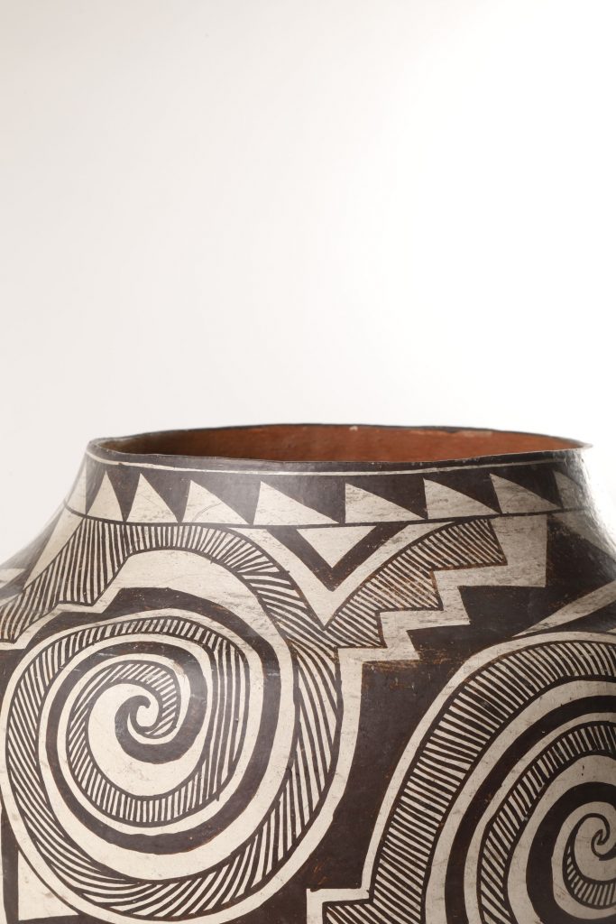
What you see: A large Acoma Tularosa Revival jar, created circa 1920, possibly by Mary Histia. Santa Fe Art Auction estimates it at $5,000 to $10,000.

The expert: Gillian Blitch, president and CEO of the Santa Fe Art Auction.

How is “Acoma” pronounced? AH-ko-MAH.

Who are the Acoma, what region are they from, and do they still exist? Acoma is a pueblo in the northern part of New Mexico. The village is still there. It’s considered to be the oldest continually inhabited pueblo in the United States.

What do we know about how this large Acoma Tularosa Revival jar was made? It would have been made using the coil clay method. You make a snake out of the clay and coil it around and around to build the pot.

Where would the clay have come from? Traditional potters, to this day, gather their own clay. The pueblos have different local clay colors in a range from buff to red to white. Acoma is known for its white color. The clay has to be tempered using shards of prehistoric pots, so the clay will hold together and hold water. The clay is refined until it becomes workable material.

How did the potters paint the clay? They painted over it with slip, a very, very watered-down clay. This has a cream-colored slip. The designs painted on it are from mineral and vegetable dye pigments, done with a brush made from chewed-up yucca stalks.

And I understand that almost all Native American potters are women, correct? Yes. There have always been a few male potters, and in the 21st century, a husband might paint a pot [that his wife fashioned], but classically, men created rock art and women created pottery.

What does “Tularosa Revival” mean here? Tularosa is another region that was actively creating pottery between 1100 and 1300 A.D. Near Acoma, there’s a trench with shards of broken pottery from that period. Acoma potters ground them up to use to temper the clay for their pots. I speak of acquiring a piece of history when you acquire an Acoma pot because it often contains shards of ground-up pots.

This Acoma Tularosa Revival jar is described as “large”. What makes it large? Does its size give us a clue about how it was used? Yes. Smaller pots are usually for tourists, because you can’t do much with a small pot. You couldn’t get a large jar in your luggage to take it back east. This jar measures 12 inches high and 13 inches in diameter. Because it’s in almost perfect condition, I don’t think it was ever used.

How would it have been used? It has a wide opening, so it could have been used for water. The base of the jar is concave, so it sits comfortably on the head. But if it was used for water, the top would have been worn down from scraping its lip against the edge of the pool or the river. We have another piece in the sale where you can see the wear on the top. Maybe, by 1920, this jar might have gone into a collection unused.

Are the designs we see on the jar traditional Acoma designs? Do they carry any meanings? These are Tularosa designs. What makes it Tularosa Revival is the ancient designs, which were found on prehistoric shards of pottery around the Acoma pueblo. It’s a very large, much-discussed area what the patterns may or may not have signified. The answer is, we don’t know, but they are remarkable prehistoric patterns.

What can we tell, just by looking, how difficult this Acoma Tularosa jar would have been to make? It’s not done on a potter’s wheel. It’s all done by eye and hand. And the pattern repeats perfectly, completely around the jar. She didn’t have a pencil or a ruler. She did it completely by hand.

How do we know that the Acoma Tularosa jar dates to circa 1920? It would be the design, the level of decoration, the quality of the clay, and the fact that it was probably Mary Histia, who was doing that [style of pot] at the time.

So this jar is characteristic of what Mary Histia did? Absolutely. It’s hard to know when she was born, but her dates are 1881 to 1973.

She would have been an established potter by 1920. Definitely. By 1920, she was the queen of Acoma pottery. President Roosevelt knew of her, and had several pieces by her in the White House collection. She was a star of the pottery world.

Did she sign or mark the piece in any way? It was considered inappropriate to sign a jar around these times, but it’s very typical of the work Mary Histia was doing. We can’t say for sure it’s Mary Histia, but she was one of the great matriarchal potters from this period.

Matriarchal potters? Mary Histia was the first in a long line of distinguished potters from Acoma that includes Marie Z. Chino, Juana Leno, Jessie Garcia, and Lucy M. Lewis. Her work continues to be very collectible and very important. There’s no signatures [on it], but the Theodore Roosevelt connection made a difference. Mary Histia was the reviver of Tularosa designs. Potters after her went on to do the same thing.

What is this Acoma Tularosa Revival jar like in person? Are there aspects of it that the camera does not pick up? It’s remarkable for its fineness. It’s thin, remarkably fine in its execution. It’s not a big, heavy, chunky pot. If you knock it, it makes a pinging sound, like knocking a wine glass. And it’s completely smooth to the touch, with a very fine cream slip and brown pigment painted on. It’s dazzling.

Why will this Acoma Tularosa Revival jar stick in your memory? The clarity of the design, the size, the condition–it’s just a thing of beauty. It’s mezmerizing.

How to bid: The large Acoma Tularosa Revival jar is lot 406 in Session 2 of the Joseph Pytka Collection of New Mexico Art & Artefacts, taking place February 29, 2020 at Santa Fe Art Auction.


How to subscribe to The Hot Bid
Click the trio of dots at the upper right of this page. You can also follow The Hot Bid on Instagram and follow the author on Twitter.

Images are courtesy of the Santa Fe Art Auction.

Gillian Blitch appeared on The Hot Bid in 2019, discussing an Oscar Howe painting that went on to set a world auction record.

The Sky City Cultural Center and Haak’u Museum in the Acoma Pueblo maintains a page on the history of Acoma pottery.

Would you like to hire Sheila Gibson Stoodley for writing or editing work? Click the word “Menu” at the upper right for contact details.

A Margaret Bourke-White Vintage Photograph of the George Washington Bridge Could Fetch $75,000 (Updated February 2020)

The George Washington Bridge, shot by Margaret Bourke-White and printed circa 1933. The warm-toned silver print could fetch $75,000 at Swann.

Update: The vintage Margaret Bourke-White photograph of the George Washington Bridge sold for $81,250.

What you see: A photograph of the George Washington Bridge, shot by Margaret Bourke-White and printed circa 1933. Swann Auction Galleries estimates it at $50,000 to $75,000.

The expert: Deborah Rogal, associate director of photographs and photobooks at Swann Auction Galleries.

Who was Margaret Bourke-White, and why does her work remain influential today? She became a pioneering photojournalist and was the first woman photojournalist at Life magazine. She covered World War II, the Great Depression, and a lot more. We appreciate her work for merging a high level of aesthetic sophistication with strong editorial comment.

How did this Margaret Bourke-White photograph of the George Washington Bridge come to be? Was it for an assignment? It was intended for a story in Fortune magazine. The George Washington Bridge was constructed over a four-year period, from 1927 to 1931. At its completion, it was the longest suspension bridge in the world.

What, if anything, do we know about how Margaret Bourke-White got this shot? The point of view is east to west. The photo is shot from the New York side, not the New Jersey side. [The look of the image] suggests it was shot in the afternoon in pretty bright sunlight. It would have been important to her to highlight the material used and the physicality of the structure.

How did she get this angle on the bridge? Was she standing in the middle of it, with cars passing her? I agree that she was standing somewhere in the middle of the span. In a variant of this photo, you can see a bit more of the actual span and you can see at least one car, small and in the distance.

What can we tell, just by looking, how difficult it might have been for her to get this shot? To me, it seems she would have been crouching or she arranged the tripod at a very low position so she could angle the camera upward to highlight the size and scope of construction. It gives the print a sense of the sublime. In the image, you don’t see the road itself. Our eye focuses on repeated imagery, allowing us to wonder at a new architectural feature of the city.

How does the way Margaret Bourke-White chose to compose this shot show her mastery of photography? She really focuses on architectural strength. She offers a sense of poetry and awe without losing visual strength–a hallmark of Margaret Bourke-White.

Would it have been difficult for her to shoot the George Washington Bridge in a way that excludes any features of New Jersey on the far side? The bridge is quite high. It’s a huge bridge, and the sense of being suspended in the air is pretty palpable. On the New Jersey side is the Palisades, a beautiful landscape feature. I’m not sure she had to do a lot to get the landscape out of the shot. I think she had to tilt the camera to get the expanse she wanted.

How, if at all, does this image of the George Washington Bridge connect to her earlier architecturally-themed photographs? There’s a clear connection between all elements of her career. She had a remarkable ability to capture a sense of bigness, of scale and power, as well as finer details like texture and the materiality of industry, and she could translate that sensation to people who encountered her work in a magazine.

Where does this image of the George Washington Bridge rank among the top ten best photographs by Margaret Bourke-White? In the top five, for sure. Her humanist images of the Great Depression have sold well at auction, but those are different.

It’s worth mentioning here that Margaret Bourke-White stands out for her ability to take strong photos of human beings and equally strong photos that have no human beings in them whatsoever, such as this one… True. She’s able to create powerful human images that display an ability to connect with an audience, and photograph structures to bring a sense of beauty and appeal while retaining a sense of strength. She’s extraordinary.

How rare are prints of Margaret Bourke-White’s photo of the George Washington Bridge? We last sold one in October 2000 for $29,500. Since then, it’s appeared only a handful of times as a vintage fine print. [The online Swann Galleries archive goes back to 2001.]

How do we know that this image was produced in 1933? Because of the provenance. In this time frame, it was given to Robert Kiehl, the original owner.

Do we know why Margaret Bourke-White would have made this print then? Would it have been a gift for Kiehl? Many of the photographs printed before the secondary market for photographs [arose around 1970 or so] were made as gifts for family members and friends. It’s certainly possible it was a gift for him.

How rare are early Margaret Bourke-White prints, such as this one? There’s no real census of her photos. There are likely few of any given image existing in the print format. For this one, there are probably five to ten. Some might fall lower in that range. There are certainly fewer in the range of vintage.

Thank you for mentioning that, I should ask–when you describe a photograph as “vintage,” what do you mean? It was printed before 1970? “Vintage” is a word that’s defined slightly differently [depending on who’s using it]. For us, it’s a print made close to when the negative was made.

What is this Margaret Bourke-White photograph of the George Washington Bridge like in person? Are there aspects of it that the camera doesn’t quite capture? It’s a stunning object, with a rich dimensionality associated with fine art prints. It has a very rich texture and a fine range of tones. Seeing a work like this in person always adds to the experience.

The silver print photo is described as being “warm-toned.” What makes it warm-toned? It’s a sepia toning that adds warmth and stability to the print. Her vintage prints frequently have a warm tonality, a creamy [cream-colored] mount, and are signed below the image. This is her classic presentation.

How does the provenance add value to the photograph? We can trace it to Margaret Bourke-White herself. She gave it to Robert Kiehl, who worked as her assistant between 1932 and 1935, when she had a studio in the Chrysler Building. The direct provenance is special, and adds to the value of the work.

Do we know if Kiehl might have helped produce this photographic print? It’s possible he had a hand in the creation of the print, given his capacity as her assistant, but there’s no proof.

Has this print been to auction before? No, it’s fresh to market.

What’s the world auction record for this Margaret Bourke-White photograph of the George Washington Bridge, and what’s the overall world auction record for a photograph by her? The record for the George Washington Bridge photograph was set in April 2013 at Phillips. It sold for $104,500, and it was also signed and mounted. The world auction record in general was set in April 2019 at another Phillips auction, by a Great Depression image, Flood Refugees, Louisville, Kentucky. It sold for $400,000.

Why will this Margaret Bourke-White photograph of the George Washington Bridge stick in your memory? It’s a stunning representation of a trailblazing photographer at the height of her powers. It’s an homage to what’s new and modern and a chance to see her experiment with abstraction, contrast, and beauty. It has everything we associate with Margaret Bourke-White in one image. I think it has it all.

How to bid: Margaret Bourke-White’s photograph of the George Washington Bridge is lot 130 in the Classic & Contemporary Photographs sale at Swann Galleries on February 25, 2020.

How to subscribe to The Hot BidClick the trio of dots at the upper right of this page. You can also follow The Hot Bid on Instagram and follow the author on Twitter.

Swann Galleries is on Instagram and Twitter.

Deborah Rogel has appeared on The Hot Bid previously discussing a tintype of Dr. Mary Edwards Walker and a record-setting photographic portrait shot by Peter Hujar.


Image is courtesy of Swann Auction Galleries.

Would you like to hire Sheila Gibson Stoodley for writing or editing work? Click the word “Menu” at the upper right for contact details.

A Harry Houdini Postcard from Houdini’s Personal Collection Could Fetch $2,500 (Updated March 2020)

A circa 1900s postcard of Harry Houdini, elaborately bound in chains and wearing nothing but a loincloth. It bears a stamp from the Harry Houdini Collection, and it could sell for $2,500 or more at Potter & Potter.

Update: The vintage Harry Houdini postcard from the Harry Houdini Collection sold for $2,375.

What you see: A circa 1900s Harry Houdini postcard depicting the legendary magician in chains. The address side bears a stamp from the Harry Houdini Collection. Potter & Potter estimates the vintage postcard at $1,500 to $2,500.

The expert: Gabe Fajuri, president of Potter & Potter.

Houdini was photographed many, many, many times during the course of his career. Why is this image such a standout? I mean, when I think of Houdini, I think of this picture. It’s a combination of beefcake, magic, metaphor, hardware, and really, kind of… all the things Houdini stands for, rolled into one photo.

Other photographs exist of Houdini in chains, but fully clothed. Why is this one more powerful than those? It’s emblematic of his entire career. He’s not just a handsome guy in a photo studio. It’s a genre-setting image, an iconic pose and scene.

Do we know whose idea it was for Houdini to have these pictures taken? Was it him, or did someone else make the suggestion? My guess is it’s Houdini. He was a guy with a very carefully crafted image. Early in his career, he got help from [vaudeville theater owner and booking agent] Martin Beck. Was Beck standing there at the photo shoot? I doubt it. But when Houdini realized something was working, he didn’t walk, he ran in that direction. It was a theme he must have understood, because he came back to it throughout his career. In one of his films, Terror Island, he’s basically just wearing a loincloth.

Why might Houdini have wanted to pose for these photos? What do they do for him that a fully clothed shot does not? He posed for both, of course. He understood every aspect of what that meant in the sense that it might have been a little bit scandalous. He was definitely pushing a boundary there, and stirring up interest–he’s not just shackled, he’s basically undressed. It’s titillating, but it had the added effect of proving that he was not hiding anything and he was able to escape the chains through his ability alone.

It looks like Houdini posed for the photo in Holland in September 1903. Did he run any risks in having them taken? They seem racy now. I imagine they might have been scandalous then. Were they? I’m not really clear on that. It’s not clear to me what the reaction would have been. It was not considered pornography. I don’t know if we’re casting a certain amount of modern inference over something that’s not as scandalous as we think. There’s a Houdini poster showing him performing an escape from prison in Amsterdam, and he’s underclothed. If the poster was acceptable enough to print and stick up on a building… maybe he was able to cross some border of decency and get away with it.

Are the chains Houdini poses with for this photo actual, no-kidding chains of the sort from which he escaped, or were the chains chosen solely for how they would look on camera? They were definitely functional. Remember, by this point, Houdini is performing challenge escapes on a regular basis. [Theater-goers] were allowed to bring their own handcuffs and restraints. Houdini was making a challenge–‘Lock me up in your cuffs, and I’ll escape.’ Were these the things he was escaping from? 100 percent. My guess is he provided them to the photographer. No doubt similar things were tossed at him, quite literally, in public appearances.

Do we have any notion of how Houdini used this image, outside of the postcard and the Amsterdam poster? And would he have printed the postcard with the intent of selling it as a souvenir? I’m not sure that he did. It seems unlikely. If there was a handbill or a flyer that used this image, it wouldn’t surprise me.

The reverse side of the Harry Houdini postcard, with the Harry Houdini Collection stamp visible.

This postcard bears a stamp that reads “Harry Houdini Collection”. What was the Harry Houdini Collection? Would that have been his personal collection? Yes, it was probably owned by him. I understand it [the stamp] was put there by his wife, to prove that it was his.

So it was Houdini’s own archival copy? Or one of many in his collection.

Do we know how the postcard left the Harry Houdini Collection? We don’t, but it could have been given away, or it could have been sold. Things started leaving Houdini’s family’s possession quite quickly after he died. There was tremendous interest in Houdini, and a lot of souvenir hunters out there, looking for things.

I take it that Houdini had quite the personal library? He absolutely never saw a piece of paper that he didn’t like. Thank goodness for that.

How rare is this Houdini postcard? I’ve probably seen it half a dozen times.

Can you quantify what the presence of the Harry Houdini Collection stamp adds to the value of the postcard? I don’t think there’s ever been any doubt about it being a beautiful, authentic postcard, but let’s say ten percent.

Is this image of Houdini in chains more sought-after than other images that show him bound or escaping his bonds? These things speak to different people for different reasons. The iconic nature of the image helps this one.

But people prefer images of Houdini actively escaping over other images of him? Yeah, but images that people haven’t seen can do well. Last December, we had a postcard of Harry and Bess that did well because it was unusual, and people hadn’t seen it. It sold for $2,600.

What condition is the Houdini postcard in? Lovely. I could do without the little tape marks on the back, but it’s nice.

How does this image of Houdini speak to the larger themes his work expressed and evoked, and which set him apart from other magicians? How does it capture the promise of, and the yearning for, escape from bondage? To play an amateur Dr. Freud here–Houdini was a diminutive guy, an immigrant to these shores, and he found a way to beat whatever was thrown at him. That’s a pretty powerful metaphor. It’s a concept that resonates even in modern times.

How to bid: The vintage Harry Houdini postcard from the Harry Houdini Collection is lot 360 in the Magic Collection of Jim Rawlins III auction at Potter & Potter on February 29, 2020.

How to subscribe to The Hot BidClick the trio of dots at the upper right of this page. You can also follow The Hot Bid on Instagram and follow the author on Twitter.

Follow Potter & Potter on Instagram and Twitter.

Images are courtesy of Potter & Potter. 

Gabe Fajuri has appeared on The Hot Bid many times. He’s talked about an oversize Alexander: The Man Who Knows poster, a Daisy and Violet Hilton poster from the conjoined twins’ vaudeville years, an impressive talking skull automaton that went on to sell for $13,200,  a magician automaton that appeared in the 1972 film Sleuth, a rare book from the creator of the Pepper’s Ghost illusion,  a Will & Finck brass sleeve holdout–a device for cheating at cards–which sold for $9,000a Snap Wyatt sideshow banner advertising a headless girl, a record-setting stage-worn magician’s tuxedo; a genuine 19th century gambler’s case that later sold for $6,765; a scarce 19th century poster of a tattooed man that fetched $8,610; a 1908 poster for the magician Chung Ling Soo that sold for $9,225; a Golden Girls letterman jacket that belonged to actress Rue McClanahan; and a 1912 Houdini poster that set the world record for any magic poster at auction.

A couple of the links included above come from Wild About Houdini, an excellent blog by John Cox which is more than worthy of your time.

Would you like to hire Sheila Gibson Stoodley for writing or editing work? Click the word “Menu” at the upper right for contact details.

A Nintendo PlayStation Prototype–Probably the Only Surviving Example of a Failed Sony-Nintendo Project-Goes to Auction At Heritage in March (Updated March 6, 2020)

The console and controller for what appears to be the sole surviving prototype for the Nintendo PlayStation, a failed Sony-Nintendo project from the early 1990s.

Update: WOW! The Nintendo PlayStation prototype sold for $360,000!

What you see: A Nintendo PlayStation prototype dating to circa 1990-1992, and evidently the only surviving prototype from the abandoned collaborative project between Sony and Nintendo. Heritage Auctions has declined to give an estimate.

The expert: Valarie McLeckie, director of video games at Heritage Auctions.

Let’s start by talking about how this Sony-Nintendo PlayStation project came about. I take it they weren’t direct competitors in the early 1990s? Yeah, essentially. Sony had no intention of becoming a video game company, but today, it’s one of the largest.

How well-known was the Sony-Nintendo PlayStation project at the time it was live? That’s a bit hard to say. Usually, companies are pretty secretive about projects. It did get to a point where the public found out about it, but it was late in the process, when it began to fizzle.

How did Sony and Nintendo divide the labor on the PlayStation project? It was not so cut-and-dried. Nintendo had created the Super Nintendo [SNES] by this point. It was released in 1991 in North America. This [project] was actually designed to be an add-on to the [SNES] console to play CD-Rom-based media.

CD-Rom based media? They said originally it wasn’t going to play games. It was going to play different types of media–karaoke was an idea, or encyclopedias. That’s why Nintendo let its guard down. They didn’t see it as a way to play games. And they thought people wouldn’t want to wait 15 seconds to load a game on a disc.

Why did the Sony-Nintendo PlayStation project fail? Nintendo realized the benefits of the contract it had with Sony were weighted so heavily on Sony’s side that it could be disastrous if they moved forward. Essentially, Nintendo would not receive royalties with software sales using discs. They announced at the 1991 Consumer Electronics Show (CES) that they’d work with Philips instead.

The complete set of materials that comprise the Nintendo PlayStation prototype, which will be offered at Heritage Auctions in March.

It’s believed that 200 Nintendo PlayStation prototypes were made, but what evidence do we have to support that number? I’m not really sure. It’s a ballpark number based on the number of prototypes made for game development purposes.

Ok, but why was it necessary for them to make 200 prototypes? Why couldn’t they get by with five, or a dozen? Did they need to make that many for the people who were in charge of quality control? Or was it more like with action figures, where the prototype goes through distinct stages? I’m sure those all were factors. A lot goes into the development of something like this. Different teams need to get their hands on it. One or five prototypes isn’t enough.

So, the 200 number–is that back-calculated from what was probably made, based on what we know about how other gaming consoles have been developed, or are there surviving documents that mention there being 200? I’m sure there probably is an internal document showing the exact number or alluding to it, but internal paperwork is hard to get your hands on. It’s never released outside the company, and when they’re done with it, they destroy it. Based on what people said at the time, 200 is a reasonable estimate.

The controller for the Nintendo PlayStation prototype, shown upside down, with wiring attached. It's a little hard to see because it's beige on beige, but the information plate identifies the controller as made by Nintendo.

How do we know that only one of these Nintendo PlayStation prototypes survive? If there were others out there, it’s pretty unlikely they would have left the company. When a game company is done with them [the prototypes] they typically trash them or take them home as a memento. It’s unlikely there’s another one out there, especially with something like this.

Olaf Olaffson, a higher-up at Sony, owned this Nintendo Playstation prototype. Do we know why he kept it? No. I looked to see if Olaffson made any comments in the past [about keeping the device]. From what I can see, he never acknowledged it, not publicly.

How did the prototype leave Olaffson’s possession and end up with its second owner? That is an interesting story, and kind of long. Olaffson left Sony to work for Advanta Corporation [a finance company; he was there from 1997 to 1999]. He left Advanta before it went bankrupt, and the prototype was swept up in the company assets. It was in a mystery box in the [bankruptcy] auction and it was bought by a very lucky person. That person has said they thought they were getting kitchen utensils–they didn’t think there was tech in there.

When did the second owner learn what they actually had? It wasn’t until years later when it was posted to Reddit. There was a myth about this console. Someone made a post about the Superdisc, and he [the owner] responded with pictures. Reddit was in awe over the thing. The pictures got it out there. People didn’t think it was real. Turns out it was. [The Reddit poster also filmed a short video that displays the prototype.]

Does the Nintendo PlayStation prototype work? Originally, it didn’t function and the sound didn’t work. Ben Heck [Benjamin Heckendorn, a computer engineer known for modifying consoles] rewired it and got it to where it was working fully and completely.

What’s your favorite detail of the Nintendo PlayStation prototype? The controller itself is pretty finalized. The only difference between it and a Super Nintendo controller, aesthetically speaking, is you see Sony PlayStation on the front, and “Nintendo” is in raised plastic on the back. It’s so wacky to see, but it looks exactly like a Nintendo controller.

What games can be played with the prototype? It does play Super Nintendo games. It was meant to be an enhancement [to the Super Nintendo] though they also said there would be a stand-alone version. It’s typical for companies not to come up wiht game ideas until the console is in a finalized state. Any games [made specifically] for it may have been destroyed or may never have been created. There is a user-made game [for the prototype], a homebrew game. I haven’t played it, but I hear it’s very cute.

What is the prototype like in person? The thing that stands out when you see it–it’s Nintendo and Sony. If you look at the two companies and the relationship between them now, it’s purely competitive. It’s sort of shocking to see this, almost like it shouldn’t exist. [Laughs.] The controller really is my favorite part. It stands out the most. It’s like your playing a Super Nintendo, but then you look down and you see the controller–it’s like an alternative universe where [the project] worked out. It works exactly the same [as an SNES controller] but it’s a weird feeling to see the controller in your hand.

The front of the console of the Nintendo PlayStation prototype.

How did you set the estimate for the Nintendo PlayStation prototype? What comparables did you look to? I don’t have an estimate. We fully trust the market with this. It’s hard to say what it’s worth until it’s sold.

Are you sure you can’t give me some sort of number to work with? We’re doing our best not to set unrealistic estimates on the piece, because there are a lot of rumors.

Have other game console prototypes gone to auction? Might their prices hint at what the Nintendo PlayStation prototype might do? Nothing compares to this. It’s an unreleased prototype. It was not purchased with the knowledge of what it was, and was never sold for what it’s possibly worth.

So, until now, game console prototypes have changed hands in private sales, not at auction? Ebay sales aside, that’s correct. We’re the first to dive into this as a formal market.

The Nintendo PlayStation prototype was restored to functionality, but how important is that? If it didn’t work, would it be worthless? For me, I don’t care if it works or not. You want it for the historical value. It’s a Nintendo-Sony PlayStation. There’s not going to be another one like this.

Why will this Nintendo prototype stick in your memory? Because it’s the closest thing to a unicorn I’ve ever seen in person. It might be the only chance in my lifetime that I get to see it. I’m really savoring my time working with it.

How to bid: The Nintendo PlayStation prototype is lot #93060 in the Comics Signature Auction taking place at Heritage Auctions from March 5 through March 7, 2020.

How to subscribe to The Hot BidClick the trio of dots at the upper right of this page. You can also follow The Hot Bid on Instagram and follow the author on Twitter.

Heritage Auctions is on Twitter and Instagram.

Images are courtesy of Heritage Auctions.

Would you like to hire Sheila Gibson Stoodley for writing or editing work? Click the word “Menu” at the upper right for contact details.

Albrecht Dürer’s The Rhinoceros Could Fetch $18,000 at Freeman’s (Updated February 19, 2020)

The Rhinoceros, an iconic 1515 woodcut by Albrecht Dürer, could sell for $18,000 or more at Freeman's.

Update: The sixth state of the 1515 Albrecht Dürer print, The Rhinoceros, sold for $81,250. Yay!

What you see: The Rhinoceros, a 1515 woodcut by German artist Albrecht Dürer. Freeman’s estimates it at $12,000 to $18,000.

The expert: David Weiss, senior vice president at Freeman’s.

So, for those who might never have encountered Albrecht Dürer before, could you talk about who he was, and why he remains influential today? He’s considered the preeminent German Renaissance artist and he’s credited with bringing Renaissance art to northern Germany. He was only 56 when he died, but he was established by his twenties as a painter and printmaker, and his genius lives on.

How did the woodcut print of The Rhinoceros come about? What we know is… first of all, rhinoceroses were not at all common in western Europe at the time. Dürer didn’t see a rhino, but he saw a sketch that was sent from Moravia. Dürer’s image was based upon an actual Indian rhino that arrived in Lisbon in 1515. It was the first living example of a rhinoceros in Europe since Roman times. The woodcut was very popular in Europe and remained so until the 18th century. It was presumably Dürer’s idea to make it.

Wait wait wait. Dürer did the woodcut without actually seeing a live rhino? He relied on someone else’s sketch? He did it based upon the sketch [which was later lost] and on news of the rhino’s arrival in Lisbon, which was published in Nuremberg. He was really thought of in Renaissance circles as one of the true artists of the period, a genius. That a rhinoceros would be intriguing to him is not surprising.

Where is Dürer in his career in 1515, when he makes The Rhinoceros? He’s well-established, and nearing the end of his life. He passes in 1528.

Is there any proof that Dürer created The Rhinoceros because he thought it would sell well–that it would be a hit with the public? It’s an interesting question whether or not his approach to this was if it was commercially viable. Arguably the subject did go through his mind. The arrival of the rhino sparked a great deal of interest. He thought it would be a good subject for a woodcut, and it was very popular.

Do we have any notion of why Dürer issued The Rhinoceros as a woodcut rather than, say, an engraving? Woodcuts are something that can be produced in greater quantity than engravings, which are more labor-intensive.

Dürer’s The Rhinoceros… doesn’t look exactly like a rhinoceros. We recognize this now. But is it possible to know if Dürer knowingly and deliberately departed from what he saw in the sketch and what he read in the contemporary accounts to give the beast what looks to be armor plates? There is some artistic license in the way he created his own version of the rhinoceros, with armor and rivets and what looks like breast plates. It would be wonderful to compare the [since lost] sketch to the original image. It would be fascinating to see, but we can’t do that. As for the translations [into German of the stories of the arrival of the rhinoceros], written descriptions of the original German documents don’t survive.

Detail of The Rhinoceros, showing its head and shoulders in profile along with Dürer's famous signature.

Dürer made this woodcut with only a sketch and a few written accounts to go on. I would be scared stiff to depict a rarely seen animal based on such meager source material, and yet, Dürer got reasonably close to reality. Why do you think Dürer’s The Rhinoceros remained an influential image after it was clear that it wasn’t strictly accurate? At the time, the rhinoceros was, essentially, a mythical beast. In some circles, the beast was conflated with a unicorn. I think he probably reveled in making a mythical, mystical image.

How was Dürer’s The Rhinoceros received in its day? It was highly popular and very well-received. What I don’t know is precisely how many were produced, and how it was received in commercial terms. It was viewed for a long time as a realistic or accepted depiction of a rhinoceros.

In its time, Dürer’s The Rhinoceros was considered an accurate depiction of a rare, exotic beast. We now know that he got some things wrong, but his rhino still commands attention anyway. Why do you think we 21st-century people enjoy the rhino despite its not being strictly accurate? The print resonated with the European art world and the European public at the time and it stayed popular for decades. I’m not sure I can answer your question about why it sustained its popularity. Part of it, certainly, is it’s a good-looking image, and part of it is how much of a departure from reality it is. It’s visually compelling.

Might The Rhinoceros‘s continued success be tangled up in the fact that it’s not strictly accurate, but it still looks very much like a rhino–that cognitive dissonance that comes from seeing something that looks real, but can’t be real? I think that’s a fair statement. It appears as a rhino, but not realistically so. It’s certainly not surreal. It’s not created from the subconscious. It’s a recognizable image.

The image of the beast goes right up to the edges of the paper. Do we know why Dürer did that? It’s worth noting that most prints extant of this image either have no margins or very thin, slight margins, measured in milimeters. It’s simply how the print was issued.

Might Dürer have done that to give the impression that the rhinoceros was so large that the paper could barely contain it? I don’t know if he was trying to make the animal seem bigger in the viewer’s mind. You could make the case that hardly a milimeter is wasted in that rhino. It seems to take over the space on which he depicts it. 21st century eyes can look at it as an imposing beast about to burst out of the four walls in which it is contained.

We don’t know how many copies of The Rhinoceros were printed in 1515. But do we know how many of them survive? I don’t know the number that’s around if we take into account private and public collections. I do know the number that have been offered [at auction] in the modern era, and what they’ve sold for. Since 1990, 26 woodcuts of The Rhinoceros have been at auction. [This doesn’t mean 26 copies from one of the first through eighth states of the 1515 woodcut have been offered; some of the 26 might be the same example coming back up for sale.]

The example of The Rhinoceros at Freeman’s is from the sixth state of eight produced in 1515. Does that matter? Do collectors prefer the earliest possible state, or are woodcuts of The Rhinoceros so rare that anything from 1515 is fine by them? Earlier states, particularly the first, are going to be rarer and more sought-after and command higher prices at auction. With each descending state, there’s less rarity and slightly less interest.

What is The Rhinoceros like in person? Are there any aspects of the Dürer woodcut that the camera doesn’t pick up? It’s a wonderful thing, it really is. What really comes across is the strength of the printed line of the woodcut itself and the fragility of the 16th century paper. You can hold it up to the light and see through it. On one hand, it’s a strong, imposing image of a beast, but on the other hand, it’s created on very thin paper that’s survived for centuries. It’s a striking image in person.

What’s your favorite detail of Dürer’s rhinoceros? I like the all-over plating itself, and the designs within it–the intricacies.

What’s the world auction record for Dürer’s The Rhinoceros? It sold at Christie’s New York in 2013 for $866,500. It’s worth noting that the estimate for the print was $100,000 to $150,000. It was a first state in perfect condition, and it had the text on top. Our print doesn’t have the upper panel above the rhino with text. I can’t tell you precisely why it was cut, but it’s not uncommon. The one that sold for so much had the text above the image. It’s also the third-highest price realized at auction for any work by Dürer.

What’s the condition of this print of Dürer’s The Rhinoceros? It’s in generally good condition, but not in mint condition. Generally good, with some minor restoration.

Why will this woodcut of Dürer’s The Rhinoceros stick in your memory? It’s the first time in my career that I’ve appraised and handled this print by Albrecht Dürer. It’s an iconic image that I’ve never handled as a specialist in charge of an auction.

How to bid: Albrecht Dürer’s The Rhinoceros is lot 1 in the European Art & Old Masters sale at Freeman’s on February 18, 2020.


How to subscribe to The Hot Bid
Click the trio of dots at the upper right of this page. You can also follow The Hot Bid on Instagram and follow the author on Twitter.

Freeman’s is on Twitter and Instagram as well.

Images are courtesy of Freeman’s.

Would you like to hire Sheila Gibson Stoodley for writing or editing work? Click the word “Menu” at the upper right for contact details.

See My Robb Report Story on Artcurial’s 2020 Retromobile Auction (THB Bonus)

Please see my piece for Robb Report’s website that previews top automotive lots in Artcurial’s 2020 Retromobile auction in Paris.

The lineup includes a 1929 Mercedes-Benz 710 SS 27/140/200hp Sport Tourer (shown above), estimated at $6.6 million to $8.8 million, as well as a 1938 Alfa Romeo 6C 2300 B Lungo Cabriolet by Worblaufen, estimated at $1.3 million to $1.9 million, and a 1993 Jaguar XJ220 C Le Mans that competed in the 1993 and 1995 editions of the 24 Hours of Le Mans.

The auction takes place on February 7, 2020.

Also see Robb Report‘s main website and subscribe to the print edition.

Robb Report is on Twitter and Instagram.

Also see the landing page for Artcurial’s 2020 Retromobile sale and the main website for the auction house.

Artcurial is on Twitter and Instagram.

Image of the 1929 Mercedes-Benz is courtesy of Artcurial and copyright Alex Penfold.

Would you like to hire Sheila Gibson Stoodley for writing or editing work? Click the word “Menu” at the upper right for contact details.

An Ed Moses Untitled Canvas Could Command $25,000 (Updated February 17)

Untitled, a 1985 oil and acrylic on canvas by the late Los Angeles-based artist Ed Moses. It could sell for $25,000 or more at Los Angeles Modern Auctions.

Update: The 1985 Untitled Ed Moses painting sold for $28,125.

What you see: Untitled, a 1985 oil and acrylic on canvas by Ed Moses. Los Angeles Modern Auctions (LAMA) estimates it at $18,000 to $25,000.

The expert: Clo Pazera, specialist at LAMA.

First, could you briefly introduce Ed Moses, and talk about why his work continues to speak to us? Moses was an L.A.-based artist, born and raised in Los Angeles — he went to UCLA, and first started exhibiting with Ferus Gallery in 1957. Ferus was a foundational L.A. gallery and a lot of the fellows — mainly fellows — who exhibited there had attended Chouinard, like John Altoon, Larry Bell, and Ed Ruscha, but Moses went to UCLA. Moses did spend some time briefly in New York, where he met Willem de Kooning and other abstract artists of that cohort — that may be one of the reasons that his works are more abstracted than, say, Ruscha or Bell… though in 1969, Moses had a show at Riko Mizuno Gallery and cut out big chunks of the ceiling so the artwork was essentially the light dancing across the floor. So even though he was mainly a painter and collagist throughout his career, he did experiment with other mediums and movements.

How prolific was Ed Moses? Has someone done a catalogue raisonné for him? He was pretty prolific. He produced a significant body of work throughout the years — not quite so many prints, he definitely focused more on drawings, collages, and paintings. Nobody has done a catalogue raisonné of his works yet. I know that the Ed Moses estate is currently still active, but I’m not sure whether they have plans to start a raisonné or not.

Can you give a rough number for how many works Ed Moses might have produced over his lifetime? Certainly I would say in the hundreds, but I don’t have a real ballpark figure.

Is there a period during his career that collectors prefer more than other periods? If so, does this work belong to that period? Throughout the decades, Moses’s style transitioned pretty significantly. In the early 1960s, he really focused on works-on-paper, and then in the 70s, he transitioned back to his roots in painting. By 1985, he was mainly working as a painter, and this work is a great example of the style that he solidified in that era.

Where was Ed Moses in his career in 1985, when he made this untitled work? At this point, he was mid-career. This was around when he was picked up by L.A. Louver Gallery, which went on to represent him for another 15 or so years.

How is it typical of his work—what marks it as an Ed Moses painting? Also, are there any ways in which this 1985 painting is atypical of his work? This is a pretty typical example of Moses’ work. He utilizes the diagonal grid pattern pretty frequently, it was one of his favorite motifs from the mid-seventies to his death.

Thank you for mentioning the diagonal grid pattern–I meant to ask about it. How often do diagonals come up in the work of Ed Moses? Why did it hold his interest? Yes, the diagonal grid comes up often in his work. In the early 1970s he became very interested in Navajo textiles, so many of his paintings have a textile-like quality to the compositions, which I see reflected in this work.

How often did Ed Moses tend to choose these colors—red, green, and black? Moses definitely used red quite a bit in his work, and red and black tended to be one of his favorite color palettes. The addition of green comes up less often.

This work is untitled. Did Ed Moses usually decline to name his paintings? He did title paintings, but also often enough would leave them untitled. He would frequently have obscure titles that seemed to refer to something, but it was unclear what that was, such as Down-Broz #1 or Mug-Po.

How often do Moses paintings come to auction? Since he was an L.A.-based artist, we see his works pretty often. Outside of L.A., they don’t come up quite so much. Moses is definitely a LAMA mainstay — we are the auction house to go to for his works.

Ed Moses died relatively recently, in 2018. What effect, if any, has his passing had on his market? Have you seen an uptick in consignments, or have things been steady? Oftentimes when an artist dies, counter to common belief, their prices will go down. But we actually set the world record for Ed Moses shortly after his passing, when we sold an Untitled work from his Hegemann series — estimated to sell for $30,000 – $50,000 — for $100,000.

What is this untitled Ed Moses painting like in person? Are there aspects of it that the camera doesn’t quite pick up? Moses’s works always have a lot of texture to them, which doesn’t always come through in images. A lot of abstract artists really lay on the paint, but Moses really liked to utilize the texture of the substrate, which is something that you can’t always detect in a photograph.

The substrate? What is the substrate? The bottom layer, like canvas, linen, or paper.

How did you arrive at the estimate of $18,000 to $25,000? In my role as an auction specialist, I look at what similarly sized works from a similar period have been offered for in the past. This is a really beautiful example of Moses’s work of that era, so we have confidence that the hammer price will exceed our low estimate.

Why will this untitled Ed Moses piece stick in your memory? It’s surprisingly playful — within his chosen structure of the grid, it’s easy to become absorbed in his breadth of mark-making, from watery paint blossoms to the artist’s own footprint. 

How to bid: Untitled by Ed Moses is lot 21 in the Modern Art & Design sale taking place February 16, 2020 at LAMA.

How to subscribe to The Hot Bid: Click the trio of dots at the upper right of this page. You can also follow The Hot Bid on Instagram and follow the author on Twitter.

Los Angeles Modern Auctions (LAMA) is on Twitter and Instagram.

Image is courtesy of Los Angeles Modern Auctions.

Would you like to hire Sheila Gibson Stoodley for writing or editing work? Click the word “Menu” at the upper right for contact details.