The Kurt Cobain Guitar from MTV Unplugged’s 1993 Nirvana Episode Could Command $1 Million and Several World Auction Records (Updated June 20, 2020: WHOA!)

Shown in full here is the 1959 Martin D-18E guitar that Kurt Cobain played during a legendary episode of MTV Unplugged. The vintage instrument could sell for $1 million.

Update: WHOA! The 1959 Martin D-18E guitar that Kurt Cobain played on the 1993 MTV Unplugged episode featuring Nirvana commanded just over $6 million–$6,010,000, to be exact. It did indeed set several world auction records, including most expensive guitar at auction; most expensive Martin guitar; and most expensive item of Nirvana memorabilia.

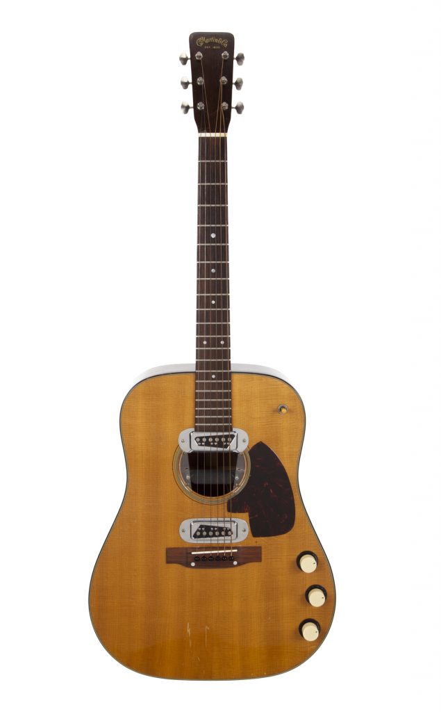
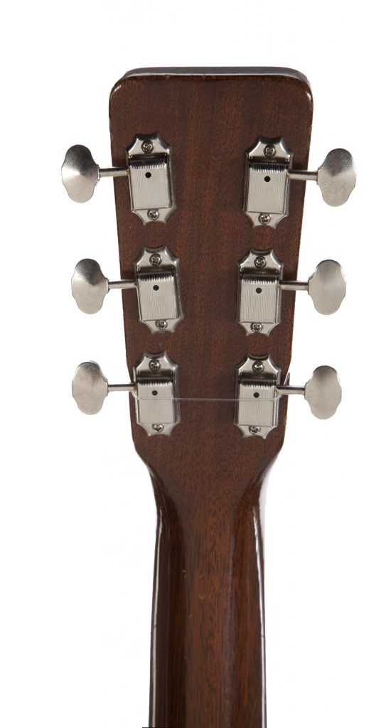
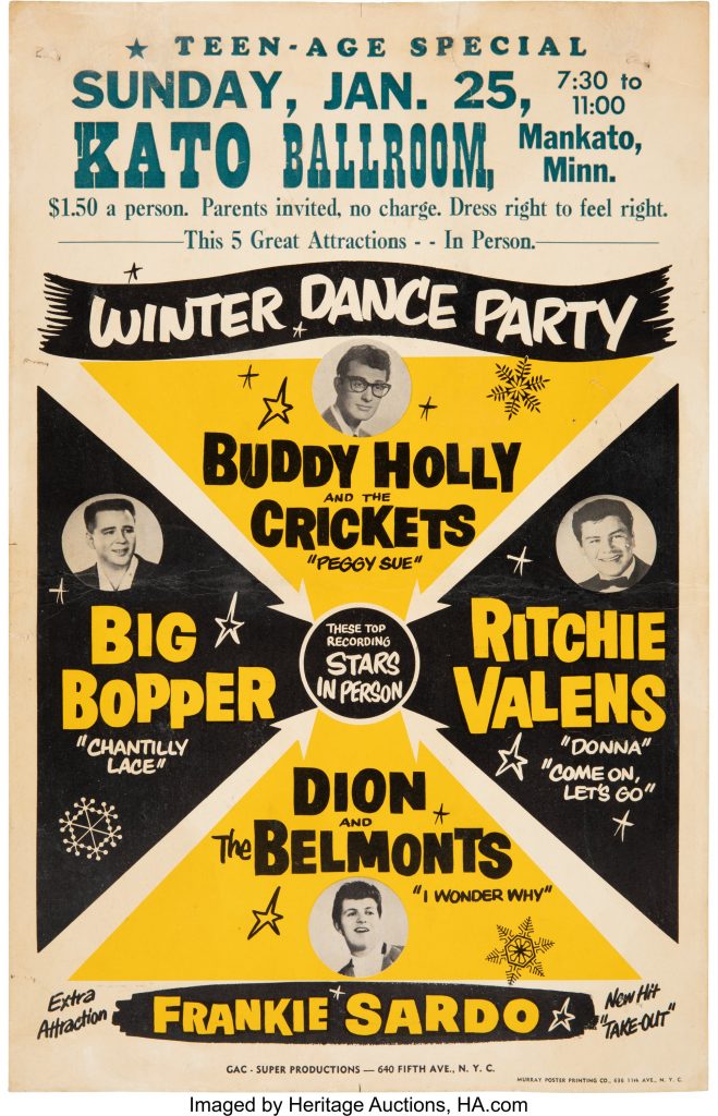
What you see: A 1959 Martin D-18E guitar, played by Kurt Cobain for Nirvana’s 1993 MTV Unplugged episode. Julien’s Auctions estimates it at $1 million.

The expert: Martin Nolan, executive director of Julien’s Auctions.

Who was Kurt Cobain, and why does his music still resonate today? Kurt Cobain was the lead singer, guitar player, and writer for the band Nirvana, which had a short lifespan. Cobain died tragically in April 1994, but the peak of his fame was 1991 through 1994. Grunge music and grunge clothing represents an era of music, an attitude, Gen X–so many things are wrapped up in it. Nirvana has music and lyrics that have meaning to us all right now.

Another angle on the vintage Martin guitar Kurt Cobain played during the 1993 MTV Unplugged performance by Nirvana.

I get the sense that there’s not a lot of Kurt Cobain material out there to be had. Is that right? That’s absolutely true. There’s a very limited amount of stuff out there. Kurt Cobain was a minimalist guy in a minimalist era. The majority of the stuff is still with the family. We sold a Fender guitar of his last year for $340,000. And the green cardigan [he wore during the MTV Unplugged episode] we sold for $334,000. I think Kurt Cobain would be laughing and crying at the same time [over the result]. He bought it for a few bucks in a thrift shop, and it has cigarette burns and stains. And he wrote great songs, but he was also an artist from a very young age. When his drawings come to market, they can get $7,000, $8,000, $9,000.

I guess Kurt Cobain is kind of like John Lennon, in a way. Exactly. There’s a lot of crossover between Kurt Cobain and John Lennon. The Beatles transformed music and our attitude to music in the 1960s. Nirvana did it again in the 1990s.

The front of the headstock of the 1959 Martin D-18E guitar cherished by Kurt Cobain. He chose it to perform the entire 14-song setlist for the MTV Unplugged Nirvana episode.

Do we know when and how Kurt Cobain acquired this 1959 Martin D-18E guitar? Kurt Cobain played many guitars and broke many guitars on stage. It was part of his show, and part of his schtick. He bought this in the early 1990s at Voltage Guitars, a store in Los Angeles. Martin made 302 of those D-18E guitars. They’re rare and highly collectible. This guitar is number seven in the production run.

What might have moved Kurt Cobain to purchase this vintage guitar? He bought it for a couple of reasons. Kurt Cobain was a left-handed guitar player, and it’s easy to adapt a Martin guitar for left-handers. He also added a Bertolini pickup. That made it an electric guitar–it was still acoustic, but it was modified for electricity. [Since this story went live on May 18, 2020, Lloyd Chiate, owner of Voltage Guitars, offered a correction: The Martin D-18E is, in fact, an electric guitar. While we can no longer ask Cobain why he added the Bertolini pickup, he may have done so to improve the guitar’s tone and its performance during recording sessions.]

A close-up on the 1959 Martin D-18E guitar that shows the Bertolini pickup Kurt Cobain added to it (it's visible inside the sound hole).
If you look inside the sound hole, you can see the Bertolini pickup that Kurt Cobain added to the 1959 Martin D-18E guitar.

MTV Unplugged was a well-regarded, even prestigious musical showcase before taping the Nirvana episode, but that 1993 show is great enough to demand its own category. Why? What makes it such a magnificent performance? Kurt Cobain ruled the roost with that production. He designed the stage, the candlelight, the chandelier–all his decision. There were 14 songs, including six covers from the Vaselines, David Bowie, Lead Belly, and the Meat Puppets. He had members of the Meat Puppets on stage during the performance. It was shot in one take, which is the first time that had happened for MTV Unplugged. Everything Kurt could give, every single ounce, he laid it out in that performance. Five months later, he was gone.

A detail shot of the vintage 1959 Martin belonging to Kurt Cobain that shows the body of the guitar.

Do you think, maybe, Kurt Cobain approached the look and feel of the MTV Unplugged performance and made those choices knowing he might not be around much longer? For me, it’s hard to say, but with hindsight, the candles, the lilies–it was almost a funeral parlor type of setting. He certainly seized the moment to deliver an unforgettable performance for us all. He poured it out there, and the Martin guitar was the canvas that he used. Kurt is gone, but the guitar remains of this historic event.

Did Kurt Cobain use this Martin guitar exclusively for all 14 songs in the MTV Unplugged set list, or did he switch it out for another instrument for some songs? I believe this was the only guitar Kurt used during MTV Unplugged.

A detail shot of the vintage Martin owned by Kurt Cobain, showing three knobs on its right side.

This one is a weird one for me because Nirvana is part of my life. I remember where I was when I got the news of Kurt Cobain’s death, and I connected with his outlook on things… He didn’t want to be famous. He didn’t love fame at all, or music executives, or studios. [In the MTV Unplugged episode] he looked to elevate less well-known bands. The 14 songs included Lead Belly. He had the Meat Puppets. He could have had more famous artists, but he said no, we want the Meat Puppets.

The Kurt Cobain guitar comes with the hard case that he stored it in. How unusual is it to have a guitar from a name musician that retains its carrying case? I wouldn’t say it’s very rare. It’s fairly common. If it’s a special guitar, I’d say a hard-shell case is attached to it. What’s really interesting is it’s not a custom guitar built for Kurt Cobain. It’s not a highly decorated guitar. It was made by the Martin Guitar Company in 1959. He got it in the early 1990s and he played it a lot and played it in important venues. It clearly was something special.

The vintage Martin guitar owned by the late Kurt Cobain, shown in full, with its hard case, and items found inside the case.

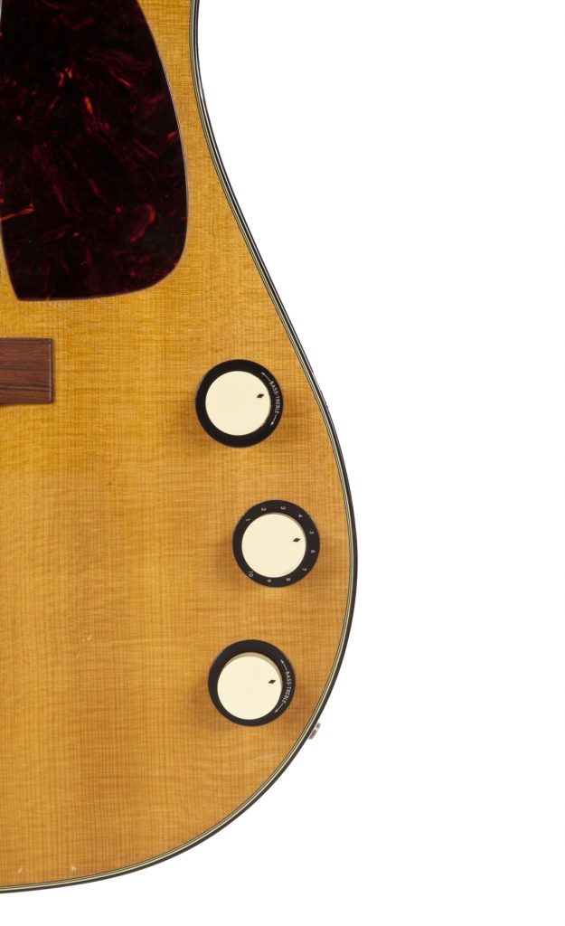
Yeah, I think it’s worth pointing out that the Kurt Cobain guitar is not covered in mother-of-pearl or silver or other flashy decorations. It’s a tool to do a job. He definitely had an affinity with the guitar and a sense of reverence for it. It’s a musical instrument built to deliver sound–that’s what it was used for. It doesn’t seem right to have it tricked up with all the bells and whistles. It’s a beautiful guitar with nothing ostentatious about it.

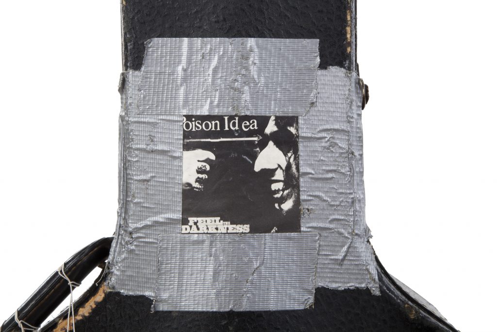
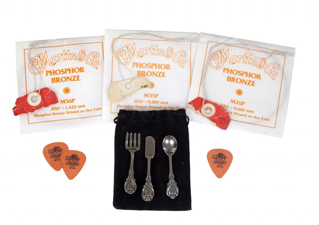
Can you talk about how Kurt Cobain decorated the guitar case, and talk about the things of his that come with the case? On the case, there’s a flyer from Poison Idea, stuck on with silver masking tape. It’s like a postcard of the 1990 album cover for Feel the Darkness. Poison Idea was a huge inspiration for Kurt and Nirvana. There’s an Alaska Airlines sticker, luggage tags on the handle, and also half a pack of guitar strings. And there’s a suede pouch, like a stash pouch, a recreational drug pouch, I’d describe it as. It has a miniature knife, fork, and spoon.

A closeup on a Poison Idea flyer that Kurt Cobain duct-taped to the neck of his guitar case. It touts the punk band's 1990 album Feel the Darkness.

Yeah, what’s the deal with the little set of utensils? Do we know why it’s there, and how Kurt Cobain might have used it? I have no idea, but I think it was a souvenir. You can wear it [the utensils] on a lapel, but you can attach them to the pouch. The spoon is pinned to the outside of the pouch.

The Kurt Cobain guitar comes with its case and an assortment of items found with the case, including luggage tags, spare strings, guitar picks, and a set of miniature utensils.

How do we know that this 1959 Martin D18-E guitar is the same one Kurt Cobain played in the MTV Unplugged episode? It’s so well-documented. It’s so identifiable, with the video performance. The markings on the guitar match perfectly. There’s no question this is the guitar.

You mean the scratches on the guitar match those on the guitar Kurt Cobain plays in the MTV Unplugged show? Exactly. It’s easy to match up.

Scratch marks on the body of the 1959 Martin D-18E guitar match marks on the guitar Kurt Cobain was filmed playing during the MTV Unplugged episode.

Julien’s estimates the Kurt Cobain guitar at $1 million. That’s a serious number. Not many stage-played guitars get seven-figure estimates. What informed the number? Dave Gilmour’s 1969 Martin D-35 sold one year ago for $1 million, the highest price paid for a Martin guitar. Before that, Eric Clapton’s 1939 Martin OO0-42 sold for $791,500. We’ve estimated this 1959 Martin D-18E guitar at around $1 million, and I think we could set a new record for a Martin guitar, and possibly could set a world auction record for a guitar.

The world auction record for any guitar belongs to another David Gilmour guitar sold last year at Christie’s, a 1969 black Fender Stratocaster that commanded $3.975 million. You think the Kurt Cobain guitar has a shot at taking the title? This definitely has the potential, given the interest in it, and the sophisticated buyers interested in it.

What sort of reaction are you getting for the Kurt Cobain guitar? Bigger than usual, even for a top-of-the-line item? There’s been an unbelievable outpouring. It’s up there with when we sold the John Lennon guitar that had been lost for years, and up there with the Marilyn Monroe dress. I’ve done so many interviews!

A shot of the vintage Martin Kurt Cobain owned, alongside its hard shell case.

What condition is the Kurt Cobain guitar in? The case is beat up, but the guitar is in great condition.

Did the person who consigned the Kurt Cobain green cardigan consign the guitar? No, they’re not the same person.

The Kurt Cobain-owned vintage Martin guitar, shown in full inside its case.

Do we know what happened to the Kurt Cobain guitar after he died in 1994? How did it go from the estate to the current consigner? I have to be careful here because I’m under an NDA (non-disclosure agreement). The guitar stayed in the family for many years. It comes to the market from a consigner who remains anonymous. It comes free and clear, no issues, absolutely none.

What is the Kurt Cobain guitar like in person? It’s a good, sturdy guitar. A big guitar, but not tremendously heavy. Given its age and history, it’s in very good condition. It’s been played, but it’s been cared for as well.

Have you played the Kurt Cobain guitar? No. I loosened the strings to take it on the plane [to personally escort it to London, where it’s on display until May 31, 2020 at the Hard Rock Cafe in Piccadilly Circus]. The cabin pressure on the plane could tighten them up, and they could snap. We think the strings on it are from when Kurt last played it. Nothing has been done to the guitar since then. We want the new owner to get the guitar from Kurt, as the last person who played it.

Does this June 2020 sale represent the first time the Kurt Cobain guitar has come to auction? It’s the first time it’s been to auction. We felt that $1 million was the appropriate estimate for this particular guitar because of its importance. Based on the pre-auction interest, it still feels like a conservative estimate.

A detail shot of the Kurt Cobain guitar, focusing on the back of the headstock.

Did the sale price of the Kurt Cobain green cardigan factor in to the $1 million estimate for the guitar? It certainly did. Not to take away from the sweater, but if you have the chance, would you want a grungy sweater with cigarette burns, or would you want a guitar from the same performance that you can use and play? Also, when the sweater sold for $300,000, you have to think [the guitar] should sell for at least three times that, if not ten times that.

You’ve handled a lot of amazing guitars in your time at Julien’s. I mean, a lot a lot. Why will this one stick in your memory? It’s amazing just because I have a great personal appreciation of Kurt Cobain, and a sadness for how he’s no longer with us, and how he passed away. He was a creative genius, and became a star against his own wishes. To be entrusted with this guitar, and to be part of its story in a small way, is a massive privilege.

How to bid: The MTV Unplugged Kurt Cobain guitar is lot 742 in the Music Icons sale taking place at Julien’s on June 19 and June 20, 2020.

How to subscribe to The Hot BidClick the trio of dots at the upper right of this page. You can also follow The Hot Bid on Instagram and follow the author on Twitter.

Julien’s Auctions is on Twitter and Instagram.

Images are courtesy of Julien’s Auctions.

Martin Nolan previously spoke to The Hot Bid about a stage-played B.B. King “Lucille” guitar, the “Happy Birthday Mr. President” dress that Marilyn Monroe wore to serenade JFKthe first TCB necklace given away by Elvis Presley, a purple Prince-worn tunic that the star donned for a 1998 BET interview, which yielded a famous GIF; a Joseff of Hollywood simulated diamond necklace worn by Hedy Lamarr, Ava Gardner, and several other Hollywood actresses, as well as a once-lost 1962 Gibson acoustic guitar belonging to John Lennon that sold for $2.4 million–a then-record for any guitar at auction.

The 1993 Nirvana episode of MTV Unplugged isn’t online as a whole, but as of May 2020, you can watch individual songs from the legendary show on Nirvana’s YouTube channel. The band is offering access to encourage donations to the World Health Organization (WHO)’s COVID-19 Solidarity Response Fund.

Would you like to hire Sheila Gibson Stoodley for writing or editing work? Click the word “Menu” at the upper right for contact details.

A Rufino Tamayo Galaxia Print Could Fetch $15,000 (Updated May 21, 2020)

Galaxia, a monumental 1977 print by the late Mexican artist Rufino Tamayo, depicts a gorgeous, constellation-bedecked night sky that fades from magenta to royal purple.

Update: The Rufino Tamayo Galaxia print sold for $15,000.

What you see: Galaxia, a 1977 print by Rufino Tamayo. Swann Auction Galleries estimates it at $10,000 to $15,000

The expert: Todd Weyman, vice president at Swann and director of prints and drawings.

Who was Rufino Tamayo? He was a famous Mexican artist who started as a painter and a printmaker in the late 1920s. He was also well-traveled and worked in various artistic centers around the world. He wasn’t the “revolutionary” artist that [fellow Mexican artists] Diego Rivera and David Siqueiros were. His work has a much different tenor.

What role did printmaking play in Rufino Tamayo’s career? It was instrumental to his career and it propelled him to worldwide renown, but he was known for his paintings and murals.

How often do night scenes appear in Rufino Tamayo’s work? Is is a theme he returned to often, or is Galaxia a rarity? He produced night scenes throughout his career, in his paintings as well as his prints. Galaxia is by far the most ambitious and best-known. It stands apart for its size, its ambition, and its graphic quality.

Do we know what moved Rufino Tamayo to create Galaxia? He was drawing from his Zapotec heritage. The Mesoamericans based their calendar on constellations. The knowledge was passed down through the generations. Tamayo was tapping in to that. He might have chosen night images to bring the ancient Mesoamerican traditions to life.

Does the Rufino Tamayo Galaxia print depict a real place, or is it imagined? It’s almost certainly of his own invention.

Do the constellations in Galaxia correspond to known constellations? They don’t appear to be. Tamayo was drawing on the graphic quality–the dots and lines–to create a rhythmic repetition in the piece. They’re more decorative than realistic.

The Galaxia print’s medium is called “color Mixografía”. I haven’t encountered that medium before. What is Mixografía? It’s a separate printing technique developed by Tamayo in conjunction with the Taller de Gráfica Mexicana printmaking workshop in Mexico City. [The studio later changed its name to Mixografía and relocated to Los Angeles.]

Could you talk about how Rufino Tamayo uses color in Galaxia? He sure gets a lot of expression out of that purple. The color is magnificent. [Laughs] Above all, Tamayo is a great colorist. In particular, the Mixografía prints were made on very absorbent handmade paper with a cotton-like texture. It allowed the colors to bleed and blend in a manner not unlike watercolors. The tones of the vast moonlit sky give the image a wonderful ethereal quality.

How thick is the paper? In some cases, the handmade Mixografía papers are a quarter-inch or more thick. It’s a very hefty, ultra-handmade paper. It feels more like pressed cotton pulp than a fine, finished paper.

In Tamayo’s obituary in the New York Times, poet Octavio Paz said: “If I could express with a single word what it is that distinguishes Tamayo from other painters of our age, I would say, without a moment’s hesitation: sun. For the sun is in all his pictures, whether we see it or not; night itself is for Tamayo simply the sun carbonized.” Do we see Paz’s observation reflected in Galaxia? I would say so. Tamayo portrayed powerful natural phenomena as mystical forces. He didn’t just incorporate elements in his work as background–he made them the subject of his work. The sun is a sheer, all-encompassing power that makes humans seem insignificant in the face of nature.

How does the moon in Galaxia match the power of the sun in Tamayo’s work? It imparts the vastness of Tamayo’s imagery in its size and scale, and its focus on the night sky, the constellations, the moon, and the shadow of the mountain. There’s no human presence, just a vast night desert sky.

When did Rufino Tamayo start working with the Taller de Gráfica Mexicana print workshop? They started working together in 1973, when Tamayo wanted to incorporate texture and dimensionality in his prints in the same way as in his fresco work. Taller de Gráfica Mexicana was a second-generation print workshop operated by Luis Remba and his wife, Lea.

How thick is the layer of ink on the Mixografía paper? Is it similar to impasto? It’s not impasto in the sense of [that seen on] a painting, but it has impasto-like qualities.

The Rufino Tamayo Galaxia print is large and long–20 inches by 47 1/4 inches. First of all–is it printed on one sheet, or more than one sheet that’s been joined to make a whole? Amazingly, it’s one sheet.

This is a big, weird size for a print. Did Galaxia pose any extra challenges to make? Tamayo had to specifically produce handmade paper for his prints, and he had to customize it for each of his editions, including Galaxia.

Making paper by hand… that’s not trivial. Not at all, but it’s something the printmakers would have been accustomed to, despite the challenges.

Did the Rembas have to build a special press to realize Galaxia? They had to build a special press, but they built it in 1973, in advance of this [the creation of the Mixografía print medium].

Is Galaxia the largest print that Rufino Tamayo made? No, he did larger. [Laughs]. In May 2019, we actually had one that was almost 60 inches by 95 inches. Its maquette utilized the largest lithographic stone ever produced. It still survives at the Mixografía workshop. Imagine working with that in the studio.

The lot notes describe the Rufino Tamayo Galaxia print as a “large, scarce print”, but I see this is number 66 of 100. I don’t necessarily think of a limited edition print run of 100 as translating to scarcity. What makes this print scarce? Given the size of Galaxia, its delicateness, and the care that goes into preserving it, it’s scarce. There have been only four at auction, including this one, in the last 30 years.

Now that you mention it, how do collectors store a Rufino Tamayo Galaxia print without damaging the ink? Most that I see are kept in shadow box frames. The paper has a textured quality, and the ink is not completely flat. It needs room, and also protection. You can’t pile it with other things in a flat file.

What’s the world auction record for a Rufino Tamayo Galaxia print? Interestingly, the last impression to go to auction was at Swann in 2018. It achieved $11,875.

How does the 2018 Galaxia compare to the one you have in the upcoming sale? Do you think it will beat the record set two years ago? I think the odds of beating it are fairly strong. The market for Tamayo has gotten stronger. The 2018 impression and this one are fairly equivalent. If anything, there’s one fewer on the market. It’s a little more scarce. It might be a little more sought-after.

What is the Rufino Tamayo Galaxia print like in person? I’m guessing it, more than most, is tough to translate to pixels on a screen. It’s difficult. The paper is wonderfully textured, and the colors are so vivid and deep. When you’re in front of it, it transports you. It’s not a characterless inked sheet of paper. There’s a mood about it, something about the colors and the view.

It’s easy to imagine crickets chirping or frogs croaking as you look at it. Galaxia is large. As you stare at it, nothing else is in your field of vision. Your isolation under the night sky is imaginable.

Why will this Rufino Tamayo Galaxia print stick in your memory? I think it’s so evocative of his work. You can see in it the artist’s hand and his creativity. And it is transporting. There’s something universal about the beauty of a night sky like this. Everyone gets to see one at some point.

How to bid: Rufino Tamayo’s Galaxia print is lot 402 in the Old Masters Through Modern Prints sale at Swann Auction Galleries on May 21, 2020.


How to subscribe to The Hot Bid
Click the trio of dots at the upper right of this page. You can also follow The Hot Bid on Instagram and follow the author on Twitter.

Swann Auction Galleries is on Instagram and Twitter.

Todd Weyman has appeared on The Hot Bid twice before, talking about a Howard Cook print that depicts the Chrysler Building and a print of M.C. Escher’s Night and Day.

Mixografía, the printmaking studio that collaborated with Rufino Tamayo, has a website.

Image is courtesy of Swann Auction Galleries.

A Paul Evans Sculpture Front Cabinet Could Fetch $150,000 (Updated May 13, 2020)

A Paul Evans sculpture front cabinet, created in 1975. The slate-topped Brutalist marvel could sell for $150,000 or more at Rago in May.

Update: The Paul Evans sculpture front cabinet sold for $106,250.

What you see: A Paul Evans sculpture front wall-mounted cabinet, created in 1975. Rago Auctions estimates it at $100,000 to $150,000.

The expert: David Rago of Rago Arts and Auctions.

Who was Paul Evans? He’s from Newtown, Pennsylvania. He was formally trained in jewelry-making, studying at Cranbrook [now known as the Cranbrook Educational Community], and then became a furniture maker. He had at least four studios that I know of, [including] a gallery he and Phillip Lloyd Powell owned together in the 1960s and 1970s. He died of a heart attack in 1987.

Where was Paul Evans in his career in 1975, when he made this sculpture front cabinet? Was he mostly a regional phenomenon? Yes and no. We get offered Evans pieces. It’s what we’re known for. One reason we get offered them is they were made here and never left. Paul Evans or Dorsey Reading [Evans’s studio manager] personally set them up in their homes. Evans was catering to educated, wealthy world travelers. Imagine how radical this cabinet was in the 1960s and 1970s.

Radical? Normal people were not buying this stuff. They were not buying benchmade pieces by radical guys working in New Hope, Pennsylvania.

Paul Evans made about 75 sculpture front cabinets. This example features three doors.

This sculpture front wall-mounted cabinet is what I think of when I think of Paul Evans. But do we know how he hit upon this look? I can only guess, but people had credenzas. People needed pieces to hold silverware and tableware in the dining room, and needed pieces to hold stereos in the living room. It’s a very functional form. It’s a large piece of furniture with a lot of flat surfaces. Evans transformed them into works of art within a modern household.

But do we know how Paul Evans came to give his sculpture front cabinets this particular style and appearance? He was a jewelry designer first. Each box is designed like a little piece of jewelry, with small elements. Evans knew what it was basically going to look like. He’d do them [design the look of the sculpture front] all together and give them to Dorsey Reading to fabricate.

Do any of the motifs on Paul Evans sculpture front cabinets repeat, or is every cabinet entirely different-looking? He repeated these ideas, but no two are alike. If you look on the left-hand panel of the three on this cabinet–do you see the three crosshatches in orange?

Evidently thinking it wasn't heavy enough on its own, Evans topped his sculpture front cabinets with a slab of locally quarried slate. It takes four people to move the piece, with two assigned to the top.

Do the crosshatches kind of look like a tic-tac-toe grid? Yes. That’s unusual. The circle to the right of the tic-tac-toe–that’s always there. On the right-hand panel of the three, on the lower left, you’ll see another circle that looks like a sun. That’s an unusual variation, with color radiating from it. The clusters of gold nail heads–Evans liked that. There are always nail heads. If you look at the cluster of nail heads above the sun, and look to the right, there are stalactites. He always has those. There are four of them total on all three doors. The motifs tend to repeat, but he always plays with them.

How many sculpture front pieces did Paul Evans make? He made about 75 sculpture front pieces, and probably made them over eight or nine years. They’re labor-intensive, but all one-of-a-kind. And they were not a lot of money.

Not a lot of money? No. I’ve had half the sculpture front pieces made, and easily one-third of them had their original invoices. The most expensive was several thousand dollars. I recall invoices that say $1,000, $1,500.

So the original prices don’t reflect the labor that went into them. Not in my opinion.

A head-on view of the Paul Evans sculpture front cabinet. His initial training as a jeweler shaped the appearance of this piece.

The lot notes say this Paul Evans sculpture front cabinet comes with digital copies of the original invoice and drawing. Does that indicate that the cabinet was commissioned? Yes and no. I think he might have had a small selection of these in his shop on Main Street in New Hope, Pennsylvania, and took orders from them. But no two are alike. I’ve had cabinets with two doors, three doors, four doors. There are similarities in their shape, and the types of designs [on the front], and the mined slate tops–those are from a local quarry.

Because the Paul Evans sculpture front cabinet is not heavy enough on its own–it needs a slate top. Exactly. It takes two men to carry the top. And you can’t get any more of the slate. It’s quarried out. It’s gone. There’s a lot of character to this slate.

Why do you think Paul Evans chose the slate to top the sculpture front pieces? I don’t know why, but it’s a local element, and it’s beautiful. It’s not even a polished piece of stone. It has whorls and ridges in it. It’s not a flat surface. But it’s a beautiful accompaniment to the sculpture front.

Would Paul Evans have designed the sculpture front cabinet and handed the design off to Dorsey Reading to fabricate? It was more collaborative than that, from what I understand. As Dorsey was fabricating, Paul Evans might sketch something out and Dorsey would incorporate it. I’d say Paul Evans was the primary artist here, but Dorsey knew what he was doing.

So the sculpture front design was kind of liquid? Evans might add a motif while Reading was still making it? Yes, or a couple of motifs. It wasn’t like he sketched the whole thing out.

A side view of the sculpted front of the Paul Evans cabinet, showing how some of the motifs jut forth.

What can we tell, just by looking, about how difficult this Paul Evans sculpture front cabinet was to make? That I can’t speak to. For Evans to come up with the design–easy. Dorsey, his skills are really good. But it’s all magic to me.

How much work does this Paul Evans sculpture front cabinet represent? I think this took about a week. It didn’t take a day, or a month. This is thick, welded steel. The ones [cabinets] on a wall are two-and-a-half feet deep.

How heavy is this Paul Evans sculpture front cabinet, and how did its installers make sure that it didn’t tear away from the wall? I would say it’s 1,000 pounds for a full-size [cabinet]. This is a little less, because it’s a three-door. They didn’t just go into the sheetrock or plaster. They were set right into the studs, because the studs are supporting the wall.

A side view of the Paul Evans sculpted front cabinet, showing its raw, rugged appearance. Installers typically bolt the cabinets to the studs of the wall to ensure it won't pull away.

Oh! So it became part of the architecture. Yeah. When we move them, we don’t move them in one piece. We take the doors off. That’s three-quarters of the weight.

Paul Evans sculpture front cabinets were used when they were new, but do contemporary collectors use them, or do they tend to treat them like pure sculpture? I don’t see anyone using them as record cabinets. They store mostly dishes and silverware. But I think people who buy them understand they’re high art.

What condition is the Paul Evans sculpture front cabinet in, and what condition issues do you tend to see with these pieces? I joke about it, but I’m serious–they’re indestructible. This is as solid as it looks. There can be some rust issues, and the colors can fade or oxidize, but this has good color. Look at the checkerboard on the left door. It has blue, yellow, red. Good color. And the kelp-like blue stuff below it, the red background is like dried blood. I think the color was more expressive half a century ago, but it has beautiful color.

What is the Paul Evans sculpture front cabinet like in person? I think it’s photographed beautifully. It’s a powerful piece of Brutalist design. It’s massive, creative, and has a very strong presence to it.

This particular Paul Evans sculpture front cabinet was pictured in the book Paul Evans: Crossing Boundaries and Crafting Modernism. Does that matter at all to collectors? As I like to say, I can’t guarantee it helps, but I can guarantee it never hurts. This cabinet has great provenance, from its original owners, and even an original sketch. That’s plenty. On top of that, it was selected for the monograph of the artist. And the colors pop on this one.

Do collectors prefer the Paul Evans sculpture front cabinets that are more colorful? Yes, definitely. The one I sold for the most had a lot of red and sky blue in it. It was very colorful.

Is this piece unusually colorful for a Paul Evans sculpture front cabinet? Usually you don’t get as many of them. Usually, it’s just reds and blues. The checkerboard [on the left door] and the sun on the right door give you the full rainbow. They’re on opposing sides of the piece, but they’re not placed at the same level. It’s a really lyrical piece. You’ve got a thousand-pound piece of steel here, yet there’s an elegance and a lightness. That’s genius–the genius of design.

Why will this piece stick in your memory? I like the way the elements on the front are composed. It has a really good balance to them, a symmetry to them. The condition is excellent, and the colors are softer and add balance to the mass and scale of this piece. I would like it better if it was a four-door over a three-door, yes. But for this size, it’s perfect.

How to bid: The Paul Evans sculpture front cabinet is lot 116 in the Modern Design sale at Rago Auctions on May 13, 2020.

How to subscribe to The Hot BidClick the trio of dots at the upper right of this page. You can also follow The Hot Bid on Instagram and follow the author on Twitter.

Rago Auctions is on Twitter and Instagram.

Images are courtesy of Rago.

David Rago has appeared on The Hot Bid several times before, speaking about a George Ohr vasea super-tall Wally Birda record-setting unique ceramic tile by Frederick Hurten Rheada Paul Evans cabinet, and a René Lalique vase.

Dorsey Reading has a website.

Would you like to hire Sheila Gibson Stoodley for writing or editing work? Click the word “Menu” at the upper right for contact details.

A P.G. Wodehouse-signed First Edition of His First Novel Could Command $3,000 (Updated May 7, 2020)

A first edition copy of The Pothunters, the debut novel by P.G. Wodehouse. The beloved English author also signed the book, which could command $3,000 or more.

Update: The first edition signed copy of The Pothunters by P.G. Wodehouse sold for $1,950.

What you see: A first edition signed copy of The Pothunters, P.G. Wodehouse’s debut novel. Freeman’s estimates it at $2,000 to $3,000.

The expert: Darren Winston, head of the books, maps, and manuscripts department at Freeman’s.

Who was P.G. Wodehouse, and why does his work still resonate today? First, I should say, because I know it’s a pet peeve with collectors, it’s pronounced “Woodhouse”. When you’re talking with serious collectors and you say “Wodehouse,” they’ll shut you down immediately. Wodehouse is an English author, and he really is from another era. He was 20 when Queen Victoria died. When he realized he was a good writer, he became diligent about how he worked. He agonized over a sentence until he got it right. From a technical standpoint, he’s not dated–100 years later, the jokes are still funny.

That’s a good point. Why are P.G. Wodehouse’s jokes still funny? Good material is good material. Whether you like it or not, it’s just good writing.

The upper class, luxurious English-centric world that P.G. Wodehouse describes in his novels… he’s evoking a world that never really existed, strictly speaking. Certain things are real–the schools, the mansions, the cars–but it didn’t literally exist the way he imagines it. You’re right, it’s an imaginary place, except for the fact–and this is my interpretation–what I’ve learned is all his books and characters are his life experience, and it’s his life experience between the ages of 10 and 25. You could argue that every character is pastiche and parodies. Downton Abbey covers the same timeline as those books. If it took a comedic turn instead of a dramatic turn, you’d have it [Wodehouse].

How does The Pothunters fit in to P.G. Wodehouse’s world? The Pothunters is his experience. He went to a school like St. Austin’s. He knew those boys and those masters. It’s a tiny portion of English society, and there’s a lot of pain in that way of life–not in a depressing way, but it was what it was. To poke fun at it was a way of getting through it. I think the world of P.G. Wodehouse is [not dissimilar] to the way people talk about Tolkien and The Hobbit–he created a world and populated it. In his last books, it’s still basically 1919.

Why do you think Americans embraced P.G. Wodehouse’s books so firmly? He didn’t write down to anyone, ever. He did it respectfully, so the upper class laughed at themselves, and the lower class laughed, but not in a mean way. Never mean.

In thinking about why P.G. Wodehouse still hits the mark, I realized that most people know someone like Gussie Fink-Nottle, who’s utterly obsessed with an obscure topic, or Tuppy Glossup, a nice-enough guy who has character flaws. So even if they’re running around in white tie and tails, they seem familiar anyway. I married a Brit, and I think I have a different experience of England than some of my friends do. I want to point out–it’s absurd but true–those people are out there. The people in the books–I’ve met them. I knew a friend who went to an English boarding school and university, and he speaks that way, like it’s 1905. He’s very modern in some ways, but he’s on an archaic trajectory. It’s like having a dodo bird in front of you. It’s fascinating to see it exist.

The Pothunters is P.G. Wodehouse’s first novel. How did its publication come about? Did he have a hard time selling the manuscript? It was published when he was 20, but he’d been writing since he was a teen. I don’t know if he had trouble getting it published. It was serialized in three installments and published in what would have been called a boys’ magazine. He wrote very much in the tradition of what he read as a boy–what the Brits call a “boys’ own book”.

What is The Pothunters about? It’s about a bunch of boys at an English boarding school not unlike the one he went to. A “pot” is what they call a trophy. The pothunters are trying to find pots that have been stolen from the school. He was writing in the style that he was reared in, and the subject matter was his own life.

What themes and tropes appear in P.G. Wodehouse’s The Pothunters that recur in later Wodehouse books? The Pothunters is really the school story. You could say it launched his entire career.

Without The Pothunters, we don’t get Psmith, and we don’t get the background that many of the upper class characters share in the Jeeves and Wooster books. Exactly. You can argue that Wodehouse has characters in his canon in all age strata. Some of them grew up with him.

Over the last few days, my family and I have been watching episodes of the 1990s television series adaption of Jeeves and Wooster, starring Stephen Fry and Hugh Laurie… One of the lots for sale is a tweed waistcoat Fry wore in the series.

Seriously? Whoa. I’m a big fan of the show and a bigger fan of Fry and Laurie. It speaks to one thing I love about what I do–I can put on a Stephen Fry vest, and maybe you saw it last night. And I can hold this copy of The Pothunters, which P.G. Wodehouse had in his hands 100 years ago. There’s one degree between me and him. It never gets old.

Did you try on the Stephen Fry Jeeves vest? I put it on and jokingly said if it didn’t sell, I’d buy it.

Did it fit? It did! Dangerously, it did. My wife gave me a knowing look [as if to say] if it comes home, it’s OK.

To get back to P.G. Wodehouse’s The Pothunters, how good a debut novel is it? I’m not a critic, but it can be argued it’s a very, very good debut. It’s his style. It didn’t change. That book came fully equipped.

This P.G. Wodehouse first edition of The Pothunters appeared in 1902. Does the copy predate the use of dust jackets? Or did it have a dust jacket and lose it at some point? Dust jackets were beginning to be a thing. As far as anyone knows, The Pothunters was issued without a dust jacket, but my feeling is it might have been. You can see others in the sale that are very much in the style of the period. The first edition we’re talking about is so clean, and the design is so simple, [I think] it had to have had a jacket.

Do we know how big the first edition of The Pothunters was? There’s no known quantities for the book. Wodehouse was paid a percentage on copies sold. I’d have to think closer to 500 than 5,000 were printed.

How often does a first edition copy of P.G. Wodehouse’s The Pothunters appear at auction? It shows up occasionally. If there are 50 copies of a Jeeves and Wooster online, there [might be] two Pothunters, and one will be a reprint and one will be a first edition.

P.G. Wodehouse wrote prolifically, but didn't sign all that many of his books. This first edition of The Pothunters, his debut novel, is among the few that he autographed. He lettered his name with a fountain pen, which indicates that he signed the book not long after its publication.

This copy is signed by P.G. Wodehouse. How rare is his signature, and how rare is it to see one on a first-edition copy of The Pothunters? Wodehouse signed for friends and fans. He didn’t sign a ton. What’s really cool about this signature on The Pothunters is it’s in fountain pen, and if you look at the ink, it’s old and brown. It makes me think it’s early. And it just says “P.G. Wodehouse”. He often signed with his nickname, Plum, or signed “Plum–P.G. Wodehouse”. Because this just says “P.G. Wodehouse”, it says to me he was young and not confident enough that the world would know him as Plum. It’s a big difference from the 90-year-old Wodehouse signing in ballpoint pen.

P.G. Wodehouse signed this copy of The Pothunters closer to when the book came out. Exactly. It’s uncommon to find a P.G. Wodehouse book signed. To find a copy of The Pothunters signed contemporaneously–that makes it much more interesting. Looking at auction records, I couldn’t find another.

What’s the world auction record for a copy of P.G. Wodehouse’s The Pothunters, and what’s the world auction record for any P.G. Wodehouse book? The highest in general was 2013, at Bloomsbury in London, for The Globe By the Way Book, a 1908 collection of pieces he and a friend, Herbert Westbrook, published in The Globe. It’s one of the rarest pieces of Wodeiana. It sold for £26,840 ($42,192) against an estimate of £2,500 to £3,500 ($3,900 to $5,500), way more than ten times its high estimate. The record for The Pothunters was also set at Bloomsbury in 2014. It sold for £3,968 ($6,200) against an estimate of £1,200 to £1,800 ($1,900 to $2,800).

Was the record-setting copy of P.G. Wodehouse’s The Pothunters signed? It wasn’t. If we can beat $6,200, that would be fantastic.

What’s the condition of this first edition copy of The Pothunters? It was read. We’re lucky that it wasn’t abused. Its architectural parts are sound. If I had to distill it into two words: very good. The only thing that happened to this copy of The Pothunters over the last 120 years was that Wodehouse applied his name, which is a plus.

The first edition of The Pothunters is part of a larger single-owner P.G. Wodehouse collection that Freeman’s is offering on May 7. How well-regarded is the collection and its collector, William Toplis? He built the collection over 25 years and he had very high standards. There are no crappy copies. Everything is a home run. It’s a beautifully curated collection. The only thing that’s worth zero dollars is a copy of Big Money that he must have read at the beach.

How hard is it to build a P.G. Wodehouse collection such as this one? It’s difficult. Wodehouse is a popular subject to collect. He does have a following. This is a really good collection. Toplis was super-diligent. He knew what he wanted, he found it, and he paid for it.

Why will this P.G. Wodehouse first edition and this collection stick in your memory? I think it will stick in my memory because it was a collection. I never met Bill Toplis, but I feel I got much closer to him because I got the gift of handling his books. I saw where his heart was. These 190-odd items might go to 190 places, and Bill’s mojo is in them.

But isn’t it difficult to conduct and oversee the single-owner sale? I mean, you’re dismantling decades of work. In theory, yes. In practice, and this is going to sound corny, the collection is like a tree, and 190 acorns have come from it. Now they’re going back into the wild to seed 190 collections. It’s what I think should happen with beautiful things. They should move around, and lots of people should get to enjoy them.

How to bid: The P.G. Wodehouse first edition of The Pothunters is lot 105 in the P.G. Wodehouse Collection of William Toplis auction at Freeman’s on May 7, 2020.

How to subscribe to The Hot BidClick the trio of dots at the upper right of this page. You can also follow The Hot Bid on Instagram and follow the author on Twitter.

Freeman’s is on Twitter and Instagram as well.

Darren Winston appeared previously on The Hot Bid talking about a first edition copy of A Confederacy of Dunces signed by Walker Percy.

Images are courtesy of Freeman’s.

P.G. Wodehouse has an official website.

Would you like to hire Sheila Gibson Stoodley for writing or editing work? Click the word “Menu” at the upper right for contact details.

Inaugural License Plates from the Eisenhower-Nixon Years Could Sell for $6,000 (Updated May 15, 2020)

An inaugural license plate issued to President-elect Dwight D. Eisenhower in 1957. It's one of the only two inaugural plates to include photographic portraits, and both feature Eisenhower and Nixon.

Update: The single 1957 inaugural license plate issued to President-elect Dwight D. Eisenhower, sold for $7,995. The pair of 1953 inaugural license plates issued to Vice President-elect Richard M. Nixon sold for $2,767.50.

What you see: An inaugural license plate issued to President-elect Dwight D. Eisenhower in 1957, for his second inaugural celebration. It’s one of two lots of inaugural license plates from the Eisenhower-Nixon years in a mid-May sale at Morphy’s; the second lot is a pair issued to Vice President-elect Richard M. Nixon in 1953. Both lots carry estimates of $3,000 to $6,000.

The expert: Jim Fox, consultant for Morphy Auctions.

What were the first inaugural license plates ever issued, and would those plates be most sought-after by collectors? The answer is Franklin Delano Roosevelt, in 1933. Those were the first inaugural plates.

I’m surprised it was that late. Keep in mind that automobiles weren’t popular until the teens. But yes, the FDR 1933 plates are the rarest, the least common, and fewer survived. We don’t know how many FDR 1933 plates were issued, and we don’t know how many survived.

I found a 2017 Washington Post article that shows several different inaugural license plates, and it looks like the two designs issued in the 1950s for Eisenhower and Nixon are the only inaugural plates that picture the inaugurees. Is that correct? Yes. These are the only plates that picture the inaugurees.

Do we know how or why the 1950s inaugural license plates came to feature actual black-and-white portrait photographs of Eisenhower and Nixon? I don’t know why they did it, other than it’s an attractive design. I don’t know that there’s more to it than that.

I realize I’m asking you to speculate, but do we have any idea why no other inaugural license plate designs include pictures of the president and the vice president? If it was going to happen [again], I thought it would have happened with the last inaugural. To be honest, I doubt the presidents and vice presidents themselves spent a lot of time on inaugural license plates. The inaugural committees make decisions like that. [Putting portraits on inaugural plates is] a great idea, and looking back, it looks like a better and better idea. But I can’t tell you what the logic was.

I find it odd that no one since Eisenhower and Nixon have included their pictures in an inaugural license plate design. It seems like a natural. We’re Americans. We love our cars, and we love telling the world what we think about politics by sticking things onto our cars. Lots of people would buy an inaugural license plate that shows the faces of the president and the vice president. In today’s culture, it does seem natural, and it [putting imagery on license plates] is a proven technology. I wish I had a better answer for you, but I’m sorry to say I don’t. Somebody thought it was a good idea, and went with it.

It’s weird, looking at the other inaugural license plates–they’re kind of interchangeable. If you covered up the year, there’d be no way to guess which plate belonged to which inaugural, except for the Eisenhower-Nixon plates. Absolutely true. Block the date and they’re the same.

This pair of inaugural license plates was issued to Vice President Richard Nixon in 1953. Note that both men are smiling in their 1953 photos, and not smiling in their 1957 photos.

It seems extra-weird that only Eisenhower and Nixon appear on inaugural license plates because the president who came after them, John F. Kennedy, was one of the most telegenic presidents we’ve ever had. You’d think he or his inaugural committee would want to put his picture on the plates. Kennedy switched, and for whatever reason, they didn’t see it as necessary. Maybe they thought it was too expensive. I don’t think the minds of people worked the same then as they do now. Now, everything’s telegenic. Hollywood, let’s call it Hollywood. But license plates are legal documents. That’s all they are–legal documents. They validate a vehicle for a short period of time.

Would the inaugural license plates have come with registrations? Yes. They were legitimate. They were just legitimate for a short time. [Neither of the two lots of inaugural license plates have retained their registration paperwork.]

I take it the registrations would have been placed in the glove boxes of the cars that rolled along D.C. streets in those 1950s inaugural parades? You can bet that no one [would have pulled over Eisenhower or Nixon and] said, “Excuse me, can I see your registration?” On a practical level, it’s worthless. On a historical level, it’s priceless.

Were inaugural license plates only used in inaugural parades? They were used just for inaugural parades, but by the 1960s, the plates were good for the month of the inaugural. Later, it was extended to 90 days. You could put the plates on your car and do what you wanted with them. I put a Nixon second inaugural plate on my car in the 1970s, and the police stopped me within the hour, asking, “Is that a real plate?” The policeman looked at me for the longest time and finally said, “I don’t know what to do with this.” I said, “You don’t have to. It’s legitimate.”

Where were you pulled over? This was in Ohio. Anything [any inaugural license plate appearing on a car] outside of D.C. and the police think, “What the heck?” The policeman finally said goodbye. He never figured it out.

Do we know what technique or tool was used in the 1950s to print black-and-white photographic portraits onto steel to create these inaugural license plates? Whatever they used must have been effective, because the images still look good after sixty-odd years. That’s right, they look great. But that question is out of my league, that’s all I can say.

My best guess–and it’s definitely a guess–is someone on the first Eisenhower-Nixon inaugural committee either created the printing process or knew the company that did, and told the committee members about it, and they went for it. That’s as likely to be the case as anything. Or it could have been curiosity–“I wonder if we can get their photographs onto a plate?” As far as I know, it was never used outside those two inaugurals.

Did both lots of inaugural plates come from the same consigner? Yes.

Do we know how long the consigner had them? As far as I’m aware, he had them in the 70s.

Lot 2008, the inaugural license plate issued to Eisenhower for his second ceremony, consists of one plate. Do we know where its mate is? Might the Eisenhower family have kept it? That’s not out of the question, but it’s not known what happened to the other plate.

The condition of the 1957 Eisenhower inaugural license plate is rated at 9.0. What does that mean? Morphy’s has a way of grading plates that is not widely used [among license plate collectors]. A 10 would be perfect. In the world of license plates, we give letters: F for fair, G for good, EX for excellent.

How does the 9.0 translate into a grade on the letter scale? Probably very good (VG) to very good plus (VG+). All the plates in those two lots are nice. One [one of the two Nixon plates from 1953] has a slight distortion of a bolt hole that brings it down a bit [to an 8.5 rating]. But a VG+ plate is still a beautiful plate, or it should be.

Inaugural license plates issued to presidents and vice presidents weren’t left on the cars for long. But do collectors like to see some wear on them? Something that proves they were actually on a car that a president or vice president rode in during an inaugural parade? My answer is absolutely. You want a little bit of road dust to prove it was on the road.

As I was preparing my questions, my nine-year-old pointed out to me that the two men are smiling on the 1953 inaugural license plate and aren’t smiling on the 1957 plate. Does that matter at all to collectors? Or is the 1953 a bit more valuable because it’s from the first Eisenhower-Nixon inaugural? [Laughs] I got a kick out of that. I think it’s perfect that a nine-year-old made that observation. Though it probably has no significance whatsoever, it’s a fascinating observation.

It is kind of startling to see Nixon smiling. That doesn’t strike me as being his natural state. And you can see these guys age a ton in those four years.

The Eisenhower lot consists of a single inaugural license plate from 1957. The Nixon lot has both plates from 1953, the first inaugural. Both lots have the same estimate: $3,000 to $6,000. Why? Can you explain why things shake out this way? Number one is more desirable than number two. As a result, a single inaugural plate from a president compares to a pair from the vice president.

What are the inaugural license plates like in person? They’re more substantial than modern plates, which are made of aluminum. These plates are steel, and the plates were made from steel up to the 1980s.

What’s the world auction record for an inaugural license plate? Might one of these lots set a new record? The record would have to be an FDR 1933 plate. I think it’s possible one of these could set a record. It’s a matter of who tunes in. [Since this story went live, the folks at Hake’s pointed me to what appears to be the world auction record: A set of inaugural plates that graced President Ronald Reagan’s parade car in 1981. The set sold for almost $15,000 in 2005 at Hake’s.]

How to bid: The 1957 Eisenhower inaugural plate is lot 2008 in the Automobilia & Petroliana sale at Morphy Auctions on May 13 and 14, 2020. The pair of 1953 Nixon inaugural plates is lot 2009.

How to subscribe to The Hot BidClick the trio of dots at the upper right of this page. You can also follow The Hot Bid on Instagram and follow the author on Twitter.

Image is courtesy of Morphy Auctions.

Would you like to hire Sheila Gibson Stoodley for writing or editing work? Click the word “Menu” at the upper right for contact details.

Magician Johnny Thompson’s Cups and Balls Set Could Fetch $4,000 (Updated May 3, 2020)

The late magician Johnny Thompson's personal set of cups and balls could command $4,000 at Potter & Potter.

Update: Magician Johnny Thompson’s customized set of cups and balls sold for $14,400.

What you see: Magician Johnny Thompson’s cups and balls set. Potter & Potter estimates it at $2,000 to $4,000.

The expert: Gabe Fajuri, president of Potter & Potter.

Who was Johnny Thompson, and what made him stand out from his magician peers? Whatever the job required, he was not only capable, but supremely capable. He was a general practitioner of magic, in a sense. He could do it all–trade shows, amusement parks, Las Vegas stages, cabaret, the Playboy club circuit–and he really could do it well.

I understand he was good at both close-up magic and stage magic, and that’s relatively rare? Thompson was an extremely talented close-up performer, but his stage act is what everybody knew him for, and which he did the most: The Great Tomsoni and Company.

Being good at both close-up and stage magic… is that the magician’s version of being ambidextrous? Do many magicians do both? More than you’d think, but usually, you find your strength and stick with it. Not many are at the level that Johnny Thompson was.

How important was the cups and balls routine to Johnny Thompson’s act? It was one of his signature pieces. He managed to relate the stories of the people who influenced his magic and paid tribute to them during the performance.

The cups in Johnny Thompson's set are silver-plated and feature engravings of Egyptian hieroglyphs. At the time they were made, a tomb in Egypt was believed to picture men performing the cups and balls routine. The hieroglyphs on Thompson's cups appear to be purely decorative and do not replicate the famous, since-debunked ones in the scene in the tomb.

And how important is the cups and balls routine within the history of magic? It’s vital. It’s the… what would a good analogy be? It is the standard. People often say a magician can be judged by his facility with this routine. This is the raw stuff, vital stuff as far as magic is concerned. If you can master the routine, you truly have arrived. If you can develop your own cups and balls routine at a masterful level, it sets you in another class.

Do we know when the Johnny Thompson cups were made? I don’t. They were obviously made after the Charlie Miller cups were first put on the market, because they’re a modification of a commercially available product. I guess the 60s or the 70s. I don’t have an exact date.

Do we know who or what company made the Johnny Thompson cups? I don’t. The cups themselves are by Magic Inc., which was and still is a shop in Chicago. The cups were copper. Who silver-plated them and engraved them for him, I don’t know.

He didn’t leave behind any notes about when and who modified the cups for him? Not that we’ve been able to find. Even in the book about Johnny Thompson’s life, I don’t believe it mentions who the engraver or the silver-plater was.

And I take it that the balls and the imitation lemons are probably from Magic Inc.? It’s hard to know. The lemons are some sort of latex or rubber. They’re solid. He kept performing until the year he passed away. He could have added [new sets of balls and lemons] at any time.

Thompson's cups and balls set includes imitation lemons, which he would produce during the finale.

The cups were originally all-copper. Why might Johnny Thompson have had them silver-plated? Does the contrast of the silver outside and copper inside make the routine easier to perform, or more interesting to watch? I don’t think it has any effect on the actual trick as performed or viewed by an audience. He was paying homage to Dai Vernon, who had his own spectacular engraved set of cups–it was a tip of the hat to him.

The lot notes say that Johnny Thompson “paid tribute to his forebears: Max Malini, Pop Krieger, Dai Vernon, Charlie Miller, and Jacob Daley” in his routine. How did he do that? Those were people, some he knew and some he didn’t, who shaped the way that the trick was done in the 19th and 20th centuries. He swept them together into a narrative about these men. He actually performed as them. He would assume their stance, their posture, their voices, and perform the routine as if he were them. His imitation of Dai Vernon was very, very funny. [A circa 1979 video shows Thompson performing the cups and balls, celebrating each man in turn. The cups and balls performance starts at 2:13, but a close-up shot at 3:33 makes it clear that Thompson is not using the set in the auction.]

It looks like the Johnny Thompson cups are engraved with Egyptian hieroglyphs. Do the hieroglyphs carry a message? Can they be translated? Or are they just decorative? I have not attempted to translate them, but for years it was assumed an Egyptian tomb showed men performing the cups and balls. [That theory] has been discredited in the last 20 years or so. They’re probably doing something else. But the cups and balls is an ancient feat, and one of the most fundamental magic tricks there is. Some postulate that it’s the first trick. There’s no way to state that with ultimate certainty, but it’s a pretty basic trick, and certainly, people performed it in ancient times, if not in Egyptian times.

Johnny Thompson's cups were originally all-copper, but he had them silver-plated and engraved with images of Egyptian hieroglyphs.

When this set of cups and balls was customized, the Egyptian tomb was believed to show people performing the earliest known magic trick. Are the hieroglyphs on the Johnny Thompson cups the same as those on the wall of that tomb? They do not appear to be. They appear to be entirely different. They probably are Egyptian hieroglyphs. They look entirely authentic. But they’re not the ones that people thought for years were men performing the cups and balls.

Was this Johnny Thompson’s favorite set of cups and balls? Did he usually perform with it? He would have used it all the time, but I don’t know if it was his favorite. Certainly, it was one of his favorite effects, and it was one of his signature pieces.

I understand there was or is a second set of Johnny Thompson cups and balls. Do we know where it is? There was a second set, but it’s a different shape. I don’t know where it is.

The Johnny Thompson cups and balls set appears in his 2018 two-volume book, The Magic of Johnny Thompson. Does that make the set more interesting to collectors? I think it does, a fair amount. Here’s his signature piece, recorded for all posterity in the book. He’s literally teaching you how to do the routine [with this set]. I think it adds quite a lot.

What is the Johnny Thompson cups and balls set like in person? Are there details that the camera doesn’t capture? There’s a functionality to them, but also an aesthetic interest. They’re not just plain cups, and they are substantial.

Penn and Teller are the filter through which I view magic, and they do a cups and balls routine with red Solo cups and clear plastic cupsIt’s interesting to note that Thompson worked with them on, essentially, every routine in [their] show. He’s the third man, so to speak. Thompson was behind the scenes, contributing to the art form. He developed material for Criss Angel, Mat Franco, and Lance Burton. He was the guy you could count on. His list of credits could literally fill a book.

Do you perform the cups and balls routine? Have you tried performing with the Johnny Thompson cups and balls set? I haven’t tried doing it with this set. When I considered myself an entertainer, I did do the cups and balls, but those kinds of things are best left to the professionals.

Have you spoken with others who have had a chance to work with the Johnny Thompson cups and balls set? Before the COVID-19 crisis closed the office, we had a few magicians here who had a chance to look at the cups. Their response was visceral. It certainly got a rise out of them. They were definitely affected by them. They’re little talismans.

Have you sold sets of cups and balls that belonged to any of the five magicians Johnny Thompson included in his routine? We’ve sold more than one set that Dai Vernon owned, but the silver-engraved set that’s so famous is held by a private collection. And we’ve sold cups and balls from Pop Krieger.

Why will this set of Johnny Thompson cups and balls stick in your memory? I’m in a curious position, personally. I know people whose material I sell. Johnny Thompson gave a lecture for magicians in Chicago in April 2018, after his book came out. Afterward, he came up to me, gave me a hug and a kiss, and said, “If anything happens to me, you sell this stuff and make sure my wife gets the money.” Now here it is, happening. It’s very different from getting a letter from an estate or an institution. I am by no means one of Johnny Thompson’s great friends. but we were friends. That’s why it will stick in my memory. He entertained me with the cups and balls like he entertained tens of thousands of people. It’s poignant and bizarre at the same time.

How to bid: Magician Johnny Thompson’s cups and balls set is lot 470 in the May Magic Auction at Potter & Potter on May 2, 2020.

How to subscribe to The Hot BidClick the trio of dots at the upper right of this page. You can also follow The Hot Bid on Instagram and follow the author on Twitter.

Follow Potter & Potter on Instagram and Twitter.

Images are courtesy of Potter & Potter. 

Gabe Fajuri has appeared on The Hot Bid many times. He’s talked about a vintage Harry Houdini postcard from the magician’s personal collectionan oversize Alexander: The Man Who Knows poster, a Daisy and Violet Hilton poster from the conjoined twins’ vaudeville years, an impressive talking skull automaton that went on to sell for $13,200, a magician automaton that appeared in the 1972 film Sleuth, a rare book from the creator of the Pepper’s Ghost illusion,  a Will & Finck brass sleeve holdout–a device for cheating at cards–which sold for $9,000a Snap Wyatt sideshow banner advertising a headless girl, a record-setting stage-worn magician’s tuxedo; a genuine 19th century gambler’s case that later sold for $6,765; a scarce 19th century poster of a tattooed man that fetched $8,610; a 1908 poster for the magician Chung Ling Soo that sold for $9,225; a Golden Girls letterman jacket that belonged to actress Rue McClanahan; and a 1912 Houdini poster that set the world record for any magic poster at auction.

Would you like to hire Sheila Gibson Stoodley for writing or editing work? Click the word “Menu” at the upper right for contact details.

A Liberty Cap Flag Finial That Was Hoisted at the Pratt Street Riot, an Early Clash During the Civil War, Could Command $25,000 (Updated April 29)

A Liberty cap flag finial that was hoisted during the Pratt Street Riot, one of the earliest deadly incidents of the Civil War, could sell for $25,000.

Update: The Liberty cap flag finial sold for $18,750.

What you see: A painted tinware and zinc Liberty cap flag finial that was part of one of the earliest deadly incidents of the Civil War–the Pratt Street Riot of April 1861. Freeman’s estimates it at $15,000 to $25,000.

The Expert: Lynda Cain, vice president and department head for American furniture, folk and decorative arts at Freeman’s.

How often do you see an antique flag finial that’s worth anything on its own? Are other flag finials of the period as visually interesting as this one? It clearly looks like a parade finial, meant for parades and political things. Figural pieces like this are very rare. This is the only example I’ve seen like this. I don’t know that anyone has seen one like this.

How would this Liberty cap flag finial have been used? It’s meant to be raised on the top of a flagpole. With this one, it has a history of being raised and used. The only others I’ve seen like this have been political lanterns [used in torchlight parades].

Would this have been a common, easily obtainable decorative piece in the mid-19th century? Or was it closer to handmade? I don’t know. In the mid-19th century, there were all sorts of companies making political and military material. It was popular, especially lanterns, and especially at mid-century. At the same time, many [metal] weathervanes were made. The finial is tin and zinc. It’s rather sophisticated.

So, a company that made weathervanes might also have made something like this Liberty cap flag finial? It could have. A very talented tinsmith made it.

So it’s not homebrew. No, no.

Could you talk a bit about the Liberty cap form, and the symbolic significance of the Liberty cap? It traces its origins to antiquity. It was originally from Anatolia, in Turkey. People who the Romans considered barbarians wore this kind of cap. They were a free-spirited people. Later, freed slaves in Rome wore the cap to indicate they were free citizens. You even see it in Roman statuary. But we most closely associate it with the French Revolution. Today, it’s used on many state crests, and on the panoply of arms of the U.S. Army. It’s become one with liberty.

Is the Liberty cap flag finial solid? It’s hollow.

What do I see dangling from the end of the Liberty cap flag finial? It looks like a tassel, but it’s gilded heavy wire.

What might the tassel material have looked like when the Liberty cap flag finial was new? I think it probably looked a bit more like a tassel, and the paint would have been brighter and fresher.

The tassel-like stuff at the back wouldn’t have been longer? Maybe it was a bit longer, but the gilt is pretty much there.

This Liberty cap flag finial was carried by someone at what became known as the Pratt Street Riot, in 1861. What was the Pratt Street Riot? It was in the very early days of the Civil War, five days after Fort Sumter was surrendered. A Massachusetts regiment was headed to Washington, D.C. to defend the capital. They had to change trains in Baltimore, and they had to move from one train to another. A crowd gathered that was unhappy.

And the crowd would have been supporters of the South? They were definitely on the side of the South, this group of people. They followed the soldiers to the trains, and there was kind of a stand-off. Supposedly in this group, the finial was on the flagpole, flying a Southern flag, but it wasn’t really an official Southern flag at that moment. Shots were fired, and people were killed, along with innocent bystanders. They were the first casualties of the Civil War. Someone has inscribed the finial on the front: “From the staff of which the Rebel Flag was carried on April 19th 1861 in Baltimore Md. in the attack on the Mass 6th.” [A total of 11 civilians and five soldiers died in the incident.]

A detail shot of the Liberty cap flag finial that displays the inked inscription, which reads: "From the staff of which the Rebel Flag was carried on April 19th 1861 in Baltimore Md. in the attack on the Mass 6th."

I see a lot of nicks and dings on the painted surface of the Liberty cap flag finial. Is that the wear you would expect from a metal piece of this vintage, or do these nicks and dings represent damage it may have received during the Pratt Street Riot? We don’t know any of those things. We don’t know anything about when it was carried at the Pratt Street Riot. The consigner, who is a Pennsylvanian on the Main Line, purchased it from a couple, and it did descend in their family. He probably purchased it about 15 years ago.

So there’s no way to be sure that the paint loss we see on the Liberty cap flag finial was caused by being knocked around at the Pratt Street Riot? We don’t know. We can’t really call it ephemera, but I don’t think it was put on a pedestal. It could have been beat up. It could have been in other parades. We don’t know.

People didn’t have much of a collecting mentality in 1861. Why might someone have kept this Liberty cap flag finial and recorded its role in the Pratt Street Riot directly on it? You’ve got to remember, there were early collectors, who had the idea that the [American] centennial was not too far away. There were people who hung on to things, and they did save things from the Civil War. Things were retained and treasured.

Depending on when the inscription was written, couldn’t it have been evidence of the Liberty cap flag finial having been present at the scene of a violent crime? We don’t know when the inscription was put on. It could have been the late 19th century. It’s not uncommon to have it done later or at the time. So many times, we see notes on things, pinned to an object because they wanted to keep the history with the piece.

So we don’t have any idea who inked the inscription on the Liberty cap flag finial, or when they might have done it? I can’t tell, but it looks like 19th-century handwriting to me.

Do we have any notion of why the person who inscribed it wrote directly on the white part of the Liberty cap flag finial? I suppose they put it there because it’s the largest flat surface. At the back, it’s sort of ridged. And I think it shows on the white part. They could have put the inscription on the underside, but I don’t think they thought about where they were making it. They really wanted to make the point that it was an important piece, [that it was] at the Pratt Street Riot. That meant more to the person who marked it than anything else. They wanted to make it permanent.

What is the Liberty cap flag finial like in person? It’s very cool, just a fabulous object. It looks sculptural, really amazing. I’ve just never seen anything like this.

What’s it like to handle this piece? It’s kind of chubby on the bottom, and it tapers. It’s got a nice feel to it, a nice weight.

A head-on full shot of the Liberty cap flag finial, dating to the mid-19th century, rendered in tin and zinc, and painted in bands of red, white, and blue.

Is that pole-like whitish thing sticking out from the bottom of the Liberty cap flag finial part of the piece, or is it just something you placed it on to photograph it? It’s all attached. The extension is part of it. There’s a conical section that’s been hollowed out [at the bottom of the extension]. The pole goes into that.

What comparables did you look to when writing the estimate for the Liberty cap flag finial? I didn’t find any. It may be unique. It’s got a great presence. It’s a very rare object. Is it a folk art object? Almost. It’s political history, it’s military history. It’s an extreme rarity. And it’s a Liberty cap, a symbol of liberty since ancient times–an inescapable association. It’s significant as a piece of Americana. $15,000 to $25,000 is not crazy.

Why will this piece stick in your memory? I’ve never seen one like it. [Laughs.] I find it highly satisfying. As a hat form, I think it’s a fabulous object. It really does look like a Liberty cap. Whoever created this did a magnificent job of creating the appearance of a soft cap out of tin. You can see the lines where it folds over, as if it’s a soft material. I think it’s remarkable. I’m hoping another will come out of the woodwork. It’s always good to find another one, I think.

How to bid: The Liberty cap flag finial is lot 95 in the American Furniture, Folk & Decorative Arts sale taking place at Freeman’s on April 28, 2020.

How to subscribe to The Hot BidClick the trio of dots at the upper right of this page. You can also follow The Hot Bid on Instagram and follow the author on Twitter.

Freeman’s is on Twitter and Instagram as well.

Lynda Cain previously spoke to The Hot Bid about an 1858 Know-Nothing American flag and a mid-19th century Franklin Fire Company parade hat.

Images are courtesy of Freeman’s.

Would you like to hire Sheila Gibson Stoodley for writing or editing work? Click the word “Menu” at the upper right for contact details.

A Wilson Franks Baseball Cards Complete Set on a Single Uncut Sheet Could Command $20,000

A complete set of 1954 Wilson Franks baseball cards on an uncut sheet could command $20,000.

What you see: An uncut sheet of 1954 Wilson Franks baseball cards, representing the complete set of 20 cards. Robert Edward Auctions (REA) estimates it at $20,000.

The expert: Brian Dwyer, president of REA.

What was the Wilson Franks company? Does this 1954 series of baseball cards represent its only foray into offering baseball cards as promotional items? Yes. Wilson Franks was in the hot dog business and produced a 20-card set, packaged with its hot dogs.

How rare is it to come across any uncut sheet of baseball cards? The older the set, the more difficult it is, generally, to find sheets. The 70s and 80s are much more plentiful in uncut form. The 50s are largely devoid of uncut sheets.

The lot notes say the 1954 Wilson Franks baseball cards are “highly prized by collectors as one of the most attractive and desirable of all 1950s regional issues.” Could you elaborate? It’s a very colorful set. For 20 cards, 17 of them have non-white, colored backgrounds–bright blue, yellow, purple. It’s very visually appealing, featuring prominent images of the players and images of a floating package of franks near the player. The color, the rarity, and the design makes them prized.

Do you know how the Wilson Franks baseball cards were received when they were new? It’s hard to say what people thought of them in 1954, but I know in our hobby, Wilson Franks cards are universally regarded as tough to find. I don’t imagine they were heavily produced or distributed over a wide area.

And I take it that because Wilson Franks never did a second set, the baseball cards didn’t work out for them? Yeah. A lot of the time, they’re done as promotional vehicles. If they don’t drive sales or engage customers, they’d move on to something different.

I understand that baseball cards issued in a set of 20 are unusual–it’s more typical to have 100 or more. Does its relatively small size make the 1954 Wilson Franks baseball card set more interesting to collectors? I would say that the smaller size makes it a set that collectors… I struggle to say “easily”, because they are tough to collect even still, but 20 makes it a manageable set, if you’re up to the challenge. If it was 200, it would be very difficult, if not impossible, to manage.

The best-known way to collect baseball cards is by purchasing a pack with a stick of gum inside. Wilson Franks sold hot dogs. It makes logical sense that a hot dog company might try giving away baseball cards–people go to a game and eat hot dogs. How many other hot dog companies did what Wilson Franks did? There are a number of companies outside of the bubblegum world that tried the promotional vehicle of baseball cards. Hunter Wieners did players’ pictures on the side of their boxes. Briggs Meats and Rodeo Meats offered baseball cards as well. All date to the early 1950s. Kahn’s, a meat company, had the longest and most successful run with baseball cards, from 1955 through the 1970s. But bubblegum is the main product associated with baseball cards.

How rarely do complete cut sets of the 1954 Wilson Franks baseball cards come to auction? Ironically, we have one in the current auction. It’s a unique pairing to have a complete set as issued alongside its uncut form. Complete sets show up relatively frequently. You might see one or two sets a year if you’re lucky.

How many uncut sheets of 1954 Wilson Franks baseball cards have you seen or handled? We’ve handled two and seen two others. There are probably no more than … ten would be the high estimate.

While this is a visually compelling set of baseball cards, I see some flaws. The designer could have done a better job of working the package of hot dogs into each card–too often, it hovers awkwardly near the player. And Ted Williams appears to have lost his bat. Do collectors care about these things, or do they find them charming? They are what they are. To some collectors, there’s a charm to the lack of sophistication [in the design], the quirky charm of floating meat. They look past any issues with the images.

Am I seeing the Ted Williams card correctly? I can’t blow up the thumbnail as big as I’d like. Is his bat in fact missing? The knob is visible in his hands. An argument can be made that the bat should intersect with the area between his head and the hot dogs.

Is it possible that the designer took the bat out to make room for the hot dogs and never put it back in? We don’t have the true [source] image, so it’s hard to say where the bat should be positioned. It’s possible it was removed entirely for design purposes.

What’s your favorite baseball card in this group, or your favorite detail? I’ve always liked the Ted Williams card for its simplicity. It’s one of only three in the set with a white background. I like the Ted Williams because it’s a clean card, but the Roy Campanella is my favorite. It’s him in a catching position, with a bright-color background. It sums up baseball to me.

What is this uncut sheet of 1954 Wilson Franks baseball cards like in person? Are there any aspects that the camera doesn’t quite pick up? Aside from its size–it’s 19 inches tall by 10 1/2 inches wide–every other detail carries over accurately online. In person, you’re struck by the size, but on a computer, the colors and the images translate perfectly.

Do we know how this particular sheet of uncut Wilson Franks baseball cards survived? And in general, what sorts of things have to happen to allow a full sheet of circa 1950s uncut baseball cards to survive intact? We see a number of different paths for uncut sheets. Some are strictly excess. We’ve heard stories about them being rescued from Dumpsters at the end of projects. We’ve heard stories about executives taking them home. We’ve heard about pressmen taking a sheet home. There are a number of different circumstances. Normally, they fall in one of two categories. One is discarded, then saved, and two is purposefully saved by an executive, an art department, or someone associated with the production of the cards, and later put into circulation as a collectible.

But we don’t know the story behind the survival of the sheet you’re offering currently? Correct.

The uncut sheet of Wilson Franks baseball cards is described as being in “Overall Very Good Condition”. What does that mean here? It takes into consideration all aspects of the sheet and cards. The evaluation is much different than a single card that we might sell. “Very Good” means it presents well, but it’s not without flaws. There are spots of paper loss on the back, and evidence of an adhesive strip along the top edge. And due to its size, it has creasing, and abrasions around the edges.

The reverse of the 1954 Wilson Franks uncut sheet of baseball cards shows stats and facts for all 20 players, as well as some minor damage to the paper.

As we speak on April 9, ten days before the auction closes, the sheet of Wilson Franks baseball cards has been bid up to $6,250. Does that mean anything at this stage? It’s only meaningful in the sense that there’s good early interest in it. Ten days out is still very early in the process. We expect more bids, but it’s a good early start for something that should sell in the $15,000 to $20,000 range.

Why will this piece stick in your memory? It’s the first one I’ve personally handled, and it’s very neat anytime something this rare crosses your desk. It sticks out. It’s a tough-to-find set and it’s got an iconic Ted Williams card. Seeing it in one piece, uncut, is pretty special.

How to bid: The 1954 Wilson Franks uncut sheet of baseball cards is lot 1110 in the Spring 2020 auction at REA, closing on April 19, 2020.

How to subscribe to The Hot BidClick the trio of dots at the upper right of this page. You can also follow The Hot Bid on Instagram and follow the author on Twitter.

Robert Edward Auctions is on Twitter and Instagram.

Image is courtesy of Robert Edward Auctions.

Would you like to hire Sheila Gibson Stoodley for writing or editing work? Click the word “Menu” at the upper right for contact details.

An Untitled David Hammons Work from 1965 Could Command $180,000 (Updated June 4, 2020)

An untitled David Hammons work depicting shackles disappearing from the wrists of a pair of raised fists. The exceptionally early work by the noted contemporary artist could sell for $180,000 or more.

Update: The untitled David Hammons work sold for $137,000.

What you see: An untitled David Hammons paper collage and tempera on board from 1965. Swann Auction Galleries estimates it at $120,000 to $180,000.


The expert
: Nigel Freeman, director of Swann’s African-American fine art department.

Who is David Hammons? He’s a very interesting artist, a contemporary artist, still living and working. He’s an interesting artist because he uses many different media and makes them his own. And there is socio-political commentary in his work, about the African-American experience or something larger than the object itself. He’s an artist who’s seen a meteoric rise in his value in the last ten years. Some of his most famous works are performance pieces. He once set up a blanket on the streets of New York and sold snowballs. He’s had a long career, and he’s part of a group of contemporary artists who are highly prized by collectors.

Where was David Hammons in his career in 1965? He was a young artist then, in Los Angeles, working with other artists in starting to explore non-traditional art mediums.

David Hammons made this work in 1965, while he was still a student.  He gave it to a roommate, possibly as a wedding present.

But this untitled David Hammons work is a more traditional work–paper collage and tempera on masonite board… That speaks to its early beginnings as a student living in Los Angeles, starting his odyssey. He didn’t settle into the work we know today until the late 1960s. It’s exciting because it’s an early work, but with a quality that’s very much his own.

What was the state of the black power movement in Los Angeles in 1965, in the wake of the Watts riots? Do we know if and how aware Hammons was of such things? I’m no social historian, but it was a politically active time. I think it would have been impossible for someone of his position not to be affected by the political and social climate of the time. 1965 was definitely an important time in the civil rights movement. Black power was more of a recognized movement in the later 1960s. To relate it to another piece, Elizabeth Catlett did a piece with raised fists after the 1968 Olympic [athlete protest] in Mexico City. This raised fist is about struggle and a symbol of freedom. I don’t know if it was a political symbol then as it would be later.

Could you discuss the significance of this raised fist image? It’s not one raised fist. It’s two raised fists, bound by shackles. It’s hard to see–the shackles are disappearing. You can just make it out in the paper collage. The moment [portrayed] is just as the fists are freed. It’s obviously a powerful symbol as we look at it now.

Do we know anything about why David Hammons might have made this particular image in 1965? It’s hard to know the artist’s intent without speaking to him, but 1965 was a turbulent time. In that period, everything had a political meaning, especially for African-American students. It’s something you can’t separate from the political and social meaning. This is about breaking free, and freedom and liberty. It’s very much a product of its time.

David Hammons was a student when he made this untitled work. Might he have done it for a class assignment? That I don’t know. I think he was very much an independent-thinking person. He gave this as a wedding present to a friend who was his roommate at the time.

It was a wedding present? An image of shackled fists being freed is kind of a weird choice when you’re celebrating people binding themselves to one another. [Laughs] I didn’t think about that aspect. Maybe there’s a joke there. Maybe it’s not meant to relate to the wedding. Who knows? This person lived with the artist, and they shared a lot. I don’t think Hammons was making a comment on his friend’s ceremony. The owner and the artist kept in touch. There’s only been one owner [of this work]. It was a personal gift at an early point in Hammons’s career. It speaks to their relationship, and their time together.

Is this untitled 1965 David Hammons work the first instance of him portraying a raised fist? I haven’t seen anything like this from this period, so it could be.

How does the raised fist show up in his work in later years? It does show up, but what’s interesting about this artwork is not just the subject, but the medium. David Hammons developed a body of work based on the body. He made body prints where the face, the hands, part of the body would be covered with what almost looked like margarine, pressed against pigment and pressed on paper. Yves Klein and Robert Rauschenberg have done similar works. It’s printmaking, with your body as the block. The prints hold up well. In the early to mid-1970s, Hammons added collage. This piece is a window into what would become his first major body of work.

Are the hands and arms in this untitled David Hammons work life-size, as they are in his body prints? They’re pretty close, yeah. They might be a bit bigger.

So you can draw a direct line between this untitled David Hammons work and his series of body prints? That’s what’s exciting about this piece. Collage is part of it, and the painting is a very direct, simple representation of the body and disappearing shackles.

Could you discuss how David Hammons chose to portray and compose the hands and shackles in this untitled work? The hands are direct and outlined in black. They’re the only part that got a heavy outline. There’s no outline for the shackles. They kind of disappear. The heavy black outline is what makes a statement. It has a bold quality to it.

Could you also talk about the colors David Hammons chose? The brown of the arms seems to blend in with the frame… [Laughs] We included the frame because it set off the work really nicely. It’s hard to talk about the colors without having another work to compare it to. In the body prints, there are very few colors. He’s trying to be very direct. Not until the 70s does he use more colors and become more painterly. It’s all about the image, I think.

What is this untitled David Hammons piece like in person? Are there aspects of it that don’t show up on camera? I do think in person the collage is more apparent. It’s made of see-through pieces of paper, almost tissue paper, and the paper is glued down. The tactile quality of the paper and how it’s made is more apparent in person.

Is the effect of the disappearing shackles more obvious in person? It still is kind of subtle in person. It takes a moment to make out where the links of the chain are. You can make out the shapes because the shapes are there in the paper. If it was on flat white paper, the shapes may have been raised. Here, he’s able to suggest shapes, though there’s no outline.

What condition is the untitled David Hammons piece in? It’s in very good condition. There appears to be no significant defects or damage. It’s had one owner and it’s held up very well. It looks good.

David Hammons is notoriously private. How has that affected the secondary market for his work? He has not followed the traditional path of being associated with one gallery or dealer. He has worked with galleries to mount exhibits, but he has no direct representation. He’s charted his own course. He has a mystique about being an outlier, an independent person, a mystery. He’s had a fascinating career, doing it his way, and now his work is among the most sought-after contemporary works today.

What’s the world auction record for a piece by David Hammons? The current sales record was set at Phillips in November 2013 by an untitled piece, a basketball backboard chandelier from 2000. It sold for $8.5 million.

How might this early David Hammons untitled piece do? His works sell for millions of dollars on the primary market today. If something like that [his world auction record] came back to the market today, it would be [sell for] considerably higher. We’ve had body prints of his. Typically, they sell for six figures or up to a million for complex or large ones. This is such an early work and a different work, not a body print. It’s something else. That’s where my estimate is.

What’s the world auction record for a David Hammons body print? Was it set at Swann? No, it was another auction house. It was an untitled mixed media collage from 1975 that sold at Sotheby’s in November 2017 for $1.6 million.

So the world auction record David Hammons piece is untitled, and the record for a David Hammons body print is untitled, and this piece is untitled, too. Does David Hammons usually decline to title his works? Rarely is there a title. Most body prints are untitled, and I think with early works, there are few if any titles.

Why will this untitled David Hammons piece stick in your memory? Because it’s a really strong image by David Hammons. It’s unusual, it’s strong, and it’s an early work that gives us a window into the development of a young artist who would go on to do incredible work. It’s very interesting, very exciting.

How to bid: The 1965 untitled David Hammons piece is lot 69 in the African-American Fine Art sale scheduled for June 4, 2020 at Swann Galleries. (The original auction date was postponed due to the Covid-19 pandemic.)

How to subscribe to The Hot BidClick the trio of dots at the upper right of this page. You can also follow The Hot Bid on Instagram and follow the author on Twitter.

Swann Galleries is on Instagram and Twitter.

Nigel Freeman spoke to The Hot Bid previously about an Irene V. Clark painting from the Johnson Publishing Company collectionan Elizabeth Catlett sculpture that went on to set a new world auction record for the artist; an Emma Amos mixed-media work that ultimately sold for an auction record for the artist;  a set of Emperor Jones prints by Harlem Renaissance artist Aaron Douglasa story quilt that Oprah Winfrey commissioned Faith Ringgold to make about Dr. Maya Angelouan Elizabeth Catlett painting, and a Sargent Johnson copper mask

Image is courtesy of Swann Auction Galleries.

Would you like to hire Sheila Gibson Stoodley for writing or editing work? Click the word “Menu” at the upper right for contact details.

A Jim Dine Screen Could Sell for $9,000

A limited edition screen, created in 1969 by Jim Dine. Shown in full, each of the five panels depicts a different aspect of the outdoors: a blue sky, a yellow field, green grass, a black starry night, and a rainbow.

What you see: A Jim Dine landscape screen, created in a limited edition of 30 in 1969. Wright estimates it at $7,000 to $9,000.

The expert: Richard Wright, CEO of Rago/Wright.

Who is Jim Dine, and what makes his work compelling? Jim Dine is a pretty famous artist. He starts working in the late 1950s and very early 1960s, and participates in the very first Happenings in New York City. His work is not really Pop Art, but there’s Pop Art sensibilities in early work of his. He’s famous for his heart paintings and his bathrobe prints. Dine’s art is very human. It’s about being alive. To me, there’s a sense of joy and wonder about the world in the screen. The panels refer to the sky, the grass, a rainbow, and–it’s open to interpretation–a starry night.

How prolific is Jim Dine? Has anyone done a catalogue raisonné on him? There might be a catalogue raisonné of his prints and multiples. This screen is a multiple [an artwork deliberately produced in a series of identical pieces]. He’s a master printmaker from the early 1960s to today, and it’s a really important part of his output.

Is it fair to say he’s done several thousand artworks over his seven-decade career? Oh yes, sure.

Where was Jim Dine in his career in 1969, when he made this limited edition screen? By 1969, I think he’d left New York and was coming into his very personal style. The colors and the mood of this piece is pretty 1960s. It’s of its place and time.

Do we know how he came to make this limited edition screen? I don’t. He’s definitely always worked in prints, and done other multiples. I don’t know of other screens he’s done.

A detail shot of the Jim Dine screen, showing his signature on the yellow panel.

What can we tell, just by looking, about how challenging this Jim Dine screen might have been to make? It’s a screenprint, published by Petersburg Press, London. It’s all individual panels hinged together. I don’t think it was that complicated. It’s a screenprint on linen canvas, so it gives the feel of a painting. It’s always interesting when an artist conceives of a painting in three dimensions. He could have had it [the screen] totally flat, have it read as 2-D. The fact that it can stand freely in space… painters want [their works to be] strong enough to get off the wall. That’s what this does. It has the presence of a painting in space.

Do you think that’s what Jim Dine was trying to achieve here–a painting in space? I do. There’s no reason to pursue a folding screen other than wanting to be out in space, a divider standing apart from the wall.

Is the Jim Dine screen double-sided? It is double-sided.

Did he design it and hand it off to others to fabricate, or was he physically involved in the creation of the limited edition? I think he designed the prototype and handed it off for production. He would have overseen the final production and okayed it by signing it.

What motifs and details present in the Jim Dine screen appear in his later work? Definitely the rainbow. There’s a great little rainbow painting in the Whitney’s permanent collection–The Black Rainbow, from 1959 to 1960. I don’t know how long he used the motif, but he definitely used it throughout the 1960s.

Another detail shot of the Jim Dine screen, showing the starry night and rainbow panels.

In what ways is this Jim Dine screen typical of his work, and in what ways is it atypical? I don’t think he did a lot of screens. The screen, in and of itself, is atypical. It feels to me, looking at it, as pretty identifiable as Jim Dine. The color palette and the juxtaposition of imagery feels like his work.

Is the color palette part of his visual signature? I think, from the 1960s, yes. Again, there’s a kind of Pop-iness to the color palette and the way it’s put together–blue to yellow to green to black to rainbow–the colors are almost banging up against each other, a cacophony of color. He uses color in an almost riotous way, almost a discordant way.

In prepping for this story, I found a 2017 Chicago Reader article in which Dine was quoted as saying, “I’ve always viewed my work as self-portraits, no matter what it’s been.” Do you think that holds true here? If so, in what ways might the screen serve as a Jim Dine self-portrait? Yes, I think it’s kind of what I said about his work being very human. I think his work is less about him and more about being alive, the essence of the vitality of life. The landscape screen [reflects] all hours of day and night. The rainbow is up against what I think is a night sky. Summer grass is up against yellow and a blue sky. Obviously it’s not literally a self-portrait. I read it as the feeling of being alive and outside, of being in the world and seeing it all.

What is the Jim Dine screen like in person? Are there any aspects or details that the camera doesn’t pick up? In person, you get the nice texture of the canvas, which gives more warmth than you would get with paper. And you get the height–it’s six feet high. It has a bodily presence as well.

The photos make the Jim Dine screen seem cheerful-looking. Is it a mood-lifter in person? Particularly now, with everyone stuck in place because of COVID-19? [Laughs] Yeah. Again, what I value about his work is his sense of humanity. In a time of social isolation, you feel the joy of feeling alive. It can be one of the hardest things to tune in to and be aware of. The screen reminds you to look at the sky, the grass, take a deep breath, smell the earth. It’s all pretty real stuff.

The Jim Dine screen shown in full, folded, with the rainbow panel prominent.

How heavy is the Jim Dine screen? It’s easy to move around. One person can move it, but I haven’t actually moved it.

This Jim Dine screen is number three in an edition of 30. How often do they tend to come to market? On the world-wide auction market, it appears roughly once in 18 months.

This particular screen was owned by Gene Summers, who was a friend of Jim Dine. Does that provenance make it more interesting to collectors? Gene was a dear friend of Jim and wanted to buy one example of everything he produced in prints and multiples. Summers was an architect, and he worked with Dine on hotels and restaurants. It’s always wonderful when something is acquired directly from an artist by someone who had a long relationship with him, and has never been on the market. I don’t want to overstate it. It’s a multiple. I don’t know if [the provenance] adds that much. But if you’re a connoisseur, it’s a really great one, and it has a story that’s quite nice.

What condition is the Jim Dine screen in? It’s definitely in very good condition. With careful use, it’s pretty easy to maintain the condition of this piece.

In your experience, do clients use the Jim Dine screen as a screen, or do they treat it more like a work of art? Kind of both. I think a lot use it against a wall, or up against a window that shows another building, or in an ugly corner, creative uses like that.

What’s the world auction record for this Jim Dine screen? It was $15,000, set at Swann in May 2015.

Why will this Jim Dine screen stick in your memory? We’re dealing with Gene Summers’ family. I never got to know Gene personally, but I’ve worked with the widow and the extended family. I’ll remember the piece because it was part of Gene’s life. That’s how it stays with me.

How to bid: The Jim Dine landscape screen is lot 128 in the Art + Design Part 1 sale taking place at Wright on April 9, 2020.

How to subscribe to The Hot BidClick the trio of dots at the upper right of this page. You can also follow The Hot Bid on Instagram and follow the author on Twitter.

Wright is on Twitter and Instagram.

Images are courtesy of Wright.

Richard Wright has appeared on The Hot Bid previously, discussing a pair of Pedro Friedeberg Hand chairs that were offered in the same Rago auction, a record-setting Walter Dorwin Teague-designed Nocturne radio, a record-setting Isamu Noguchi table, and an Isamu Noguchi sculpture.

Would you like to hire Sheila Gibson Stoodley for writing or editing work? Click the word “Menu” at the upper right for contact details.

A Beatles-signed Baseball from Their Final Concert Could Command $100,000

A baseball signed by all four Beatles at what would turn out to be their final live concert. Shown here is the George Harrison signature, which he rendered in green ink.

What you see: A baseball signed by all four of the Beatles at what proved to be their final official concert, performed on August 29, 1966 at Candlestick Park in San Francisco, California. Julien’s Auctions estimates it at $80,000 to $100,000.


The expert: 
Martin Nolan, executive director of Julien’s Auctions.

First off, how rare is it to find anything signed by all four of the Beatles? It’s fairly rare, but what’s rare about this is it’s a baseball.

How many baseballs are out there that were signed by all four Beatles? There are four known to exist.

Have you seen any of the other three? Yes. We sold one a couple of years ago for $100,000.

This isn’t the first baseball I’ve seen that’s signed by celebrities who don’t play baseball. Heck, I’m not even sure if any of the Beatles were into cricket, a distant British cousin of the sport. Why is this a thing–famous people who aren’t baseball players signing baseballs? This was the Beatles’ last U.S. concert tour, and the last performance on the tour, in Candlestick Park in San Francisco. The baseball is appropriate because the concert was in a baseball stadium. The nice thing about it for us is it’s not just Beatles collectors vying to own it, but sports collectors. Music collectors and sports collectors are the two biggest genres of collectors out there.

How did this Beatles-signed baseball come to be? Mike Murphy was a new employee in the clubhouse there in 1966. His sister, Anna, was a huge fan of the Beatles and asked him if he’d try to get tickets for her. He was new, so he didn’t want to rock the boat. He didn’t get her tickets. She stayed at home. He was working the concert and saw it was only half-sold, and he felt bad. He could have easily gotten tickets for his sister. He got the Spaulding baseball, and got each member of the Beatles to sign it and gifted it to Anna. But she had no interest in it. She had wanted to see the Beatles perform live. A baseball had no meaning to her. She threw it into a closet and it sat there for 35 years.

This Beatles-signed baseball is one of four known to sport a complete set of signatures. Shown here is the side with John Lennon's signature.

How did the Beatles-signed baseball leave Anna’s possession? Did she give it away? She sold it to collector Terry Flores, who knew her nephew. He acquired it from her in 2001.

It looks like the four Beatles didn’t use the same pen when they signed this ball–George Harrison’s signature is green, Paul McCartney’s is red, and the other two are in a more standard color of pen ink. Do we know why it shook out that way? It’s likely that whatever pen they had in hand at the time was used. One was red, and another was green. They always got requests to sign things backstage. They signed with whatever they had in hand.

A baseball signed by all four Beatles at what would turn out to be their final live concert, performed at Candlestick Park in San Francisco. Shown here is the Paul McCartney signature, which he rendered in red ink.

You mentioned above that Candlestick Park was only half-full for the August 1966 Beatles concert. I realize no one knew at the time that it would end up being the last Beatles performance during a concert tour, but I have to admit I’m surprised that the show didn’t sell out, and didn’t come near selling out. Do we know why? The Asian tour [the Phillipines section of the Beatles’ 1966 tour] was sort of controversial. They snubbed the leaders of the Phillipines, but it wasn’t intentional. The government removed all police protection for them and all proceeds from the concert as well, and they got beaten up by people. George Harrison said, “We’re going to have a couple of weeks to recuperate before we go and get beaten up by the Americans.” Also, John Lennon had made the comment about the Beatles being “more popular than Jesus” [in March 1966] and it caused a huge outcry, particularly below the Mason-Dixon line. There was negativity about the Beatles at the time.

And why did the August 29, 1966 show end up being the final official Beatles concert? I think they themselves felt they couldn’t do this anymore. They were jaded by it all. 100-watt amplifiers were designed to work great in the Cavern Club, but not for a stadium of 50,000 to 60,000 people. John Lennon would change the words [of songs as he sang live] because the audience couldn’t hear the words–that’s how bad the sound system was. Ringo would watch the backs of his three colleagues, their body movements, to get the rhythm. They weren’t able to work their craft, and [concert-goers weren’t able] to appreciate what they were performing. And there was a sense of… they were young guys, and if they weren’t touring, they were in the studio, recording. They wanted to live life.

What condition is the Beatles-signed baseball in? You have to keep in mind that the baseball is 54 years old, but it’s in good condition. Anna, who got it first, put it in a closet. It was not exposed to light, she wasn’t touching it, it stayed intact. The signatures are covered by a protective coating, so if you hold it in your hand, you won’t erase the signatures.

You’ve seen many sets of genuine Beatles signatures. Where would you rank this set? The quality is good. You can see it yourself online. You know exactly who’s signing. The George Harrison signature is especially legible.

I understand that the Ringo Starr signature had some conservation work. What was done? I’m not exactly sure. The signature has not been altered in any way. They’ve done something to it to make it more evident. It may have been fading. The signature, as an original, is intact.

Only four Beatles-signed baseballs exist. This one carries Beatles history as well, having been signed during what turned out to be their final concert. Shown here is the Ringo Starr signature.

The Beatles signatures are distributed over the surface of the ball, making it hard to show all four at once. How would you recommend displaying it? All four signatures is key. You don’t want to show just one. What we would advise is having a glass case, a cube case–it should be UV light protective–to go over the ball, and the ball could sit on a carousel and spin.

How did you set the estimate for this Beatles-signed baseball? We thought $80,000 to $100,000 was a fair estimate. Again, there are only four Beatles-signed baseballs, and it [the final Beatles concert] is a pretty historic event. Maybe it’s not their greatest moment, but it’s certainly a milestone. The baseball tells the story of what went down that night.

How does this Beatles-signed baseball compare to the other three? This one is historic because it’s so well-documented, and the provenance is so solid.

This same Beatles-signed baseball was in your May 2019 Beatles auction in Liverpool, and it’s coming up for sale again less than a year later. I understand that stuff happens–death, divorce, et cetera–but why is it coming back now, and how does its returning to auction relatively soon change your strategy for selling it? Yes, the buyer who bought Lot 111 in this upcoming sale bought it last year as an investment. It was reconsigned as we believe it will do better now even though it’s only a year later. The April 2020 auction is celebrating 50 years since the Beatles formally disbanded, and we anticipate, with the current climate and uncertainty in the stock market, our clients and investors are looking to diversify their portfolios. This baseball, signed by all four of the Beatles, is a tangible asset, a great conversation piece, and an important part of our pop culture history. We expect it will sell for a much higher amount on April 10.

Do you think it might set a new world auction record for a Beatles-signed baseball? Yes.

And this is only the second of the four Beatles-signed baseballs to go to auction, correct? You sold the other one that was auctioned? Yes. The two others are in private hands and haven’t come to auction.

And you think it will set a new record because of its connection to the final Beatles concert? Yes, and it’s in a Beatles-dedicated auction. It’s been 50 years since they disbanded on April 10, 1970. You can’t take away the music, you can’t take away the memories, you can’t take away from this item’s importance. It was signed by all four, and two are gone. You can’t get another baseball signed by the Beatles. It’s part of the storyline of what was happening with the Beatles at that time.

The COVID-19 pandemic has played havoc with everything, auction schedules included. How will Julien’s conduct this sale? We won’t be gathering in the room, but it will be a live auction, with phone bids and online bids. There will be an auctioneer, and you can follow along online.

What is the Beatles-signed baseball like in person? Are there aspects or details that don’t come across on camera? No, but when I hold it–gently, to make sure I’m not touching the signatures–I think of the history it represents, and how incredible it is that it’s survived until now. It’s in pretty good nick, I must say.

How to bid: The Beatles-signed baseball is lot 111 in Julien’s Auctions sale, The Beatles at the Hard Rock, taking place April 10, 2020 in New York.

How to subscribe to The Hot BidClick the trio of dots at the upper right of this page. You can also follow The Hot Bid on Instagram and follow the author on Twitter.

Julien’s Auctions is on Twitter and Instagram.

Image is courtesy of Julien’s Auctions.

Martin Nolan previously spoke to The Hot Bid about a Lucille guitar played on stage by B.B. King,  the “Happy Birthday Mr. President” dress that Marilyn Monroe wore to serenade JFKthe first TCB necklace given away by Elvis Presley, a purple Prince-worn tunic that the star donned for a 1998 BET interview, which yielded a famous GIF; a Joseff of Hollywood simulated diamond necklace worn by Hedy Lamarr, Ava Gardner, and several other Hollywood actresses, as well as a once-lost 1962 Gibson acoustic guitar belonging to John Lennon that sold for $2.4 million–a record for any guitar at auction.

Would you like to hire Sheila Gibson Stoodley for writing or editing work? Click the word “Menu” at the upper right for contact details.

A Winter Dance Party Poster Touting Buddy Holly, The Big Bopper, and Ritchie Valens Days Before They Died in a 1959 Plane Crash Could Set a New World Auction Record (Update April 2020: So Close!)

An original 1959 Winter Dance Party concert poster, touting Buddy Holly, the Big Bopper, and Ritchie Valens, all of whom would later die in a February 3 plane crash mythologized as "The Day the Music Died". The poster could sell for $100,000 or more at Heritage Auctions.

Update: The Winter Dance Party concert poster sold for $125,000–$7,000 shy of the world auction record for any concert poster. Wow!

What you see: A Winter Dance Party concert poster, touting Buddy Holly, the Big Bopper, and Ritchie Valens, all of whom would die in a plane crash on February 3, 1959–aka The Day the Music Died. Heritage Auctions issued no formal estimate for the poster, but its likely range is between $50,000 and $100,000.

The expert: Pete Howard, consignment director at Heritage Auctions for entertainment and music.

How rare are pre-1960 concert posters in general? I get the impression that the further back you go, the less likely they are to survive. Exactly. There’s a saying: People didn’t save much from the 1960s because they were having too much fun. But people didn’t save anything from the 1950s. I often say many if not most of the concert posters from the 1950s and back were saved by accident, and found by accident.

Found in walls, as insulation… Exactly. “This is cool, I’m gonna save this,”–that kind of thinking didn’t happen until the 70s.

I understand that five examples of the Winter Dance Party poster survive–three printed with dates before the plane crash that became known as The Day the Music Died, and two after. How does this poster compare to the other four? This is the only four-color Winter Dance Party poster. On all the others, the information at the top is printed in black. This is a nice teal color. It’s the only four-color to survive. This is a good one. There are no mint ones.

In a video that appears on the Heritage Auctions lot page for the Winter Dance Party poster, you say the poster is “Arguably the best and rarest rock concert poster in history.” That’s quite a statement. Could you elaborate? What makes it the one that rules them all? It has tremendous, off-the-charts cachet to it. It’s rock’s first tragedy, and the music is still so alive today. The poster is visually charismatic–everyone loves the graphics on it. And the wording: “Parents invited, no charge.” All those elements come together to make it arguably the most collectible or best concert poster. Some prefer the psychedelic concert posters of Jimi Hendrix or the Grateful Dead, but for Jimi Hendrix and the Grateful Dead, I think there are over 100 first printings that exist. This thing is stupid-rare by comparison.

Concert posters of the era were often printed with a blank space on them where the specific date and venue for the show would be added later. Has anyone found a stash of Winter Dance Party posters with blank tops, which would have gone unused after the plane crash that we now call The Day the Music Died? One would think it [such a stash] could possibly survive. Anyone with a sense of nostalgia and foresight would have saved it. But it was just trash can, trash can, trash can.

Immediately after the plane crash, when the accident hadn’t yet grown into The Day the Music Died, the blank posters would have been seen as so much useless paper, and trashed? That’s right. There could be blanks out there, but they’ve never come forward.

You mentioned the graphics before. Could you say more about them? I’ve seen other concert posters of this type that look terrible–trying to cram too many acts into the space, or using eye-stabbing colors, or both. But the Winter Dance Party poster is beautiful. It certainly is, and it’s symmetrical. It plays nicely on the eyes. It was intentional. And the black and yellow–they got away cheaply enough to use one other color than black in the design. It’s an iconic image. A lot of people who know nothing about rock ‘n roll recognize this image.

The Winter Dance Party poster lists Buddy Holly, the Big Bopper, and Ritchie Valens and names their biggest hits, not their newest singles. Would you talk about why that’s important, and how it makes the poster more interesting? Generally, when an artist is on tour, they’re promoting their newest singles. Often the poster designer and the [concert tour] management would put the newest single on the poster. [But] do you want to sell tickets, or sell records? My thought is, if you put the biggest hit on the poster, people think, “Wow, let’s go.” It’s just happenstance that “Let’s sell tickets” won the vote. The Big Bopper’s newest single was Big Bopper’s Wedding. Imagine how silly that would look–Big Bopper’s Wedding. It’s pure happenstance that they used big hits to sell tickets and didn’t focus on promoting the new singles.

How did this particular example of the Winter Dance Party poster manage to survive? This one was not saved by accident. It was taken down off the wall of the Kato Ballroom by a teenage girl who was walking out. She had no idea of investment value, or it being worth something someday. She had a fun time and took it home as a memento. Why more people didn’t do that, I don’t know. Some do, and throw it away in later years.

They get older and move out and don’t take it with them… There’s a hundred scenarios for why posters don’t survive. The basement floods and there’s water damage. There’s a vengeful brother or sister. Having taken it down in the first place is unusual. Not screwing up the poster in the decades since is really unusual.

Do we know how, exactly, this particular one managed to survive so well? We don’t know. It was a bit worse for wear, but it was touched up by a paper conservation expert.

The lot notes mention that the Winter Dance Party poster “has been reproduced and bootlegged ad infinitum over the ensuing decades.” Can you talk about how we know this example is a genuine 1959 original? This might be a bit of a complicated answer. After doing something for so long–I’ve been doing this 30 years–an expert like me has a built-in radar detection system that kicks in. It’s almost this unconscious feeling coming over you, merging all the red flags and green flags in your life. Either you feel uncomfortable with the piece, or you feel comfortable and move ahead with due diligence. The fact that it came from the original girl, now woman, who attended the show and saved it and gave a great letter of provenance, and I examined the piece in person… it’s hard to put into words what you look for. It’s a feeling you get when you examine something. If something is all green flags, no red flags, you get excited. This was green flags every step of the way.

This Winter Dance Party poster is described as a “window card”. What does that mean? The term “window card” is 100 percent synonymous with a cardboard concert poster, not a paper one. It was put in store windows and thumbtacked on telephone poles, where it might last for days or weeks. That’s why they’re tall and thin. [It measures 14 inches by 22 inches.] You can put them up on a telephone pole and not lose anything.

What is the Winter Dance Party poster like in person? Are there aspects of it that the camera doesn’t quite pick up? No, but there’s a feeling of history that comes over you as you hold it. It’s wonderful–the show really happened, and this person [who took the poster off the wall] stood near the stage and watched the musicians. You get an overwhelming feeling of nostalgia and genuineness when you hold it.

What’s your favorite detail of the poster? “Parents invited, no charge.” I think that’s just stunning.

Ok, when I was a teenager, I was pretty much a square, but even I would have considered a concert with a poster that said, “Parents invited, no charge” as kryptonite, straight-up. But in the late 1950s, how many parents were hip enough to want to go to it anyway? What’s ironic is that 50 years later, you may as well have said, “Parents invited. Witness rock ‘n roll history, make everyone else green with envy that you were there, and have a story you can regale your grandchildren with for the rest of your life, no charge.”

Was “Parents invited, no charge” a common phrase seen on concert posters in the late 1950s? I’ve seen tens of thousands of concert posters, and I would guess that I’ve seen the phrase less than five times on a poster.

And the phrase shows up on posters from the late 1950s and early 1960s? Yes. They didn’t put it on Beatles posters, that’s for sure.

Didn’t the concert promoters run the risk of scaring off their target audience by proclaiming that parents were invited to the show? That’s a good point, but maybe… it’s not New York City, where there are four cool concerts a month. This is the dead of winter. Nothing exciting happens in Mankato, Minnesota–no offense–and the biggest hitmakers are coming to town. I don’t think the kids would be dissuaded by a few parents being there.

As of March 27, 2020, the Winter Dance Party poster had been bid up to $19,500, with eight days to go before the auction. Is that meaningful at all, to have such a large bid well before the sale date? Posters like this are driven by emotion. I’ve seen posters sit there, dead in the water in the leadup time, and explode on auction day as everybody jumps in at once. I’ve seen posters jump out weeks before the auction and just not grow much from there. Trying to predict when excited bidders will place bids is folly, but it’s part of what makes the auction game fun–not so much for bidders, but for sellers.

Heritage Auctions did not require a formal estimate for the poster, but if you assigned an estimate, what would it be? It’s hard to mess with a window between $50,000 and $100,000.

This is the first Winter Dance Party poster to go to auction. What comparables–other items that have sold at public auction–would you look to when writing the estimate? I’d look at private sales. That’s often a gauge. Winter Dance Party posters have changed hands privately for $175,000.

What’s the significance of such an important original concert poster making its auction debut? What’s fun about auctioning a Winter Dance Party poster for the first time is, is this going to pull out previously unknown Winter Dance Party posters? When John and Mary Smith in the upper midwest see the result, they might think, “Maybe it’s time to sell ours.” I once calculated that there’s a quarter-billion garages, attics, and basements in the United States. Quarter-billion, with a “b”. Are there five more Winter Dance Party posters in closets or attics? Are there no more? This auction has the potential to smoke out others.

What’s the world auction record for an original concert poster? It’s $132,000, for a Beatles Shea Stadium poster sold in 2004. I have felt all along that we have a chance of surpassing that.

Why will this Winter Dance Party concert poster stick in your memory? It’s the first time in history one has been to auction. As I’ve said, it’s arguably the coolest and greatest rock concert poster out there. There’s no Elvis Presley I’d want more, no Beatles I’d want more, no Jimi Hendrix I’d want more, no Bob Dylan I’d want more. I’m not taking this for granted. This might be the peak of my poster auction career. It might be peaking right now.

How to bid: The Winter Dance Party poster is lot 89140 in the Entertainment & Music Memorabilia Auction at Heritage Auctions on April 4 and 5, 2020.

How to subscribe to The Hot BidClick the trio of dots at the upper right of this page. You can also follow The Hot Bid on Instagram and follow the author on Twitter.

Heritage Auctions is on Twitter and Instagram.

Images are courtesy of Heritage Auctions.

Would you like to hire Sheila Gibson Stoodley for writing or editing work? Click the word “Menu” at the upper right for contact details.

A Nicolò Barovier Mosaico Vase Could Command $500,000

A large Mosaico vase, made in the mid 1920s by Nicolò Barovier. It could command half a million dollars at Wright in early April.

What you see: A rare and important Mosaico vase by Nicolò Barovier, dating to the mid-1920s. Wright estimates it at $300,000 to $500,000.

The expert: Sara Blumberg, a consultant for Wright.

Who was Nicolò Barovier, and what was Artisti Barovier? Barovier is the name of the company and the family. It’s one of the oldest glass furnaces in the world, and one of the oldest companies in the world. [The Barovier family business dates back to 1295.] Nicolò Barovier was related to Ercole Barovier, and both were the sons of Benvenuto Barovier. As it [the company] went forward, its name changed over time, and it became Barovier & Toso, which still exists.

Do we know how many Mosaico vases Nicolò Barovier made? We have ways of tracking them, but we don’t know how many were made. We can say quite easily that not many remain, and we can’t have definitive numbers. I can only tell you they’re very, very rare.

What does “very rare” mean in this context? In terms of the Mosaico vase, there’s somewhere around 100. There may be slightly more or less.

Is it difficult to tease out which Mosaico vases were made by Nicolò Barovier, and which were made by his brother? It’s very difficult to do. Nicolò didn’t sign all his pieces, and Ercole didn’t sign all his pieces. Sometimes we know [the authorship] through archival materials. Nicolò favored more plant-like patterning, where Ercole seemed to experiment with more specific kinds of patterns, almost geometric patterns. But they were made with the same spirit, in the same way, based on the same method.

I notice that elsewhere in the sale, there’s an Ercole Barovier Mosaico vase dating to the same time and having the same dominant blue color, but Ercole’s vase has an estimate of $100,000 to $150,000 while Nicolò’s is estimated at $300,000 to $500,000. Why do the estimates vary so much, given that they were made at the same time, in the same way, in the same general style? The Nicolò Barovier might be seen as having a slightly rarer form and patterning. There’s only one other known Nicolò Barovier like this. I personally see them as equal in importance and rarity, but the Nicolò Barovier is stunning to see, with exceptionally complicated patterning. In the Ercole Barovier, there’s a grid-like pattern. The Nicolò Barovier has stems and flowers–it’s a very complicated piece of glass.

How did the Baroviers make Mosaico vases? I get the impression that the glass-making technique wasn’t new in the 1920s, but they revived it and added to it? It’s rooted in an ancient technique involving murrine, or sliced canes of glass. The slices of glass are arranged on a plate that makes a pattern, whatever that might be. That was the first step in the ancient world. The difference [between then and the 1920s is the ancient pieces] weren’t blown, but slumped. They laid a configuration of glass over it and heated it.

And the heat would knit the glass slices and the glass matrix into a whole? Yes. What was new was the Baroviers figured out how to do it with blown glass–a miraculous feat.

The Nicolò Barovier Mosaico vase, shown from the other side.

How did they make the ancient technique work with blown glass? Picture a blob of clear glass on the end of a blowpipe. The molten glass is constantly spinning. The glass slices are laid out in a pattern on a plate. The glassblower puts the blob into the plate in a rolling fashion. The blowpipe keeps spinning. It never stops, ever. The glass slices are blown out, expanding them and the clear glass simultaneously. If it sounds difficult, it absolutely is. The finesse required is absolutely unbelievable.

…Uh, how strong do you have to be to execute a Mosaico vase? Very, very strong. It’s not for the faint of heart. A lot of the best [glassblowers] were strong, burly people who made very delicate things.

Did Nicolò Barovier participate in the actual glass-blowing, or did he create the Mosaico vase design and hand it off to others to execute? In almost every case, the designer of the glass never executes the glass. They hand it off to others.

And glass-blowing is a team effort, yes? What are the other people doing as the glassblower rolls the blob of clear glass in the plate of colored glass slices? They’re doing basically every task imaginable. They’re opening up the furnace so the glassblower can put it in and take it out, and they make sure the placement of the murrine is such so it [the required maneuvers] can happen quickly and easily. It’s quick because it has to be.

Sounds like a ballet. It is quite like that. Everyone has to work with absolute fluidity.

…and if one of the little glass slices slides out of place…? One mistake, and that can be enough to lose the piece.

And that’s why there aren’t that many Mosaico vases? They’re a pain in the butt to produce? Right, because there was so much loss and they were incredibly expensive to make. It was like studio glass. It was a way for the company to get attention, to show what they’re capable of. They’re very effective as a marketing tool.

Did the Barovier company sell these Mosaico vases? People did buy these things. They could go to the company and request that something be made. But we have no real records for this. We don’t know how many were sold and how many were made by request. But they were so expensive and difficult, they wouldn’t do it without a buyer.

So, you couldn’t buy a Mosaico vase at, say, Tiffany & Co., but if you saw one at a Biennale and were so moved that you approached the company and asked to buy one, you could get one. Exactly right. It’s like commissioning a painting.

A closeup of the Nicolò Barovier Mosaico Vase, showing the flower design worked into the overall pattern.

The Nicolò Barovier Mosaico vase measures nine inches in diameter and 13 inches high. That’s big. Did its size make it more difficult to create? The larger it is, the more difficult it is to make. So many things can occur. It [the molten glass] becomes harder and harder to control.

How do we know this Nicolò Barovier Mosaico vase dates to between 1924 and 1925? There’s enough archival information to substantiate the date. We know when Nicolò Barovier was working, and we know precisely what was going on at the company.

The glass art takes the form of a vase, but would anyone have used it as a vase? I get asked that all the time. It’s certainly possible, but with the Mosaico, it’s unlikely. There’s no way to know how many people used them in this way.

This Nicolò Barovier Mosaico vase features his incised signature. Did he typically sign his vases, or is the signature inconsistent? It’s very inconsistent. As far as I can tell, less than half the Mosaico vases were signed. It’s an amazing thing to me to [think he could] make something so sublime and then not sign it. It’s a bit of a mystery why it’s inconsistent. It might have been that he didn’t sign them generally, but did if people asked him to do so.

What is the Nicolò Barovier Mosaico vase like in person? Are there aspects of it that the camera doesn’t quite pick up? It’s absolutely brilliant in person. Jim [Jim Oliveira, her business partner] describes it as three-dimensional stained glass, and that is what it feels like when you hold it in your hand. The only thing you can’t see in the photo is the beautiful rounded form, which doesn’t translate well.

Another detail shot of the Nicolò Barovier Mosaico vase that features the stems of the flowers.

What is your favorite detail of the Nicolò Barovier Mosaico vase? The stems that run down from the clusters of flowers. It’s a beautiful aspect of the pattern, very much like a natural element from the ground.

Could you also talk about the choice of color here–the dominant blue matched with orange and green? If you look at the body of work for Mosaico vases, generally speaking, the colors are quite vivid. There are Mosaico pieces in paler tones, but Nicolò Barovier looked at color as an important part of the design, to make it as alive as possible. And you do have this level of transparency–that dynamism is encouraged and enhanced by the use of strong colors.

Dynamism in the glass? Could you elaborate? When you look at the design, you can see the other side of the vase simultaneously. The color just heightens the experience.

What’s the world auction record for a Nicolò Barovier piece, and what’s the world auction record for any Barovier piece? The Nicolò Barovier record is ours, set in January 2019 by a Mosaico vase that sold for $317,000. The Barovier record belongs to a Bosco di Betulle vase sold at Christie’s London in October 2019 for £707,250 (about $837,000).

Why will this Nicolò Barovier Mosaico vase stick in your memory? I’ve had the great fortune of handling many of these over the years. I could easily describe every one in detail. Every single Mosaico vase I’ve seen and handled has had an impact on me. I’m very taken with them. Great art never leaves you.

How to bid: The Nicolò Barovier Mosaico vase is lot 160 in the Important Italian Glass auction at Wright on April 2, 2020.

How to subscribe to The Hot BidClick the trio of dots at the upper right of this page. You can also follow The Hot Bid on Instagram and follow the author on Twitter.

Wright is on Twitter and Instagram.

Images are courtesy of Wright.

Sara Blumberg has appeared on The Hot Bid before, talking about a Thomas Stearns glass masterpiece and a stunning Italian macchie vase.

Sara Blumberg and Jim Oliveira have a website, Glass Past.

Barovier & Toso has a website.

Would you like to hire Sheila Gibson Stoodley for writing or editing work? Click the word “Menu” at the upper right for contact details.

RIP Peter Loughrey, Founder of Los Angeles Modern Auctions (Updated March 25, 2020)

A photograph of Peter Loughrey, founder of Los Angeles Modern Auctions. He died on March 16, 2020 at the too-damn-young age of 52.

Peter Loughrey, founder of Los Angeles Modern Auctions (LAMA), died of cancer on March 16, 2020, at the age of 52.

Loughrey holds a special place in the history of The Hot Bid. He was the interviewee in the first story ever posted to the website, on February 20, 2017–which happened to be his 49th birthday.

Loughrey was among a select group of people who I’ve schemed to feature on The Hot Bid as often as possible, simply because they’re so damn smart, interesting, knowledgable, and enthusiastic about their wares. (No, I will not tell you who the other people are.)

Below you will find links to stories from The Hot Bid in which Peter Loughrey appeared, followed by links to appreciations of Loughrey from other publications.

His loss is being felt deeply and keenly in Los Angeles and across the country and the world. A March 19, 2020 LAMA press release on his life and his passing described an earlier battle Loughrey had with a different cancer, and included this quote: “I was given the gift of living another 25 years after my first diagnosis and have no regrets. The best thing that ever happened to me was having cancer at a young age–as it defined my life. I lived my days to their fullest and on my own terms with the underlying thread that each day was a gift.”

My condolences to his wife, Shannon, president of LAMA, and to all at the auction house.

Please consider making a donation in Loughrey’s memory to the Decorative Arts and Design department at the Los Angeles County Museum of Art (LACMA).

An Alma Thomas painting sells for almost $400,000.

SOLD! A Jonathan Borofsky work fetches $9,375 at LAMA.

A Bounty Hunter dune buggy sold for $36,250 at LAMA.

A Wendell Castle rocking chair could fetch $120,000 at LAMA.

RECORD! An Ed Ruscha Print Sold for More Than $200,000 in 2014.

RECORD! Carole Feuerman’s Bibi on the Ball sold for $118,750–a new record for the artist.

SOLD! Kenneth Noland’s Songs: Yesterdays fetched (click to see). Also! Happy birthday to The Hot Bid.

Peter Loughrey, esteemed auctioneer and curator, dies after battle with cancer. Architectural Digest, Mallery Roberts Morgan.

Peter Loughrey, founder of Los Angeles Modern Auctions, leaves us at 52. KCRW, Frances Anderton.

Appreciation: My “Antiques Roadshow” moment with Peter Loughrey, champion of California modernism, Los Angeles Times, David A. Keeps.

Also? Cancer can go drop-kick itself directly into the sun. Directly. Into. The. Goddamn. Sun. Just sayin’.

A Wharton Esherick Table Made for Hedgerow Theatre Could Fetch $250,000 (Updated October 28, 2020)

The Thunder Table, made by Wharton Esherick for Hedgerow Theater in Rose Valley, Pennsylvania. Long a mainstay of the theater, it could sell for $250,000 or more at Freeman's.

Update: The Thunder Table sold for $187,500.

What you see: The Thunder Table, created by Wharton Esherick in 1929 for the Hedgerow Theatre Company in Rose Valley, Pennsylvania. Freeman’s estimates it at $150,000 to $250,000.

The expert: Tim Andreadis, department head of 20th century design at Freeman’s.

Who was Wharton Esherick? He was an artist, a sculptor in wood, and a furniture maker who was active in Paoli, Pennsylvania in the early 1900s up to his death in 1970. He thought he would make it as a painter. He carved up wood for frames, and people who saw his artwork responded to the frames more than they did the pictures. [After that] he started to experiment more with furniture and sculpture. He experienced the Arts and Crafts community of Rose Valley, Pennsylvania, or the legacy of it–it was on its last legs at that point. Seeing Rose Valley furniture inspired him to get increasingly creative in his designs. If you see a piece by Esherick, you know it’s by him. He is from that first generation of artists who looked at a utilitarian object made of wood and thought, “Can I make this into a work of art on its own? Can I make it into a sculptural piece?”

So, though Esherick took formal art training, he taught himself to make furniture? He did. He didn’t know what he was supposed to do, and he didn’t have people around him telling him, “You can’t do that, you can’t make a chair like that.” Fortuitously, he had a neighbor, John Schmidt, who had trained in Germany in the guild system and knew how to construct chairs and cabinets. Esherick leaned on John [for technical help].

How prolific was Wharton Esherick? When you look at his whole body of work–if you include all the pieces of artwork, counting every little doodle, it’s probably somewhere between 3,000 to 5,000 pieces. Of that, 300 to 400 could count as furniture.

He didn’t think of his furniture as art? He very famously considered himself an artist. He didn’t consider himself a woodworker or a craftsman. Wood or metal or paintings, they were all the same thing to him.

How did his furniture work find favor? The 1920s, 30s, and 40s were a Colonial moment [in American furniture]. People who could afford a piece by Esherick, which was not inexpensive, were buying Chippendale chairs. Fortunately for Esherick, influential people encountered his works. Hedgerow Theatre operated as a sort of gallery for him.

Where was Wharton Esherick in his career in 1929, when he made the Thunder Table? He was really at a transitional moment. He dipped his toes in the pond of furniture, so to speak, and he made some of his earliest designs. He was very involved with Hedgerow Theatre, making set designs for them, costume designs, sitting in the balcony and sketching performers. From these, he gained inspiration to create furniture. He made some of his really great pieces in the 1920s and 1930s. It was a very fruitful period for him, but certainly not his most productive period. He was making what are effectively one-offs, wholly original works that are not replicated designs with serialized production.

How did his relationship with the Hedgerow Theatre start, and how long did it last? It lasted his entire life. Esherick’s wife, Letty, was friends with Dr. Ruth Deeter, who was the sister of Jasper Deeter, a theatrical type from New York City who was coming to Rose Valley to start a repertory theater. Wharton, being Wharton, wanted to check it out. He met Jasper, and found each other very kindred spirits. Esherick helped repair the theater in some cases. If the theater needed a table, he’d carve a table. If it needed chairs, he’d make some chairs. He created [the furniture] with love and artistic integrity. You can’t separate Hedgerow Theatre from Esherick in this early period. It infiltrated everything he was doing.

Was Esherick was involved with Hedgerow Theatre until he died? He created his last piece for the theater in the 1930s, but he was involved with it for many more years. He was still kind of on hand if something needed to be fixed. There wasn’t much need for additional pieces. What he made in the 1920s and 1930s stood up to the test of time.

An image that Wharton Esherick carved into the surface of the Thunder Table. It references a pose taken by lead actors in Thunder on the Left, a play staged at Hedgerow Theatre around the time Esherick made the table.

How did this piece get the name “The Thunder Table”? In 1929, the theater staged a production of Thunder on the Left. I don’t know a lot about the production, but the carving that exists on the table was taken directly from a pose that the two lead actors had in the production. Esherick saw the actors in the dramatic pose, and that inspired the carving he put on the tabletop.

How did the people at the Hedgerow Theatre use the Thunder Table? It was meant to serve at least two functions. It was in use [at the residence] where the actors lived and worked. They sat around the table for meals and for meetings. At some point, the table moved to the theater’s green room, a reception area. That’s where it spent the majority of the past several decades.

The Thunder Table is big–almost ten feet long. How often did Esherick work on that scale? It’s not atypical to see a table this large, but there aren’t many. It’s among his masterworks. There’s nothing quite like this table for Hedgerow Theatre.

What do we know about how Esherick made the Thunder Table? He probably had help with this table, from Schmidt. The table is primarily made from oak with the exception of a handful of walnut butterflies. What’s interesting is the table was deliberately warped to have ends that kind of drop off. Looking at it, you’d think it happened over time, but looking at old photos, it’s clear that’s how Esherick created it. It’s stabilized by a central stretcher [visible under the table, and spanning its length]. The whole stretcher can be removed so the table can be moved.

Esherick signed the central stretcher of the Thunder Table with an inscription that includes his initials and the name of the theater. He carved the year-date (1929) in Roman numerals on the other side.

So “stretcher” is the name for that long piece under the table? Yes. What’s cool about the central stretcher is it’s signed and dated. On one side, it says, “WE, Hedgerow,” and the other side has 1929 in Roman numerals. It’s typical for Esherick to sign and date his work.

But I imagine the signature and date on the Thunder Table stretcher is fancier than most? It’s certainly indicative of what he did earlier [in his career]. Because of his connection to Hedgerow Theatre, you expect him to speak to that partnership in the signature, and he did.

Why are the Thunder Table’s legs diagonal? The legs being slanted gives the table a bit more support than if the legs came straight down.

I take it the Thunder Table is heavy? It has a pretty decent weight, mostly due to the fact that it’s made from oak, a very heavy wood.

How many people do you need to move it? Two strong guys can move it. Otherwise, it’s a four-man job.

What is the Thunder Table like in person? It’s imposing. It’s a big table. You kind of stand in reverence of it. There’s a certain air of importance about this table that you sense immediately because of its imposing proportions and the attention paid to every detail. People who are not familiar with Wharton Esherick or Hedgerow Theatre look at it and say, “Wow.”

Have you sat at the Thunder Table? I have. It’s interesting, when you sit at the table, you’re not very far from the person at the other side. You can reach out and touch them. It lends a sense of intimacy to the table and [shows] how Esherick envisioned people living and acting together in close quarters.

A detail shot showing one end of the Thunder Table. Its legs are tilted to allow for better support of the heavy oak tabletop.

What’s your favorite detail of the Thunder Table? It’s hard to pick one, but the way the legs are constructed is very visually interesting. It’s a very Esherick type of shape, the trapezoidal element of the legs. And the signature, combining him and Hedgerow Theatre in the table itself, is a very special element not seen on other furniture. It’s clear there was an artistic kinship here.

Do we know why he carved the image of the two figures into the surface of the Thunder Table? Carvings only exist in early Wharton Esherick pieces from the 1920s and 1930s. It’s a true crossover from sculpting and drawing to his furniture. He thought of them as a way to add dramatic qualities to his furniture. Pieces by Esherick that have carvings on them are very, very scarce. The carving brands this work as a piece made for Hedgerow Theatre, and it speaks to Esherick’s journey as an artist influenced by Deeter and the actors at Hedgerow.

Is the Thunder Table unique among Wharton Esherick’s artistic furnishings? Very unique. It’s certainly among what I would consider his masterpieces. The table itself is a spectacular piece of artistry on its own. Considering it in relation to the theater and the countless number of individuals who lived and worked with it… there are pictures of actors folding clothes on it, and wiping it down after drinking their morning coffee. It was very much a part of Hedgerow Theatre. It’s one of the special Wharton Esherick pieces that [embodies] not just the story of Wharton Esherick, but the story of a community and its significance to his life and work.

How did Hedgerow Theatre influence Wharton Esherick? It gave him license. He had the support of a nearby community steeped in artistic traditions, and a group of people who understood what he was after. The influence Hedgerow Theatre had on Wharton Esherick can’t be overstated. It’s not clear what Esherick’s work and his life would look like without being exposed to Hedgerow Theatre for so many years.

Did Wharton Esherick make matching chairs for the Thunder Table? There were chairs made for use with the table, but not made en suite with either of the big tables. He makes the Thunder Table in 1929, the Sawbuck Table in 1934, and the chairs in 1938. He made the set of 36 chairs out of hammer and axe handles, which functioned as legs and stretchers. They were so well-regarded that people would ask Esherick for a hammer handle chair, and he had run out of handles, so he sculpted handles to resemble them out of oak and ash. The later iterations of the design are called his ash chairs.

Do any of the hammer handle chairs that Esherick made for Hedgerow Theatre survive? Over the decades, as actors would leave the theater or retire, it was not uncommon for a chair to be taken or given to them because they were so emblematic of the community. Some are in museum collections, and some are in private collections. Eight stayed with Hedgerow Theatre through the years.

How many Wharton Esherick pieces from Hedgerow Theatre will be in the upcoming Design sale? The chairs, a staircase, three tables… 12, total.

A detail of Wharton Esherick's Thunder Table, showing the tabletop and the signed central stretcher.

The Thunder Table carries an estimate of $150,000 to $250,000. How did you arrive at that number? What comparables did you consider? There aren’t a lot of comparables. Esherick was not as prolific as George Nakashima or some of the others. He doesn’t come to market as frequently. But when I learned of Wharton Esherick, it never occurred to me that pieces from the Hedgerow Theatre might be available on the market [someday]. They seemed so seminal to Esherick’s body of work–that’s why the collection is so important. There are no other collections like it, no collections made in the 1920s and 1930s, on this scale, that exist in situ being brought to market in this way.

Do the dozen pieces by Wharton Esherick in the upcoming sale represent everything that remains that he made for Hedgerow Theatre? This represents everything he made in the way of furniture and woodworking.

What’s the world auction record for a piece by Wharton Esherick? It’s a sculpted-top buffet that sold at Rago in 2009 for $335,500.

Do you think the Thunder Table will meet or beat that number? There are several reasons it could set a new record for Wharton Esherick: because it’s from his early period, because of its connections to Hedgerow Theatre, and because it stands alone as a singular piece of studio furniture from the period. With this table, you are able to tell the story of Wharton Esherick’s connection to Hedgerow Theatre, arguably his single biggest influence as an artist. You’re not only able to show a masterwork by the dean of American woodworking, you’re able to tell the story of what made Wharton Esherick who he was.

Why is Hedgerow Theatre selling these Wharton Esherick pieces now? When Esherick created furniture for Hedgerow Theatre, it was utilitarian and used almost daily. Today, the value of the Thunder Table makes it very difficult to operate [the theater’s green room as a reception area] because it becomes a room that houses a table–not very functional for a theater. They’re selling so they can continue to produce theater and let another institution take over the stewardship of these pieces.

Why will Wharton Esherick’s Thunder Table stick in your memory? It’s the kind of piece you never forget. It’s a piece you know about, read about, and see at Hedgerow Theatre, knowing the relationship between Esherick and the theatre. It will forever carry that history with it. It captures a moment in time and all the years of service. It represents the artistic spirit of the theater and Esherick’s own ideals–can you live true to yourself in the arts? It tells the story of Hedgerow Theatre and Wharton Esherick, and [it lets an] audience experience both in a way they can’t experience it otherwise.

How to bid: The Wharton Esherick Thunder Table, made for Hedgerow Theatre, will be in an upcoming Pennsylvania Sale at Freeman’s. Originally scheduled for March 31, 2020, the auction containing Esherick’s Hedgerow Theatre material was postponed due to COVID-19 restrictions. The new sale date is October 28, 2020.

How to subscribe to The Hot BidClick the trio of dots at the upper right of this page. You can also follow The Hot Bid on Instagram and follow the author on Twitter.

Freeman’s is on Twitter and Instagram as well.

Tim Andreadis previously spoke to The Hot Bid about a Phillip Lloyd Powell double bed, a George Nakashima Sanso table with Conoid chairs, which sold for $187,500; an Albert Paley coffee table that commanded $8,125; and a Wharton Esherick sculpture that set a world auction record for the artist.

Images are courtesy of Freeman’s.

Wharton Esherick’s studio is now a museum. You can follow it on Instagram. It also maintains a page on Wharton Esherick and the Hedgerow Theatre.

The Hedgerow Theatre Company has a website.

Would you like to hire Sheila Gibson Stoodley for writing or editing work? Click the word “Menu” at the upper right for contact details.

Two Princess Doraldina Fortune Teller Machines–One Original and One Restored–Go to Auction at Morphy (Updated June 22, 2020)

An unrestored 1928 Princess Doraldina fortune teller machine, shown in full. Morphy Auctions could sell it for $30,000 or more.

Update: The unrestored Princess Doraldina machine shown above sold for $24,600. Its “sister”, featuring a white-clad mannequin, garnered $17,220.

What you see: A Princess Doraldina fortune teller machine. Morphy Auctions is offering the vintage coin-op and a second Princess Doraldina machine in the same auction. Both were made by the same Rochester, New York company in 1928. The estimate on the machine shown above is $20,000 to $30,000. Its “sister,” shown below and featuring a mannequin clad in white, carries an estimate of $15,000 to $25,000.

The expert: Tom Tolworthy, chief executive officer at Morphy Auctions.

Another 1928 Princess Doraldina fortune teller machine, which has been restored. It will appear in the same Morphy sale and could command $25,000.

I have to admit, I’m more familiar with the Zoltar style of fortune-telling machine–the ones that feature a man wearing a turban. How popular was the Princess Doraldina style of machine in 1928? You’d see her before you’d see Zoltar. Most Zoltars are not that old. There were several manufacturers of gypsy fortune-telling machines. The Princess Doraldina machines were made between 1928 and 1930.

I’ve never met anyone named Doraldina. Do we know where the name comes from? Is it the name of the wife or daughter of a higher-up at the company that made the machine? Nobody really knows, but the company in Rochester, New York that made it was named the Doraldina Fortune Telling Machine Company.

What do we know about the company? It was only in business for a couple of years, from what anybody knows. I wasn’t able to find much research on it. In the world of fortune-telling machines, it was late to the party.

What can we tell, just by looking, how hard these Princess Doraldina fortune teller machines were to make? They were very advanced for the time, and the operation was really simple. Some fortune tellers early on, such as Madame Zita, had clockwork mechanisms. The Princess Doraldina was electric. The body was covered with a nice outfit, the head was made out of wax, and it had an articulating hand. You’d put the coin in, and the hand would move over the cards in front of her. The mechanism would dispense a card with a fortune on it.

Detail shot of the restored Princess Doraldina machine, with its glass glue chip sign visible below the mannequin.

Both of these Princess Doraldina fortune telling machines were made by the same company in the same year. The cabinets look different, and the Princess Doraldina mannequins are dressed differently. Are there other significant differences between the two? One is considered a restored machine, and one is considered original. The front of the restored one has a glass glue chip sign underneath the mannequin. The other one doesn’t have that, and never did. [It has a sign on top of its cabinet.] The glue chip sign could have been an add-on for an operator–when they bought it, the sign could have been an option. What you find with arcade machines is sometimes, variations are based on what materials the manufacturer had at the time. They might have run out of [the first run of] signs, or decided to make one without it.

Do both Princess Doraldina mannequins perform the same movements? Yes.

Do the differences in the cabinets and the outfits on the mannequins indicate that the Doraldina company was customizing the machines? With the restored one… many times, the clothing is moth-ridden and not usable, so it’s changed out with period clothing. My guess is whoever restored it added the clothing. The clothing on the unrestored one is original.

Detail shot of the unrestored Princess Doraldina mannequin. The mechanism that moved her hand connected to a bellows that made it look like she was breathing.

Does the clothing on either or both the Princess Doraldina mannequins reflect styles that appeared in the company catalog? I believe the unrestored one was ordered that way. It could have been a distributor or a leasing agent who ordered the machines that way [mannequins with a specific outfit], so they could tell it was theirs. There were definitely other Doraldina machines. They might have wanted them to be identified differently.

We know that the unrestored Princess Doraldina fortune teller machine was placed in Seaside Heights, New Jersey. Do we know where the restored one might have been? We don’t. We’re sure it would have been in a penny arcade at the time, but there are no marks on it, and the person who consigned it doesn’t know the provenance.

And the company wouldn’t have been selling its coin-op machines privately in 1928? Yes, they did not sell to individuals. The machines only became collectible in the 1960s and 1970s.

Do both of the Princess Doraldina fortune teller machines work? Both do work. The one that has the tin sign on top of it is in all-original condition. Collectors refer to it as a “survivor”. It has its original clothes, original lamp, top sign, and paint, which is unbelievable. Original-condition is more valuable because it’s impossible to find them like that.

If either or both of the Princess Doraldina machines didn’t work, would they be less interesting to collectors? No. If it didn’t work, it wouldn’t bring as much. We’d certainly list it as not working, and we’d tell as much about it as possible so the person buying it knows they’re getting into. But not working doesn’t mean it’s not valuable.

The unrestored Princess Doraldina fortune teller machine, with its assorted cabinets open to display its inner workings.

What had to happen to allow the unrestored Princess Doraldina fortune teller machine to survive so well? A lot of the time, the machines were placed on the boardwalk and brought in at night. This one sat inside a carousel in Seaside, New Jersey that had an inner enclosure. It [also] had to sit in a warehouse for a long time, and while it might not have been in climate-controlled conditions, it wasn’t in damp conditions. If it had sat in a damp place for a long period of time, the mechanism would have rusted. It still works the way it did almost 90 years ago. That’s what makes it a good survivor.

What are these Princess Doraldina coin-op machines like in person? Are there aspects that the camera doesn’t pick up? They stand about nine feet tall and they’re relatively large. They take up a three-foot-by-three-foot footprint. The mannequin is the size of a five-foot or a five-foot-two woman. She’s pretty life-like, and she’s wearing costume jewelry. In a world of arcade machines and Pac-man, it’s a very impressive-looking fortune teller.

Is there anything about how Princess Doraldina moves that doesn’t come across in a still photo? She has a bellows in her chest that makes it look like she’s breathing. It’s interesting to see the articulation of the movement in the chest as it simulates breathing.

And the breathing mechanism also moves Princess Doraldina’s hand? Yes. The coin triggers an electric motor, which triggers the cycle [of actions the mannequin performs]. She breathes, moves her hand, selects a card, and the card shoots out the front. The cards would be loaded randomly in a stack, and the electric movement would push the next card out.

Is Princess Doraldina the only fortune-telling machine of the time with a mannequin that seemed to breathe? It wasn’t the only one. There was another company in Cleveland that made a grandma fortune teller that had a breathing motion, but Princess Doraldina was rather unique among fortune tellers. A lot of the time, fortune-telling machines didn’t have figures, or they didn’t have the movement mechanisms of Princess Doraldina to make the experience complete.

Do the Princess Doraldina coin-op machines make noise? I understand that it wouldn’t have been heard over the noise of an arcade or a boardwalk, but still. There’s a very light mechanical noise as it dispenses the fortune card. It’s not much more noise than a fridge.

What sorts of fortunes does Princess Doraldina give out? What do the cards tend to say? They mostly had to do with happiness in life, live long and prosper. All positive, no negative fortunes. We have cards for both machines. We have some originals, and some reproductions.

Do the two Princess Doraldina coin-op machines come from the same consinger? They are from two different consigners.

The restored Princess Doraldina fortune teller machine, with its cabinet door opened to show its interior.

How unusual is it to have two Princess Doraldina coin-op machines in the same sale? It’s very unusual to have two in the same sale, and very unusual to have them in subsequent auctions, one after another. But that’s the nature of supply in the business of antiques. I’m not aware of an auction that ever sold two.

If the Princess Doraldina coin-op machines had been identical, would you have put them in the same sale? I wouldn’t. If it was our choice, I would have delayed the second [the restored example] to November. The consigner wants to sell and is not concerned about it bringing less because there’s two in the auction.

Why will these Princess Doraldina coin-op machines stick in your memory? Having two at a time will stick in my memory. Having one in original condition will stick in my memory. This is the nicest original-condition one I’ve seen, and I’ve seen many of them. Most that you find in original condition need to be restored or conserved. I think this one could move into somebody’s house after a little clean-up and a little oil in the mechanism.

How to bid: The unrestored Princess Doraldina fortune teller with the red and black box is lot 1297 in the Coin-Op & Advertising sale at Morphy Auctions on June 20, 2020. [It was originally set for late April, but COVID-19 restrictions forced a reschedule.] The restored Princess Doraldina coin-op machine with a figure clad in white is lot 1196.

How to subscribe to The Hot BidClick the trio of dots at the upper right of this page. You can also follow The Hot Bid on Instagram and follow the author on Twitter.

Images are courtesy of Morphy Auctions.

Would you like to hire Sheila Gibson Stoodley for writing or editing work? Click the word “Menu” at the upper right for contact details.

A Piece of Crystallized Gold Could Sell for $300,000 (Updated March 15, 2020)

An unusually large (379-gram) specimen of crystallized gold, found relatively recently in Brazil. Heritage Auctions estimates it at $200,000 to $300,000.

Update: The large specimen of crystallized gold sold for $156,250.

What you see: A large (379-gram) specimen of crystallized gold, found relatively recently in Brazil. Heritage Auctions estimates it at $200,000 to $300,000.

The expert: Craig Kissick, director of nature and science for Heritage Auctions.

What is crystallized gold, and how is it different from standard gold? Some 98 percent of all gold ever mined on earth is refined. Gold in its natural form is rare already. Even a one-ounce nugget is rarer than a five-carat diamond. Crystallized gold is, basically, where the gold occurs naturally, but in a leafy form where you can see the crystallization.

So, all gold has crystals, but in crystallized gold, the crystals are visible? In layman’s terms, that’s essentially true. And crystallized gold has very high purity, at least with the ones from South America. It’s darn near 99.9 percent pure, which is pretty much unheard of.

How does crystallized gold form? That’s above my pay grade, but a lot of that hard science is known. Most crystallized gold tends to occur with quartz–the quartz will be a matrix, or a host rock it attaches to. But you do have examples of crystallized gold with no other visible constituents.

The lot notes describe this specimen as being “extremely rare and desirable for gold”. Why is that the case? Very little gold exists in its natural mined form. A lot doesn’t necessarily have the intrinsic aesthetic value of crystallized pieces. It’s a subset of a rare pot.

This specimen of crystallized gold weighs 379 grams, which is relatively hefty. How much of its value comes from its weight? Crystallized gold is looked at for its aesthetic beauty rather than its inherent value. With a crystallized specimen, it’s “How pretty is it?” With a gold nugget, it’s “How big is it?”

So inherent value doesn’t really play a role here, because no one in their right minds would melt a piece of crystallized gold? One hundred percent correct. It’s valued for its form over its melt price. Crystallized gold commands a premium well beyond the commodity value of industrial gold.

And crystallized gold gains its shape and appearance directly from the process of crystallization? Yes, it’s a natural function. Samples are cleaned to make sure they have the most lustrous appearance, but they’re nature’s art, not man-made art.

How often do samples of crystallized gold of this size come to auction? This might not be fair, because I’m a big guy, but samples that are palm-sized or bigger are pretty rarified air. We see maybe half a dozen per year.

What is it like to handle this specimen of crystallized gold? Is it heavy? When you pick up a 40-ounce gold nugget, the size of a softball, you say, “Wow, I can’t believe I’m holding so much gold! I don’t want to drop it on the floor.” With crystallized gold, you don’t have any heaviness. It’s delicate. It’s foil-like, very leafy. Gold is the most malleable metal on earth. You can bend gold, but you can’t break it.

It sounds like you want to be extra-careful when handling crystallized gold, for fear of bending or distorting the little branches. I would say that’s not a bad idea. You don’t want anything to come off. It’s naturally thin and delicate.

So how did the photographer get the specimen to safely stand on one end to take the picture? We’ve got ways to finagle things. You can lean it against a sheet of plexiglass and magic it away in Photoshop. Or you might stick something very small [on the end you’re standing it on], something that wouldn’t impact or damage the specimen, to keep it vertical long enough to take the shot.

And I’m guessing it’d be a very silly idea to try to make jewelry out of crystallized gold, then? It’s just not done? You really don’t. Gold nugget jewelry was a rage for a while there, but crystallized gold would probably be too soft for that. Some samples of crystallized gold are more durable than others, but [making it into] something you’d wear every day and touch all the time–you don’t want to do that.

The lot notes say this specimen was “found by sheer luck in a farm field in Brazil”. Can you tell me more? [Laughs] A lot of times, luck trumps science. It was probably a farmer in a field who realized it was gold, started a mine, and found more examples. This piece was also displayed recently at the Tucson Gem and Mineral Show.

Is it possible to say when it was found in that field in Brazil? This is a relatively new thing, a phenomenon of the last five years. It’s probably someone who wasn’t a gold prospector who came across it, brought it to town, and then word got out. It ultimately made its way to our auction. That’s more story than we get for most, but it came from a very reputable source. There’s no doubts there, no reason to question the provenance of this piece.

You said earlier that weight doesn’t really matter much with a piece of crystallized gold. Yet its 379-gram weight is clearly stated in the lot notes. How much does its weight matter, really? You can see individual crystal faces on it, but it’s also like a nugget, because it’s a really solid piece. It has some dimensionality to it. 379 grams… keep in mind that there’s 31.103 grams in a troy ounce. This is over 12 ounces. That is a lot of gold.

Is the specimen more interesting because it’s nugget-like? I’d say this variety of gold, which has been coming from South America, is very complex but robust, and the purity of the material is unusually high. This specimen is 12 ounces of darn near pure gold. It’s something special.

What is the specimen of crystallized gold like in person? It’s intricate and complex and rather robust–it’s not a flat piece. You can look at it from any angle. You can see how the crystals go from top to bottom, all around. If

I only have one photo of the crystallized gold specimen, from one angle. What does the other side look like? My recollection from seeing it is it’s pretty similar on the other side. Some specimens have a pretty side and a side that’s no use to anybody. This has a three-dimensional presentation.

The headline for the lot includes several place names: “Serra do Caldeirão claims. Pontes e Lacerda, Mato Grosso. Brazil”. What do they mean here? “Claims” is akin to a mine. The others are simply geographic, like we’re doing city, county, state, and country. Pontes e Lacerda is like the city, Mato Grosso is the region, and Brazil is the country. That’s important information to collectors.

What condition is the specimen in? It’s in pristine condition. I don’t see any flaws in it. If there was a big break in it, it’d definitely be problematic.

How does this specimen of crystallized gold compare to others you’ve handled? Another one in the sale is a little bit larger and is not as aesthetically idyllic as this is. I’ve seen spectacular examples from South America, but I’ve rarely seen pieces this large. These are two of the largest I’ve handled, for sure.

Why will this piece of crystallized gold stick in your memory? It’s one of the newer finds from Mato Grosso. I’m used to seeing small pieces of high value. This is massive compared to others from that place. And it’s striking. Anytime I see a superlative singular specimen of gold, of course I’m going to remember it. And I hope it’s going to sell for a high amount, and that will be what I’m going to remember.

How to bid: The 379-gram specimen of crystallized gold is lot #72032 in the Nature & Science Signature Auction taking place at Heritage Auctions, Dallas on March 14, 2020.

How to subscribe to The Hot BidClick the trio of dots at the upper right of this page. You can also follow The Hot Bid on Instagram and follow the author on Twitter.

Heritage Auctions is on Twitter and Instagram.

Image is courtesy of Heritage Auctions.

Craig Kissick has appeared on The Hot Bid once before, discussing a matched set of bull mammoth tusks.

Would you like to hire Sheila Gibson Stoodley for writing or editing work? Click the word “Menu” at the upper right for contact details.

Franz Jozef Ponstingl, An Underappreciated Pennsylvania Artist, Gets His Due in the March 2020 Issue of Art & Antiques (THB Bonus)

Isotopes of Furniture, a 1971 painting by Franz Jozef Ponstingl that appears in the 2020 show at the Michener Art Museum.

In the March 2020 issue of Art & Antiques, I wrote about Franz Jozef Ponstingl, a 20th century artist from Pennsylvania whose works look like the covers of science fiction novels to-be-written.

Ponstingl’s story is a classic tale of an undiscovered artist. Once, in frustration, he hauled his entire output to the local Salvation Army. (Spoiler alert: It didn’t stay there).

The Art & Antiques story references Ponstingl: Dreams of Past Futures, an exhibit at the Michener Art Museum in Doylestown, Pennsylvania, until June 20, 2020.

Here’s a direct link to the story.

Art & Antiques is available at Barnes & Noble. I’d be delighted if you’d subscribe to the magazine.


If you’d like to hire me for writing or editing work, click the word “Menu” at the upper right for contact details.

A Schrader Five-Bolt Diving Helmet Could Command $7,000 (Updated March 15, 2020)

A Schrader five-bolt diving helmet, made by Schrader in the early 21st century after its own 19th-century design. It has never touched the water.

Update: the Schrader five-bolt diving helmet sold for $4,250.

What you see: A Schrader five-bolt diving helmet. It’s based on a late 19th century design by the company, but it was produced by Schrader in the 2000s. Nation’s Attic estimates the helmet at $4,500 to $7,000.

The expert: Don Creekmore, co-owner and founder of Nation’s Attic in Wichita, Kansas.

A detail shot of the name plate affixed to the front of the Schrader diving helmet.

What was the A. Schrader Diving Equipment Company? The company started in 1844. Around 1849, it started producing diving helmets on a limited basis. [Founder] August Schrader observed divers using crude helmets in New York and thought he could do a better job.

This Schrader five-bolt diving helmet is described as dating to the late 19th century. Can we pin it down more precisely? There’s one thing I want to mention. It’s a 19th century design and style, but it was probably made in the last 20 years, custom made as a a 19th century five-bolt.

The Schrader company made the diving helmet in the last 20 years, as a faithful rendition of one of its 19th century designs? Probably in the early 2000s. There’s not a specific record for this particular helmet. The company was sold in 1999.

But because it was made by the same company that produced this five-bolt design in the late 19th century, it has continuity and value? Yeah. Schrader would produce something like this if you ordered it in the 1950s or the 1850s.

The lot notes describe this Schrader diving helmet as “one of the most impressive and rarely seen diving helmet designs of the 19th century”. What makes it so? The five-bolt style was an option in the 19th and 20th centuries. You could request that it be made. It was more expensive, and not all divers wanted that configuration.

A detail shot showing two of the five bolts that secure the top, or bonnet of the Schrader diving helmet to the bottom, or neck ring.
A closeup shot that shows two of the five bolts that give this Schrader diving helmet its name.

What made the five-bolt style of diving helmet different? It has five large bolts around the neck ring. The top [the part that encloses the head, known as the bonnet] and the bottom [known as the neck ring] separate. The bolts are tightened with thumbscrews to create a seal. Though the five-bolt might sound easy or nice, it was a bit less popular than threading the top and bottom together.

The more popular diving helmet design of the time threaded the two component pieces in place? The vast majority of helmets that survive have the interrupted thread pattern. They’d thread the top onto the bottom and use a rubber gasket or seal [to make it watertight]. The five-bolt was not a problematic design, but it was more expensive, and people shied away from it.

How did Schrader sell its diving helmets? Did it produce a catalog and only start work once it received an order, or did they tend to have a few finished helmets on hand, ready to pack and ship? They didn’t have them in inventory, waiting to be purchased. They had a catalog with two designs–the five-bolt or the threaded, and options could be added.

How would a Schrader diving helmet have been used in the late 19th century? It was used by the military and by commercial divers. The military wasn’t putting specific markings on the helmets in that time period. A lot of the time, they were worn for salvage work–ships would sink, and salvage companies would employ divers to retrieve valuables.

And there wouldn’t have been any recreational divers in the late 19th century, right? Not at all. There was no recreational use of these. Diving was way too dangerous and expensive. And there was no formal training. Whoever had the guts to get into it, that was the requirement, more or less. As long as you were willing to do it and you had someone up top to pump the air [down to you], you were qualified.

You couldn’t be claustrophobic and work as a diver in the 19th century. Once the helmet is closed, you know immediately if you can do it or not.

This Schrader diving helmet is also described as a “four light” model. What does that mean? “Light” is a term for the windows in the diving helmet. Typically, there are three or four windows. The fourth is on the top of the helmet. At the turn of the century, it was a $10 option to have a window on top.

A full three-quarter view of the Schrader diving helmet. It's called a "four light" model because it has four lights, or windows. The one installed at the top was an option that cost $10 extra.

When did it make sense to spring for the fourth light? If your work involved working under a ship hull and looking up, an extra window would help with that. If you were looking down mostly, why bother with the $10?

And $10 in the late 19th century is not the same thing as $10 today… Do we know how much the complete two-piece Schrader diving helmet would have cost back then? Was the five-bolt version $100? Probably a little bit more. Between $120 to $160 at the turn of the previous century. Another thing to keep in mind is there’s a lot more equipment needed to support a diver. The bill could get up there–$1,000 to $1,500.

A full three-quarter rear view of the Schrader diving helmet.
The dozen brails appear on the outer edge of the neck ring, or lower part of the diving helmet. If you look at the left side of the image, you can see a gap between the collar and the breastplate that hints at how the collar could be detached and removed.

How did someone get in and out of a diving suit in the 19th century? How many other people did they need to help them put it on and take it off? Usually you’d need a few guys to get in the big canvas suit. The diving helmet has a series of 12 bolts, or brails, along the collar. It lifts off the breastplate and comes off. Threaded studs stick up or go through the collar of the canvas suit…

It sounds like trying to do up buttons without being able to see where the buttons are. And it’s heavy rubber, and brass, and copper, and it’s wet. Usually, it was a struggle. You’d secure the brails, then the bolts, and you were in the suit. When the brails press down on the rubber, it creates a seal.

So, with one assistant, you’ll get dressed, but it’ll be slow. With two, it goes much faster. That’s why there was usually two guys, and one or two guys to manually turn the pump that pumps air to the diver. [The assistants, called “tenders”, helped the divers with their gear and pumped the air during the dive.] If one is tired or his back seizes up, hopefully, the other can relieve them.

Whoa. Because you have to keep the air coming. You’ve got to trust your guy. [Laughs].

A rear view of the Schrader diving helmet with the all-important non-return valve visible at the center back.

And I take it the brass fitting poking out of the back of the head piece, or bonnet, is where the air hose would have attached? Yes. Another feature on the back is the non-return valve. [The valve is part of the fitting that accepts the air hose. It’s at the center of the back of the bonnet in the picture above.] It was a safety feature conceived of in the 19th century. Before, if the diver was 100 feet deep and the air line got cut suddenly, the air would quickly escape. It meant death for the diver immediately. This valve stopped the air from escaping if the hose got cut.

Yikes, the pressure… …is not your friend at those depths.

How much does the Schrader diving helmet weigh? Do we know what each piece weighs, and what it weighs as a whole? The total weight is around 70 pounds. I haven’t weighed the parts separately, but they’re similar, so, about 35 pounds. The Schrader five-bolt is about five pounds heavier than the other style.

Who could wear such a thing, even if they only spent a short time out of the water? With the helmet, you’ve got your suit, and very heavy boots made out of brass and lead, plus a belt weighted with brass ingots. Without the weight, you wouldn’t sink. It was hundreds of pounds to have on. It’s comfortable once you’re in the water. But you’ve got to be a tough guy.

Not everyone could do it. Not even if they were young and strong, it seems. You needed two people under your shoulders lifting you up to walk you to the ladder. You needed assistance to get in the water and get out.

Oh gosh, and if you’re coming back out, you’re hundreds of pounds heavier than normal AND you’re wet. And you’ve been working, and you’re tired. Lots of times, these were tough guys who didn’t want people to assist them. But they required assistance to get in and out of the water.

Don Creekmore's collection includes this circa 1940s newspaper photo, which he kindly shared. While the diving helmet is not a precise match for the Schrader five-bolt, it illustrates how pre-modern diving equipment was worn and used.
Don Creekmore’s collection includes this circa 1940s newspaper photo, which he kindly shared. While the diving helmet is not a precise match for the Schrader five-bolt, it illustrates how pre-modern diving equipment was worn and used.

How much did a full diving suit weigh, with helmet and belt and boots? It was substantial. Between 225 and 300 pounds is a good, broad range, depending on the work being done.

Why is the Schrader diving helmet made from copper and brass? Why were those the best metals to use? They don’t rust. That’s the major concern there.

To our 21st century eyes, the Schrader diving helmet looks beautiful. But was it made with beauty in mind? Or was it as “beautiful” to 19th century divers as a dock full of container ships is to us now? It was strictly functional. There were no aesthetic considerations at all. They were not meant to be collectible, but people kept them because they were visually interesting. That’s why we collect them today–they’re cool-looking.

This diving helmet was never used, and there are several others in the March 14 auction that clearly were. Do collectors show a preference for either type? There are two reasons why people buy them. One, to have an impressive display piece in their collection. Two, historical dive groups around the country wear vintage diving helmets. You could use this right now if it was checked out [by a certified dive expert]. For a commercial dive, it probably wouldn’t be allowed, but for historic recreation purposes, if it holds air, it’s good to go.

So who buys Schrader diving helmets now? Do most collectors view them as functional sculpture? Probably 90 percent of people who collect them never take the helmet and use it. It’s historic and for display. For 50 percent of people, this was their occupation. For the other 50 percent, they saw a helmet in an old movie or a magazine article and thought, “Oh my God, that’s really cool-looking.” Half the customer base is people who simply find them interesting. They look visually interesting, and they know the risks and the dangers undertaken by the divers originally. It gets people interested in having such a thing.

I can only imagine what a 19th century diver would think of all of this. They probably could not fathom it. “You want to dive? No one is paying you to do it?” But groups around the country do it.

The lot notes describe the Schrader diving helmet as “100 percent authentic”. What does that mean here? Some diving helmets have components that might have been replaced for whatever reason. This is as it left the factory in the 2000s. This was made by the Schrader company in a configuration it offered in the 19th century.

Ok, so if you wanted to use this Schrader diving helmet on an actual, honest-to-goodness dive, you could. But how? I’m guessing you wouldn’t want to hook it up to period-correct air hoses, even if there were any that survived in good enough condition to use… In a diving group, when you’re using an antique helmet, usually the helmet is the only thing that’s antique. [Laughs] Everything else is new, for safety purposes. A lot of times, when a group gets together, they bring all their equipment.

It seems that historic diving is social and anti-social at the same time. It is. You’re down there by yourself, doing your thing, but you rely on other people. As a group, it’s a tight-knit community, especially among people who are professional or military divers.

Have you worn this Schrader five-bolt diving helmet, or one similar to it? Yes.

What was that like? Uncomfortable. The first time you’re put into the helmet and the front is closed, it’s real loud, because you’ve got air being pumped into it–a very loud hissing noise. Once you’re committed, in the water, you’re in it. [Laughs]. You have to stay calm and trust the safety of the helmet and the people monitoring what you’re doing. It’s claustrophobic, at least the first time, but it’s something you get used to.

Did you dive while wearing a Schrader five-bolt diving helmet? Multiple people help you suit up and get in the water. Communications with the five-bolt are done by pulling on the rope: one pull for “more rope”, and two for “get me out of here.”

Were any supports for the helmet built into canvas diving suits in the 19th century, or did divers have to take the full weight of the helmet directly on their shoulders? When you’re out of the water, the helmet rests directly on your shoulder blades. It’s uncomfortable. There is a pad you could use [between the helmet and your shoulders] but tough guys don’t want to appear to need special assistance.

Is the pad kind of like the neck pillows they sell at airport gift shops? Yes, but without the polka dots and the colors.

What condition is the Schrader diving helmet in? Essentially, it’s new old stock. It’s never been used or put in the water.

Why will this Schrader diving helmet stick in your memory? It’s a five-bolt pattern. The military used to use five-bolt helmets, but around 1916 it introduced the U.S. Navy Mark V, and it became the standard helmet. Those that were in stock were modified to make them similar to the Mark V, which was a threaded style. There aren’t many surviving examples of the five-bolt style. It’s visually different, it’s mechanically different, and the military took a lot of them and made them into something different. To collectors, it’s the visual component that’s key.

How to bid: The Schrader five-bolt diving helmet, made in the early 21st century by Schrader after its own 19th century design, is lot 0061 in the Spring 2020 Historic Diving Auction, offered on March 14, 2020 by Nation’s Attic.

How to subscribe to The Hot BidClick the trio of dots at the upper right of this page. You can also follow The Hot Bid on Instagram and follow the author on Twitter.

Nation’s Attic is on Twitter.

Images are courtesy of Nation’s Attic.

The Historical Diving Society is indeed A Thing, and it has a website.


Would you like to hire Sheila Gibson Stoodley for writing or editing work? Click the word “Menu” at the upper right for contact details.

An Acoma Tularosa Revival Jar Could Command $10,000 (Updated March 2020)

A large Acoma Tularosa Revival jar, created circa 1920 and painted with swirling crosshatched spirals in brown pigment over a cream slip, could command $10,000.

Update: The large Acoma Tularosa Revival jar sold for $6,000.

What you see: A large Acoma Tularosa Revival jar, created circa 1920, possibly by Mary Histia. Santa Fe Art Auction estimates it at $5,000 to $10,000.

The expert: Gillian Blitch, president and CEO of the Santa Fe Art Auction.

How is “Acoma” pronounced? AH-ko-MAH.

Who are the Acoma, what region are they from, and do they still exist? Acoma is a pueblo in the northern part of New Mexico. The village is still there. It’s considered to be the oldest continually inhabited pueblo in the United States.

What do we know about how this large Acoma Tularosa Revival jar was made? It would have been made using the coil clay method. You make a snake out of the clay and coil it around and around to build the pot.

Where would the clay have come from? Traditional potters, to this day, gather their own clay. The pueblos have different local clay colors in a range from buff to red to white. Acoma is known for its white color. The clay has to be tempered using shards of prehistoric pots, so the clay will hold together and hold water. The clay is refined until it becomes workable material.

How did the potters paint the clay? They painted over it with slip, a very, very watered-down clay. This has a cream-colored slip. The designs painted on it are from mineral and vegetable dye pigments, done with a brush made from chewed-up yucca stalks.

And I understand that almost all Native American potters are women, correct? Yes. There have always been a few male potters, and in the 21st century, a husband might paint a pot [that his wife fashioned], but classically, men created rock art and women created pottery.

What does “Tularosa Revival” mean here? Tularosa is another region that was actively creating pottery between 1100 and 1300 A.D. Near Acoma, there’s a trench with shards of broken pottery from that period. Acoma potters ground them up to use to temper the clay for their pots. I speak of acquiring a piece of history when you acquire an Acoma pot because it often contains shards of ground-up pots.

This Acoma Tularosa Revival jar is described as “large”. What makes it large? Does its size give us a clue about how it was used? Yes. Smaller pots are usually for tourists, because you can’t do much with a small pot. You couldn’t get a large jar in your luggage to take it back east. This jar measures 12 inches high and 13 inches in diameter. Because it’s in almost perfect condition, I don’t think it was ever used.

How would it have been used? It has a wide opening, so it could have been used for water. The base of the jar is concave, so it sits comfortably on the head. But if it was used for water, the top would have been worn down from scraping its lip against the edge of the pool or the river. We have another piece in the sale where you can see the wear on the top. Maybe, by 1920, this jar might have gone into a collection unused.

Are the designs we see on the jar traditional Acoma designs? Do they carry any meanings? These are Tularosa designs. What makes it Tularosa Revival is the ancient designs, which were found on prehistoric shards of pottery around the Acoma pueblo. It’s a very large, much-discussed area what the patterns may or may not have signified. The answer is, we don’t know, but they are remarkable prehistoric patterns.

What can we tell, just by looking, how difficult this Acoma Tularosa jar would have been to make? It’s not done on a potter’s wheel. It’s all done by eye and hand. And the pattern repeats perfectly, completely around the jar. She didn’t have a pencil or a ruler. She did it completely by hand.

How do we know that the Acoma Tularosa jar dates to circa 1920? It would be the design, the level of decoration, the quality of the clay, and the fact that it was probably Mary Histia, who was doing that [style of pot] at the time.

So this jar is characteristic of what Mary Histia did? Absolutely. It’s hard to know when she was born, but her dates are 1881 to 1973.

She would have been an established potter by 1920. Definitely. By 1920, she was the queen of Acoma pottery. President Roosevelt knew of her, and had several pieces by her in the White House collection. She was a star of the pottery world.

Did she sign or mark the piece in any way? It was considered inappropriate to sign a jar around these times, but it’s very typical of the work Mary Histia was doing. We can’t say for sure it’s Mary Histia, but she was one of the great matriarchal potters from this period.

Matriarchal potters? Mary Histia was the first in a long line of distinguished potters from Acoma that includes Marie Z. Chino, Juana Leno, Jessie Garcia, and Lucy M. Lewis. Her work continues to be very collectible and very important. There’s no signatures [on it], but the Theodore Roosevelt connection made a difference. Mary Histia was the reviver of Tularosa designs. Potters after her went on to do the same thing.

What is this Acoma Tularosa Revival jar like in person? Are there aspects of it that the camera does not pick up? It’s remarkable for its fineness. It’s thin, remarkably fine in its execution. It’s not a big, heavy, chunky pot. If you knock it, it makes a pinging sound, like knocking a wine glass. And it’s completely smooth to the touch, with a very fine cream slip and brown pigment painted on. It’s dazzling.

Why will this Acoma Tularosa Revival jar stick in your memory? The clarity of the design, the size, the condition–it’s just a thing of beauty. It’s mezmerizing.

How to bid: The large Acoma Tularosa Revival jar is lot 406 in Session 2 of the Joseph Pytka Collection of New Mexico Art & Artefacts, taking place February 29, 2020 at Santa Fe Art Auction.


How to subscribe to The Hot Bid
Click the trio of dots at the upper right of this page. You can also follow The Hot Bid on Instagram and follow the author on Twitter.

Images are courtesy of the Santa Fe Art Auction.

Gillian Blitch appeared on The Hot Bid in 2019, discussing an Oscar Howe painting that went on to set a world auction record.

The Sky City Cultural Center and Haak’u Museum in the Acoma Pueblo maintains a page on the history of Acoma pottery.

Would you like to hire Sheila Gibson Stoodley for writing or editing work? Click the word “Menu” at the upper right for contact details.

A Margaret Bourke-White Vintage Photograph of the George Washington Bridge Could Fetch $75,000 (Updated February 2020)

The George Washington Bridge, shot by Margaret Bourke-White and printed circa 1933. The warm-toned silver print could fetch $75,000 at Swann.

Update: The vintage Margaret Bourke-White photograph of the George Washington Bridge sold for $81,250.

What you see: A photograph of the George Washington Bridge, shot by Margaret Bourke-White and printed circa 1933. Swann Auction Galleries estimates it at $50,000 to $75,000.

The expert: Deborah Rogal, associate director of photographs and photobooks at Swann Auction Galleries.

Who was Margaret Bourke-White, and why does her work remain influential today? She became a pioneering photojournalist and was the first woman photojournalist at Life magazine. She covered World War II, the Great Depression, and a lot more. We appreciate her work for merging a high level of aesthetic sophistication with strong editorial comment.

How did this Margaret Bourke-White photograph of the George Washington Bridge come to be? Was it for an assignment? It was intended for a story in Fortune magazine. The George Washington Bridge was constructed over a four-year period, from 1927 to 1931. At its completion, it was the longest suspension bridge in the world.

What, if anything, do we know about how Margaret Bourke-White got this shot? The point of view is east to west. The photo is shot from the New York side, not the New Jersey side. [The look of the image] suggests it was shot in the afternoon in pretty bright sunlight. It would have been important to her to highlight the material used and the physicality of the structure.

How did she get this angle on the bridge? Was she standing in the middle of it, with cars passing her? I agree that she was standing somewhere in the middle of the span. In a variant of this photo, you can see a bit more of the actual span and you can see at least one car, small and in the distance.

What can we tell, just by looking, how difficult it might have been for her to get this shot? To me, it seems she would have been crouching or she arranged the tripod at a very low position so she could angle the camera upward to highlight the size and scope of construction. It gives the print a sense of the sublime. In the image, you don’t see the road itself. Our eye focuses on repeated imagery, allowing us to wonder at a new architectural feature of the city.

How does the way Margaret Bourke-White chose to compose this shot show her mastery of photography? She really focuses on architectural strength. She offers a sense of poetry and awe without losing visual strength–a hallmark of Margaret Bourke-White.

Would it have been difficult for her to shoot the George Washington Bridge in a way that excludes any features of New Jersey on the far side? The bridge is quite high. It’s a huge bridge, and the sense of being suspended in the air is pretty palpable. On the New Jersey side is the Palisades, a beautiful landscape feature. I’m not sure she had to do a lot to get the landscape out of the shot. I think she had to tilt the camera to get the expanse she wanted.

How, if at all, does this image of the George Washington Bridge connect to her earlier architecturally-themed photographs? There’s a clear connection between all elements of her career. She had a remarkable ability to capture a sense of bigness, of scale and power, as well as finer details like texture and the materiality of industry, and she could translate that sensation to people who encountered her work in a magazine.

Where does this image of the George Washington Bridge rank among the top ten best photographs by Margaret Bourke-White? In the top five, for sure. Her humanist images of the Great Depression have sold well at auction, but those are different.

It’s worth mentioning here that Margaret Bourke-White stands out for her ability to take strong photos of human beings and equally strong photos that have no human beings in them whatsoever, such as this one… True. She’s able to create powerful human images that display an ability to connect with an audience, and photograph structures to bring a sense of beauty and appeal while retaining a sense of strength. She’s extraordinary.

How rare are prints of Margaret Bourke-White’s photo of the George Washington Bridge? We last sold one in October 2000 for $29,500. Since then, it’s appeared only a handful of times as a vintage fine print. [The online Swann Galleries archive goes back to 2001.]

How do we know that this image was produced in 1933? Because of the provenance. In this time frame, it was given to Robert Kiehl, the original owner.

Do we know why Margaret Bourke-White would have made this print then? Would it have been a gift for Kiehl? Many of the photographs printed before the secondary market for photographs [arose around 1970 or so] were made as gifts for family members and friends. It’s certainly possible it was a gift for him.

How rare are early Margaret Bourke-White prints, such as this one? There’s no real census of her photos. There are likely few of any given image existing in the print format. For this one, there are probably five to ten. Some might fall lower in that range. There are certainly fewer in the range of vintage.

Thank you for mentioning that, I should ask–when you describe a photograph as “vintage,” what do you mean? It was printed before 1970? “Vintage” is a word that’s defined slightly differently [depending on who’s using it]. For us, it’s a print made close to when the negative was made.

What is this Margaret Bourke-White photograph of the George Washington Bridge like in person? Are there aspects of it that the camera doesn’t quite capture? It’s a stunning object, with a rich dimensionality associated with fine art prints. It has a very rich texture and a fine range of tones. Seeing a work like this in person always adds to the experience.

The silver print photo is described as being “warm-toned.” What makes it warm-toned? It’s a sepia toning that adds warmth and stability to the print. Her vintage prints frequently have a warm tonality, a creamy [cream-colored] mount, and are signed below the image. This is her classic presentation.

How does the provenance add value to the photograph? We can trace it to Margaret Bourke-White herself. She gave it to Robert Kiehl, who worked as her assistant between 1932 and 1935, when she had a studio in the Chrysler Building. The direct provenance is special, and adds to the value of the work.

Do we know if Kiehl might have helped produce this photographic print? It’s possible he had a hand in the creation of the print, given his capacity as her assistant, but there’s no proof.

Has this print been to auction before? No, it’s fresh to market.

What’s the world auction record for this Margaret Bourke-White photograph of the George Washington Bridge, and what’s the overall world auction record for a photograph by her? The record for the George Washington Bridge photograph was set in April 2013 at Phillips. It sold for $104,500, and it was also signed and mounted. The world auction record in general was set in April 2019 at another Phillips auction, by a Great Depression image, Flood Refugees, Louisville, Kentucky. It sold for $400,000.

Why will this Margaret Bourke-White photograph of the George Washington Bridge stick in your memory? It’s a stunning representation of a trailblazing photographer at the height of her powers. It’s an homage to what’s new and modern and a chance to see her experiment with abstraction, contrast, and beauty. It has everything we associate with Margaret Bourke-White in one image. I think it has it all.

How to bid: Margaret Bourke-White’s photograph of the George Washington Bridge is lot 130 in the Classic & Contemporary Photographs sale at Swann Galleries on February 25, 2020.

How to subscribe to The Hot BidClick the trio of dots at the upper right of this page. You can also follow The Hot Bid on Instagram and follow the author on Twitter.

Swann Galleries is on Instagram and Twitter.

Deborah Rogel has appeared on The Hot Bid previously discussing a tintype of Dr. Mary Edwards Walker and a record-setting photographic portrait shot by Peter Hujar.


Image is courtesy of Swann Auction Galleries.

Would you like to hire Sheila Gibson Stoodley for writing or editing work? Click the word “Menu” at the upper right for contact details.

A Harry Houdini Postcard from Houdini’s Personal Collection Could Fetch $2,500 (Updated March 2020)

A circa 1900s postcard of Harry Houdini, elaborately bound in chains and wearing nothing but a loincloth. It bears a stamp from the Harry Houdini Collection, and it could sell for $2,500 or more at Potter & Potter.

Update: The vintage Harry Houdini postcard from the Harry Houdini Collection sold for $2,375.

What you see: A circa 1900s Harry Houdini postcard depicting the legendary magician in chains. The address side bears a stamp from the Harry Houdini Collection. Potter & Potter estimates the vintage postcard at $1,500 to $2,500.

The expert: Gabe Fajuri, president of Potter & Potter.

Houdini was photographed many, many, many times during the course of his career. Why is this image such a standout? I mean, when I think of Houdini, I think of this picture. It’s a combination of beefcake, magic, metaphor, hardware, and really, kind of… all the things Houdini stands for, rolled into one photo.

Other photographs exist of Houdini in chains, but fully clothed. Why is this one more powerful than those? It’s emblematic of his entire career. He’s not just a handsome guy in a photo studio. It’s a genre-setting image, an iconic pose and scene.

Do we know whose idea it was for Houdini to have these pictures taken? Was it him, or did someone else make the suggestion? My guess is it’s Houdini. He was a guy with a very carefully crafted image. Early in his career, he got help from [vaudeville theater owner and booking agent] Martin Beck. Was Beck standing there at the photo shoot? I doubt it. But when Houdini realized something was working, he didn’t walk, he ran in that direction. It was a theme he must have understood, because he came back to it throughout his career. In one of his films, Terror Island, he’s basically just wearing a loincloth.

Why might Houdini have wanted to pose for these photos? What do they do for him that a fully clothed shot does not? He posed for both, of course. He understood every aspect of what that meant in the sense that it might have been a little bit scandalous. He was definitely pushing a boundary there, and stirring up interest–he’s not just shackled, he’s basically undressed. It’s titillating, but it had the added effect of proving that he was not hiding anything and he was able to escape the chains through his ability alone.

It looks like Houdini posed for the photo in Holland in September 1903. Did he run any risks in having them taken? They seem racy now. I imagine they might have been scandalous then. Were they? I’m not really clear on that. It’s not clear to me what the reaction would have been. It was not considered pornography. I don’t know if we’re casting a certain amount of modern inference over something that’s not as scandalous as we think. There’s a Houdini poster showing him performing an escape from prison in Amsterdam, and he’s underclothed. If the poster was acceptable enough to print and stick up on a building… maybe he was able to cross some border of decency and get away with it.

Are the chains Houdini poses with for this photo actual, no-kidding chains of the sort from which he escaped, or were the chains chosen solely for how they would look on camera? They were definitely functional. Remember, by this point, Houdini is performing challenge escapes on a regular basis. [Theater-goers] were allowed to bring their own handcuffs and restraints. Houdini was making a challenge–‘Lock me up in your cuffs, and I’ll escape.’ Were these the things he was escaping from? 100 percent. My guess is he provided them to the photographer. No doubt similar things were tossed at him, quite literally, in public appearances.

Do we have any notion of how Houdini used this image, outside of the postcard and the Amsterdam poster? And would he have printed the postcard with the intent of selling it as a souvenir? I’m not sure that he did. It seems unlikely. If there was a handbill or a flyer that used this image, it wouldn’t surprise me.

The reverse side of the Harry Houdini postcard, with the Harry Houdini Collection stamp visible.

This postcard bears a stamp that reads “Harry Houdini Collection”. What was the Harry Houdini Collection? Would that have been his personal collection? Yes, it was probably owned by him. I understand it [the stamp] was put there by his wife, to prove that it was his.

So it was Houdini’s own archival copy? Or one of many in his collection.

Do we know how the postcard left the Harry Houdini Collection? We don’t, but it could have been given away, or it could have been sold. Things started leaving Houdini’s family’s possession quite quickly after he died. There was tremendous interest in Houdini, and a lot of souvenir hunters out there, looking for things.

I take it that Houdini had quite the personal library? He absolutely never saw a piece of paper that he didn’t like. Thank goodness for that.

How rare is this Houdini postcard? I’ve probably seen it half a dozen times.

Can you quantify what the presence of the Harry Houdini Collection stamp adds to the value of the postcard? I don’t think there’s ever been any doubt about it being a beautiful, authentic postcard, but let’s say ten percent.

Is this image of Houdini in chains more sought-after than other images that show him bound or escaping his bonds? These things speak to different people for different reasons. The iconic nature of the image helps this one.

But people prefer images of Houdini actively escaping over other images of him? Yeah, but images that people haven’t seen can do well. Last December, we had a postcard of Harry and Bess that did well because it was unusual, and people hadn’t seen it. It sold for $2,600.

What condition is the Houdini postcard in? Lovely. I could do without the little tape marks on the back, but it’s nice.

How does this image of Houdini speak to the larger themes his work expressed and evoked, and which set him apart from other magicians? How does it capture the promise of, and the yearning for, escape from bondage? To play an amateur Dr. Freud here–Houdini was a diminutive guy, an immigrant to these shores, and he found a way to beat whatever was thrown at him. That’s a pretty powerful metaphor. It’s a concept that resonates even in modern times.

How to bid: The vintage Harry Houdini postcard from the Harry Houdini Collection is lot 360 in the Magic Collection of Jim Rawlins III auction at Potter & Potter on February 29, 2020.

How to subscribe to The Hot BidClick the trio of dots at the upper right of this page. You can also follow The Hot Bid on Instagram and follow the author on Twitter.

Follow Potter & Potter on Instagram and Twitter.

Images are courtesy of Potter & Potter. 

Gabe Fajuri has appeared on The Hot Bid many times. He’s talked about an oversize Alexander: The Man Who Knows poster, a Daisy and Violet Hilton poster from the conjoined twins’ vaudeville years, an impressive talking skull automaton that went on to sell for $13,200,  a magician automaton that appeared in the 1972 film Sleuth, a rare book from the creator of the Pepper’s Ghost illusion,  a Will & Finck brass sleeve holdout–a device for cheating at cards–which sold for $9,000a Snap Wyatt sideshow banner advertising a headless girl, a record-setting stage-worn magician’s tuxedo; a genuine 19th century gambler’s case that later sold for $6,765; a scarce 19th century poster of a tattooed man that fetched $8,610; a 1908 poster for the magician Chung Ling Soo that sold for $9,225; a Golden Girls letterman jacket that belonged to actress Rue McClanahan; and a 1912 Houdini poster that set the world record for any magic poster at auction.

A couple of the links included above come from Wild About Houdini, an excellent blog by John Cox which is more than worthy of your time.

Would you like to hire Sheila Gibson Stoodley for writing or editing work? Click the word “Menu” at the upper right for contact details.

A Nintendo PlayStation Prototype–Probably the Only Surviving Example of a Failed Sony-Nintendo Project-Goes to Auction At Heritage in March (Updated March 6, 2020)

The console and controller for what appears to be the sole surviving prototype for the Nintendo PlayStation, a failed Sony-Nintendo project from the early 1990s.

Update: WOW! The Nintendo PlayStation prototype sold for $360,000!

What you see: A Nintendo PlayStation prototype dating to circa 1990-1992, and evidently the only surviving prototype from the abandoned collaborative project between Sony and Nintendo. Heritage Auctions has declined to give an estimate.

The expert: Valarie McLeckie, director of video games at Heritage Auctions.

Let’s start by talking about how this Sony-Nintendo PlayStation project came about. I take it they weren’t direct competitors in the early 1990s? Yeah, essentially. Sony had no intention of becoming a video game company, but today, it’s one of the largest.

How well-known was the Sony-Nintendo PlayStation project at the time it was live? That’s a bit hard to say. Usually, companies are pretty secretive about projects. It did get to a point where the public found out about it, but it was late in the process, when it began to fizzle.

How did Sony and Nintendo divide the labor on the PlayStation project? It was not so cut-and-dried. Nintendo had created the Super Nintendo [SNES] by this point. It was released in 1991 in North America. This [project] was actually designed to be an add-on to the [SNES] console to play CD-Rom-based media.

CD-Rom based media? They said originally it wasn’t going to play games. It was going to play different types of media–karaoke was an idea, or encyclopedias. That’s why Nintendo let its guard down. They didn’t see it as a way to play games. And they thought people wouldn’t want to wait 15 seconds to load a game on a disc.

Why did the Sony-Nintendo PlayStation project fail? Nintendo realized the benefits of the contract it had with Sony were weighted so heavily on Sony’s side that it could be disastrous if they moved forward. Essentially, Nintendo would not receive royalties with software sales using discs. They announced at the 1991 Consumer Electronics Show (CES) that they’d work with Philips instead.

The complete set of materials that comprise the Nintendo PlayStation prototype, which will be offered at Heritage Auctions in March.

It’s believed that 200 Nintendo PlayStation prototypes were made, but what evidence do we have to support that number? I’m not really sure. It’s a ballpark number based on the number of prototypes made for game development purposes.

Ok, but why was it necessary for them to make 200 prototypes? Why couldn’t they get by with five, or a dozen? Did they need to make that many for the people who were in charge of quality control? Or was it more like with action figures, where the prototype goes through distinct stages? I’m sure those all were factors. A lot goes into the development of something like this. Different teams need to get their hands on it. One or five prototypes isn’t enough.

So, the 200 number–is that back-calculated from what was probably made, based on what we know about how other gaming consoles have been developed, or are there surviving documents that mention there being 200? I’m sure there probably is an internal document showing the exact number or alluding to it, but internal paperwork is hard to get your hands on. It’s never released outside the company, and when they’re done with it, they destroy it. Based on what people said at the time, 200 is a reasonable estimate.

The controller for the Nintendo PlayStation prototype, shown upside down, with wiring attached. It's a little hard to see because it's beige on beige, but the information plate identifies the controller as made by Nintendo.

How do we know that only one of these Nintendo PlayStation prototypes survive? If there were others out there, it’s pretty unlikely they would have left the company. When a game company is done with them [the prototypes] they typically trash them or take them home as a memento. It’s unlikely there’s another one out there, especially with something like this.

Olaf Olaffson, a higher-up at Sony, owned this Nintendo Playstation prototype. Do we know why he kept it? No. I looked to see if Olaffson made any comments in the past [about keeping the device]. From what I can see, he never acknowledged it, not publicly.

How did the prototype leave Olaffson’s possession and end up with its second owner? That is an interesting story, and kind of long. Olaffson left Sony to work for Advanta Corporation [a finance company; he was there from 1997 to 1999]. He left Advanta before it went bankrupt, and the prototype was swept up in the company assets. It was in a mystery box in the [bankruptcy] auction and it was bought by a very lucky person. That person has said they thought they were getting kitchen utensils–they didn’t think there was tech in there.

When did the second owner learn what they actually had? It wasn’t until years later when it was posted to Reddit. There was a myth about this console. Someone made a post about the Superdisc, and he [the owner] responded with pictures. Reddit was in awe over the thing. The pictures got it out there. People didn’t think it was real. Turns out it was. [The Reddit poster also filmed a short video that displays the prototype.]

Does the Nintendo PlayStation prototype work? Originally, it didn’t function and the sound didn’t work. Ben Heck [Benjamin Heckendorn, a computer engineer known for modifying consoles] rewired it and got it to where it was working fully and completely.

What’s your favorite detail of the Nintendo PlayStation prototype? The controller itself is pretty finalized. The only difference between it and a Super Nintendo controller, aesthetically speaking, is you see Sony PlayStation on the front, and “Nintendo” is in raised plastic on the back. It’s so wacky to see, but it looks exactly like a Nintendo controller.

What games can be played with the prototype? It does play Super Nintendo games. It was meant to be an enhancement [to the Super Nintendo] though they also said there would be a stand-alone version. It’s typical for companies not to come up wiht game ideas until the console is in a finalized state. Any games [made specifically] for it may have been destroyed or may never have been created. There is a user-made game [for the prototype], a homebrew game. I haven’t played it, but I hear it’s very cute.

What is the prototype like in person? The thing that stands out when you see it–it’s Nintendo and Sony. If you look at the two companies and the relationship between them now, it’s purely competitive. It’s sort of shocking to see this, almost like it shouldn’t exist. [Laughs.] The controller really is my favorite part. It stands out the most. It’s like your playing a Super Nintendo, but then you look down and you see the controller–it’s like an alternative universe where [the project] worked out. It works exactly the same [as an SNES controller] but it’s a weird feeling to see the controller in your hand.

The front of the console of the Nintendo PlayStation prototype.

How did you set the estimate for the Nintendo PlayStation prototype? What comparables did you look to? I don’t have an estimate. We fully trust the market with this. It’s hard to say what it’s worth until it’s sold.

Are you sure you can’t give me some sort of number to work with? We’re doing our best not to set unrealistic estimates on the piece, because there are a lot of rumors.

Have other game console prototypes gone to auction? Might their prices hint at what the Nintendo PlayStation prototype might do? Nothing compares to this. It’s an unreleased prototype. It was not purchased with the knowledge of what it was, and was never sold for what it’s possibly worth.

So, until now, game console prototypes have changed hands in private sales, not at auction? Ebay sales aside, that’s correct. We’re the first to dive into this as a formal market.

The Nintendo PlayStation prototype was restored to functionality, but how important is that? If it didn’t work, would it be worthless? For me, I don’t care if it works or not. You want it for the historical value. It’s a Nintendo-Sony PlayStation. There’s not going to be another one like this.

Why will this Nintendo prototype stick in your memory? Because it’s the closest thing to a unicorn I’ve ever seen in person. It might be the only chance in my lifetime that I get to see it. I’m really savoring my time working with it.

How to bid: The Nintendo PlayStation prototype is lot #93060 in the Comics Signature Auction taking place at Heritage Auctions from March 5 through March 7, 2020.

How to subscribe to The Hot BidClick the trio of dots at the upper right of this page. You can also follow The Hot Bid on Instagram and follow the author on Twitter.

Heritage Auctions is on Twitter and Instagram.

Images are courtesy of Heritage Auctions.

Would you like to hire Sheila Gibson Stoodley for writing or editing work? Click the word “Menu” at the upper right for contact details.

Albrecht Dürer’s The Rhinoceros Could Fetch $18,000 at Freeman’s (Updated February 19, 2020)

The Rhinoceros, an iconic 1515 woodcut by Albrecht Dürer, could sell for $18,000 or more at Freeman's.

Update: The sixth state of the 1515 Albrecht Dürer print, The Rhinoceros, sold for $81,250. Yay!

What you see: The Rhinoceros, a 1515 woodcut by German artist Albrecht Dürer. Freeman’s estimates it at $12,000 to $18,000.

The expert: David Weiss, senior vice president at Freeman’s.

So, for those who might never have encountered Albrecht Dürer before, could you talk about who he was, and why he remains influential today? He’s considered the preeminent German Renaissance artist and he’s credited with bringing Renaissance art to northern Germany. He was only 56 when he died, but he was established by his twenties as a painter and printmaker, and his genius lives on.

How did the woodcut print of The Rhinoceros come about? What we know is… first of all, rhinoceroses were not at all common in western Europe at the time. Dürer didn’t see a rhino, but he saw a sketch that was sent from Moravia. Dürer’s image was based upon an actual Indian rhino that arrived in Lisbon in 1515. It was the first living example of a rhinoceros in Europe since Roman times. The woodcut was very popular in Europe and remained so until the 18th century. It was presumably Dürer’s idea to make it.

Wait wait wait. Dürer did the woodcut without actually seeing a live rhino? He relied on someone else’s sketch? He did it based upon the sketch [which was later lost] and on news of the rhino’s arrival in Lisbon, which was published in Nuremberg. He was really thought of in Renaissance circles as one of the true artists of the period, a genius. That a rhinoceros would be intriguing to him is not surprising.

Where is Dürer in his career in 1515, when he makes The Rhinoceros? He’s well-established, and nearing the end of his life. He passes in 1528.

Is there any proof that Dürer created The Rhinoceros because he thought it would sell well–that it would be a hit with the public? It’s an interesting question whether or not his approach to this was if it was commercially viable. Arguably the subject did go through his mind. The arrival of the rhino sparked a great deal of interest. He thought it would be a good subject for a woodcut, and it was very popular.

Do we have any notion of why Dürer issued The Rhinoceros as a woodcut rather than, say, an engraving? Woodcuts are something that can be produced in greater quantity than engravings, which are more labor-intensive.

Dürer’s The Rhinoceros… doesn’t look exactly like a rhinoceros. We recognize this now. But is it possible to know if Dürer knowingly and deliberately departed from what he saw in the sketch and what he read in the contemporary accounts to give the beast what looks to be armor plates? There is some artistic license in the way he created his own version of the rhinoceros, with armor and rivets and what looks like breast plates. It would be wonderful to compare the [since lost] sketch to the original image. It would be fascinating to see, but we can’t do that. As for the translations [into German of the stories of the arrival of the rhinoceros], written descriptions of the original German documents don’t survive.

Detail of The Rhinoceros, showing its head and shoulders in profile along with Dürer's famous signature.

Dürer made this woodcut with only a sketch and a few written accounts to go on. I would be scared stiff to depict a rarely seen animal based on such meager source material, and yet, Dürer got reasonably close to reality. Why do you think Dürer’s The Rhinoceros remained an influential image after it was clear that it wasn’t strictly accurate? At the time, the rhinoceros was, essentially, a mythical beast. In some circles, the beast was conflated with a unicorn. I think he probably reveled in making a mythical, mystical image.

How was Dürer’s The Rhinoceros received in its day? It was highly popular and very well-received. What I don’t know is precisely how many were produced, and how it was received in commercial terms. It was viewed for a long time as a realistic or accepted depiction of a rhinoceros.

In its time, Dürer’s The Rhinoceros was considered an accurate depiction of a rare, exotic beast. We now know that he got some things wrong, but his rhino still commands attention anyway. Why do you think we 21st-century people enjoy the rhino despite its not being strictly accurate? The print resonated with the European art world and the European public at the time and it stayed popular for decades. I’m not sure I can answer your question about why it sustained its popularity. Part of it, certainly, is it’s a good-looking image, and part of it is how much of a departure from reality it is. It’s visually compelling.

Might The Rhinoceros‘s continued success be tangled up in the fact that it’s not strictly accurate, but it still looks very much like a rhino–that cognitive dissonance that comes from seeing something that looks real, but can’t be real? I think that’s a fair statement. It appears as a rhino, but not realistically so. It’s certainly not surreal. It’s not created from the subconscious. It’s a recognizable image.

The image of the beast goes right up to the edges of the paper. Do we know why Dürer did that? It’s worth noting that most prints extant of this image either have no margins or very thin, slight margins, measured in milimeters. It’s simply how the print was issued.

Might Dürer have done that to give the impression that the rhinoceros was so large that the paper could barely contain it? I don’t know if he was trying to make the animal seem bigger in the viewer’s mind. You could make the case that hardly a milimeter is wasted in that rhino. It seems to take over the space on which he depicts it. 21st century eyes can look at it as an imposing beast about to burst out of the four walls in which it is contained.

We don’t know how many copies of The Rhinoceros were printed in 1515. But do we know how many of them survive? I don’t know the number that’s around if we take into account private and public collections. I do know the number that have been offered [at auction] in the modern era, and what they’ve sold for. Since 1990, 26 woodcuts of The Rhinoceros have been at auction. [This doesn’t mean 26 copies from one of the first through eighth states of the 1515 woodcut have been offered; some of the 26 might be the same example coming back up for sale.]

The example of The Rhinoceros at Freeman’s is from the sixth state of eight produced in 1515. Does that matter? Do collectors prefer the earliest possible state, or are woodcuts of The Rhinoceros so rare that anything from 1515 is fine by them? Earlier states, particularly the first, are going to be rarer and more sought-after and command higher prices at auction. With each descending state, there’s less rarity and slightly less interest.

What is The Rhinoceros like in person? Are there any aspects of the Dürer woodcut that the camera doesn’t pick up? It’s a wonderful thing, it really is. What really comes across is the strength of the printed line of the woodcut itself and the fragility of the 16th century paper. You can hold it up to the light and see through it. On one hand, it’s a strong, imposing image of a beast, but on the other hand, it’s created on very thin paper that’s survived for centuries. It’s a striking image in person.

What’s your favorite detail of Dürer’s rhinoceros? I like the all-over plating itself, and the designs within it–the intricacies.

What’s the world auction record for Dürer’s The Rhinoceros? It sold at Christie’s New York in 2013 for $866,500. It’s worth noting that the estimate for the print was $100,000 to $150,000. It was a first state in perfect condition, and it had the text on top. Our print doesn’t have the upper panel above the rhino with text. I can’t tell you precisely why it was cut, but it’s not uncommon. The one that sold for so much had the text above the image. It’s also the third-highest price realized at auction for any work by Dürer.

What’s the condition of this print of Dürer’s The Rhinoceros? It’s in generally good condition, but not in mint condition. Generally good, with some minor restoration.

Why will this woodcut of Dürer’s The Rhinoceros stick in your memory? It’s the first time in my career that I’ve appraised and handled this print by Albrecht Dürer. It’s an iconic image that I’ve never handled as a specialist in charge of an auction.

How to bid: Albrecht Dürer’s The Rhinoceros is lot 1 in the European Art & Old Masters sale at Freeman’s on February 18, 2020.


How to subscribe to The Hot Bid
Click the trio of dots at the upper right of this page. You can also follow The Hot Bid on Instagram and follow the author on Twitter.

Freeman’s is on Twitter and Instagram as well.

Images are courtesy of Freeman’s.

Would you like to hire Sheila Gibson Stoodley for writing or editing work? Click the word “Menu” at the upper right for contact details.

See My Robb Report Story on Artcurial’s 2020 Retromobile Auction (THB Bonus)

Please see my piece for Robb Report’s website that previews top automotive lots in Artcurial’s 2020 Retromobile auction in Paris.

The lineup includes a 1929 Mercedes-Benz 710 SS 27/140/200hp Sport Tourer (shown above), estimated at $6.6 million to $8.8 million, as well as a 1938 Alfa Romeo 6C 2300 B Lungo Cabriolet by Worblaufen, estimated at $1.3 million to $1.9 million, and a 1993 Jaguar XJ220 C Le Mans that competed in the 1993 and 1995 editions of the 24 Hours of Le Mans.

The auction takes place on February 7, 2020.

Also see Robb Report‘s main website and subscribe to the print edition.

Robb Report is on Twitter and Instagram.

Also see the landing page for Artcurial’s 2020 Retromobile sale and the main website for the auction house.

Artcurial is on Twitter and Instagram.

Image of the 1929 Mercedes-Benz is courtesy of Artcurial and copyright Alex Penfold.

Would you like to hire Sheila Gibson Stoodley for writing or editing work? Click the word “Menu” at the upper right for contact details.

An Ed Moses Untitled Canvas Could Command $25,000 (Updated February 17)

Untitled, a 1985 oil and acrylic on canvas by the late Los Angeles-based artist Ed Moses. It could sell for $25,000 or more at Los Angeles Modern Auctions.

Update: The 1985 Untitled Ed Moses painting sold for $28,125.

What you see: Untitled, a 1985 oil and acrylic on canvas by Ed Moses. Los Angeles Modern Auctions (LAMA) estimates it at $18,000 to $25,000.

The expert: Clo Pazera, specialist at LAMA.

First, could you briefly introduce Ed Moses, and talk about why his work continues to speak to us? Moses was an L.A.-based artist, born and raised in Los Angeles — he went to UCLA, and first started exhibiting with Ferus Gallery in 1957. Ferus was a foundational L.A. gallery and a lot of the fellows — mainly fellows — who exhibited there had attended Chouinard, like John Altoon, Larry Bell, and Ed Ruscha, but Moses went to UCLA. Moses did spend some time briefly in New York, where he met Willem de Kooning and other abstract artists of that cohort — that may be one of the reasons that his works are more abstracted than, say, Ruscha or Bell… though in 1969, Moses had a show at Riko Mizuno Gallery and cut out big chunks of the ceiling so the artwork was essentially the light dancing across the floor. So even though he was mainly a painter and collagist throughout his career, he did experiment with other mediums and movements.

How prolific was Ed Moses? Has someone done a catalogue raisonné for him? He was pretty prolific. He produced a significant body of work throughout the years — not quite so many prints, he definitely focused more on drawings, collages, and paintings. Nobody has done a catalogue raisonné of his works yet. I know that the Ed Moses estate is currently still active, but I’m not sure whether they have plans to start a raisonné or not.

Can you give a rough number for how many works Ed Moses might have produced over his lifetime? Certainly I would say in the hundreds, but I don’t have a real ballpark figure.

Is there a period during his career that collectors prefer more than other periods? If so, does this work belong to that period? Throughout the decades, Moses’s style transitioned pretty significantly. In the early 1960s, he really focused on works-on-paper, and then in the 70s, he transitioned back to his roots in painting. By 1985, he was mainly working as a painter, and this work is a great example of the style that he solidified in that era.

Where was Ed Moses in his career in 1985, when he made this untitled work? At this point, he was mid-career. This was around when he was picked up by L.A. Louver Gallery, which went on to represent him for another 15 or so years.

How is it typical of his work—what marks it as an Ed Moses painting? Also, are there any ways in which this 1985 painting is atypical of his work? This is a pretty typical example of Moses’ work. He utilizes the diagonal grid pattern pretty frequently, it was one of his favorite motifs from the mid-seventies to his death.

Thank you for mentioning the diagonal grid pattern–I meant to ask about it. How often do diagonals come up in the work of Ed Moses? Why did it hold his interest? Yes, the diagonal grid comes up often in his work. In the early 1970s he became very interested in Navajo textiles, so many of his paintings have a textile-like quality to the compositions, which I see reflected in this work.

How often did Ed Moses tend to choose these colors—red, green, and black? Moses definitely used red quite a bit in his work, and red and black tended to be one of his favorite color palettes. The addition of green comes up less often.

This work is untitled. Did Ed Moses usually decline to name his paintings? He did title paintings, but also often enough would leave them untitled. He would frequently have obscure titles that seemed to refer to something, but it was unclear what that was, such as Down-Broz #1 or Mug-Po.

How often do Moses paintings come to auction? Since he was an L.A.-based artist, we see his works pretty often. Outside of L.A., they don’t come up quite so much. Moses is definitely a LAMA mainstay — we are the auction house to go to for his works.

Ed Moses died relatively recently, in 2018. What effect, if any, has his passing had on his market? Have you seen an uptick in consignments, or have things been steady? Oftentimes when an artist dies, counter to common belief, their prices will go down. But we actually set the world record for Ed Moses shortly after his passing, when we sold an Untitled work from his Hegemann series — estimated to sell for $30,000 – $50,000 — for $100,000.

What is this untitled Ed Moses painting like in person? Are there aspects of it that the camera doesn’t quite pick up? Moses’s works always have a lot of texture to them, which doesn’t always come through in images. A lot of abstract artists really lay on the paint, but Moses really liked to utilize the texture of the substrate, which is something that you can’t always detect in a photograph.

The substrate? What is the substrate? The bottom layer, like canvas, linen, or paper.

How did you arrive at the estimate of $18,000 to $25,000? In my role as an auction specialist, I look at what similarly sized works from a similar period have been offered for in the past. This is a really beautiful example of Moses’s work of that era, so we have confidence that the hammer price will exceed our low estimate.

Why will this untitled Ed Moses piece stick in your memory? It’s surprisingly playful — within his chosen structure of the grid, it’s easy to become absorbed in his breadth of mark-making, from watery paint blossoms to the artist’s own footprint. 

How to bid: Untitled by Ed Moses is lot 21 in the Modern Art & Design sale taking place February 16, 2020 at LAMA.

How to subscribe to The Hot Bid: Click the trio of dots at the upper right of this page. You can also follow The Hot Bid on Instagram and follow the author on Twitter.

Los Angeles Modern Auctions (LAMA) is on Twitter and Instagram.

Image is courtesy of Los Angeles Modern Auctions.

Would you like to hire Sheila Gibson Stoodley for writing or editing work? Click the word “Menu” at the upper right for contact details.

A Tamara de Lempicka Portrait Could Set Yet Another New World Auction Record for the Artist (Update February 6: It Did!)

Update: Portrait de Marjorie Ferry (Portrait of Marjorie Ferry) by Tamara de Lempicka sold for £16,280,000, or $21.1 million–easily a new record for the artist at auction, and the third painting of hers to break her auction record in a span of 15 months.

What you see: Portrait de Marjorie Ferry (Portrait of Marjorie Ferry), a 1932 oil on canvas by Tamara de Lempicka. Christie’s London estimates it at £8 million to £12 million, or $10.4 million to $15.6 million.

The expert: Keith Gill, head of the Impressionist and Modern art evening sale held at Christie’s London.

Who was Tamara de Lempicka, and why does her work still speak to us today? She was a famous female artist of the 1920s and early 1930s, and very much in the celebrity mold of her time. She was probably almost ahead of her time in terms of her approach to things. I don’t think her art has dated as such. Her aesthetic appeals to people today as in the 20s and 30s. Her art has become timeless.

Aside from a six-month trip to Italy that she took as a 13-year-old with her grandmother, what art training did she have? She undertook some art studies in Saint Petersburg, and when she came to Paris in 1918, she went to classes as often as she could. She studied at the Académie de la Grande Chaumeière, and enrolled with Maurice Denis at the Académie Ranson, and she traveled to Italy quite frequently. And she sat in cafes in Montparnasse and discussed art and fashion with the avant-garde. 

So, no traditional art studies that ended with a degree, but more than sufficient… I can’t say she was self-taught, but she didn’t take a formal qualification. She took every single opportunity to be taught.

How prolific was Tamara de Lempicka? Is there a catalogue raisonné? Yes. There are 218 recorded works on paper, and in terms of oils, there are 520 in the book. It’s worth pointing out that it includes works from the 1940s into the 1970s, where really, the key period is the late 1920s and early 1930s.

What happened in the 1940s? She did far fewer commissions, and more still lifes. She didn’t paint identified individuals. There’s a mix of imagery.

So she didn’t just do portraits, but she’s most famous for her portraits? She’s most famous for her portraits, and they’re the most highly valued works she did.

At what point in her career do her paintings start looking like the Portrait of Marjorie Ferry–the imagery we think of when we think of Tamara de Lempicka? I’d say she finds her way very early in the 1920s. I would argue her style evolved to what we recognize in 1925, and by 1927, she has her mature style, the style that propelled her to fame and fortune.

How did Tamara de Lempicka’s social life shape her business life? How did it help her attract clients and commissions? It’s incredibly difficult to say which way around it worked. Really, the two very much related to each other. The paintings built her social life. Her portraiture was almost instantaneously successful. She became a celebrity, and she got more commissions and became someone people wanted to have at parties. She wouldn’t have been invited to parties or have become famous if people didn’t like her work.

Where was Tamara de Lempicka in her career in 1932? She was very much the toast of Paris. She was absolutely at her peak. Her top 10 [works at] auction all date from 1925 through 1932, the year of this work.

I’ve seen Tamara de Lempicka’s work described as Art Deco in its style. What makes it Art Deco? The stage-like lighting and the very stylized backdrops it has. In a picture like this, it’s the greys, whites, and blacks in the background, and it’s [Ferry’s] very Art Deco hairstyle as well. The haircut is very much of that time.

How did the commission for Portrait of Marjorie Ferry come about? Did she know Ferry or her husband or both? The balance of probability is she knew them both. Around 1933, she did a portrait of Suzy Solidor, one of her lovers who was a cabaret singer. It’s likely she met Marjorie Ferry through her relationship with Solidor, and probably, Ferry’s other half, a wealthy banker who commissioned the portrait, was part of her circle at the time.

I understand one reason that Ferry’s husband commissioned the portrait was to immortalize a cabochon ring that he’d given her. Can you talk a bit about how Tamara de Lempicka structures the composition to showcase both the sitter and her jewelry? She does it through a very interesting device. You’re drawn to her face and hair, and the red of her lips. Then you have the very vertical line of her arm, drawing your eye down to her other hand, and the red in her nails. If you drew a straight line from the center of her lips, you’d land on the light in her ring. It’s very clever.

Does this work represent the only time that Marjorie Ferry appears in a painting by Tamara de Lempicka? Yes. It was a one-off commission. The only people she paints a number of times are her family or her lovers.

What do we know about how Tamara de Lempicka worked? Would she have had Marjorie Ferry pose in her studio, or would she have shot photographs of her and worked from those? The balance of probability is Ferry sat for the portrait in an old-fashioned sense. The background is very much in line with the design of the artist’s studio in Paris. It wasn’t exactly like this, but it was a very stripped-down steel interior with lots of reflections.

De Lempicka described her style of painting as “clean”, and credited her style with her success. Could you talk about what she meant when she said “clean”? In this work, the “clean” aspect is around the simplicity of it, a fundamental focus on the sitter and the simplistic background. It’s a stripped-back, minimalist aesthetic, both in the backgrounds and in the way she paints her figures. This work has a very flat surface, but the variation is all in the color and the paint, not in the surface. You can see the link between this and photography.

I’m not sure I understand what you mean when you say you see the link between this and photography. It’s not going out of its way to look like a painting. It’s not painting for painting’s sake. It’s more about the subject and the use of light and dark rather than the physical surface of the painting.

A story about Tamara de Lempicka on the Christie’s website describes her work as “conspicuously luxurious pictures for conspicuously luxurious times”. Do you agree? What, in your opinion, makes them “conspicuously luxurious”? The look of the fabric, the dresses you see on the sitters–it’s a very luxurious, satin type of fabric. It creates a very luxurious feeling. And the ring Ferry has, the perfect nails, the perfect hair, it very much illustrates the wealth of the time.

And it’s very Old Masters-y to revel in the details of luxurious fabrics… Exactly. It goes back to the Medicis, and commissioning portraits as status symbols.

What’s the painting like in person? Are there any aspects that the camera fails to pick up? Not really. I think it’s incredibly striking in person. It feels almost lifelike, life-size. When it’s on the wall, you appreciate the incredible shades of light and dark.

What’s your favorite detail of this painting? It’s her hand with the ring and the nails, because it’s very much an intrinsic part of the story of the picture, the sitter, and the fiance. And one of the hardest things for artists to do is to paint hands, and Tamara de Lempicka paints hands incredibly well. She’s drawing attention to her prowess.

No fear. It’s very much in your face, “Look how good I am”. She wants to be compared to the Old Masters in terms of technical ability.

In 2018, Christie’s sold the artist’s La Musicienne for a record price. Last November, Sotheby’s sold La Tunique Rose for a new record. Is it a coincidence that the record for a work by Tamara de Lempicka has broken twice in the span of 18 months, or do the sales represent an acceleration in her market? We often find strong prices when we bring other works by the artist to market. There is that result we had in 2018, which was a record then. When you achieve a record for the artist, the market talks about the artist. Maybe it started people thinking more about Tamara de Lempicka. What’s nice is a lot of her works are in private collections. Clients see the price and think about parting with a certain painting.

How does Portrait de Marjorie Ferry compare to the two recent record-holders? I know it once held the world auction record for a Tamara de Lempicka work… It held the record for one day, and it was broken the following night by Portrait of Madame M. But I think it’s very comparable to both of them in terms of quality, technique, and composition, and arguably more comparable to the 1929 work [La Musicienne], which has the second highest price. Her style evolves. In 1927, she wasn’t quite at her peak, but in 1929, she was absolutely at her peak in terms of style.

How long has Tamara de Lempicka been a feature of Impressionist and Modern evening sales? Is that recent? It goes back a long way. We had a strong piece in an evening sale in 2004 and others in 2006. What’s different here is we featured Portrait de Marjorie Ferry on the cover, and that’s the first time a female artist has been on the cover of the catalog for an Impressionist and Modern evening sale [at Christie’s London]. Everyone is saying how incredible it is as a catalog cover.

Is Portrait de Marjorie Ferry the first work by Tamara de Lempicka with an estimate that edges into the double-digit millions? Yes. The one that made a big price in New York [La Tunique Rose] had an estimate of $6 million to $8 million, and before that [La Musicienne] was $6 million to $8 million. This one is £8 million to £12 million, very much the highest starting price for the artist.

What are the odds that Portrait de Marjorie Ferry will break the record on February 5? All I would say is it has a very good chance.

Why will this painting stick in your memory? I like it because it has a very strong… almost insight into the strength of her [Ferry’s] personality. She looks directly at you, and she has grey eyes, which tie into the greys in her clothes and in the background. And I’m proud to be somebody who put a female artist on our cover.

How to bid: Tamara de Lempicka’s Portrait de Marjorie Ferry is lot 8 in the Impressionist and Modern Evening Sale taking place at Christie’s London on February 5, 2020.

How to subscribe to The Hot BidClick the trio of dots at the upper right of this page. You can also follow The Hot Bid on Instagram and follow the author on Twitter.

Christie’s is on Twitter and Instagram. 

Image is courtesy of Christie’s.

Gill also speaks in an article about Tamara de Lempicka on the Christie’s site.

Would you like to hire Sheila Gibson Stoodley for writing or editing work? Click the word “Menu” at the upper right for contact details.

A Wedgwood Fairyland Lustre Pot with Cover Could Command $50,000 (Updated February 17)

A Wedgwood Fairyland Lustre Ghostly Woods Malfrey Pot with cover, shown in full, with the four ghost figures at the center.

Update: The Wedgwood Fairyland Lustre Ghostly Woods Malfrey pot with cover sold for $18,750.

What you see: A Wedgwood Fairyland Lustre Ghostly Woods Malfrey pot with cover, standing 13 inches tall and produced sometime in the 1920s. Skinner estimates it at $30,000 to $50,000.

The expert: Stuart Slavid, director of fine ceramics and senior vice president at Skinner.

Let’s start by talking about what Fairyland Lustre is, and how it came to be. I have to say–if I didn’t know it was Wedgwood, I’d never guess it was by them… Wedgwood, for a long time, was traditionalist. They made things that were classical designs, and they never stopped. Fairyland Lustre was beyond anything designed by Wedgwood, and it came from Daisy Makeig-Jones.

Who was Daisy Makeig-Jones? She was enthralled with nursery rhymes and fairy tales from a young age. She read them to her siblings, and they stuck with her. When she went to Wedgwood, she was pretty old for an apprentice. She started at 28, when most started at 14 or 15. She worked her way up through the ranks to become a designer, a position not held by a woman.

How did Daisy Makeig-Jones convince Wedgwood, which built its reputation on classical-looking ceramics, to produce the Fairyland Lustre line? She didn’t have to sell them on it. She only had to sell it to the art director, John Goodwin, who gave her her own studio. Fairyland Lustre was a new line that brought Wedgwood into the 20th century. It was a good cash cow as long as it lasted.

Are there technical advances that happened around 1915 that allowed Wedgwood to make the Fairyland Lustre line, or was Wedgwood able to realize it with the tools and techniques they already had? Fairyland Lustre was totally Daisy Makeig-Jones’s vision, and she realized it. Wedgwood hadn’t done anything like it before. It was quite revolutionary at the time. I toured the Wedgwood factory in the late 1980s or early 1990s, and I asked the head potter, “Why can’t you make Fairyland Lustre today with the technology you used to make it in the 1920s?” Wedgwood had tried [to revive the line] in the 1970s and it came out flat. He said, “Because we can’t use lead.” The lead in the glaze gave it its iridescence.

What was the reaction to the Wedgwood Fairyland Lustre line when it debuted in 1915? Was it a hit right away? It was, but it was the ordinary lustrewares that were a hit, not the Fairyland Lustre. It wasn’t because of the beauty of it, but the price point. It would cost the average English person a month’s wages for a piece of Fairyland Lustre. Fast-forward to today, and the Fairyland Lustre price point is much higher than the ordinary lustrewares.

I take it, then, that fewer pieces of Fairyland Lustre sold when it was new? I might love a Ferrari, but I’m happy with a Toyota.

How many different types of Fairyland Lustre did Wedgwood make? There are three types. The first is the ordinary lustreware, with butterflies, birds, and dragons on it. The second is the Fairyland Lustre, which has fairies on it. The third is unknown, or other–designs within the line that have animals or something else on it, but are not ordinary.

I came across a description of a type of Fairyland Lustre as being “true” Fairyland Lustre. Which of the three types is the “true” Fairyland Lustre? It’s the second. There were a number of books Daisy used as influences. Some that she read to her siblings gave her inspiration.

…books illustrated by Arthur Rackham? Absolutely. And there was a whole series of fairy books by Andrew Lang that were published between 1890 and 1910, when Daisy was old enough to be the eldest sister [and read to her younger siblings].

And through the 15-odd years of the Wedgwood Fairyland Lustre line’s existence, it was entirely the vision of Daisy Makeig-Jones? All are her designs. Some are signed and some are not. She could not possibly have done them all, but she is credited with them all.

Do we have any numbers on how many pieces of Fairyland Lustre Wedgwood made? I imagine they made more of the ordinary lustrewares… You’re probably correct, but there are no numbers on that. It’s hard to date Fairyland Lustre because so many of the designs were re-used for as many as 15 years. When Fairyland Lustre [the true Fairyland Lustre] arrived in 1916, there were as many as 62 variations.

Wedgwood discontinued the Fairyland Lustre line around 1929 or so. Why? The art director changed, and tastes changed. And it was right after the stock market crash. When [the new art director] called Daisy Makeig-Jones into his office to fire her, she continued to work. A short time later, Wedgwood discontinued most of the Fairyland Lustre patterns. She went back to her studio and smashed all the molds and instructed the staff to destroy the remaining stock. She left the factory and was never heard from again.

She didn’t try to launch her own studio after Wedgwood fired her? Daisy Makeig-Jones was an odd lady, and a heavy smoker. My favorite story about her is she had a kiln in her office, not for ceramics, but for making grilled cheese sandwiches. She died in 1945. She was only 63.

The piece I’m focusing on is a Wedgwood Fairyland Lustre Ghostly Woods Malfrey pot with cover. What scene do we see depicted on the piece? Is there a narrative? It depicts a land of illusion adapted from the legend of croquemitaine–a bogeyman. But if you read the story, you don’t know how [the scene on the Wedgwood piece] got from point A to point B. The translation of the story to the design makes no sense. [Makeig-Jones] may have gotten inspiration from the croquemitaine story, but there’s a rabbit at the bottom of the piece [look at the lower right] that’s running to Alice in Wonderland.

The piece is described as being a Malfrey pot with cover. What is that, exactly? A Malfrey pot, in our terms, is like a covered ginger jar. Sometimes it’s round, sometimes it’s oval, sometimes it’s vertical, but there’s always a domed cover on it.

And the four robed figures are the ghosts? Yes.

I only have one photograph of the piece. Does the design repeat on the other side? All Fairyland Lustre decorations cover all sides. I’m pretty sure the same scene is on the other side.

What’s your favorite detail of the Wedgwood Fairyland Lustre Ghostly Woods piece? Probably the figures. They don’t show up on any other Wedgwood designs. They’re not scary ghosts–they’re just kind of fun.

What are the four ghosts carrying? Torches? Maybe, but our guess as to what they’re carrying–we interpret it the way we want to interpret it. At the top [above the ghosts] there’s a thing that looks like a big bat, but it’s actually a Roc bird.

I think I see a face in the tree on the right… You see all sorts of funny things like that [in Fairyland Lustre scenes]. At the bottom, there’s a huge toad in gold, right at the front.

What do we know about how the Wedgwood Fairyland Lustre Ghostly Woods piece might have been made? It was printed [a print transfer was applied to the blank shape], then it was hand-painted over the print. Fairyland Lustre pieces [could go to] the kiln as many as five times. It was quite a process. It certainly wasn’t done in a day. The gilding was the last step.

Did Fairyland Lustre go through a period when it was unfashionable with collectors, or has it always been sought-after? When it was first produced, it was quite successful. You don’t produce it for 15 years unless it does well at the time. In terms of collecting, Fairyland Lustre didn’t become popular until the 1960s and 1970s. Wedgwood collectors had to be students of the 18th century. Not until the next generation came along and opened their eyes to the wider world of Wedgwood did they collect Fairyland Lustre as well.

Which group is bigger nowadays–the group of collectors who are only interested in Fairyland Lustre, or the group of collectors who are broadly interested in Wedgwood? The ones who are interested in Wedgwood A to Z, because there’s 260 years of production. People who only collect Fairyland Lustre have only 15 years of production. But at some point, someone is going to tell their story.

I count 14 pieces of Fairyland Lustre in the upcoming Skinner sale. Is it unusual to have so many? Are they all from the same consigner? No, they are two collections. We might have two, three, four, five pieces in a sale. This is a nice showing of Fairyland Lustre and should be a nice barometer of the market today. These pieces, and the magnitude of these pieces, will bring some [additional examples of Fairyland Lustre] out of the woodwork.

How often does a Wedgwood Fairyland Lustre Malfrey pot with cover and a Ghostly Woods theme come to auction? This is at least the second one, and it might be the same one [the two recorded auction appearances might belong to this example]. It doesn’t show up very often.

What’s the world auction record for a piece of Wedgwood Fairyland Lustre? I don’t know what the record is, but no one sells more or has sold more Wedgwood than I have. In the time I’ve been at Skinner, the most expensive piece of Fairyland Lustre we’ve sold was a Temple on a Rock vase and cover that got $61,500 on an estimate of $15,000 to $25,000 last July. [A second Temple on the Rock vase and cover appears in the upcoming sale, estimated at $30,000 to $50,000.]

Does that healthy July 2019 result indicate an acceleration in the market for Wedgwood Fairyland Lustre, or is it a coincidence? There’s an acceleration at the high end with the true Fairyland Lustre. It was the Museum of Fine Arts, Boston that got the Temple on a Rock vase and cover, but someone had to underbid it. [As of January 2020, the MFA Boston hasn’t included the acquisition in their online database.]

What is the piece like in person? It’s not everybody’s cup of tea, but if you like it, it’s amazing. If you look at Fairyland Lustre, you think it can’t possibly be Wedgwood. It’s wonderful. It’s the thing dreams are made of.

Are there aspects of it that the camera doesn’t quite pick up? The photographer did a really good job showing the colors and the iridescence of the thing. It’s a photographer’s nightmare to shoot this stuff. Because it’s so shiny and lustrous, it reflects off everything in the room. It really is a very difficult thing to shoot.

What condition is it in? It’s in tremendous condition. It has its original cover, and that makes a huge difference. The covers tend to slide off. It [the design of the ceramic piece] doesn’t have an inside rim. There’s nothing to secure it. If you’re carrying it across a room, you’d better be careful. The first thing to look for is if the cover has been repaired. This one has not.

Why will this piece of Wedgwood Fairyland Lustre stick in your memory? It’s one of my favorite subjects. There are so many Fairyland Lustre subjects, but they’re kind of redundant–fairies in the woods. Ghostly Woods, you don’t see it. The patterns you don’t see are much more interesting than the patterns you see often.

How to bid: The Wedgwood Fairyland Lustre Ghostly Woods Malfrey pot with cover is lot 365 in the European Furniture & Decorative Arts auction at Skinner on February 14, 2020. 

How to subscribe to The Hot BidClick the trio of dots at the upper right of this page. You can also follow The Hot Bid on Instagram and follow the author on Twitter.

You can follow Skinner on Twitter and Instagram.

Image is courtesy of Skinner.

Would you like to hire Sheila Gibson Stoodley for writing or editing work? Click the word “Menu” at the upper right for contact details.

An Irene Clark Painting Shown in Ebony Magazine Could Sell For $7,000 (Updated January 31: RECORD!)

Mansion on Prairie Avenue, a mid-20th century painting by African-American artist Irene Clark. A similar work by the same artist is in the collection of the Art Institute of Chicago.

Update: Mansion on Prairie Avenue sold for $30,000–more than four times its high estimate, and a new world auction record for the artist.

What you see: Mansion on Prairie Avenue, a mid-century oil on masonite board by Irene V. Clark. Swann Auction Galleries estimates it at $5,000 to $7,000.

The expert: Nigel Freeman, director of Swann’s African-American fine art department.

Let’s start by talking about Irene Clark–who she was, and why she’s still collected today. She’s an interesting artist. She studied at the Art Institute of Chicago. She was a modern painter at the time when there were few African-American women painters. She was interested in embracing different kinds of imagery and subject matter and embracing the African-American experience.

Was Irene Clark prolific? And do we know how many works she did with a mansion theme? This is a subject she did a number of versions of, but I don’t think it’s a series, in that those I’ve seen are the same subject. It was an interesting subject for her. If you like painting your dog and you keep painting your dog, that doesn’t mean you do dog portraits. Her other work is a little different, usually an isolated figure or a mask on a background. We know this painting is important to her because the other versions are well-known.

But as far as numbers go, do we have an idea of how many artworks Irene Clark produced? I don’t know. I don’t see her work that often. She had a long career, but her market is quite small. She’s had less than 20 works at auction. Most are paintings on wood or paper, in a similar size and format.

And the number of Irene Clark mansion works? I’ve seen two others and this one. The one in the Art Institute of Chicago is almost identical [to the one on offer at Swann]. They are very similar, but not identical. She’s revisiting the subject, not just copying it.

Did Irene Clark start painting mansion works while she was studying at the Art Institute of Chicago, or did they come later? I believe they were done in the 1950s and 1960s, after her Works Progress Administration period. The one in the Art Institute of Chicago collection is circa 1955. I don’t know exactly when these were painted. They’re not dated. [The one offered at Swann has a circa date range of 1955 and 1962, and the one in the museum is circa 1955.]

Is Irene Clark best known for her mansion paintings? I think the best way to put it is because one’s in the Art Institute of Chicago and the other is in Cedric Dover’s book American Negro Art, yes, it’s probably her best known subject.

What makes Irene Clark’s mansions a compelling subject for an artwork? They show how the neighborhoods on the South Side of Chicago were changing. With the Great Migration, the neighborhoods of 19th century mansions changed and became predominantly African-American.

Are the people Irene Clark shows in the windows and in front of the mansion specific characters that appear in every mansion painting? No, they’re a general kind of idea. The South Side of Chicago, with its big stone buildings, was kind of a historic district. They were built for rich white families in the 19th century. Now, African-Americans live there. She’s reflecting on that in the picture. She’s relating it to the African-American experience on the South Side of Chicago.

Is the mansion recognizable as a specific South Side Chicago mansion, or is it a fanciful invention of hers? It’s probably just a fanciful version. It’s just the idea of a mansion in the neighborhood and the people who live there. I guess it could have been done from a sketch, but it’s probably the artist’s interpretation. It seems very much her own. It’s playful and fanciful, with everybody in the windows. It’s her artistic license.

What is the Irene Clark painting like in person? It has a fair amount of texture. It’s painted on wood, and has an underlying solidity. It has texture and weight to it. I think the image gives a good sense of what it looks like in person.

Would the Johnson Publishing Company have commissioned this mansion painting from Irene Clark? I’m not aware of any direct commission, but I don’t have a lot of information. I can’t really say. My feeling is they would have been able to acquire work from the artist if they wanted to, but I don’t know where it was acquired.

I ask because I see in the lot notes that the painting was pictured in a December 1973 issue of Ebony, which was the company’s flagship magazine. Yes, it was illustrated in a later magazine. They were publicizing the [art] collection in the 1970s after the building had opened [at 820 S. Michigan Avenue in Chicago in 1971; in 2017, the city of Chicago declared it as a local landmark.] I’m quite positive it was acquired directly from the artist. A lot of artists were contacted directly for works for the collection, but I don’t have documentation.

How often do Irene Clark works come up at auction? Maybe one every couple of years. There haven’t been many. It depends on the year. It’s infrequent.

What’s the world auction record for an Irene Clark? It was set two years ago at Ripley Auctions in Indianapolis. It was called South Chicago Scene and it sold for $4,750.

So if Mansion on Prairie Avenue sells for its low estimate, that will be a new auction record for Irene Clark. Right.

What are the odds of that happening? I think it will do well for a couple of reasons. It’s a well-known subject of hers. It’s known within the collection because it was featured in Ebony. It’s a good representation of the African-American experience in Chicago. It ticks the boxes.

Is everything in the Johnson Publishing Company sale fresh to market–nothing has appeared at auction before? They did acquire works from galleries and dealers. I don’t believe any works were acquired at auction. Many of these artists, especially works from the 1970s, were acquired directly, and many are new to auction or have few auction records. I think 25 artists [represented] in this collection don’t have auction records.

Wow. I imagine you haven’t had that many debut artists in one sale since you founded the African-American art department at Swann in 2006. That’s right. I wrote a lot of biographical information for this sale. It’s a great collection, because it brings together well-known, important African-American artists across the country.

But I imagine there will be a lot of competition for this Irene Clark work because of its strong Chicago connection? It definitely appeals to collectors of Chicago art and Chicago artists, and it appeals to people who collect early African-American art, and people who known the Johnson Publishing Company collection and know the importance of the company. It will resonate with different types of collectors.

Why will this Irene Clark work stick in your memory? It’s definitely a significant work by her. It speaks to her work, and it’s something that meant a lot to her. It’s very similar to the work in the Art Institute of Chicago. If it’s good enough for an institution, I think it will be sought-after by many collectors. It’s a fascinating subject, and I think it will resonate with people.

How to bid: Mansion on Prairie Avenue by Irene Clark is lot 12 in the January 30, 2020 sale of African-American Art from the Johnson Publishing Company at Swann Auction Galleries.

How to subscribe to The Hot BidClick the trio of dots at the upper right of this page. You can also follow The Hot Bid on Instagram and follow the author on Twitter.

Swann Galleries is on Instagram and Twitter.

Nigel Freeman spoke to The Hot Bid previously about an Elizabeth Catlett sculpture that went on to set a new world auction record for the artist; an Emma Amos mixed-media work that ultimately sold for an auction record for the artist;  a set of Emperor Jones prints by Harlem Renaissance artist Aaron Douglasa story quilt that Oprah Winfrey commissioned Faith Ringgold to make about Dr. Maya Angelouan Elizabeth Catlett painting, and a Sargent Johnson copper mask

Image is courtesy of Swann Auction Galleries.

Would you like to hire Sheila Gibson Stoodley for writing or editing work? Click the word “Menu” at the upper right for contact details.

Special Note: RIP Terry Jones

In March 1987, I was fourteen years old and obsessed with Monty Python.

I learned about the existence of fanzines and decided I wanted to do one about the British comedy troupe.

I have no idea why I thought it would work, but I dialed the London phone directory, or operator, or whatever body helped you locate London phone numbers back then, and asked for the number for Terry Jones.

He was listed.

I sat there holding a piece of paper with the numbers on it for a bit. I dialed.

He answered.

I did not die of a heart attack.

I told him, in what I am certain must have been a high-pitched, terrified voice while rushing my words, that I wanted to start a Monty Python fanzine, and asked for his help.

He did not flinch. He did not slam the phone into its cradle. He did not tell me off. Instead, he volunteered the phone number for what was then the main Python office and gave me a specific name to ask for.

A few months later, I started my zine. I ran it for five years.

When I came to London at age seventeen, he was one of the three Pythons who were in the city at the time and invited me to visit them in their homes. (The others were Eric Idle and Terry Gilliam.)

He was never anything less than 100 percent supportive and kindly toward me. Never.

If I hadn’t started that Python fanzine as a teenager, I would not be where I am today–no question.

And I could not have started the fanzine without Terry Jones’s spontaneous and unhesitant act of kindness, bestowed on a weird American girl he had never met, who cold-called him at home and breathlessly asked for his help.

RIP, Terry, and thank you, for everything.

Here’s the BBC story about Jones’s death. If his family announces plans for a public celebration of his life, I’ll update this post with the news.

An Alexander: The Man Who Knows Poster Could Command $1,500 (Updated Jan 28)

Alexander: The Man Who Knows, an eight-sheet vintage poster printed circa 1915 to tout the act of Alexander, an American performer who claimed to read minds.

Update: The circa 1915 Alexander, The Man Who Knows poster sold for $1,560.

What you see: A circa 1915 poster touting Alexander, The Man Who Knows. It measures 108 inches by 80 1/2 inches. Potter & Potter estimates the oversize vintage poster at $1,000 to $1,500.

The expert: Gabe Fajuri, president of Potter & Potter.

Let’s start by talking about Alexander–who he was, where he performed, and where he was in his career around 1915, when this poster was printed. He was at the peak of his powers. He was an American, no real city of birth, but a west coaster. I don’t believe he ever performed outside the U.S., but he certainly traveled across the U.S. over his career.

I understand that Alexander was a mentalist. Could you explain the difference between a magician and a mentalist? He did also do magic tricks. The thing that set him apart from other people was his ability to apparently read minds in such a believable way. He would answer questions people would write down and seal in an envelope–some deeply personal, some frivolous. It set him apart from other people who did the same kinds of tricks.

And the turban Alexander wears in the poster was part of his costume? It was also integral to his act. It was built for him for his mentalism routine. There were mechanical devices in the turban that he used to communicate with his assistants offstage. It was a way for backstage assistants to whisper in his ear. This was in the teens, the 20s, probably back a little further than that. It was pre-radio, a combination of induction coils and telephone technology. David Copperfield has the turban now on display in his place in Las Vegas. [While it doesn’t show the Alexander turban, this video gives a decent overview of Copperfield’s private museum.]

So Alexander was best known for answering questions from his audience? Hence “Alexander: The Man Who Knows”? The Q & A was one of his trademark routines. A dozen or a hundred people would write a question they were seeking an answer to. Without opening and reading the envelope, Alexander would answer the question and reveal personal details of the people in the audience. He’d give their names, the number of children they had, their address, and he’d answer the question in the envelope. [Only after we spoke did it occur to me that Johnny Carson must have been riffing off of Alexander with his “Carnac the Magnificent” routine on The Tonight Show.]

And I take it Alexander relied on his assistants to relay that information through the devices in the turban? It was more complicated than that. He used everything in his arsenal to acquire and deliver information. The material he was best known for made people believe he could actually read your mind.

Did Alexander use cold reading and hot reading? Yes, I would say that’s fair. I imagine there was a combination of the two. Probably a lot of hot reading.

I read the Wikipedia entry on Alexander and it seems pretty outlandish–killing four men? Marrying between seven to fourteen times? Escapes from jail? What information do we have about him that can be trusted? There’s a wonderful biography written by a man named David Charvet that draws on sources including diaries. David’s book is the final word on Alexander’s story. Killing four men… I’m not sure that’s ever been proven. Tax evasion, there are public records as far as that kind of thing. Polyamorous lifestyle, there’s not much doubt about that. Certainly his theatrical successes are provable. His is a tantalizing story and a lot is verifiable. Can I prove he murdered people? No. Can I prove he was an opportunist? Yeah.

Why is Alexander: The Man Who Knows such a powerful poster? I think it’s the striking simplicity of the design. His eyes follow you. It leaves open a lot of room for interpretation. It’s tantalizing as a stand-alone object. It grabs your attention. It’s still doing its job more than 100 years later.

And I take it Alexander is best known today for these Alexander: The Man Who Knows posters, and not the substance of his act? 100 percent. No one knows who this guy was in the real world. His biography is great, but it was never on the best-seller list.

How involved would he have been in the design of this Alexander: The Man Who Knows poster? He was probably intimately involved. If he was so involved as to modify the name of the printer to something more theatrical, he was probably involved in the design.

The “Av Yaga Bombay” tag is in the lower right corner of the poster.

Alexander modified the name of the printer to something more theatrical? All his posters bear the mark of Av Yaga, a phony printing company in Bombay. No one has been able to determine who printed the poster. He did it [invented Av Yaga] to deliberately create a mystic aura of the east around him.

To extend the illusion? Yeah. He’s a gringo, but he’s wearing a turban and pretending to be privy to the secrets of the ages. This guy’s life should be a movie.

This Alexander: The Man Who Knows poster is big–108 inches by 80 1/2 inches. Where would it have been displayed? On the side of a building. Probably more than one poster if the bill poster had space. I’ve often wanted to buy one of these to put it up on the side of a building.

I don’t see a blank band on the top or the bottom of the Alexander: The Man Who Knows poster to tell people the venue and the dates of his performance. How did local promoters tell people when and where Alexander would appear? Occasionally they would overprint the theater and the date on posters like this one. Or the theater and the date would be posted adjacent to it.

Usually, with desirable vintage posters, only a few examples survive in varying states of condition. I understand that’s not the case with Alexander posters. Could you explain what happened? When Alexander retired, he was still a relatively young man. He sold his entire show to a man, Robert Nelson. A truck showed up at Nelson’s house and he thought it was a done deal. Then a second truck showed up with unused posters. Reportedly, there were several tons of paper. For years, he was selling posters, and eventually, they found their way into the hands of poster dealers.

Was there only this red background style of Alexander: The Man Who Knows poster, or were there others? There were many different varieties. There were probably more of the red one-sheet size than most others.

The one we’re discussing is the red eight-sheet version. How rare is that? It’s less common. I’ve only had two or three in 12 years.

What condition is it in? A. About as good as it gets for a poster this size.

Is it in better condition than the other examples you’ve handled? Actually, yes.

What’s the world auction record for an Alexander: The Man Who Knows poster? For a one-sheet, I don’t remember. We sold a unique signed window card in December 2017 for $15,600. I think, because of its size, most collectors will stay away from it [this example], but I hope I’m proven wrong.

What is the Alexander: The Man Who Knows poster like in person? Almost overwhelming. Definitely hard to avoid. It’d be great in a bowling alley or a restaurant that has vibrant ambience. It’s kind of a traffic stopper.

Why will this poster stick in your memory? His life should be a movie. He was a bootlegger, a tax-evader, a bigamist, a mentalist, the list goes on and on. And it’s a great poster with a great aesthetic. Alexander understood how to sell the sizzle and the steak.

How to bid: The oversize Alexander: The Man Who Knows poster is lot 538 in the Vintage Posters sale taking place at Potter & Potter on January 25, 2020.

How to subscribe to The Hot BidClick the trio of dots at the upper right of this page. You can also follow The Hot Bid on Instagram and follow the author on Twitter.

Follow Potter & Potter on Instagram and Twitter.

Image is courtesy of Potter & Potter. 

Gabe Fajuri has appeared on The Hot Bid many times. He’s talked about a Daisy and Violet Hilton poster from the conjoined twins’ vaudeville years, an impressive talking skull automaton that went on to sell for $13,200,  a magician automaton that appeared in the 1972 film Sleuth, a rare book from the creator of the Pepper’s Ghost illusion,  a Will & Finck brass sleeve holdout–a device for cheating at cards–which sold for $9,000a Snap Wyatt sideshow banner advertising a headless girl, a record-setting stage-worn magician’s tuxedo; a genuine 19th century gambler’s case that later sold for $6,765; a scarce 19th century poster of a tattooed man that fetched $8,610; a 1908 poster for the magician Chung Ling Soo that sold for $9,225; a Golden Girls letterman jacket that belonged to actress Rue McClanahan; and a 1912 Houdini poster that set the world record for any magic poster at auction.

Would you like to hire Sheila Gibson Stoodley for writing or editing work? Click the word “Menu” at the upper right for contact details.

Afghan Girl, an Iconic Photograph by Steve McCurry, Could Sell for $9,000

Afghan Girl (Sharbat Gula), a portrait of a young refugee shot in 1985 by Steve McCurry for National Geographic. A large print of the iconic image could sell at Skinner for $9,000.

What you see: Afghan Girl, an image shot by American photographer Steve McCurry in 1984 of a 12- or 13-year-old girl later identified as Sharbat Gula. It appeared on the June 1985 cover of National Geographic magazine. Skinner estimates a photographic print of the image at $7,000 to $9,000.

The expert: Robin S. R. Starr, director of American and European Works of Art at Skinner.

So let’s begin by talking about how this photo came to be–who shot it, how the photographer got the opportunity to shoot it, etc. Steve McCurry started out as a documentary photographer and a photojournalist. In the late 1970s, he was certainly known, but not with an uppercase K, for becoming the go-to guy photographing in the region on the border of Afghanistan and Pakistan.

And this particular photo arose from one of those assignments? In 1984, National Geographic wanted to put together a feature article on the growing number of refugees in the camps on the Afghanistan-Pakistan border, and they approached him to do it. In the process of touring one camp, Nasir Bagh, he was looking for a subject and overheard voices in a tent that was set up as a girls’ school. Sitting in the tent was a stunning girl with amazing green eyes. She was the oldest [student], off by herself, and shy. She was 12 years old.

How did Steve McCurry get the shot? He came into the tent, spoke to the teacher, and asked for permission to photograph the students. He wanted the girl because of her green eyes, which were so amazing, but he started with other students in hopes she would loosen up. The kids had never seen a camera before. It was all new to them.

Did McCurry know right away what he had, or did he only realize it later? He knew that intense look was something he was looking for, but it wasn’t until he went through the images back home that he realized how striking and amazing the photograph was.

And I understand that National Geographic nearly went with a different McCurry shot of the same sitter? National Geographic went back and forth on which shot to use–you can see the other, which is her holding her veil in front of her face. They realized this was so much more striking, they went with it instead on the cover.

Might part of the reason that Afghan Girl is so compelling is the sitter did not grow up with a camera, and had never seen a camera before? Sure, that was part of it. I certainly suspect she hadn’t seen a lot of white guys, and she was of an age when she [as a Muslim] was supposed to be covering up in front of strangers. She might have been uncomfortable uncovering for a foreigner with a strange contraption.

Steve McCurry has shot countless photographs. Is it fair to say that Afghan Girl is his best-known image? Absolutely. Absolutely. You may not know Steve McCurry, but you know this image.

Afghan Girl has been described as the “most recognized image” ever published by National Geographic. Can you talk about why that’s such a big deal? I mean, it’s the last survivor among the photo-driven magazines of the 20th century, such as Look and LifeThat’s huge. I’m a big fan of National Geographic. I love the articles, and love learning about new places, new cultures, new things, but it’s the images. They’ve had some really phenomenal photographs over the years. They’re timeless.

Did McCurry make note of the sitter’s name at the time? No, he did not know her name. I don’t think he was in the tent for more than an hour.

How did he and National Geographic figure out who the Afghan girl was? After the September 11 attacks, National Geographic wanted to send a TV crew to find her.

Wait, how are the September 11 attacks relevant to National Geographic wanting to find her? Wouldn’t they have gotten enough questions from people asking who she was and them having to say “no idea” that they were moved to try to track her down? I think it was some of both. They wanted to know who she was, and Afghanistan was in the news again–do we attack? Do we not attack?

So National Geographic wanted to cover Afghanistan, and they saw the search for the Afghan girl as a way to approach the story. Exactly. In finding her, they could see what the Afghan people had been through.

How did they find her? McCurry knew which camp she had been in, and some of the camps were still there. Nasir Bagh still existed in 2002, but it was due to be demolished. The film crew went around with her picture, asking, “Do you know her?” A lot of people claimed to know her, and some claimed to be her. Finally somebody who had been associated with the camp said, “I know her brother.” They put the film crew in touch with the brother, who united them.

What happened when the National Geographic crew met the sitter, who we now know is Sharbat Gula? She remembered being photographed, but had never seen the picture. She had no idea it was world famous. They had another photo shoot, very quick, and she agreed to uncover. She was wearing a purple burka and held a copy of the original magazine in her hands.

How did the Afghan Girl photo change the life of Steve McCurry? It put him on the map. I can’t imagine how it changed his life in terms of jobs, grants, and funding. Anybody can take a picture of the downtrodden, but to take it well, with humanity and dignity–that’s hard. Steve McCurry can do it. Not many people can.

How did the Afghan Girl photo change the life of Sharbat Gula? It didn’t affect her life much at all until she was told, 20 years later, that the image was world-famous. Then, all of a sudden, it changed her life. In the aftermath of the second meeting, Steve McCurry wanted to help her family. She lived in a really dangerous area on the Afghan-Pakistani border. He and National Geographic got medication for her, her husband, and her children, and paid for her and her husband to make a pilgrimage to Mecca. National Geographic also created a fund, the Afghan Girls Fund, that provided education to girls and women. Later it was changed to the Afghan Children’s Fund. I think it still exists.

When was the Afghan Girl image released as a fine photographic print? It’s an open edition [this means Afghan Girl prints are available now, and there’s no explicit limit on the total number that may be produced during McCurry’s lifetime]. I know some were printed in the late 1980s or early 1990s. There have been lots of printings.

So it appears fairly often at auction? If it doesn’t come up today, wait until tomorrow. I think Artnet has 115 results. It’s not rare, and it’s not getting more rare.

What’s the world auction record for an Afghan Girl print? It was a unique dye-bleach print made in 2012, measuring 33 by 22 inches–quite large. It was sold in 2012 at a Christie’s auction called The National Geographic Collection: The Art of Exploration. It brought $178,900.

Steve McCurry signed the Afghan Girl print you’re offering for sale. Does that matter? I would be concerned if it didn’t have a signature. It doesn’t make it more valuable, it makes it valid.

What’s the image like in person? Are there aspects of the photograph that don’t come across on a screen? And I imagine it has to be different from seeing it on a magazine cover. One thing is the scale, obviously. Looking at it at 20 inches tall is different than looking at it on a phone or a computer screen. It’s life size. When someone life size is staring directly at you, it’s compelling. You pick up on the flecks of white in her scarf, and get a sense of the depth of her hair. Also, some people who claimed to be her didn’t have the scar–she has a dark mark down the middle of her nose. [If you’re not looking at a large print of the image,] You don’t pick up on that otherwise.

In January 2019, Skinner sold an Afghan Girl print of the same size for $19,680 against an estimate of $8,000 to $12,000. How does this example compare to that one? It’s very similar. They’re the same size, and both were signed on the back. More specifically, the provenance to it [the 2019 example] was from the Howard Greenberg Gallery. Outside of that, there’s not a lot of difference.

What makes Afghan Girl such a strong image? It’s such a perfect picture of a refugee. Her clothes are ragged, and there’s no obvious Hollywood smudge of dirt on her face, but she doesn’t look airbrushed. There’s a lot within those young eyes–her gaze is direct and unflinching, and a little frightened and curious. It’s such a riveting face. How could it not attract the attention of those who want to know what’s going on with the Afghan people? …No one image can sum up a moment. Some get pretty damn close. This is one of them. It’s beautiful and so striking. That’s why it speaks to so many people.

In particular, what makes Afghan Girl such a strong photographic portrait? There are so many emotions in her face. I think that’s it, in a nutshell. We don’t look at that face and say, “She’s angry, end of story”, or “she’s happy” or “she’s innocent”. That complexity of emotions is what makes people human and real. That striking, perceptive gaze makes her so present, and so real.

How to bid: The Afghan Girl photograph is lot 135 in the American & European Works of Art sale at Skinner on January 23, 2020.

How to subscribe to The Hot BidClick the trio of dots at the upper right of this page. You can also follow The Hot Bid on Instagram and follow the author on Twitter.

Robin S. R. Starr first appeared on The Hot Bid discussing a record-setting painting by Florine Stettheimer.

You can follow Skinner on Twitter and Instagram.

Steve McCurry has a website. He’s also on Instagram.

Images are courtesy of Skinner.

Would you like to hire Sheila Gibson Stoodley for writing or editing work? Click the word “Menu” at the upper right for contact details.

The Future of Auctions, a THB Bonus from the January 2020 Issue of Robb Report

The January 2020 issue of Robb Report includes a story by me on the future of auctions.

Today’s collectors are more likely to experience the rush of their first auction win in front of a screen or holding a phone instead of raising a paddle in a sale room.

What does that mean for the auction world?

Is the sale room doomed?

And could a digital-only auction house someday dethrone Christie’s or Sotheby’s?

See what I have to say.

Robb Report is the premier luxury lifestyle magazine. I encourage you to subscribe.

Robb Report is, of course, on Twitter and Instagram.

Would you like to hire Sheila Gibson Stoodley for writing or editing work? Click the word “Menu” at the upper right for contact details.

Two Pedro Friedeberg Hand Chairs Could Each Sell for $9,000 (Updated January 24, 2020)

Update: Both of the Pedro Friedeberg Hand chairs sold for at least double their high estimates. The unadorned mahogany example commanded $18,750, and the silver leaf version sold for $23,750.

What you see: A Hand chair, covered in silver leaf and designed by Mexican artist Pedro Friedeberg. Shown further along in this story is a second Hand chair in unadorned mahogany. Both chairs date to circa 1965, both will be offered at Rago in the same auction, and each carries an estimate of $7,000 to $9,000.

The expert: Richard Wright, president of Wright auction house. [Rago and Wright merged in 2019.]

Who is Pedro Friedeberg, and why is his work still collected today? He’s a self-styled eccentric and a surrealist. I should say–I’ve never met him, and I’m not an expert on Pedro Friedeberg, but I’ve handled a good bit of his work and referenced his website and his statements. He comes off as a 21st century Dalí. He’s proudly eccentric. That seems to be his brand.

Would the Hand chair be Friedeberg’s best-known work? I think that’s fair to say. It’s his most widely produced.

Do we know how he came up with the idea of the Hand chair? I don’t know that, but to me, his art is all about… if you look at Surrealism, Salvador Dalí does the Lips sofa in the 1930s and reintroduces it in the 1960s. A bit of a Pop sensibility comes to Surrealism in the 1960s. There’s a body consciousness. The Hand is evocative. It draws on motifs that appear earlier in his work. You can make an art-historical case that there’s threads of it in Mexican fine art, in Frida Kahlo, and Catholic iconography.

Yeah, the Hand chair strikes me as having a sort of retablo feel to it. Exactly. I’m sure Friedeberg would tell a fantastical story of how the Hand chair came to be. He could be an unreliable narrator.

You said the Hand chair draws on motifs that appear earlier in Friedeberg’s work. Could you elaborate? He has a fine art practice [as well as his design work]. The same surrealistic elements are in his painting–hands that point. I’m sure he was working with the motif in two-dimensional art before it manifested as a chair.

A Pedro Friedeberg Hand chair in unadorned mahogany, dating to circa 1965. It, too, could sell for $9,000 or more at Rago.

How is the Hand chair produced? Is it mass-produced, or is it created in a more artisanal manner, like studio furniture? It’s all studio-produced in Mexico. It’s not widely distributed, but he’s worked within the art gallery system. It’s not true production furniture. [Hand chairs produced] while he is alive are considered original Pedro Friedeberg furniture.

On the Wikipedia page for Pedro Friedeberg, there’s a reference to maybe 5,000 Hand chairs having been produced since the design debuted in 1962. Is that accurate? I can’t imagine there are 5,000 of them. In reading things that he writes, you have to take everything with a large grain of salt.

Even throwing in the Hand-Foot variants, we don’t get to 5,000? Even so, I think, based on what comes up in a year, 5,000 is a lot to be circulating.

What number do you think is more likely, based on your gut feeling? I would say–and there are a lot of variations–half that number.

How many variations of the Hand chair are there? And is the Hand-Foot chair considered a Hand chair? It’s considered a form of the Hand chair. There’s the Hand chair in natural wood, and with silver or gold leaf. There are at least two Hand-Foot variations: a single foot, and a cluster of feet.

Do collectors clearly prefer any one variation over the others? I don’t think it’s that rigorous a collecting mentality. They buy them because they’re cool, and they make a statement in a room, rather than buying them as a significant investment in a serious work of art. I don’t know if there’s a clear hierarchy. Gold and silver leaf is an upgrade from the standard wood–that feels true to me. Visually, I think the silver and the gold are nicest. The silver is rarer than the gold. It’s up to you which one you find more interesting.

Both these chairs are undated, but both have a circa date of 1965. What clues point to a relatively early date for the two Hand chairs? There’s not a ton of info out there. You can’t just send them [Pedro Friedeberg and his studio] infomation. There’s not an archivist to help you. These dates are based on facts that come from the consigners.

From the look of his website, having an archivist would be antithetical to Pedro Friedeberg’s brand… That seems to be apparent to me. [Laughs] He’s a fine artist who doesn’t want to work within the system. Friedeberg’s work floats outside of that.

And these two Hand chairs are from two different consigners? Yes.

Why does it make sense to have two versions of the same chair, made around the same time? Is it because they’re just different enough from each other? That was the thinking. There’s enough depth and interest in the market to have two, a wood and a silver. And they are opposing–a left-handed example and a right-handed example. You can take the two and put them next to each other to form a settee.

The silver leaf Hand chair is signed by Friedeberg and the plain mahogany one is not. Does that matter at all? Again, it comes down to… people are not approaching it as a fine art purchase, but as a decorative art purchase. The wood one is unsigned, but we have the provenance, which guarantees it’s original. The silver is signed. Obviously, it’s nice to have it signed.

Why do the two different Hand chairs have the same estimate? The silver variation is the better chair. In giving them a $7,000 to $9,000 estimate, we didn’t bother making the distinction to say that the silver chair is slightly rarer, and signed. It’s a more pragmatic decision, to think of it as a Hand chair.

What condition are the Hand chairs in? And what issues do you tend to see with vintage Hand chairs? Both are in good condition, and in general, they actually tend to be in good condition. The worst that happens, with the leaf examples, is scratching to the leaf. Hand chairs are lightly used, and if they’re cared for at all, they’re in good shape.

Have you sat in a Hand chair? What is that like? The seat is deeply carved. It does have a contour to make it practical to sit in. It’s great for the Instagram era. It’s theatrical. It’s not uncomfortable to sit in, but I wouldn’t put a suite of Hand chairs around a conference table to conduct meetings. [Laughs]

So, comfortable, but only just? They’re functional chairs, but you don’t sit in them often, or for very long. You may perch on one to put on your shoes, but you won’t watch a movie in a Hand chair.

What’s the world auction record for a Hand chair? It’s a gold, single Hand chair sold at Rago in September 2018 for $28,750 on a $6,000 to $8,000 estimate.

Is there any chance that the silver leaf Hand chair might take off like that record-setting gold leaf one did a little while ago? People buy these because they’re looking for a cool chair to make a statement. When Hand chairs do well, they’re bought by decorators or clients who use it as a punctuation mark in a room. [Whether a chair takes off at auction is] really driven by are there two people who really want that chair?

Has the Hand chair always been sought-after, or was there a time when it was considered unfashionable? It’s always been a chair that would garner your attention. It’s never been a chair that there’s no interest in. It’s pretty cool, but I think his market has risen and it looks better than it was in the 1990s. Friedeberg is well overdue for a proper retrospective. I’d love to see that happen while he’s alive, but I think it will be in the future. He fits in in an interesting way with the Surrealist Pop sensibility, and with motifs from Mexico. I think there’s a real story there.

So, right now, the Hand chairs are regarded as decorative art, not fine art. Is it possible in the years to come that general opinion might morph, and they might be seen as fine art? And if so, have you seen that sort of shift–first seen as decorative art, now seen as fine art–happen with other furnishings or fittings? I do believe Friedeberg’s work will be reassessed at some future date. As he is a fine artist, the chairs may be seen in that context, but as they also serve a function, they will always be in a middle ground. The sculptor Franz West made decorative art works that sit in that middle ground, and they are viewed in both ways. Scott Burton is another example. Future curators and scholars will decide.

Why does Pedro Friedeberg’s Hand chair design endure? How has it avoided being dated or dismissed as kitsch to remain collectible in the 21st century? I just think it’s visually cool. In its classic configuration with the pedestal base, it’s chic. You can mix it with several different types of decoration, and it fits in. It seems to accomplish walking the line between weird and chic.

How to bid: The silver leaf version of the Hand chair, which is left-handed, is lot 663 in Rago‘s Modern Design sale, scheduled for January 19, 2020. The right-handed mahogany version is lot 641.

How to subscribe to The Hot BidClick the trio of dots at the upper right of this page. You can also follow The Hot Bid on Instagram and follow the author on Twitter.

Richard Wright has appeared on The Hot Bid previously, discussing a record-setting Walter Dorwin Teague-designed Nocturne radio, a record-setting Isamu Noguchi table, and an Isamu Noguchi sculpture.

Rago Auctions is on Twitter and Instagram, and Wright is on Twitter and Instagram as well.

Pedro Friedeberg has a website.

Images are courtesy of Rago.

Would you like to hire Sheila Gibson Stoodley for writing or editing work? Click the word “Menu” at the upper right for contact details.

Killer Stuff and Tons of Money: Seeking History and Hidden Gems In Flea-Market America (THB: Shelf Life)

killer stuff and tons of money cover

What you seeKiller Stuff and Tons of Money: Seeking History and Hidden Gems In Flea-Market America by Maureen Stanton. $17.00 (paperback), Penguin Books.

Does it fit in my purse? Yes.

Cut to the chase. Should I buy this book? Yes.

I like Curt Avery, though I haven’t met him. Or maybe I have, and I didn’t know it; Curt Avery is not his name. (He asked the author for anonymity, and she granted it.)

Avery is the center, the linchpin, the load-bearing wall of Killer Stuff. If Stanton chose wrong, the book would fall apart.

Stanton did not choose wrong. Killer Stuff kills.

It does this despite its obviously neutered title (it’s drawn from a quote by Avery that appears on page 257, and he didn’t say “stuff”) and despite tackling a topic the uninitiated regard as bloodless–the world of antiques.

By putting an exceptional human being at the center of her book, Stanton gets at the endless, grinding challenge of the hunt for killer stuff in a visceral way.

Having Avery as the focus allows her to weave in the obligatory bits of historical information and industry-specific terms into his story, seamlessly and painlessly.

We see Avery tested and challenged out in the wild, in auction sale rooms and antiques fairs, sometimes winning and sometimes not.

She shows how winning in the world of antiques is not just spotting a prize that others have overlooked, or getting to the right booth at the right time. It means passing on the golden-looking thing that you sense, in your gut, is not on the up-and-up.

She also manages to include Antiques Roadshow, the San Diego Comic-con, and the Brimfield Flea Market.

The great test comes at the end, when we say goodbye to Curt Avery, newly 50, in the year 2010. Do you want to know what happened next? I know I did. I still wonder about Curt Avery, and I still hope he’ll find the score of a lifetime.

Worth buying new, at full price.

How to buy Killer Stuff and Tons of Money: Please purchase it from an independent bookstore near you.

How to subscribe to The Hot BidClick the trio of dots at the upper right of this page. You can also follow The Hot Bid on Instagram and follow the author on Twitter.

Image is courtesy of Penguin Books.

Maureen Stanton has a website. She’s also on Twitter and Instagram.

Killer Stuff and Tons of Money was originally published in 2011.

Would you like to hire Sheila Gibson Stoodley for writing or editing work? Click the word “Menu” at the upper right for contact details.


RECORD! A Phillip Lloyd Powell Fireplace Sold for $96,000 at Rago

A black walnut fireplace, measuring seven and a half feet tall, created by Phillip Lloyd Powell in the mid-1950s. It set a world auction record for the artist at Rago in 2008.

What you see: A carved and sculpted black walnut fireplace, created circa 1956 and 1958 by Phillip Lloyd Powell. It set a record for any piece by Powell when it sold for $96,000 against an estimate of $25,000 to $45,000 at Rago in April 2008.


The expert
: David Rago of Rago Arts and Auctions.

Let’s start by discussing Phillip Lloyd Powell and why his work still speaks to us. It’s a complicated answer. The first is he’s part of the New Hope school, and the New Hope school is considered a very relevant school of design, which includes George Nakashima and Paul Evans. Two, Powell is really good. His idea of furniture design is singular. Three, he was very hands-on. Paul Evans made 35,000 pieces. George Nakashima, 35,000 to 40,000. Phillip Lloyd Powell, maybe 1,000. Of the three of them, it works to his detriment. It’s hard to create a market if there’s not much there. But when you buy a piece by Phillip Lloyd Powell, you buy something he had his hands on. With Powell, it was personal.

In what ways is this Powell fireplace typical of his output, and in what ways is it unusual? Powell’s gift with wood was to draw out drama in grain flow, knots, and the overall organic form and feel. He did this by carefully choosing where in the grain carving and shaping would occur. He started with an overall vision and worked a piece down to creating contrasts between honed and chipped carved surfaces, often on the very same board. That’s what’s typical here. What’s unusual here is the grandness of the gesture.

The grandness of the gesture? What I’d say is the scale of it. It’s big and imposing. It almost imitates the flames of the fire in the way he treats the wood.

Is this the only fireplace Powell made? He did stuff for fireplaces, such as mantels. A sculpted wall like this–it’s the only one I’ve seen.

What’s the story behind the Powell fireplace? Did he create it on commission, or did he make it on spec as a showpiece for his New Hope showroom? My understanding is it was an on-spec piece for the showroom, probably to show his chops as an artist.

The Powell fireplace looks very powerful to me. Almost masculine. It is, but the treatment of the wood is more delicate. It’s like a fire licking a fireplace. It’s more organic. It certainly defines the New Hope school of woodworking. George Nakashima let the wood speak. Phil had more of a hand in letting it talk.

What, if anything, do we know about how the Powell fireplace was made–how it was carved and sculpted? If Powell left no notes, what can we tell, just by looking, how challenging this would have been to make? From living artists that worked with Phil, such as Dorsey Reading and Charles Tiffany, we know that his most important tools were custom-made pneumatic chisels. An automotive-use air chisel was modified and specially shaped to make deep gauges in small areas. To finish off roughly chiseled surfaces, semi-flexible shapes of rubber and foam were cut out of larger sheets and used as backing for sanding wood smooth.

Is this Powell fireplace made from a single piece of wood, or is it made from several pieces that have been joined? It’s made from a number of slabs of American black walnut. There was a few sources for the lumber. Traveling salesmen would sell lumber to artists like George Nakashima. Powell would get the pieces most others didn’t buy or want because they were too irregular for conventional use. Powell also used to source similar boards from a mill in Plumsteadville, Pennsylvania.

How did Powell fireproof the fireplace? I’m guessing that the fire itself is set far enough back. It was in fabulous condition–no indication even of it being dried out by fire.

How does the Powell fireplace show his mastery? He used wood, and he used great wood. The scale of the piece shows his capacity to sculpt. This is on a grand scale and gives him a lot of room to roam with his particular talents and his particular eye. You can see it as mirroring the fire in the fireplace, the sensuous, organic movement to it.

I see that the Powell fireplace lacks a mantel, or a shelf to put things on. I suspect this was a deliberate choice by the artist… Exactly. We can only guess, but why interrupt that? Leave it alone. Just leave it be.

I realize you last handled the Powell fireplace in 2008, but could you tell me what it was like in person? Are there aspects of the piece that the image doesn’t quite get across? I can remember what it looks like in person because it’s out on display at the Michener Art Museum in Doylestown, Pennsylvania. It has a presence to it. I’ve seen hundreds of pieces of his work. Powell was on that day. Though it is large, it’s more captivating than imposing, like the scale is ameliorated by the treatment of the wood and the overall design, curvaceous sculpting that unifies all the elements of it.

The provenance of the Powell fireplace includes Dorsey Reading, a noted craftsman who worked with Paul Evans. How did that enhance its interest to collectors? It’s nice to know it was a bench-made piece, made to spec to show off his chops, but the authorship was never in doubt. Pieces like this are so self-explanatory. If you understand organic mid-century woodworking–if you’re into that–this thing’ll talk to you.

What do you recall of the auction? We knew the piece was going to do well. We knew there was institutional interest [interest from museums]. There was a buzz before the sale.

The sale took place in April 2008. Powell passed away in March 2008. Might the timing of his death have helped push the fireplace to a record auction result? It’s certainly possible, though I think the fireplace stood on its own merits well enough. The Michener Art Museum needed a stellar example of his work, and I’m confident they’d have chased it in any case. 

Were you surprised that the Powell fireplace set a world auction record for the artist? I think I was a bit surprised, but that says more about my lack of knowledge of the material at the time. And fireplaces are not easy to sell. It’s a site-specific object. They usually don’t go well.

Are you surprised the Powell fireplace still holds the record, eleven years later? No. No. Of the thousand or so things he made, I’ve personally seen 400 or 500. I’ve had others that are special. This is the best of them. My guess is if it sold now, it would bring more.

Even though it’s a fireplace, and comes with the issues fireplaces pose? Yes.

Do pieces that Powell made to wow people in his showroom tend to sell better at auction than those he did on commission? I don’t know. I don’t know how many he made on spec for the showroom. I would say it’s a small percentage. I didn’t know the fireplace was on spec until I got it from Dorsey Reading, who was there at the time. But those guys didn’t keep records. The showroom was open on Saturdays from 9 pm to midnight, after the Bucks County Playhouse got out. They were artists during the 1960s. They were having fun, doing their thing. It was very slapdash.

Why does this Powell fireplace stick in your memory? I’m something of an expert on Phillip Lloyd Powell. I’ve been selling Powell’s work since the 1990s, and I’ve handled many pieces. I really do think I’ve seen more of Powell’s work than anybody. This is the best I’ve come across. It’s not one of the best, it’s the one.

How to subscribe to The Hot BidClick the trio of dots at the upper right of this page. You can also follow The Hot Bid on Instagram and follow the author on Twitter.

Rago is on Twitter and Instagram.

David Rago has appeared on The Hot Bid several times before, speaking about a George Ohr vase,  a super-tall Wally Birda record-setting unique ceramic tile by Frederick Hurten Rheada Paul Evans cabinet, and a René Lalique vase.

Image is courtesy of Rago Auctions.

Would you like to hire Sheila Gibson Stoodley for writing or editing work? Click the word “Menu” at the upper right for contact details.

RECORD! Ringo Starr’s Ludwig Drum Kit Commanded $2.1 Million at Julien’s in 2015

A Ludwig oyster black pearl three-piece drum kit that Ringo Starr played on stage and television, with the Beatles, in the early 1960s. It holds the world auction record for any drum kit.

During the holidays, when auction schedules slow down, The Hot Bid showcases world auction records.

What you see: A Ludwig oyster black pearl three-piece drum kit that Ringo Starr played on stage and television, with the Beatles, in the early 1960s. Estimated at $300,000 to $500,000, it sold at Julien’s for $2.1 million–a world auction record for any drum kit.

The expert: Martin Nolan, executive director of Julien’s Auctions.

So, is Ringo Starr pretty much the whole of the market for stage-played drum kits? Does he dominate the category in the same way that Muhammad Ali dominates boxing collectibles, and the way Harry Houdini dominates magic memorabilia? Absolutely. Ringo Starr is the most famous drummer in the world. He’s the Holy Grail when it comes to drummers.

Does it matter that this is a Ludwig brand drum kit? Does it have any inherent value, apart from the Ringo Starr provenance? The real impact on the value and the record sale price is it was Ringo Starr’s. The Beatles helped make Ludwig famous. [The brand] became synonymous with the Beatles and Ringo Starr. There’s no intrinsic value. The value is in Ringo Starr, and that he used it.

Could you talk about how Starr came to choose this kit? Starr had a four-piece Mahogany Duroplastic 4-piece Premier kit [that was worn out]. In April 1963, Ringo Starr and Brian Epstein [the Beatles’ manager at the time] went into a store in London called Drum City Limited. He remembers seeing the Ludwig kit in the window and saying to Brian, “Oh, great, look at this kit!” That’s what it was.

I understand the drum head, which shows the Beatles logo, is a later remake. What happened to the original drum head? The kit was borrowed by Paul McCartney for many performances in the 1970s and 1980s. When he returned it to Ringo, it was returned without the drum head. Paul, according to Ringo, has it framed on a wall in his home.

I understand the Ludwig drum kit is not complete–Starr kept the snare drum. Do we know why? It’s easier to transport and keep with him. He’s used it for very many other performances. He’s quite attached to it, and couldn’t see himself letting it go. He still has it, and Ringo Starr is still performing.

Wow. He’s almost 80, isn’t he? He looks amazing, and has so much energy. He’s an inspiration.

Ludwig made this kit just before it started putting serial numbers on its instruments. Does that matter? Or are there so many photos and films and other things that document Ringo Starr playing this drum kit that it doesn’t matter? It could be a concern, excluding the fact that it comes from Ringo Starr, and the provenance is 100 percent. Ringo helped Ludwig become famous. It skyrocketed them to fame when the Beatles started using this kit. We did a film of Ringo playing the kit and talking about it. If Ringo wasn’t here to talk about it, it could be an issue, but there are so many photos and videos of Ringo playing the kit that there’s no doubt.

Did you play these drums at any point before the 2015 auction? I definitely sat on the seat he sat on and played the hell out of those drums. [Laughs] It was phenomenal to sit there behind such an iconic drum kit and hold drumsticks and play. I got goosebumps. I have the best job in the world.

Was Ringo Starr there when you played? No!

That would be intimidating. Very intimidating. I’m not a musician, but I was drawn to it and to sit there and go, “Wow.” Ringo was fully involved with the project. He and Barbara [Bach, Starr’s wife] came to the gallery many, many times, identifying objects, telling stories. It was really cool.

I got the impression at the time that Starr was more involved than most celebrities choose to be. Is that accurate? In your experience, have any other celebrities of his stature been as involved in their sales? I’d say no. He and Barbara were unique. It was really important for them to get it right–get it all documented and recorded accurately. In a way, it was cathartic for them, letting go. Their level of involvement was truly hands-on.

Where does this drum kit rank in the pantheon of Beatles-played instruments? Were any others used at both the Cavern Club and the Ed Sullivan show, as this one was? Paul McCartney has a Hofner bass guitar that would be really important if it ever came to auction. We sold John Lennon’s 1962 Gibson, which was a record for an acoustic guitar. That was from the early days of the Beatles as well. The drum kit is certainly really important. It’s very historic and extremely well-documented. It was bought by a collector in Indiana.

A Ludwig oyster black pearl three-piece drum kit played by Beatle Ringo Starr in the early 1960s, shown in full from the rear.

I would have thought that Ludwig would have gone for it. There was great interest in it. The winner was Jim Irsay, the owner of the Indianapolis Colts. He’s a huge collector. It was important to him.

After the Beatles’ first appearance on the Ed Sullivan show, Starr stopped playing this drum kit. Do we know why he stopped then–why he didn’t play those drums for the other Ed Sullivan appearances? We have no idea about that, and I haven’t had a chance to talk to Ringo to verify that. There was obviously a good reason for it. Sound was so important to them. Maybe the new setting–a studio with a live audience–was the thinking behind that.

As you said earlier, Paul McCartney played this drum kit, too. How did that factor into its value? It definitely was a factor. There are photos of Paul McCartney playing it, and Ringo Starr playing it–a double whammy. It definitely impacted the price.

I see in the lot notes that Starr has, or had, five drum kits. Was this the only one of the five consigned to the 2015 auction? The other four were not in the sale, correct. He may have earmarked them for his children.

Do we know why he chose this one for auction? It’s certainly one that’s very historic, and it’s in its entirety, apart from the snare drum and the missing drum head. Maybe it’s because he was away from it when he loaned it to Paul for the 1970s and 1980s. Maybe it was easier to let go. But these instruments are really important. [Musicians] talk about guitars and drum kits like it’s a baby. It’s amazing how they remember these items and become attached to them.

So Starr found it difficult to sell? Yeah, yeah. He played it, he’s associated with it, he stored it and kept it for so long. He loaned it to the Grammy museum, and after that he decided to let it go, but it was definitely hard for him to let go.

How did you come up with the $300,000 to $500,000 estimate? By looking at sales of other Beatles-played instruments? Exactly, other Beatles instruments. We thought $300,000 to $500,000 was appropriate. We hoped it would break a million. We could never dream of breaking two million.

What was your role in the auction of the Ringo Starr drum kit? We had a crowded room. I was on a phone with a client–the underbidder. The winner had a representative in the room, and ultimately, he won out.

What do you recall of the sale of the Ringo Starr drum kit? There was great excitement, great buildup, great hype. There were hundreds of thousands of people watching online. Then it came to the drum kit and there was silence. We got to half a million, which was the record for a drum kit. Then $750,000. Then we broke a million. It moved very quickly between one million and two million. It was electric, it was tense, it was exciting.

So you were surprised by the final price of the Ringo Starr drum kit? We had hoped it could break a million and set a world record. Breaking two million was one of those moments when I know exactly where I was. My client couldn’t go any further, so it went to Jim Irsay.

Was Ringo Starr in the room? He was not there, but he was watching online.

What was his reaction to the sale of the Ringo Starr drum kit? He was very pleasantly surprised. It hadn’t been done before. How do you surprise a Beatle? He’s seen everything and done everything. He was really chuffed at the result.

How long do you think this record will stand? I imagine it’d be another Ringo Starr drum kit–maybe the one he played during the 1969 Beatles rooftop concert? It will take a long time to break the record. Possibly, it could be the rooftop drum kit. Because this was the first one [to come to auction directly from Ringo Starr], and he has children he may decide to leave the kits to, who knows when [another] will come on the market? It’s so rare, so unusual, and it’s from Ringo. It’s hard to offer another drum kit that would sell for more than $2.1 million.

Do we know if the drum kit he played during the rooftop concert is still around? I’m not sure, but I think he has all his Beatles kits. It’s very likely [Ringo has it].

Maybe the record will break if this set comes back to auction? It could. Think of the Marilyn Monroe dress in 1999 [which set a record at Christie’s]. Seventeen years later, it sold for $4.8 million. The underbidder kept the paddle [from the 1999 auction] and came back in 2017, determined to get it that time. They waited 17 years.

So we should plan to talk about this drum kit again in…2032? [Laughs] If you want to schedule for 2032, why not?

How to subscribe to The Hot BidClick the trio of dots at the upper right of this page. You can also follow The Hot Bid on Instagram and follow the author on Twitter.

Julien’s Auctions is on Twitter and Instagram.

Image is courtesy of Julien’s Auctions.

In case you missed it above, Julien’s filmed Ringo Starr playing this drum kit and talking about it in a promotional video for the 2015 auction.

Martin Nolan previously spoke to The Hot Bid about John Lennon’s copy of the infamous “Butcher” album cover;  Marilyn Monroe’s record-setting Happy Birthday, Mr. President dress,  a Joseff of Hollywood simulated diamond necklace worn by Hedy Lamarr, Ava Gardner, and several other Hollywood actresses; a once-lost 1962 Gibson acoustic guitar belonging to John Lennon that sold for $2.4 million–a record for any guitar at auction; and a purple tunic worn by Prince.

Would you like to hire Sheila Gibson Stoodley for writing or editing work? Click the word “Menu” at the upper right for contact details.

A Charles Addams Cartoon About Edgar Allan Poe for The New Yorker Could Sell for $12,000 (Updated December 11)

Original artwork for Nevermore, a Charles Addams cartoon about Edgar Allan Poe, which was published in The New Yorker in 1973.

Update: The original art for the Charles Addams Poe cartoon sold for the healthy sum of $22,500.

What you see: Original artwork for Nevermore, a cartoon drawn by Charles Addams and published in The New Yorker on October 29, 1973. Swann Auction Galleries estimates it at $12,000 to $18,000.

The expert: Christine von der Linn, specialist in art books and original illustration at Swann Auction Galleries.

Let’s start by discussing who Charles Addams was, and why we’re still talking about his work today. First, I think we can all agree that Addams’s style was like no other. No one else married gloom, death, and danger with humor, often tempered with tenderness and charm, like he did. He could break down humanity to its basest nature. The New Yorker writer and critic Wolcott Gibbs once described his work as “essentially a denial of all spiritual and physical evolution in the human race.” Ask any cartoonist who their main influence was, and they’ll surely name him. 

How prolific was he? His output was astounding. He submitted his first work to The New Yorker when he was 21 and continued until his death [in 1988, at the age of 76]. He worked for over 60 years and produced thousands of cartoons and 15 anthologies, which have been translated into numerous languages.

Where is most of Addams’s original artwork now? A large portion resides at the Tee & Charles Addams Foundation in Sagaponack, New York. Tee [Addams’s widow] gave a large portion to the New York Public Library. For many years, they had a dedicated rotating gallery for those works.

Where was Addams in his career in 1973, when this was published? He was 61, and still working for The New Yorker.

How did this Addams Poe cartoon come about? I understand the joke was not Charles Addams’s idea—someone else came up with it, and he was asked to illustrate it? Nevermore was, in fact, the first idea that cartoonist Jack Ziegler sold to The New Yorker. At that time, The New Yorker had mostly phased out the editorial practice of having staff cartoonists illustrate caption and concept submissions by other contributors, but it still occurred sometimes. Cartoon editor James Geraghty brilliantly tasked Addams with this one. It was only later that year, when Lee Lorenz joined The New Yorker and invited Ziegler to contribute his own work, that he became a regular cartoonist.

Could we deconstruct this Addams Poe cartoon? It strikes me that it’s much more intelligible and straightforward than other cartoons from The New Yorker I hesitate to answer this because I feel like the more you analyze a cartoon, the less funny it becomes, but I’ll take the bait. [Laughs.] Ziegler and Addams knew that Poe’s The Raven is one of the most famous poems ever written. Its tagline is seared in everyone’s brain, and Poe’s likeness is well known. Therefore, it would have immediate recognition and wide appeal, especially to a cultured readership like The New Yorker‘s. We imagine famous authors to be confident in their work, and, in fact, Poe wrote about the creation of The Raven a year later in his essay, The Philosophy of Composition, explaining that he went about it very methodically and logically. So we can’t possibly imagine that Poe had a moment of doubt or ever considered any creature other than the now-iconic foreboding black harbinger of his spiraling descent into madness. Marry that with Addams’s inimitable skill at depicting anxiety and torment, and there’s the core of the genius. Then you look at the hilariously unsuitable choices Addams showed the exhausted poet contemplating–a basic farmyard pig, a giant, ungainly moose, and a morbid, gormless looking turtle–and it becomes the most hysterically funny thing.

How does the Addams Poe cartoon testify to Addams’s skills as an illustrator, and his skills as an illustrator of gothic images? He was a genius with the details. I love the crumpled up piece of paper on the spare table and floor–what animal choices they contained, we can only imagine. His fingers barely grasping the quill pen from his limp arm resting on his thigh, and the totally dejected look on Poe’s face, are priceless. I also like how something as simple as his excluding the exclamation point after “nevermore” drives home the failure of its delivery. Addams also loved combining animals with gothic themes. He married his last wife, Marilyn, who was known as “Tee”, in a pet cemetery at their home and that is where their ashes are both interred, along with those of all their pets. And Addams was known to be an impeccable draftsman. His editors all remarked that he often handed in his cartoons in a perfect, finished state, with no edits needed. He nailed it nearly every time.

Is this the only instance in which Addams depicted Edgar Allan Poe in a cartoon for The New Yorker, or any cartoon? No. While this is the best known of them, he created three more iterations of The Raven titled Occasionally, Once Again, and the last, in 1983, a lengthier riff on the bird’s refrain, Carnivore, either-or, blood & gore…etc. He likely considered Poe a kindred spirit of the macabre.

I have to admit, when I saw this Addams Poe cartoon in the catalog, I stopped dead, my jaw dropped, and I think I even pointed at the screen. Was that your reaction when you first learned of its existence? I’m so glad you jumped on this, like you jumped on the Gorey cat. It’s a famous Addams piece, so my first thought, which happens with similar iconic Addams cartoon submissions, is that it may be one in a series of reproductions that were printed on watercolor paper with Epson Ultrachrome ink. If someone sends a low-resolution JPEG [of a piece of Addams cartoon art] and does not give dimensions, they can fool you on first glance. I had the same reaction when a consigner approached us with the famous Movie Scream cartoon that we sold in 2017, which brought $31,200.

What condition is the Addams Poe cartoon in, knowing it was created as a piece of functional art, and not to hang on a wall? Quite excellent, really. It was lovingly cared for, framed early on to protect it, and was never exposed to direct light, so the ink is strong. The back has some abraded paper and its The New Yorker stamp is a bit yellowed and frayed, but that adds to its charm, I think.    

What is the provenance of the Addams Poe cartoon? It belonged to Dona Guimaraes, who was a New York Times Magazine home section editor, an executive editor of Mademoiselle magazine, and a friend of Addams, who bequeathed it to current owner, a close friend of hers. It has never been on the market.

What is the Addams Poe cartoon art like in person? Are there details or aspects that the camera doesn’t quite catch? The size of it is impressive– 20 inches by 13 inches, which is on the larger side of some of his work. You can also see the brush work on the board, and the care he took with the areas of shading through ink and wash. When you face a work like that in person, head on, it comes at you with even more force. I’m always encouraging people to collect original cartoons because even though the caption and image are digested at first sight, seeing the medium on the surface and picturing the illustrator creating it adds a special element that connects a person to the artwork. That experience isn’t unique to engaging with fine art. 

How often do original Charles Addams cartoons for The New Yorker come to auction? I’d say about a dozen, on average. These generally consist of cartoons, doodled autographs, and covers for The New Yorker.

Does original Charles Addams cartoon art done for The New Yorker carry a premium? Yes, absolutely.

Could you quantify it? I’d say 50 percent or more. To be specific about it, cartoons for other publications that contain characters that resemble the Addams family tend to bring more. Cartoons that don’t contain them don’t bring as much.

How did you arrive at the estimate for this Addams Poe cartoon? What did you look to as comparables? I looked at the results for other large-scale cartoons for The New Yorker that were also among his most recognizable. I also considered the condition, the provenance, and the fact that it had never come up before. I am generally conservative in my estimates, believing that the auction process will allow works to find their level. I like to attract, not prohibit participation. I’d love to see this reach the level of Movie Scream, though I doubt it may reach the record price set by Sad Movie, a 1946 cartoon for The New Yorker that sold for $40,630 in 2012.

Why will this Addams Poe cartoon stick in your memory? Because it’s a perfect example of Addams’s genius. I had taken a bunch of close-up images of it for a condition report on it for a client. I was at my computer screen, looking at an enlarged, high resolution image of the pig’s face for about the 200th time, with the classic Addams deadpan dot eyes, and I started trembling with laughter, for the 200th time. And because books are fundamental to Swann’s founding and history, an Addams cartoon with a literary theme just gets me where I live. 

How to bid: The Charles Addams Poe cartoon is lot 244 in the Illustration Art sale taking place at Swann Auction Galleries on December 10, 2019.

How to subscribe to The Hot BidClick the trio of dots at the upper right of this page. You can also follow The Hot Bid on Instagram and follow the author on Twitter.

Swann Auction Galleries is on Instagram and Twitter.

Image is courtesy of Swann Auction Galleries.

Christine von der Linn has appeared before on The Hot Bid, speaking about original Edward Gorey New Yorker cover art featuring tuxedo catsa spellbinding 1938 Wanda Gág illustration for Snow White and the Seven Dwarfsan Arthur Rackham illustration of Danaë and the Infant Perseusa Rockwell Kent-illustrated edition of Moby Dick and original Erté artwork for a 1933 Harper’s Bazaar cover.

The Tee & Charles Addams Foundation has a website.

Would you like to hire Sheila Gibson Stoodley for writing or editing work? Click the word “Menu” at the upper right for contact details.

A Slav Epic Mucha Poster Could Sell for $10,000 (Updated Dec 10)

A 1930 poster for the Slav Epic, a series of monumental canvases by Alphonse Mucha. He based the poster design on the 18th painting in the show.

Update: The Mucha Slav Epic poster sold for $6,000.

What you see: A circa 1930 poster by Alphonse Mucha for the Slav Epic Exhibition. Soulis Auctions estimates it at $8,000 to $10,000.

The expert: Dirk Soulis, founder, owner, and auctioneer at Soulis Auctions in Lone Jack, Missouri.

Who was Alphonse Mucha, and why is his work still important now, roughly a century after his heyday? He was an illustrator and artist of Czech/Slav origin. He’s still important because of the quality of his work. The work itself and the beauty of it makes it a classic, whether you know who the artist is or not.

What was the Slav Epic, and why was it important to Mucha? It was a series of 20 monumental paintings, allegories of the history of the Slavic peoples. In 1899, Mucha was commissioned by the Austro-Hungarian government to create murals for the Pavilion of Bosnia-Herzegovina. Researching the history and culture of those peoples inspired him to seek sponsorship and a platform for a similar project in his home country of Czechoslovakia. 

Did Mucha intend to finish the Slav Epic by the 10th anniversary of the proclamation of the Slavic Republic, or did he start work and seize on that milestone as a deadline later on? I suspect that [the latter] is the case. He started the Slav Epic in 1910 and I’m not sure he had that [10th anniversary] goal in mind.

The poster is dated circa 1930. Did the Slav Epic open to the public in 1930? No. This poster is a little more unusual for that reason. The Slav Epic opened in Prague in 1928, and the majority of the posters are from 1928. In 1930, it opened in Brno, the second-largest city in Czechoslovakia. The image is the same for both posters.

The Slav Epic is a series of canvases. Mucha made his reputation with poster designs. Why did he make a poster for the Slav Epic? Did he need to advertise it in this way, or did he feel that people knew him best as a poster artist, and he ought to make a poster for the show? I suspect it’s a little of both. The organizers, including him, felt like a poster was in order. It was a familiar way to promote things.

Is this the only Slav Epic Mucha poster design, or did he do others to promote the show? As far as I know, this is the only poster design for the exhibition.

Do we have any notion of how many posters were printed for the 1928 and 1930 Slav Epic exhibitions, and how many survive? I think this would be difficult to accurately state. A few of his posters that are near life-size are printed in two pieces, and this is printed in two pieces, and the sheets are joined. The image is the same, and the lower portion, with the location and the date, changes.

The lower half of the Slav Epic Mucha poster gives the dates and location of the show. It's printed on a second sheet that was attached to the image sheet.
The lower half of the Slav Epic Mucha poster gives the dates and location of the show. It’s printed on a second sheet that was attached to the image sheet.

Does this Slav Epic Mucha poster draw its imagery directly from a painting in the show, or is it a more abstract image that captures the show’s overall spirit? This is drawn from the 18th canvas. By drawn, I mean it’s based on the actual painting itself.

It’s a straight repetition? Yes.

Let’s talk about what’s going on in the Slav Epic Mucha poster. Who is the woman at the center? What instrument is she playing? Is that an incense burner at her feet, and does it have any special symbolic meaning here? She and the other figures in the original mural represented Slavic youth in the 1890s. Her garb is traditional and of that late 19th century period. She plays a semi-circle stringed lyre-like instrument with cockerel head surmount and, in the original mural, the face of a woman is at its base. I can’t comment on the metaphor of the censer and smoke.

Who is the figure in the back with more than one face? Is it a god? Yes, he is the three-faced Slavic pagan god Svantovit. He’s a figure of folklore, and he holds a cup representing plenty. Svantovit does not appear in the original mural.

Did Mucha use a live model for the young woman at the center of the poster? Yes, she’s his first born daughter, Jaroslava.

How often does this Slav Epic Mucha poster tend to come to auction? It’s not very common. It’s even more uncommon to find a nice example in good condition with good color. One or two come up every few years.

What is the world auction record for the poster? The highest price I know of is an example advertising the 1928 exhibition at $10,625. [It sold at Swann Auction Galleries in January 2017.]

As of November 19, 2019, the Slav Epic Mucha poster reflected a bid of $4,000. Is that at all meaningful with weeks to go before the sale? It’s always energizing and noteworthy, but in my experience, it’s not always meaningful. The real action doesn’t start until the live auction.

What’s the condition of this example of the Slav Epic Mucha poster? It’s in good to very fine condition. Again, the colors are very strong. It’s very clean, no visual issues or detractions. It’s properly mounted and has its margins. With this example, the text panel is framed separately. That’s how the collector displayed it in his home.

The Slav Epic Mucha poster is from the collection of the late Robert Allan Haas. Who was he, and how does his provenance make the poster more interesting to collectors? Haas was an artist and an illustrator, as Mucha was. He worked for Hallmark cards, and was based in Kansas City, Missouri. He studied at the Ringling College of Fine Art, and happened upon a Mucha illustration in a book and was taken with it. He credited it with teaching him about art and life.

And Haas became a Mucha expert? To some degree, based on his notes and the books we found. At times, he authenticated pieces for the Mucha family. They consulted with him, and he knew and corresponded with them.

To what extent can we credit Haas with the good condition of the Slav Epic Mucha poster? That’s kind of the luck of the draw. He was fortunate to find a fine example. He certainly did know and understand what must be done to conserve and display posters and works on paper.

How many Mucha works from Haas are in this auction? And does that number represent the entirety of his collection? About 60. There are another 50 lots, not counting his library. There will be a second session next year in 2020–we haven’t set the date yet–and that will be the whole collection.

What is the Slav Epic Mucha poster like in person? The colors are strong, with a lot of vibrant hues. The trailing plumes of gold-embossed smoke are really striking. It’s very intriguing in person.

Would the smoke be your favorite detail of the Slav Epic Mucha poster? That is it–the plume rising, the beauty of the flowing lines, and the way it sets up the composition.

How to bid: The Slav Epic Mucha poster is lot 0016 in the Winter Fine Art Auction at Soulis Auctions on December 7, 2019.

How to subscribe to The Hot BidClick the trio of dots at the upper right of this page. You can also follow The Hot Bid on Instagram and follow the author on Twitter.

Soulis Auctions is on Instagram.

Image is courtesy of Soulis Auctions.

Would you like to hire Sheila Gibson Stoodley for writing or editing work? Click the word “Menu” at the upper right for contact details.

SOLD! The Know Nothing Flag Sold For (Scroll Down to See)

A Know Nothing American flag, dating to December 1858. It features an image of George Washington in the space where the canton would go.

Update: The Know Nothing flag sold for $25,000.

What you see: A Know Nothing American flag, dating to December 1858. Freeman’s estimates it at $25,000 to $50,000.

The expert: Lynda Cain, vice president and department head for American furniture, folk and decorative arts at Freeman’s.

Let’s start by talking about who the Know Nothings were. They were founded in 1849, and were a nativist party–anti-immigrant and anti-Catholic, largely due to Irish immigration. Ireland experienced a famine, and there were no jobs, so they moved to American cities. It was an anti-immigration movement, sadly not unlike today.

Funny how some things never seem to change. There’s an interesting letter from Abraham Lincoln about the Know Nothings. It’s from 1855, and it reads: “I am not a Know-Nothing. That is certain. How could I be? How can any one who abhors the oppression of negroes, be in favor of degrading classes of white people? Our progress in degeneracy appears to me to be pretty rapid. As a nation, we begin by declaring that “all men are created equal.” We now practically read it “all men are created equal, except negroes.” When the Know-Nothings get control, it will read “all men are created equal, except negroes, and foreigners, and catholics.” When it comes to this I should prefer emigrating to some country where they make no pretence of loving liberty-to Russia, for instance, where despotism can be taken pure, and without the base alloy of hypocracy.” The Know Nothings were a well-enough known party, though they kept it kind of secret. If anyone asked about their agenda, their members would say, “I know nothing.” [Hence the name.] They didn’t want new people, people who had different faiths. They didn’t want to change.

How would the Know Nothings have used this flag in the late 1850s? I don’t know for sure. I think maybe it was made for group meetings, secret meetings, or for someone’s personal use. But it’s small, a very small thing–only 19 inches by 23 1/4 inches. It looks like it was pinned up on something. It was not hung on a building. It was rather discreet. Nobody wants to stand up and say, “I hate people.”

The Know Nothing flag is small enough to tuck inside a coat? It’s small. It’s not something to be raised on a pole.

Detail shot of the Know Nothing flag, focused on the George Washington portrait that replaces the canton.

Here in the 21st century, we think of the design of the American flag as being fixed and inviolate. I get the impression that wasn’t the case in the 19th century, when this Know Nothing flag was made. The makers have clearly taken liberties with the basic American flag design–they’ve replaced the canton [the blue field that appears in the upper left] with an image of George Washington… This whole patch [with Washington on it] was cut out of a length of printed fabric and appliqued on the stripes. It functions as the canton, and it serves its purpose beautifully.

There are 13 embroidered stars above the eagle’s head on this Know Nothing flag. Is that meant to be a reference to the original 13 colonies? Yeah, I think they’re envisioning some sort of purer time that never was. Again, it’s comparable to the present–longing for some idyllic past that was not idyllic for everyone and not as idyllic as it seemed.

Redesigning the look of the American flag would not have been offensive in 1858? Not until 1912 was there a flag act that started to regulate things–48 stars and 13 stripes. This… I don’t think it’s a public piece. It’s private, or for a small group of like-thinking individuals.

The Know Nothing flag has 17 stripes. Does the number of stripes have any special significance to the group or its ideology? Or does it just happen to have 17 stripes for reasons known only to the person who stitched it? Very interesting. I don’t know why. I don’t know if that meant something to the Know Nothings.

The Know Nothings put a portrait of George Washington on the flag. Why did they hold Washington, of all the founders, in such high esteem? According to legendary flag collector Boleslaw Mastai, the Know Nothing Party “professed a veritable cult for George Washington”. They took partial quotes from a Washington letter of April 30, 1777, which he wrote in the wake of an assassination plot involving members of his own guard: “You will therefore send me none but Natives, & Men of some property, if you have them- I must insist that in that in making this Choice you give no intimation of my preference of Natives, as I do not want to create any invidious Distinction between them & Foreigner….”    

George Washington is shown with his hand on the hilt of a sword. Did that have particular meaning to the Know Nothings, or is that just how the company who printed the textile wanted Washington to look? You often get that, even in formal portraits. It’s not uncommon for portraits of the 18th century and the early 19th century to show [leaders] with swords to allude to their military past.

The Know Nothing flag, shown in full inside a frame.

What can we tell, just by looking, about how the Know Nothing flag was made? It’s all hand-sewn. They cut out a patch from a length of printed fabric, and appliquéd it onto the stripes.

The initials “JWL” are embroidered on the Know Nothing flag. Do we have any idea who JWL is? We don’t.

The flag also has a date on it–December 1858. Is it unusual to see a dated flag? Yes, it is unusual. We do have a couple of flags in the sale that were made by or presented to people and often, there are inscriptions on them. It’s a little different to embroider [the date], but it’s not unknown.

Does the December 1858 date have any special meaning to the Know Nothings? I don’t think so. I think it’s just when they made it [the flag].

I see what looks like scorch marks in places on the flag. What are they? There could be a number of things that cause that. Sometimes it happens if it’s folded for a long time. Something could have been spilled on it. Perhaps it was nailed to something metal and rust transferred onto the fabric.

How rare is this Know Nothing flag? I don’t know of any others. It comes from a very important flag collection, the Mastai Collection.

Have any others appeared at auction? The first Know Nothing flag at auction was this one, in 2002, when the Mastai collection sold at Sotheby’s. It was passed [it failed to sell at auction] and was sold later, within a year of the auction.

What is the Know Nothing flag like in person? It’s very colorful and bright. The reds are very vibrant. The Washington patch is a trifle faded, but not horribly. It makes an impact.

Why will the Know Nothing flag stick in your memory? Because I’ve never seen anything like it. Everybody heard about the Know Nothings in history class, but I’ve never seen a living, breathing artifact associated with the group. It’s a reminder that history repeats itself. Anti-immigration–we have that going on today.

How to bid: The Know Nothing flag is lot 39 in A Grand Old Flag: The Stars and Stripes Collection of Dr. Peter J. Keim, taking place November 24. 2019 at Freeman’s.

How to subscribe to The Hot BidClick the trio of dots at the upper right of this page. You can also follow The Hot Bid on Instagram and follow the author on Twitter.

Freeman’s is on Twitter and Instagram as well.

Image is courtesy of Freeman’s.

Lynda Cain appeared on The Hot Bid once before, discussing a jaunty 19th century hat from the Franklin Fire Company that later sold for $18,750.

Would you like to hire Sheila Gibson Stoodley for writing or editing work? Click the word “Menu” at the upper right for contact details.

SOLD! The Battleship Potemkin Poster Sold For (Scroll Down to See)

The movie poster for the 1929 Russian re-release of The Battleship Potemkin, designed by the Stenberg brothers.

Update: The Battleship Potemkin poster sold for $108,000.

What you see: A 1929 Russian movie poster for the noted Russian film Battleship Potemkin. Heritage Auctions estimates it at $50,000 to $100,000.

The expert: Grey Smith, director of vintage movie poster auctions at Heritage Auctions.

First, could we talk about Battleship Potemkin–what it’s about, why it’s considered such an effective propaganda film, why film scholars still study it? What I know is it’s considered one of the greatest foreign films in history. It was about a mutiny aboard the battleship Potemkin, and it was made for the tenth anniversary of the beginning of the [Bolshevik] revolution. Director Sergei Eisenstein was a proponent of the montage theory in film–juxtaposition of images to create emotion. Every scene within the film took a different angle. It was very exploratory for the age. When it was released in Russia [in 1925], it didn’t do very well. Only on overseas distribution did people go, “Whoa, this is quite a propaganda piece.”

Why was Battleship Potemkin re-released in Russia in 1929 if it did so poorly in the country its original run? This is purely a guess but I think it had something to do with the advent of sound. I would almost bet that the 1929 re-release had a sound element. [The 1925 version was a silent film.] I do not know that, and I can’t find evidence of it, but 1929 was when the change was being made. Also, the film governing body, Goskino, wanted to push it out again domestically after the overseas response, to see if it would get a better response.

Do we have any notion of why the Stenberg brothers, Vladimir and Georgii, were chosen to design the 1929 re-release Battleship Potemkin poster? I don’t think we’ll ever know beyond [the fact that] they were so well-known in this period, the late 1920s. They were the premier Constructivist artists. They did 300 posters in total in their ten-year career.

What makes this Battleship Potemkin poster design successful? The feel of movement. It’s about expressionist movement in an image. As far as Battleship Potemkin is concerned, it shows the turrets crossing each other in a regimented, militaristic fashion, and the two people are almost in flight. It expressed Czarist oppression. That was the whole reason for the Bolshevik revolution.

What’s going on in the poster? Is this image abstract, or does it show characters from the movie? One sailor is on a turret and the other is an officer being thrown overboard. That’s what they [the mutinying sailors] did–threw them overboard. Throwing the officer overboard is the essence of it. It’s very evocative of the film. It’s a moment in the film, but not literally. They [the Stenberg brothers] used the element of the crossed turrets to create tension.

The first two gun turrets on the Battleship Potemkin poster give the name of the movie in Cyrillic. What does the third turret say? It says “Directed by Sergei Eisenstein. Cameraman Eduard Tisse.”

I also see a logo in the lower right. What does it stand for? It’s the logo for the Soviet distributor, the state-run film production company [Mosfilm]. Russians put the print run on every poster. In the lower left of the poster, in Cyrillic, it says 10,000. You can imagine how many they discarded. Of the Constructivist posters, less than a handful [of each are] surviving.

The movie poster for the 1929 Russian re-release of The Battleship Potemkin, designed by the Stenberg brothers.

This poster design is horizontal. Is that unusual for a Russian movie poster, as it would be in most other countries? It was fairly common, yeah. There’s a suggestion that the format styles [for Russian movie posters] were a good bit broader than in the U.S. There was a great lot of liberty given to those artists. Some of the images are really incredible. In this instance, [the design] totally lends itself to a horizontal image.

Would Russian movie posters have gone up in the same sorts of places movie posters went up in other countries–movie house lobbies, boards outside construction sites, and the like? I think they had the ability to post anywhere. The story was that U.S. films did much better in the post-Revolutionary era than Russian films. Russians wanted to see light-hearted comedies. Most Russian productions were propaganda pieces. Films with less political undertones were more popular and made a lot more money than Russian productions. It could be one of the reasons why Battleship Potemkin and Ten Days that Shook the World didn’t have that big of a demand.

How many Battleship Potemkin posters from the 1929 re-release survive? I know there are fewer than four copies.

Are Russian movie posters more rare than posters from other countries? They were very much put up, then taken down and thrown away. I’m pretty sure Russia had a paper shortage. I think in World War II, the decimation in that country–so much paper was burned to stay warm, or just destroyed. The Nazis were brutal, as you know.

Were Russian movie posters recycled as well? Local theaters would print things on the back, and local grocers would use them [the backs of posters] to advertise on.

A 1929 Battleship Potemkin poster went to auction at a different house in 2012 and sold for $164,725. Is this the same poster? What do we know about its provenance? I don’t know if this is the same one. It could be the same one, but I don’t know, and if I did, I would tell you. There’s no reason not to. It’s another thing that proves how scarce the item is. Both this and the Ten Days that Shook the World poster [another great Constructivist poster, but not by the Stenberg brothers] came from a private collection. I can’t say much about it beyond it’s in great shape.

What condition is the Battleship Potemkin poster in? Incredible condition, incredible. It was folded at one point, and there were tiny chips. But it’s really incredible. When I first got it, I put it on a light table and it was hard to see it was folded.

Do we have any idea when and how the Battleship Potemkin poster left Russia, and how it survived so well? Maybe it came out after the Berlin Wall fell. Maybe it was carried out by somebody visiting there. Who knows? I find it hard to believe that anyone in government, if someone picked it up and put it in their suitcase, would know what it was. It would not have been noted in the 1960s. If it was folded, that would explain it–with folding, there’s a greater chance of traveling without damage. This one is paper-backed. Once it was conserved on paper, it looked brilliant. Also, the Russians used better paper than France, certainly South America, and Mexico. Lower-quality paper gets what collectors call “fold burns”–browning at the folds. That’s not a problem with Soviet paper [of this vintage].

What is the Battleship Potemkin poster like in person? Striking. It’s striking. The colors are really brilliant. It’s really sort of 3-D when you stand and look at it. It’s incredible, it really is. It makes me excited and makes me want to sell more Constructivist posters. No book can give you a real feel for them.

How did you arrive at the estimate of $50,000 to $100,000? When you deal with things like this, you have no idea where it’s going to go. But you’ve got to get it out there at a reasonable price. It’s the only way to get people to participate. If you don’t have underbidders, you don’t have an auction. It’s important we try to price these things to move.

As we speak on November 14, the Battleship Potemkin poster has already drawn a bid of $25,000. Is that meaningful? That’s a good sign that it’s piqued other collectors’ interest. But I don’t think anything is meaningful per se a week before the auction or more.

Why will this Battleship Potemkin poster stick in your memory? It’s an often-used phrase, but it’s such an iconic piece. I’ve been truly fortunate through the years to get great posters. I remember unique posters well because it’s exciting for me. It’s so much fun to get rare pieces in.

How to bid: The Battleship Potemkin poster is lot #86286 in the Movie Posters Signature Internet Auction offered by Heritage Auctions on November 23 and November 24, 2019.


How to subscribe to The Hot Bid
Click the trio of dots at the upper right of this page. You can also follow The Hot Bid on Instagram and follow the author on Twitter.

Heritage Auctions is on Twitter and Instagram.

Image is courtesy of Heritage Auctions.

Grey Smith has appeared on The Hot Bid three other times, talking about a lobby card from the 1932 film Freaks,  a unique Japanese movie poster for The Seven Samurai and a 1934 poster for the nudist film Children of the Sun

Would you like to hire Sheila Gibson Stoodley for writing or editing work? Click the word “Menu” at the upper right for contact details.

SOLD! The Daisy and Violet Hilton Poster Sold For (Scroll Down to See)

A circa 1930s poster featuring Daisy and Violet Hilton, conjoined twins who headlined the vaudeville circuit.

Update: The Daisy and Violet Hilton poster sold for $1,000.

What you see: A circa 1930s poster for the conjoined twins Daisy and Violet Hilton. Potter & Potter estimates it at $600 to $900.

The expert: Gabe Fajuri, president of Potter & Potter.

Could we start by talking about Daisy and Violet Hilton–who they were, and why they’re still interesting to us now? And how did they set themselves apart from other conjoined twins who appeared in public? They started out working for fairly well-established carnivals and graduated to theaters. From everything I’ve read, they were certainly talented performers and entertainers. They practiced assiduously to become talented musicians. They closed their act by dancing with two gentlemen in harmony, in concert. I think Bob Hope was one of the two men dancing at the end of the routine, before he became famous. By all accounts, it was a rousing performance. They commanded a huge salary–Houdini-level money. I can’t state that strongly enough. Literally thousands a week on the vaudeville circuit.

If they appeared in a sideshow, all they’d have to do is show up, but playing music and dancing let them rise in vaudeville? The carnival setting is literally a display of their deformity. They had something to offer above and beyond their unusual anatomy. They were entertainers. They were stars.

Other sets of conjoined twins didn’t go as far as the Hilton sisters in offering more than the fact of their uniqueness? Chang and Eng were very successful and retired wealthy. Some say the Hiltons tried to model themselves on their success that the Bunkers made. [Chang and Eng’s surname was Bunker.]

I see the poster is dated circa 1930s. I take it that it has to date before 1931, when the Hilton sisters won a lawsuit to emancipate themselves from their managers? I believe it’s pre-emancipation, yes.

How rare is this Daisy and Violet Hilton poster? How many have you handled? We’ve sold three, this being the third. I know of a couple others. They’re out there.

Was material featuring conjoined twins less likely to be saved for reasons of taste, or does it survive in roughly the same amounts as other forms of ephemera? I don’t think so. In some ways, it’s a benefit–“I can’t believe I saw it. Here’s a memento of what I saw.”

This Daisy and Violet Hilton poster has the highest estimate of any Hilton sisters material in the auction. Why? Its rarity and its aesthetic graces. [Material from] Chained for Life–I might even call it a C movie, but let’s call it a B movie–is much more readily available, and there’s much more sales history there. Probably the rarest Hilton sisters piece is the souvenir napkin. The collector who consigned it said in 30 years, they’d only seen two. But it’s less sexy than a one-sheet poster.

And that’s why it gets the highest estimate? It’s a striking image, it’s vivid, and we’re talking about people who, in a way, are cultural icons. I think a lot of people could see this item up on their wall, rather than a pinback [a button].

Is this circa 1930s poster scarcer than Chained for Life movie posters? I’m not sure I could quantify. If I remember right, the Hiltons kept working as entertainers only about five to seven years before they died, though work was scarce in their last few years. Toward the end they worked in burlesque houses, doing striptease, because they were desperate for work. In the last few years of their life, they were weighing produce in a grocery store. They had squandered their earnings, or it was spent by the family who took care of them and booked their shows.

Where do the Hiltons rank among the various sets of conjoined twins who appeared before the public? Is it Chang and Eng, and then the Hiltons? I’d say Chang and Eng, the Hiltons, and then the two-headed nightingale, Millie-Christine. The most recent biography was published about Chang and Eng, so perhaps they’re more popular. And they have that connection with P. T. Barnum, of course, which gives them a certain pedigree.

There’s a lot of material that features conjoined twins in this salenot just stuff that showcases Daisy and Violet Hilton. Is it a typical amount for your annual Circus, Sideshow, & Oddities sale, or is there more than you usually have? I think it’s about what we’ve had in previous sales. It’s on par with what we’ve had in the past.

When did Potter & Potter start doing annual Circus, Sideshow, & Oddities auctions? Not that long ago, actually. This will be our fourth annual auction. We’ve been fortunate to get nice things and become the go-to place for it. We’ve turned away twice as much for the auction as we have in it. Maybe we could do two next year.

And why not have this auction before Halloween? Why hold it in mid-November? We do a magic auction before Halloween. We’ve been doing that for 12 years.

Let me get back to the Daisy and Violet Hilton poster. What condition is it in? I’d give it a B-plus. Most condition issues are around the exterior.

How does it compare to the two other examples you’ve handled? It’s about on par with the others. It’s beautiful.

What is the Daisy and Violet Hilton poster like in person? Are there aspects that the camera doesn’t quite pick up? I think when you see it in person, at full size–you’ve got to remember, this would have gone on the side of a building, or in a lobby–it’s quite large. [It measures 42 inches by 27 and three-quarter inches.] We had one guy who came in for the magic auction [which Potter & Potter held on October 26] who said, “I’m so used to seeing it on a screen. When you stand up in front of it, it’s a completely different experience.” He was talking about magic stuff, but you can take it to heart about anything.

How to bid: The Daisy and Violet Hilton poster is lot 0133 in the Circus, Sideshow, & Oddities sale at Potter & Potter on November 16, 2019.


How to subscribe to The Hot Bid
Click the trio of dots at the upper right of this page. You can also follow The Hot Bid on Instagram and follow the author on Twitter.

Follow Potter & Potter on Instagram and Twitter.

Image is courtesy of Potter & Potter. 

In 2012, Dean Jensen wrote a biography of the Hilton sisters, dubbed The Lives and Loves of Daisy and Violet Hilton: A True Story of Conjoined Twins. It’s out of print, but worth tracking down.

Gabe Fajuri has appeared on The Hot Bid many times. He’s talked about an impressive talking skull automaton that went on to sell for $13,200,  a magician automaton that appeared in the 1972 film Sleuth, a rare book from the creator of the Pepper’s Ghost illusion,  a Will & Finck brass sleeve holdout–a device for cheating at cards–which sold for $9,000a Snap Wyatt sideshow banner advertising a headless girl, a record-setting stage-worn magician’s tuxedo; a genuine 19th century gambler’s case that later sold for $6,765; a scarce 19th century poster of a tattooed man that fetched $8,610; a 1908 poster for the magician Chung Ling Soo that sold for $9,225; a Golden Girls letterman jacket that belonged to actress Rue McClanahan; and a 1912 Houdini poster that set the world record for any magic poster at auction.

Would you like to hire Sheila Gibson Stoodley for writing or editing work? Click the word “Menu” at the upper right for contact details.

SOLD! The Jackie Robinson Doll with Box Sold For (Scroll Down to See)

A circa 1950s Jackie Robinson doll in its original box. The Dodgers legend is pictured in the upper right corner.

Update: The Jackie Robinson doll with box sold for $1,100.

What you see: A circa 1950 Jackie Robinson doll, with its original box and accoutrements. Bertoia Auctions estimates it at $1,500 to $2,500.

The expert: Auctioneer Michael Bertoia of Bertoia Auctions in Vineland, New Jersey.

Who made this doll? And is it possible to know how many of these Jackie Robinson dolls were made? I can tell you who made it: the Allied-Grand Doll Company in New York. I think the manufacturing was in Brooklyn, New York, but I’d want to double check. Based on the number of dolls I’ve seen, probably not many were made.

Apparently there were two versions of the Jackie Robinson doll, and this is the de luxe version. What does this have that the standard version lacks? This box is more elaborate, as opposed to the doll items. And it has a cardboard die cut of an actual baseball field on the front. I’ve never handled the other doll. Inside, there’s a Jackie Robinson pocket baseball game, with pinwheels and sliders that allow you to play a baseball game.

Closeup of the Jackie Robinson pocket baseball game that comes with the circa 1950s doll.

Yeah, I think I see the back sides of two wheels on the cover of the game in the full shot. There were three different gages for balls, strikes, and outs per inning. It runs up to 15 innings. It’s pretty complicated for what it is. It’s six inches by 8 inches and on cardstock. It’s pretty cool. All the dolls have a tag with a photo of Jackie Robinson, a ball with a mitt, and a wooden baseball bat that has Jackie Robinson’s signature on it.

Is the printed baseball diamond meant to be used with the pocket baseball game? The pocket baseball game, essentially, is the game. Outside of the visual, the baseball diamond has no significance. There are no figures to move around it.

And we think the Jackie Robinson doll appeared around 1950–well after his 1947 debut with the Brooklyn Dodgers–and it probably remained available until he retired from the sport in 1956? That’s my assumption. There are no dates written, no way for me to know for sure. [In holding off until 1950 or so] they were probably testing the waters to see how well Robinson was received by the audience. Once he was a success story, they jumped on the bandwagon. There’s no way to know if they continued to make it after he departed from the league, but following his retirement as a player, they probably ceased production. The life of the toy was probably a five-year run or so.

Did the Allied-Grand Doll Company tweak the design of the Jackie Robinson doll or the extras or the packaging over that span of time? Are there subtle changes that help us date individual examples? Nothing I had noticed, but there are few examples of the doll around. It’s possible it started as a large boxed set and it proved to be too expensive to produce [so they made a stripped-down version instead], or the doll itself was not enough and they sweetened it with the go-alongs [the extras, such as the printed baseball diamond and the pocket baseball game] Those are possible reasons why there are two different sets.

A closeup on the black-and-white photo of Jackie Robinson on the packaging for the doll.

Did Jackie Robinson or Major League Baseball or both approve of this doll? I see Robinson’s picture on the box, and you said the toy bat has his signature, but I’m guessing that doesn’t imply official approval? I couldn’t find anything linking to Jackie Robinson or the league. There’s only a copyright next to the signature on the box and on the [toy] bat itself, and the tags for the doll. It does not appear on the pocket baseball game.

And is there any proof that Robinson shared in the royalties for the doll? No, not at all. Interestingly enough, and not to say that it’s true, but on the cover of the pocket baseball game, it says, “Designed by the National League’s most valuable player of 1949,” so it’s possible he had something to do with it.

Is this the only Jackie Robinson doll created and marketed during his time with the Brooklyn Dodgers? It’s the only one I’ve been able to find in my digging around, and it’s the only one I’ve ever handled.

The Jackie Robinson doll, shown alone, from the front, in full Dodgers uniform. Robinson's signature is visible on the toy bat.

The 1950s predate the rise of the “action figure,” a phrase that made dolls acceptable to boys and their parents. This Jackie Robinson doll really is a doll, with toddler-like proportions. Might its appearance have affected its sales, and explain why so few survive? I presume the doll was marketed to a boy audience while also played with by a girl audience as well. It was probably for boys interested in baseball, but it has the proportions of a baby doll. It could have hit both markets. Predating action figures, it was probably a harder sell. It could indicate why it’s as scarce as it is. It might have missed the mark on the audience. The company might have been ahead of its time.

Is this the only doll that the Allied-Grand Doll Company made and marketed for a target audience of boys? Yes. The rest are girl dolls.

How did the company change its marketing to attract boys? Looking at the box, I take it they leaned heavily on baseball imagery? Yes, it’s very baseball-heavy, exactly. The corner shows Jackie Robinson at bat, but it’s very baseball-heavy, even more than Jackie Robinson himself.

The Jackie Robinson doll, shown in full, from the rear, with the baseball bat clearly attached to the right hand.

The Allied-Grand Doll Company was located in New York. Did they intend this Jackie Robinson doll to be a regional product, or did they market it nationally? There’s no way for me to tell. Allied-Grand did market nationally, and given that he was the first African-American to enter Major League Baseball, it’s very possible that the reach of the market for the doll went nationwide. I presume the majority of the demand for the doll to be close to home.

Is there any evidence that the company marketed the Jackie Robinson doll nationally? No, nothing like that.

How many examples of the Jackie Robinson doll have you handled? This is the first I’ve handled with a box, and the third I’ve seen in the last decade.

Another angle on the Jackie Robinson doll, shown in full from the left rear.

Does it come with everything it ought to have? I believe so. The tag, the bat, the baseball game, and the diamond complete the set. I’m shy to say it’s the most complete I’ve ever seen, but it’s the first I’ve seen with the pocket baseball game.

The lot notes describe the doll and its box as being in “Exc – Pristine Cond.” What does that mean here? It gives it an 85 to 90 percent condition grading, albeit with tears to the box. Given the rarity of the piece, this one grades to the 90th percentile of completeness and it’s 100 percent authentic, with no touch-ups.

I see some fading or bleaching to the doll’s baseball cap and its windbreaker. Would it have gotten that discoloration from being played with? Given the doll’s condition, it’s more age-related wear than play wear.

What is the Jackie Robinson doll like in person? It has an impressive size. It stands 13 inches tall or so–good scaling. The most important detail is the stitched uniform, albeit soiled and aged clothing. It’s cream-colored cloth with light blue stitching on it. And in my opinion, one of the neatest things is the pocket baseball game. It’s a handy little thing.

What is the provenance of the Jackie Robinson doll? It comes from a collector, a very advanced doll collector who’s had it for some years.

We’re speaking on November 4, and the Jackie Robinson doll has already been bid up to $850. Is that meaningful? It’s a soft indication of interest. We’ve had a few phone calls about the condition of the doll, but it’s a bit early to tell. I find that bidders hold their cards pretty tight until the auction is up and running.

Why will this Jackie Robinson doll stick in your memory? The rarity of it, and I think it’s going to draw very wide attention and interest. Sports-themed toys are well-received in the market. Doll collectors could easily go for it, baseball collectors–it hits all the bases.

How to bid: The Jackie Robinson doll is lot 1619, offered on day two of the Annual Fall Sale at Bertoia Auctions, scheduled for November 15, 2019.

How to subscribe to The Hot BidClick the trio of dots at the upper right of this page. You can also follow The Hot Bid on Instagram and follow the author on Twitter.

Image is courtesy of Bertoia Auctions.

Michael Bertoia appeared on The Hot Bid once before, talking about a vintage Tremendous Mike robot toy with box that went on to sell for $11,000.

Would you like to hire Sheila Gibson Stoodley for writing or editing work? Click the word “Menu” at the upper right for contact details.

SOLD! The Steiff Teddy Bear Sold for (Scroll Down to See)

A Steiff PB28 rod bear, measuring 15 and 3/4 inches tall and created circa 1903 or 1904, shown seated.

Update: The Steiff PB28 rod bear sold for €7,500, or about $8,150.

What you see: A Steiff PB28 rod bear, measuring 15 and 3/4 inches tall and created circa 1903 or 1904. Auction Team Breker estimates it at €6,000 to €9,000, or roughly $6,600 to $9,900.

The expert: Nick Hawkins, U.K. representative for Auction Team Breker, on behalf of founder Uwe Breker.

Could we start by discussing how the idea of the teddy bear came about, and how Steiff decided to produce teddy bears? Steiff had already been in existence for several years [when it made its first teddy bear]. In 1880, it made the first soft toy, an elephant. Bear toys existed for a long time before that–carved bears from the Black Forest region, and automaton bears, but they were not cuddly. Bear toys were not new [in the early 20th century] but jointed soft toy bears were new, and Steiff pioneered them.

A Steiff PB28 rod bear, created circa 1903 or 1904. When measured in a standing position, it tops out at 15 and 3/4 inches tall.

Was the story of President Theodore Roosevelt declining to shoot a bear cub while hunting in 1902 an inspiration for Steiff to create soft, jointed teddy bears? Yes, I know that story. How true it is, I’m not sure. Interestingly, the name “Teddy” attached to the bear after 1903. The earliest [Steiff bears] were not known as teddy bears.

So the creation of the Steiff teddy bears and the timing of the Roosevelt hunting trip was a coincidence? I think maybe it was a happy coincidence, you could say. The first Steiff bear was string-jointed, in 1902, and was called 55PB, with the “PB” standing for “Plush Bear”. [The Theodore Roosevelt Association discusses the origin story of the teddy bear on its website, and Steiff makes an appearance.}

And none of the string-jointed Steiff teddy bears are thought to survive, yes? I’m reluctant to say there are no survivors. It’s possible somewhere in America or Europe there’s a disjointed bear, or a bear that started life as a string bear.

Let’s also take a minute to talk about Germany’s reputation as a toy-making nation in the early 20th century. I’m under the impression that partly because it was home to Steiff and Marklin, Germany was tops in the world. There was always competition between France and Germany, but France was in decline in 1900 and Germany was in ascendance. German toymakers were very innovative during this period, making more childlike dolls and character dolls. A similar thing happened with bears. They made soft toys children wanted to hold, not expensive dolls that children had to be supervised [during play], as with French toys. Steiff and Marklin are still there and are very, very conscious of their history and identity as iconic German products. They have reproduced certain models in limited editions.

A Steiff PB28 rod bear, created circa 1903 or 1904, and shown in closeup. It seems to have been made before Steiff started sewing ID buttons in the ears of their teddy bears.

How do we know this Steiff teddy bear was made in 1903 or 1904? The rod bears were only produced for around two years, from 1903 to 1905. This one has no Steiff button in his ear. The buttons came in in 1903. It’s possible this bear had one early on and the button was removed, but there are no characteristic holes [that provide evidence there was once a button]. That’s our indication of the dating on this.

Is it possible to know how many rod bears Steiff produced from 1903 to 1905? It’s possible, if you go to Steiff, there are records, but sadly, we don’t have access to them. This is the only one Auction Team Breker has handled. I’ve personally handled and seen around 15 to 20, but I’m sure there are more than that.

But the Steiff PB28 rod bear isn’t common, correct? It is a rare item. It’s definitely not a common one. And it’s an iconic Steiff bear. String-jointed bears aren’t known to survive. If you want the first model of Steiff bear, it’s this one.

A Steiff PB28 rod bear, measuring 15 and 3/4 inches tall and created circa 1903 or 1904, shown seated.

The plush on this Steiff teddy bear is described as pale gold. Did the Steiff PB28 rod bear come in other colors? And is pale gold one of the more rare colors? There were other colors as well–dark golden mohair, blond mohair, apricot mohair. I think there is less of pale gold than light blonds. Pale gold does not turn up as much. Apricot is a rare color, and black is incredibly rare. Dark gold, light gold, blond, they do turn up.

What do we know about the provenance of this Steiff teddy bear? The anecdotal history from the family in France [who consigned it] is that it was left at the house during the occupation by a German soldier [in the 1940s, during World War II]. Like most stories from 80 years ago, you can’t verify them or contradict them. There’s no reason to contradict it, but you have to accept it with a pinch of salt.

So this Steiff teddy bear has never been to auction before? No. The Auction Team Breker sale is its first time at auction.

A Steiff PB28 rod bear, measuring 15 and 3/4 inches tall and created circa 1903 or 1904, shown standing and in profile.

I apologize if this is a silly question, but did the consigning family have a name for the Steiff teddy bear? Not that we know of.

I notice that as we speak, we don’t call the bear “it”, we call it “him”… Yes! It’s funny. With dolls and things, people do that.

What condition is the Steiff teddy bear in? He’s in great condition, but there are things that have been repaired or changed on him. The felt pads [on his paws] have been reinforced, and the original pads are underneath. Paw felt wears quickly. It’s probably one of the most common repairs. It’s lucky to have the originals under the replacements. It will be the decision of the future buyer to remove them and restore the originals or accept [the repairs] as part of his history. He’s also missing his original nose. He had a gutta-percha nose. It was one of the earliest forms of plastic. When it was new, it was a malleable material, but over time, it became brittle. The nose is now stitched, with wool or silk thread. It’s very, very hard to find one with a gutta-percha nose. I’ve seen one at auction.

The Steiff PB28 rod bear was made for children to play with. What forms of wear are visible on this bear, and what forms of wear are considered acceptable in a Steiff teddy bear of this vintage? I think teddy bear collectors are quite forgiving. These things were loved at the time and had a hard life. So often, you find bears that have been hugged so much that they’re bald in places. This bear was lucky. It has some thin patches, but most bears do.

A Steiff PB28 rod bear, measuring 15 and 3/4 inches tall and created circa 1903 or 1904, shown from the rear. Thin patches are visible on the back as well as the back of the head.

Thin patches? They normally turn up where a teddy bear has been hugged.

An X-ray of the Stieff PB28 bear, which reveals its internal rods.

This is a rod bear, which means it has rods inside its limbs that make it posable. Do the rods still work smoothly and easily? The rods survive very well. He’s still moveable as originally intended. He’s clearly a poseable bear.

A Steiff PB28 rod bear, measuring 15 and 3/4 inches tall and created circa 1903 or 1904, proving it is just as poseable as it was when it left the factory.

What is this Steiff PB28 rod bear like in person? I think he definitely has character, and quite an appealing expression. He’s helped by the fact that his fur is quite bright and in good condition. He presents very well.

How does this Steiff PB28 rod bear compare to others that you’ve handled? I think he compares very well. He’s been looked after. He’s not pristine, but he’s definitely one of the better ones.

What is the world auction record for a Steiff teddy bear? It’s Teddy Girl, which sold in 1994 at Christie’s for £110,000, hammer price [the raw price, before adding the buyer’s premium. That sum roughly translates to $141,400 in contemporary dollars.]

Why will this Steiff teddy bear stick in your memory? Because it came to Auction Team Breker from a kind of odd way from France. It was a German bear, in France, which came back to Germany. It’s an interesting story. And it’s a rod bear, and if you meet him in person, he has a nice character. Rod bears have a really specific look. It has an almost triangular-shaped face and really long paws. If you see it in profile, you know it’s a rod bear. It makes up the special character of these bears.

How to bid: The Steiff rod bear is lot 0163 in the Mechanical Music, Science & Technology, Toys & Automata sale at Auction Team Breker in in Koeln, Germany on November 9, 2019.

How to subscribe to The Hot BidClick the trio of dots at the upper right of this page. You can also follow The Hot Bid on Instagram and follow the author on Twitter.

Auction Team Breker has a website.

The folks at Auction Team Breker appeared on The Hot Bid once before, talking about a gorgeous, steampunk-looking Malling-Hansen writing ball, an early typewriter. It went on to sell for the equivalent of $111,600.

Images are courtesy of Auction Team Breker.

Would you like to hire Sheila Gibson Stoodley for writing or editing work? Click the word “Menu” at the upper right for contact details.

NEW RECORD! The Oscar Howe Painting Sold For (Scroll Down to See)

Update: Medicine Man, a casein painting by Oscar Howe, sold for $25,000 and a new world auction record for the artist.

What you see: Medicine Man, an undated painting by the late Native American artist Oscar Howe. The Santa Fe Art Auction estimates it at $25,000 to $35,000.

The expert: Gillian Blitch, president and CEO of the Santa Fe Art Auction.

Who was Oscar Howe? He was a Yanktonai Sioux from Dakota. He drew his first lines when he was three–he was always fascinated by lines. He was taken away from his parents in 1922, at age seven, and went to a federal boarding school at Pierre, South Dakota. He did two tours of duty in World War II, and did murals for the Works Progress Administration before he was called up. Throughout his career, he remained rooted in his Dakota ancestry. It was a motivation for his art. One or two academics suggested he was influenced by European Cubism and the avant-garde, but he emphatically rejected that. [The abstract elements of his art] tie into the symbology and the mythology of Sioux culture.

When did Oscar Howe’s art career gain momentum? When he went to the Santa Fe Indian School in 1938. Dorothy Dunn started the school for Indian painters and it was really focused on traditional Indian painting, which was supposed to be illustrative, and called the Studio style. The first part of his career, he was successful in the Studio style. He broke out in the 1950s–that’s why he’s important.

What happened to Oscar Howe in the 1950s? He became famous in 1958 when the Philbrook Museum of Art in Tulsa, Oklahoma held an exhibition of Indian painting. It started a project for Native American artists in 1946, and did juried exhibitions and provided a platform for exposure. The Studio style won prizes, and I guess it also unintentionally established a standard of style that prevented artists from developing their abilities. In 1958, the painting Howe sent to Philbrook was rejected. I think the term [they used to explain the rejection] was “not authentically Indian.” He was outraged, and he sent a very famous letter that said, “Are we to be held back forever with one phase of Indian painting, with no right for individualism, dictated to as the Indian has always been, put on reservations and treated like a child, and only the White Man knows what is best for him?  Now, even in Art, ‘You little child do what we think is best for you, nothing different.” Well, I am not going to stand for it. Indian Art can compete with any Art in the world, but not as a suppressed Art….” 

What inspired Oscar Howe to paint Medicine Man? It was an ancient story in Sioux culture. It’s from the tahokmu, which references a spider trap, or web [in his native language]. He used lines and planes in that painting in order to add dynamism to the figure. I think it [the lines and planes] looks like the spokes of a spider web–you look at it in a different way. Where Cubists break up the figure to flatten it, Howe uses lines to add energy to the image. You see a lot of movement. It’s not flat at all, though it’s broken into sharp geometric fields.

Ah, I was going to ask–I haven’t seen many works that straddle the line between figurative art and abstract art, but that is not what Oscar Howe is trying to do here, right? He’s combining a figure and abstraction as part of his Native American approach to art? That’s absolutely how he would argue it. It’s not abstract art in the way that Braques or Picassos were. It was about animating the figure so you’d understand what’s going on. He rejected any notion that his work was derivative of Cubism. That’s not what he was doing. In Medicine Man, the subject remains intact, unlike in Cubism, where the figures are fragmented and reorganized.

Oscar Howe used casein paint, a milk-based paint, for Medicine Man. Was that his preferred type of paint? And did he mix it himself? We see casein very often from traditional Indian painters, but I don’t know how often Howe used it. But he would have mixed the paints, yes. He was a very traditional artist.

Would he have used a live model for Medicine Man? No, it would have been from a story, and from the heritage he carried inside him. His purpose in painting was to visually articulate his language and culture, specifically Dakota and Sioux.

As of November 2019, only four Oscar Howe works have ever appeared at auction. Why do you think that’s the case? Are people just reluctant to sell–they want to keep them? As you can imagine, there’s so much interest in this piece. Most don’t want to sell his work, and he’s almost an iconic figure. Him and Joe Herrera are literally referenced as the first modernist American Indian painters. You don’t need to send [Howe’s works] to auction.

This Oscar Howe painting belonged to Patricia Janis Broder. How does that provenance affect collectors’ interest in the work? Tremendously, based on the very successful auction of her collection [with Santa Fe Art Auction in April 2019]. She was important to American Indian art history. She wrote about the material before a lot of people were paying attention. She knew what she was buying, and she lavishly illustrated [the art she bought] in her books. She definitely makes a difference.

What makes Medicine Man such a strong example of Oscar Howe’s work? This is classic Howe. The use of the tahokmu device is brilliant in this particular painting. It’s just a classic instance of energizing–the figure is there and moving and powerful and you get the force of it. It’s an expression of what the medicine man does. It articulates the medicine man’s magic and his role in Sioux culture.

Was the painting inspired by Howe’s personal encounters with medicine men? No. He spent an important part of his early life with his blind grandmother, who came from a long verbal tradition of story-telling in the Sioux culture. Though she was blind, she drew pictures in the sand to illustrate her stories.

The Oscar Howe painting is undated, but are there clues lurking in the work itself that helps us figure out when he might have made it? We know it’s definitely that later period [his modern period rather than his Studio period]. I would think it’s 1960s or 1970s, but it’s hard to say.

What’s the world auction record for an Oscar Howe painting? It was set in 1998 at Sotheby’s New York. The medium was also casein. It was called Modern Sioux Dancer and it went for $15,500. It was one of his modern pieces.

So if Medicine Man sells for even its bottom estimate, it’s a new world record for Oscar Howe… I looked at other auction records [when setting the estimate for this work] and there are so few of them, and none are comparable to this one. This is better and more typical of the best of his work. It’s more characteristic of the aspects of his art for which he is most highly prized.

What is the Oscar Howe painting like in person? Oh! [Sighs] It’s absolutely beautiful. It’s vibrant and vivacious. It’s in beautiful condition. I know it was in storage for a long time. It looks unfaded. It looks, I think, the way he wanted us to see it.

Are there aspects of the Oscar Howe painting that the camera doesn’t pick up? There’s no surface to this painting that you’re missing. It’s not an oil. Casein is very flat. You don’t see the brushwork in it.

Why will this Oscar Howe painting stick in your memory? I’ve been in the art world for more than 20 years, and I’ve never had an Oscar Howe in my hands. This artwork is so pleasing to the eye. And I have huge admiration for his conviction as an artist. I have huge respect for the letter he sent to Philbrook saying, ‘How dare you tell me how to represent my culture.’ He was brave, and he was good.

How to bid: The Oscar Howe painting is lot 0185 in the 2019 Santa Fe Art Auction, taking place on November 9, 2019.

How to subscribe to The Hot BidClick the trio of dots at the upper right of this page. You can also follow The Hot Bid on Instagram and follow the author on Twitter.

Images are courtesy of the Santa Fe Art Auction.

Would you like to hire Sheila Gibson Stoodley for writing or editing work? Click the word “Menu” at the upper right for contact details.

SOLD! The Howard Finster Painting Sold For (Scroll Down to See)

Vision of George on Planet Loraleon, a 1982 painting by the late American outsider artist Howard Finster.

Update: Howard Finster’s Vision of George on Planet Loraleon sold for $41,000.

What you see: Vision of George on Planet Loraleon, by the late American outsider artist Howard Finster. Slotin Folk Art Auction estimates it at $30,000 to $40,000.

The expert: Steve Slotin of Slotin Folk Art Auction in Buford, Georgia.

First, let’s discuss the story of Howard Finster–how he became an artist, and how his art career played out. He was a street preacher in the small town of Summerville, Georgia. He would stand on the hood of his car on Main Street and preach. He also had to make a living, so he’d put clock cases on the hood and sell them. One day, he was watching Billy Graham on TV. He watched the whole thing and couldn’t remember what he heard. Finster had a vision that he should put his sermons into art so they were always there to see, in the art. As a person of no means, he could not buy art supplies. He would say, “I take your garbage and turn it into art.” He would take refuse and any paint that was around. Early paintings were tractor enamel [paint] on board, scrap, whatever.

How was he discovered? People knew about his art but didn’t consider it art. But one day, the Talking Heads put his art on the cover [of their 1985 album Little Creatures] and R.E.M. put his art on the cover of [their 1984 album, Reckoning]. He was known and collected, but when the Talking Heads album went big, he became famous. People rushed to buy from him, and that’s when his career really soared.

Did the Talking Heads discover him? No. His work was known and in shows, but the masses–when the Talking Heads had that monster album and his art was on the cover, with David Byrne holding the world up–that’s when Howard Finster became a household name.

Not many outsider artists gain recognition while they are still alive and actively making art. How did Howard Finster react to his fame? He never changed. The only thing I think it did was let him by a nicer house for his wife. Otherwise he was the same street preacher who stayed up all night, eating coffee grounds and working on his art. It never went to his head.

How prolific was he? He started painting around 1976 and went into the 2000s. He had a good thirty-something years of painting. For the first ten years, no one really knew about him. He numbered every piece of his artwork. In his later years, his kids and grandkids helped him. I believe he got up to 40,000 pieces of art.

A detail of Vision of George on Planet Loraleon, a painting by the late American self-taught artist Howard Finster, featuring his signature and the painting's number.

He numbered every single piece of art he ever made? From the very first one forward? Yes. He was quite an unusual guy. He believed he was from another planet. He had visions, and conversations with people from the beyond.

And he was an insomniac? He worked all night and all day and hardly ever slept. He’d eat about a spoonful of Folger’s instant coffee. He had a very hard rural upbringing before he became a street preacher.

Where does Howard Finster rank among the titans of outsider and self-taught artists? He is by far the most recognized self-taught artist out there. Others may bring more at auction, but as far as making the field accessible and known to the masses, there’s no one like Howard Finster.

Really? Is he better-known than Grandma Moses? People know her stuff, but they knew it in the 1940s, 1950s, and 1960s. It’s been two or three generations since Grandma Moses connected. Howard Finster was popular in the 1980s, 1990s, and 2000s, and he still connects to the masses.

Vision of George on Planet Loraleon, a painting by the late American self-taught artist Howard Finster.

What is the story of Vision of George on Planet Loraleon? Is it a stand-alone work or is it part of a dedicated series on a specific theme? That’s the thing. Howard is really not from this world. Where his thoughts take him are very strange and unique. He did a set of four-foot-by-four-foot paintings–I guess there are under 20 pieces. He probably made two or three of George Washington. I don’t know the story behind the planet Loraleon. It could truly be all going on in his mind.

Did Howard Finster think that he came from the planet Loraleon? I think he said he traveled to all these planets. He’s way out there in the universe on this stuff.

So he didn’t claim to be from planet Loraleon? No, but he was able to visit and travel in his own mind, his own visions.

Do we know why he did 20 paintings in four-by-four size? There just happen to be 20 at that size. One is called Superpower, and dealt with the Russian-American conflict. Some are George Washington. Some are Daniel Boone. Some are about getting to heaven. They vary in subject. A few years ago we sold one of Jesus’s mother–she was a central figure for that. It brought $51,600. That’s still a record for any Howard Finster piece.

Did he scavenge or receive a pile of four-by-four boards, and use those for paintings? After a certain time, he started to get better art supplies. He still used leftover tractor enamel. He could have ordered four-by-four boards. Normal plywood is four-by-eight. Maybe he had a bunch of these cut.

How often does George Washington appear in his work? Quite often. He would repeat a lot of icons, using them over and over. He did thousands of images of Elvis at three years old. He loved people in history, especially American history.

Does his George Washington always look like this–like the portrait we see on the dollar bill? That I can’t tell you. He comes up with portraits or images. It could be the dollar. It could be a cereal box. Who knows where this stuff comes from?

A detail of Vision of George on Planet Loraleon, a painting by the late American self-taught artist Howard Finster, showing Washington's collar, which has people walking on it.

I’d like to talk about some of the details of the Howard Finster painting–particularly Washington’s collar, which looks like a sidewalk with people strolling on it. What meaning did this have for him? For a lot of his paintings, there’s no rhyme or reason to what’s going on. A lot of clouds have faces, because it’s easier for him to have faces on them. That’s what makes self-taught art America’s greatest art. Nothing else out there [is like this] and everything else after this will be a copy of this. He’s only influenced by himself and religion and what was around him.

A detail of Vision of George on Planet Loraleon, a painting by the late American self-taught artist Howard Finster, which shows a handwritten message and part of a church.

I see a church in the background, and the handwritten religious messages, but this seems less religious than other Howard Finster paintings. This doesn’t seem really religious, but he’s trying to preach at the same time. He always has churches, he always talks about Jesus. There are proverbs and messages from the Bible. There’s always some kind of preaching going on, and he’s always trying to get the world right in his mind.

Am I right in thinking this Howard Finster painting has a less crowded composition than other works of his? It’s not as busy as most of his works, and it’s very bold. Even the details of his shirt–it’s charming.

This Howard Finster paintings measures four feet by four feet. Is this the largest size he worked in? These are the biggest paintings you can get. He did a painting as a full four-by-eight sheet, but he didn’t really paint it–the paintings are stuck on there. He was prolific in his paintings. Some are big. Some are small. Whatever he could get his hands on, it didn’t matter to him, he was just trying to get the word out. Wood, concrete, fabrics, rags, anything. We’ve seen stuff on mirrors, on glass, almost anything you can think of.

Picasso and Warhol were also prolific, and that has helped their secondary markets–the volume of stuff creates momentum that keeps their markets going. Is that true for Howard Finster’s market, too? Does the volume of his work create momentum for his market? It’s more true than with Warhol or Picasso. Finster signed and numbered his works, even his later works. It’s a lot easier [money-wise] to have a Howard Finster in your house than a Warhol or a Picasso. Howard Finster did original art, but he was able to mass-produce it because he just worked so hard at it.

This painting was featured in a show and a book named Passionate Visions, by Alice Rae Yellen. How might that fact affect the painting’s value to collectors? It’s very helpful, mainly because it shows provenance, it shows it’s been exhibited. Those little things always help a piece of art.

Several other works by Finster appear in the auction. How do they compare to this work? What makes this one especially interesting when compared to the other five? The size and the rarity and just the sheer–it’s an early, early classic piece with great size to it. Whoever gets this will always have a museum-quality piece. No one can debate that.

What condition is the Howard Finster painting in? Mint condition.

Which means what, in the context of a Howard Finster painting? It’s been maintained very well. No fading. No scratches. It’s as pristine as the day he made it.

A detail of Vision of George on Planet Loraleon, a painting by the late American self-taught artist Howard Finster, which shows the decorations he burned into the frame he made for the work.

The Howard Finster painting has a frame made by him. How many Finsters have Finster-made frames? Is that common? In the early days, when he was a street preacher, he’d put clock cases and other wooden items to sell [on the hood of his car]. He made frames for his works. He would burn little designs onto the frame with power tools. If you’re lucky, you can get an early work with a frame.

Is this a pretty typical frame for him, or does it stand out in any particular way? I like this frame. It’s multi-layered, like, three or four layers of wood burned on top of each other. It’s very well built-up, and it’s a heavy frame for him. I’d say it’s one of his best frames.

We know he made 40,000 or so pieces of art. Do collectors prefer Howard Finster paintings that have certain numbers? Are they less interested in paintings with higher numbers? The period when he was going from a paintbrush message to a Sharpie message–between 5,000 and 6,000, we see permanent marker come in to write the preaching down. That’s where most collectors want to be, 5,000 and earlier. Those are his most important pieces.

I don’t see much in the lot notes about the provenance of the Howard Finster painting. Has it been to auction before? Right, it hasn’t been on the market. A dealer probably sold it [to the consignor] 20 or 30 years ago.

What is the Howard Finster painting like in person? It’s powerful. It’s big and it’s bold and it’s striking. I guarantee a lot of people will take selfies next to it during the auction.

How did you arrive at the estimate for this Howard Finster painting? I imagine it was informed by the sale of the Virgin Mary painting of the same size? This would be the second-highest price paid for a Finster if it sells within the estimate. I’d be very happy if it exceeded the estimate, and my estimates are usually conservative anyhow. There’s no other chance to get a four-foot-by-four-foot Finster. To get one on the market is rare. The others are in private collections, and when I ask about them, [the owners] want over $100,000 for it. That’s nice, but a little high for the market right now.

Vision of George on Planet Loraleon, a painting by the late American self-taught artist Howard Finster.

Why will this Howard Finster painting stick in your memory? When you look at an artist’s work–we’ve been in the auction business for self-taught art for 25 years, and we’ve had hundreds and hundreds of Finsters. Some you just gravitate to. Rarely do we have a piece like the Virgin Mary or the George Washington. Twenty-five years from now, it will be very difficult for anybody to pick up a masterpiece like this.

How to bid: The Howard Finster painting Vision of George on Planet Loraleon is lot 0186 in the Self-Taught, Outsider, & Folk Art auction at Slotin Folk Art Auction in Buford, Georgia on November 9, 2019.

How to subscribe to The Hot BidClick the trio of dots at the upper right of this page.

Image is courtesy of Slotin Folk Art Auction.

Steve Slotin previously spoke to The Hot Bid about a Sam Doyle painting on tin roofing material that went on to command $17,000; a work on paper by Minnie Evans that later sold for $8,000; and a sculpture by Ab the Flag Man which ultimately sold for $1,200.

Howard Finster has a website. So too does the Paradise Garden Foundation, which maintains the unique museum he created on four acres in Pennville, Georgia.

Would you like to hire Sheila Gibson Stoodley for writing or editing work? Click the word “Menu” at the upper right for contact details.

NEW RECORD, AGAIN! A Painted Boba Fett Rocket Launching Prototype Sold For (Scroll Down to See)

A fully painted Boba Fett rocket-launching prototype action figure, created in the late 1970s by Kenner, sold for $185,850 in November 2019.

Update: A fully painted rocket-launching Boba Fett prototype Star Wars action figure, dating to the late 1970s and pictured above, sold for $185,850 at Hake’s on November 7, 2019. The previous record, set by a different rocket-launching Boba Fett prototype, took place in July 2019, and marked the first time a Star Wars action figure crossed the six-figure threshold at auction.

The original text of this article for The Hot Bid, which showcased the action figure that set the July 2019 record and included discussion of the toy that just broke it, follows.

In the course of reporting this story, I learned about the next likely record-breaking Star Wars action figure–an even rarer Boba Fett prototype to be offered in a Hake’s auction that opens on October 15, 2019, and closes on November 6 and 7, 2019. That prototype could sell for as much as $200,000. You will see mentions of that toy, as well as pictures, woven into this article.

A circa 1979 Boba Fett rocket-launching prototype, which became the first Star Wars action figure to cross the $100k threshold at auction. It set the record in July 2019 only to see it broken in November 2019 by a different, fully painted, scarcer version of the prototype.

What you see: A circa 1979 Star Wars Boba Fett rocket-firing prototype, unpainted, with the L-slot configuration. It comes with a letter from Collectible Investment Brokerage (CIB) assigning the encapsulated toy an 85 (NM+) grade. It sold at Hake’s in July 2019 for $112,926–a new record for any Star Wars toy, and the first time a Star Wars toy has crossed the six-figure threshold at auction.

The expert: Alex Winter, President of Hake’s.

How often do late-1970s Star Wars prototype toys come to auction? What others have appeared? Prototypes for action figures are much more layered than for other things. They go through various stages, various color treatments. That’s why there’s so many Boba Fett prototypes. Only a handful have been at auction. It’s still fairly uncommon for them to come up. We happen to have had the luxury of two back to back, and one coming up. [Scroll down for news on the Boba Fett prototype that’s coming up.]

When I hear “prototype” I assume there’s just one, but you’re telling me that action figures require more than one. What number of prototypes is more typical for an action figure? Three to five? I think so. There’s a few for every figure. Boba Fett went through stages of the rocket-firing figure because it had a spring-loaded mechanism. They had to get it right, so more prototypes had to be produced.

Do we know how many Boba Fett prototypes exist? It’s all very vague and speculative, but there’s a very good article that has an accurate lineage of the Boba Fett action figure. [The 2016 story suggests that maybe 100 Boba Fett prototypes exist: about 80 of the L-slot variety, and 19 of the later J-slot version. The letters describe the shape of the rocket-firing mechanism built into Boba Fett’s backpack.]

Could you talk a bit about this rocket-firing Boba Fett toy, and why it’s legendary? It’s taken on a life of its own. Kenner documented what it was supposed to be and put it all into motion before realizing it was not going to work. [As described in the previously given link, the rocket-firing Boba Fett toy was touted in a winter 1979 Kenner catalog as free with four proofs of purchase of other Star Wars toys. Kids gathered the material, sent it off to Kenner, and waited six to eight weeks for the prize to arrive, only to discover that the much-celebrated rocket was fixed in place.] I was eight when Star Wars came out. I saw the original run and sent away for the Boba Fett figure. I don’t remember being disappointed, but everyone got a fixed rocket. Other kids could have been disappointed.

A circa 1979 Star Wars Boba Fett rocket-firing prototype, unpainted, with the L-slot configuration firing mechanism, shown with its certificate of authenticity from CIB.

This prototype is an example of the L-slot version of the toy. There was also a J-slot version. What is the significance of the slot configurations? The L-slot is the first version [of the rocket-firing mechanism]. It was very touchy–tap the figure, and it fired. The J-slot version made it a little more difficult to fire the rocket, but there was a problem. A piece of plastic could snap off that was very sharp, and could puncture [a kid’s] finger. Because they had already advertised it [as a rocket-firing toy], my guess is when they got to the deadline for when they were going to ship, they said, ‘Let’s just mount the rocket in place and get it out of here.’ [Another factor that might have led Kenner to fix the rocket in place] was a kid had choked to death on a rocket from a Battlestar Galactica toy. That could have been the reason for it. [A rocket-firing toy] sounds like a great concept, but it didn’t work. Kids got a stationary version in the mail.

This figure is unpainted. What’s the significance of that? Is it just further proof that it’s a prototype? This shows you the progression. With action figures, you go through so many stages until you get it right. Because they were still working out the firing mechanism, it was not painted. In the process, the concern is that the figure looks right, then making sure that the rocket works, and then they paint it in the final stages. It [the lack of paint] is a signpost.

Is this toy on a blank card? It’s encapsulated in plastic, in an acrylic case.

How did you set the estimate of $75,000 to $100,000? Was that the first time you’d given a Star Wars toy an estimate that includes a six-figure sum? It’s the second time. The first time was the Obi-Wan. It just got into that estimate. We based the estimate on what other Boba Fetts have sold for.

What’s the difference between this Boba Fett and the Obi-Wan Kenobi that set the record in November 2017? Is it down to one being a prototype and the other being a production toy? That’s really the big difference–one is a prototype and one is a production toy. Very few Obi-Wan have ever come to auction and sold. It’s probably a toss-up which one has fewer in existence.

The world auction record for a Star Wars toy broke three times from November 2017 to now [October 2019]–between the Obi-Wan and this Boba Fett prototype, you offered a different Boba Fett L-slot prototype in March 2018 that sold for more than $86,000. Why is there such strong movement in Star Wars toys now? Why has the record broken three times in less than two years? Five years ago, it [the Boba Fett prototype] was a $25,000 figure. Star Wars collectors are serious, and a lot are of the age where they have disposable income. It’s in the last five years or so that it’s been elevated to the level that it is.

The sale of this Boba Fett marks the first time any Star Wars toy has sold for more than $100,000. Could you discuss the significance of that? And did that milestone come when you expected it to come, or was it a little early, or a little late? The first comic book, the first baseball card, and the first original comic artwork breaking six figures was big news. This getting over $100,000 is a big deal, and a long time coming. A lot of that is [due to] third-party authentication. Other collectibles that have been encapsulated [sealed in plastic] have set the guideline for how the market is trending. That’s why we’re seeing what we see. As for the timing of the six figures, we had thought the Obi-Wan could do that. If it was one grade higher, it certainly would have. It’s trending upwards, as all Star Wars toys are. Collectors are there, and they’re ready and willing to pay what they have to.

What was your role in the auction? I tend to stay off the phones if I can. It’s all Internet bidding or phone bidding. I was monitoring things to make sure everything was running smoothly. I watched the whole auction unfold in front of me.

Did you have a dedicated screen for this Boba Fett lot? I have to watch the entire auction at once. It’s important that I watch everything unfurl.

That sounds tricky. I’ve been doing it for 34 years. But it’s hectic, for sure.

When did you know you had a new world auction record? We had a lot of activity for all three weeks online, to closing. On closing day, the Boba Fett prototype was around $85,000 with premium, which would have been $1,000 under the record. Even if we’d closed at that, we’d be happy, because it was right up to where the other sold. It came down to the wire. We got a bid at 9:19 pm, and that reopened the clock.

It reopened the clock? When you bid on an item, it resets the clock for 20 minutes.

So it extends the bidding life of the lot? Correct. When this was still going, much of the rest of the auction was over. It took to the very end until we eclipsed the record. It was a bit unnerving. A lot of people waited until the last minute, but that doesn’t work with us. We’re not eBay. There’s no sniping.

The Boba Fett sold for just under $113,000. Were you surprised by that? No. No. If it was twice its estimate, I would have been surprised, but it was just over the estimate. We were very pleased, but I wouldn’t say we were surprised.

And I understand Hake’s has another Boba Fett prototype coming up in November 2019 that could break the world auction record for any Star Wars toy again? This is the J-slot, the next version of the firing mechanism. It’s painted, and its grade is 85+. It’s the same grade [as the current record-holder], but it’s more desirable because it’s a J-slot, of which there are fewer. It looks like the one that was released.

Image of a painted rocket-firing Boba Fett prototype with a J-slot mechanism, which Hake's will offer in November 2019.
Image of a painted rocket-firing Boba Fett prototype with a J-slot mechanism, which broke the auction record for a Star Wars action figure in November 2019.

Do you have an estimate on that upcoming Boba Fett prototype? I haven’t committed to one yet. It literally showed up one day after the [July 2019] auction. It could be $100,000, it could be $200,000. It could beat the record substantially, based on what it is. It’s the more desirable of the two [styles] of rocket-firing mechanisms, it’s painted, and it appears in Star Wars collectibles reference books.

What did Kenner learn from the Boba Fett disaster, if anything? It changed the toy industry dramatically. After that, people were cautious and didn’t want to be sued [over a potential choking hazard]. [The toy industry] moved into a different era.

So it wasn’t just overpromising and underdelivering, it was eek, kids could die. Yep. They made sure every base was covered so nothing would come back on them. Now it’s obvious that a tiny piece of plastic that launches with great force was not the smartest [idea]. But it all led up to this legendary status for the rocket-fired Boba Fett.

How to subscribe to The Hot BidClick the trio of dots at the upper right of this page. You can also follow The Hot Bid on Instagram and follow the author on Twitter.

Hake’s is on Twitter and Instagram.

Images are courtesy of Hake’s.

Alex Winter also spoke to The Hot Bid about a 1939 copy of Batman’s comic book debut, which ultimately sold for almost $570,000.

I also wrote a piece about record-setting Star Wars action figures for the Field Notes section of the October 2019 issue of Robb Report.

Would you like to hire Sheila Gibson Stoodley for writing or editing work? Click the word “Menu” at the upper right for contact details.

Bonus: A La Vieille Russie’s Deceptively Modern Jewelry

A diamond and yellow sapphire ring by Cartier Paris, one of 72 pieces in the Deceptively Modern Jewelry selling exhibit at ALVR.
A winsome yellow sapphire and diamond ring by Cartier Paris, one of 72 mid-century pieces in A La Vieille Russie’s Deceptively Modern Jewelry selling exhibition.

A La Vieille Russie, a peerless gallery best known for showcasing the works of Carl Fabergé, opened a selling show in its Manhattan gallery last month.

Titled Deceptively Modern Jewelry: 1940s – 1980s, it features 72 stunning pieces by mid-century jewelers, including 10 signed pieces by Cartier.

An aquamarine and diamond necklace from the Deceptively Modern Jewelry show at ALVR.

I wrote about the show for Art & Object.

A circa 1940s "gas pipe" gold bracelet, featured in Deceptively Modern Jewelry at ALVR's Manhattan gallery.
A circa 1940s “gas pipe” gold bracelet, featured in Deceptively Modern Jewelry at ALVR’s Manhattan gallery.

Deceptively Modern Jewelry continues at ALVR until November 15. The gallery is located at 745 Fifth Avenue, fourth floor.