An Edward Millman Fresco Detail of a WPA Post Office Mural Could Sell for $5,000 (Updated February 5, 2021)

A detail of a large mural panel Edward Millman painted for the WPA on the walls of the St. Louis Post Office could sell for $5,000.

Update: The Edward Millman fresco detail sold for $2,860.

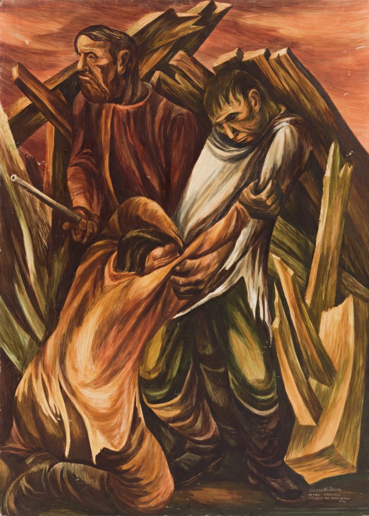
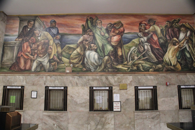
What you see: A fresco detail by Edward Millman of a mural panel he painted on the walls of the St. Louis post office for the Works Progress Administration (WPA). Swann Auction Galleries estimates it at $3,000 to $4,000.

The expert: Harold Porcher [pronounced Por-SHAY], director of modern and post-war art at Swann Auction Galleries.

Who was Edward Millman, and what made him a good choice for the St. Louis post office mural project? He was a lifelong teacher, skilled in all media–tempera, oil, fresco. His skills with fresco made him one of the leaders to get the mural project for the WPA.

Had Edward Millman done WPA projects prior to this one, and had he worked with artist Mitchell Siporin before? He had worked with Siporin in 1938 on a post office in Decatur, Illinois, and had done other murals himself for the Century of Progress International Exposition in Chicago in 1933.

I understand that Edward Millman went to Mexico and trained under Diego Rivera. How, if at all, does Rivera’s influence show up in this fresco detail and in the finished mural panel? With this panel and the fresco detail, his style is more closely aligned with [Mexican muralist] José Clemente Orozco. What Millman took from Rivera was learning the difficult technique of fresco painting and the high-contrast, limited-detail forms that translate well to fresco. Rivera limited his visual language so it could be read from afar and directly. Millman took that in his education.

What do we know about how the St. Louis post office mural project came to be? That post office was constructed under the New Deal and completed in 1937. Artists submitted images to compete for the job. Edward Millman and Mitchell Siporin were competitive because they had experience in fresco, and this job called for fresco work. Both had gone to Mexico to study mural-painting with José Clemente Orozco.

I looked at the website The Living New Deal, and I think I see the panel from which the fresco detail came–I think it’s from the far right of panel seven. Is that correct? Yes. Three large mural panels were done by Edward Millman and three by Mitchell Siporin. There were also two small mural panels, one by each artist.

What’s going on in the Edward Millman fresco detail? What do we see here? I believe it represents the early Missouri pioneers, and the struggle to go into new territories.

Are the figures settlers who are trying to build a house? They’re moving materials. It almost seems allegorical, but it feels more literal than allegorical. I think he’s trying to be more straightforward and show pioneers. One is carrying wood on his back, and it almost comes across as Christ on the cross.

How did Edward Millman and Mitchell Siporin physically do the mural work? Did they paint the frescoes during business hours, as people did their errands below their scaffolding, or did they paint when the building was closed? Thematically, the artists worked together by agreeing to tie the composition together with a ribbon of blue in the background, which represents the river. I would speculate that they worked like any other government employee, putting in daily shifts during working hours, if not nine-to-five. I found a black-and-white photo of them on the scaffolding during work hours.

This WPA post office mural is notable for depicting Native Americans and Black people as part of the story of the creation of Missouri. Do we know how the mural was received when it was unveiled? Was it controversial? I could find no articles on the public reaction at the time, which leads me to believe there wasn’t outrage or pushback from the people of St. Louis. And it has survived. It hasn’t been painted over or covered with other panels. I don’t think there was a huge positive or negative reaction. That’s my sense.

How is this Edward Millman fresco detail typical of his work, and how is it atypical? Subject-wise, I find his work veers toward the hardships and tribulations of working-class Americans. This is one of his more Cubist works in general. He moved away from Orozco-type images as he progressed. His style became more figurative later.

What can we say about the color palette Edward Millman chose for the fresco detail, and for that particular section of the mural? I believe he was, again, following the color palette of work by Orozco. In general, the panel has a wider range of colors, with blues and greens. This detail has darker tones–dark reds, burnt oranges.

Edward Millman painted this fresco detail in tempera on Masonite in 1942, possibly after the mural panel was finished. Why might he have done this? Maybe he painted it for a class, as a teaching tool? I have two thoughts. The inscription at the bottom right of the fresco detail [was maybe] added as a historical document to say the year in which the mural was completed. The second possibility is it was done earlier in 1942 and the mural was completed after. Maybe he was working out that portion of the composition.

I don’t claim to have comprehensive knowledge, but I’m trying to think of any other time I’ve seen an artist make a detail of a fresco in a different medium, and I’m coming up empty… I agree. These [multi-year fresco mural] projects had to be well mapped-out. Why do a detailed rendering of a mural section in another medium? It’s puzzling. My theory is he was working out the details of a mural section. He might have used it as a reference to do the rest. Thematically, all the panels follow the same concept–three groups of figures, with one group at the left, one at the right, and one in the center. He may have needed to work out the colors and the forms, and only chose this one section to do that.

Did Edward Millman render any other fresco details from the St. Louis post office mural in tempera? Have any of those come to auction? I’ve found no other examples of studies having been sold for this particular project for either artist. Maybe scholars will dig deeper and bring attention to other examples.

What’s the provenance of the Edward Millman fresco detail? Does it come directly from his family? He retained it until his death in 1964. It was bought from the family by a collector in Boston.

What condition is the Edward Millman fresco detail in? The paint and the panel are in great shape. There are hairline scratches in the pigment that expose the white underpainting.

What is the Edward Millman fresco detail like in person? It translates very well in the photo. It uses heavy contrasts and lots of shadow and light. There aren’t a lot of subtleties that are lost.

What is your favorite detail of the Edward Millman piece? Often, when you see studies from a larger composition, it doesn’t feel complete. This holds up as a composition on its own. It’s complete, though it’s a detail of something larger.

What’s the world auction record for a work by Edward Millman? It was a 1941 oil on canvas, titled Flophouse and showing two men, one reclining and one seated. It sold in June 2015 for $24,000. Stylistically, it’s different from the work we have, but compositionally, it’s similar.

Why will this piece stick in your memory? In Edward Millman, you see an artist who’s mastered several techniques. I attribute that to his being a teacher. Not all artists are great technicians. Millman was always learning by creating examples for his students. In that sense, I believe teachers are better technicians than most artists.

How to bid: The Edward Millman fresco detail of the WPA mural is lot 184 in The Artists of the WPA, a sale taking place at Swann Auction Galleries on February 4, 2021.

How to subscribe to The Hot BidClick the trio of dots at the upper right of this page. You can also follow The Hot Bid on Instagram and follow the author on Twitter.

Swann Auction Galleries is on Instagram and Twitter.

Images are courtesy of Swann Auction Galleries.

Please share this story on social media! It helps The Hot Bid grow.

Would you like to hire Sheila Gibson Stoodley for writing or editing work? Click the word “Menu” at the upper right for contact details.

A Complete Edward Penfield Golf Calendar from 1900 Could Fetch $12,000 (Updated January 28, 2021)

The June/July 1900 page from a golf-themed calendar illustrated by Edward Penfield. It could fetch $12,000.

Update: The Edward Penfield golf calendar from the year 1900 sold for $5,250.

What you see: The June/July page from an Edward Penfield golf calendar for the year 1900. Swann Auction Galleries estimates it at $8,000 to $12.000.

The expert: Laura Polucha, a cataloger in Swann’s illustration department.

Who was Edward Penfield, and why would he have been chosen to illustrate this golf-themed calendar? He was probably among the most famous and prolific illustration artists of all time. He’s credited with bringing the phenomenon known as the “poster craze” to America. In 1899 and 1900, he was working as the art editor for Harper’s, which was one of the largest magazine groups in New York, and he was actively taking freelance projects. That’s how the calendar came to be. His association with [publisher] R.H. Russell started in 1896.

Do we know if Penfield played golf? It’s certainly conceivable. It was a very popular activity of the time. But Penfield’s health was known not to be strong, even in his youth. It’s possible he played golf vicariously through these images. He produced his first golf calendar for Russell in 1899, and it was so popular that Russell asked for another one in 1900. That’s the version we have in our auction.

The only illustration of a group appears on the cover of the Penfield golf calendar--no all-male groups appear, and neither do foursomes.

How different are the illustrations in the two Penfield golf calendars? They’re nearly identical except for the cover and the illustration for February.

Why might R.H. Russell have wanted to print and market a golf-themed calendar in 1899 and 1900? What convinced the publisher that it would sell? Golf really started to emerge as a popular pastime in the 1890s, which was a period of profound change in the country. There was more leisure time and more recreational opportunities for the middle class. The calendar would have appealed to players and to the general public.

Do we have any idea how many copies of the golf-themed calendar were printed, and do we know how many survived? I can’t speak to how many were printed in either year, but the 1899 and 1900 calendars are very rare, especially in complete form. This is the only 1900 calendar we could find that appeared at auction in the last 20 years.

So the Penfield golf calendars were subject to being broken up? A lot of dealers would break them up because the illustrations have stand-alone appeal as single sheets.

What details in these illustrations mark them as the work of Edward Penfield? His style is characterized by the use of large, flat shapes, and large, flat areas of color, and simplified figures with bold outlines. The style translates well to the posters he was producing.

Would Edward Penfield have hand-colored the illustrations, or provided a color guide, or would someone at R.H. Russell have chosen the color palette for the calendar? Edward Penfield was heavily involved in the printing process. He really liked rich, multi-color effects. His process began with him sketching the subject and the layout and then making a master drawing in ink, using a pen and a brush to add watercolors. Once he had the master drawing, he laid down tracing paper on top, using a different piece of tracing paper for each color. That would be his maquette [original artwork]. It was not uncommon for him to stay with the pressman until the desired effect was achieved.

What sorts of effects would Penfield attempt? There was the splatter effect, where one plate would cover up some area of another to produce a new hue where they overlap. In the September illustration, you can see in the area at the lower right how the green of the grass lays on top of the yellow and orange of the sand to create a darker green color.

The September 1900 page from the Penfield golf calendar shows him using a "splatter" effect that combines two colors to make a third.

What is the Penfield golf calendar like in person? What doesn’t come over on camera? When examining it with a close eye, you can see the impressions are very deep in the thick stock of the paper. It’s well-colored.

What is your favorite illustration from the Penfield golf calendar, and why? I’m drawn to the November/December page, primarily because of the couple’s fashion. My favorite detail is the hosiery throughout the illustrations, which is fantastic. I’m a fashion historian and a fashion fanatic, and it attracted me. In the early 1900s, there were advances in high-speed knitting technology that lead to a wider availability of hosiery in brighter colors and patterns. Penfield had an eye for patterns. Here, I love the gentleman smoking a pipe and wearing socks with orange interlocking circles at the top. Hers have a bold diamond print. If you look closely, you’ll see her socks don’t quite match. I find that so charming and fashion-forward for the time. She wouldn’t get away with that off the golf course.

Check out the socks on the couple in the November/December 1900 page from the Penfield golf calendar.

Do we know if slightly mismatched socks like hers were actually available for purchase in 1900, or if Penfield had the illustration colored and printed that way simply because he liked it? It’s hard to say for sure. I haven’t heard about a trend for mismatched socks [in 1900]. I have a hunch it was Penfield’s decision.

The thing that jumped out at me in looking through the illustrations is the depictions of the players. There are a few solo men, and a few solo women. The couples are always one man and one woman. The cover shows a mixed group, but we never see a foursome, and we never see an all-male group–not once. Why might Penfield have done this? Was the sport of golf this co-ed in America in 1899 and 1900, or is Penfield just drawing the figures he wants to draw, reality be damned? This is a fascinating observation. What’s really interesting is the February illustration for 1899 showed two men playing together. It was replaced the following year by a man and a woman playing together. It’s interesting that that was swapped out. Women gradually participated in more sports in the 1870s, and by 1900, women commonly played sports like golf and tennis. Though they were barred from entry at many golf courses in the U.S., some did allow women. Shinnecock Hills Golf Club in Long Island allowed women in 1891 and was so popular, it installed a nine-hole golf course for women two years later. They couldn’t participate in tournaments, as far as I know. It was a genteel pastime, like croquet.

What condition is the Penfield golf calendar in? Overall I’d say it has really good, strong impressions, and the colors are bright and vibrant. It has punch holes at the top, which were placed by the publisher. It has the typical age wear you see in things like this.

Do we know anything about how this particular copy of the Penfield golf calendar managed to survive so well? I’m guessing that calendars are even more vulnerable than posters to being thrown out, because they’re literally date-stamped… Some are so visually appealing, they make you want to keep them around. I have a few calendars I haven’t parted with. It speaks to the enduring appeal of the images.

This question might be a little odd, and please call me out if I’m wrong. But it looks like the man in the January illustration and the woman in the March/April illustration appear together, as a couple, in the November/December illustration… do you see what I see? I agree that the April golfer is the same woman in the November/December illustration, but January… I’m bouncing between them, and his hair looks slightly different from the November/December man. It’s a sweet thought, but I can’t confidently get behind it. The man looks different.

Do prints, paintings, illustrations and other artworks that depict golf have an automatic, built-in audience? I’m guessing this calendar might not draw as much interested if its theme was, say, curling. In general, it’s been my experience that golfers have a fervent love of the sport and gravitate to artwork with a golf theme. What makes the calendar special is you don’t need to be a golfer to appreciate the artwork. It’s designed to have mass appeal.

What’s the world auction record for a Penfield golf calendar, and for any work by Penfield? A complete 1899 Penfield golf calendar–nine sheets, plus the cover–sold in February 2020 at a different auction house for $21,600. It appears to be the most expensive Penfield sold at auction also.

Why will this piece stick in your memory? I’m a cataloger for illustration art. I typically handle original art. This sale, overall, has been really unique for me. I’ll remember the calendar as one of the stars of a robust and respected collection. [The auction showcases the Dick McDonough collection of golf illustration.] I’m eager to see how it does.

How to bid: The Penfield golf calendar from 1900 is lot 272 in the Illustration Art sale taking place at Swann Auction Galleries on January 28, 2021.

How to subscribe to The Hot BidClick the trio of dots at the upper right of this page. You can also follow The Hot Bid on Instagram and follow the author on Twitter.

Swann Galleries is on Instagram and Twitter.

Images are courtesy of Swann Auction Galleries.

Please share this story on social media! It helps The Hot Bid grow.

Would you like to hire Sheila Gibson Stoodley for writing or editing work? Click the word “Menu” at the upper right for contact details.

A 1968 Hot Wheels Store Display Could Fetch $50,000 (Updated January 31, 2021)

A 1968 Hot Wheels store display, created to launch the toy line with the biggest possible bang. This example, which is unusually complete, could fetch $50,000.

Update: The 1968 Hot Wheels store display sold for $36,300.

What you see: An exceptionally rare and unusually complete 1968 Hot Wheels store display. Van Eaton Galleries estimates it at $30,000 to $50,000.

The expert: Joel Magee, consigner. He is also known as The Toy Scout, and has appeared on the TV show Pawn Stars.

How did this 1968 Hot Wheels store display come to be? Why did Mattel make it? This was the very beginning of Hot Wheels. Matchbox had dominated the industry for literally decades. When Mattel made Hot Wheels, they took it to the next level. Everything they wanted, they put into the cars. They made these gorgeous store displays which were unheard of at the time. They looked like a dealer showroom. When the kids saw that, they went crazy. No marketer had made something so elaborate for a toy.

A close-up on the Hot Wheels store display, which was designed to look like a dealer showroom.

Mattel realized they had to go big or go home if they were going to compete with Matchbox, and this is what they did? They literally created a piece of art to sell these toys. Nothing had really been done before at that level.

So, this Hot Wheels store display is pretty much how the world was introduced to Hot Wheels? Exactly. There were a lot of commercials on TV, but from a point-of-sale situation, it was everything. You were not able to not notice the display. Mattel just made it look so cool, you couldn’t resist.

Did every toy store get a Hot Wheels display of this level of quality, or was it reserved for FAO Schwarz and other high-end venues? The stores had to put in a big pre-order to get the display, but pretty much everybody got it.

What makes this 1968 Hot Wheels store display extremely rare? Mattel sent one display per store. Most were thrown away. Some displays were cut open so they could take the cars and throw the rest away. A few people saved the displays and took them home. This one is even rarer because it has a fold-out flap that advertises Hot Wheels accessories. Only three examples still have the flap.

This overhead shot of the 1968 Hot Wheels store display gives the best angle on the all-important advertising flap, which most examples lack.
This 1968 Hot Wheels store display is rare in and of itself, and it’s one of only three surviving examples to retain a flap that advertises Hot Wheels accessories.

And someone at Mattel would have had to personally assemble each display before shipping it to a toy store? They put them together like a puzzle. It’s lithograph on card, and it took a lot to put this together. Each car had to be hand-tied down, two straps per car. Mattel spared no expense in making these displays.

What else adds to the Hot Wheels store display’s rarity? It has toys in colors that were not used in the main product line. The watermelon pink Mustang only came in store displays. That adds excitement and allure to the set. It highlighted 16 cars, but not every display had exactly the same cars. Some had a chocolate brown Camaro. This display doesn’t have one.

One car in the 1968 Hot Wheels store display is unusually rare--the watermelon pink Mustang. Other versions of the display contained an equally rare chocolate brown Camaro.

Do we know why this Hot Wheels store display doesn’t have a chocolate brown Camaro? I don’t think it was intended at the time. I think they [Mattel] pretty much said, “We’ve got a bunch of cars over here, OK, take these,” and later, they made a different decision during production. The two specific [rarities unique to variants of the 1968 Hot Wheels store display] are the chocolate brown Camaro and the watermelon pink Mustang.

Does this 1968 Hot Wheels store display have all 16 toy cars that it came with originally, or have some been replaced over the years? All 16 in the display are original to the set.

The toy cars in the display are called “Redline” cars. Why? There are red lines on the tires. They’re like whitewalls, only they’re red. They’re considered the premium Hot Wheels cars, and they were made between 1968 and 1976. Then Mattel shifted to black-wall tire cars. That’s where old-school collectors stop.

Do we know how this particular Hot Wheels store display survived? It was acquired from a local hobby store in Cleveland, Ohio in 1968. A father had pestered the store owner because he wanted it for his son. One day he came in and the display was gone. He asked where it was and the owner said “I put it behind the counter. I didn’t forget you.” The father got it for the price of the 16 cars, so, he paid 59 cents times 16. [That would have been $9.44 in 1968 money, which translates to roughly $71.34 in modern dollars.]

Does the Hot Wheels store display come directly from the family? I bought it from them myself. They enjoyed it for many years, then they put it away in a closet. Fast forward 50 years, and they realized, “Oh my God, this is a life-changing moment here.”

What condition is the 1968 Hot Wheels store display in? Everything is in its original place. The plastic cover, which is an acetate-type material, tends to shrink over time, but amazingly enough, I knew a Mattel employee who had a few covers. So this has a new cover, but it’s 50 years old.

What is the Hot Wheels store display like in person? Mattel painted the cars with what they called Spectraflame paint. The best way to explain it is it glows. It’s like they take on a new life. It’s one of the things that makes people crazy for them–they’re mesmerized by how beautiful they are. [Magee later explained that Mattel stopped using Spectraflame paint on Hot Wheels cars around 1973 or 1974.]

How large is the Hot Wheels store display? It’s about two feet long by about one foot deep. It has a commanding presence. Mattel really went out of its way to make it look like the ultimate showroom. They spared no expense. The buildings and scenery in the back added to the mix.

What’s your favorite detail of the display? In my opinion, it’s the three-dimensional look to it. Mattel designed it so it doesn’t look like it was printed on a flat background. They gave it depth. They could have just stuck a few cars on bases, but instead, they put them on round platforms that do move–they’re on a rivet, they can swivel.

How many of these 1968 Hot Wheels store displays have you handled? I’ve been doing this for 35 years. I’ve handled four.

How does this example compare to the other three? This one has the flap. The flap is the big deal. The others had their flaps torn off.

Why does that front flap on the Hot Wheels store display tend not to survive? The cardboard probably got weak, and tore off, or someone tore it off intentionally. I just know that only a few have the flap.

The 1968 Hot Wheels store display carries an estimate of $30,000 to $50,000. What percentage of its value belongs with the display itself, and how much belongs to the toy cars? Between 90 and 95 percent of the value is in the display. The cars, you can get, except for the brown Camaro and the pink Mustang. The display, you can’t.

It seems like sales of Hot Wheels cars mostly happen in private, not at auction. How does that affect the estimate for this display? Very rarely does one of these come up for sale. I figure it will settle around $50,000 to $70,000 this time. Again, it’s all about quality, rarity, and desirability, and this has all of that. It’s the Holy Grail of Hot Wheels.

What’s the likelihood that this 1968 Hot Wheels store display will set a new world auction record for Hot Wheels toys? In my opinion, it will absolutely set a new record. I can’t imagine it won’t set a new record, just based on all the other stuff that’s going on. COVID-19 has changed the situation. Everyone is at home and researching different hobbies, and they want something fun that’s an investment. Hot Wheels are just skyrocketing. There are Hot Wheels that sold for $2,000 or $3,000 that are going for $5,000 or $6,000 now.

How to bid: The 1968 Hot Wheels store display is lot 0633 in A Celebration of Pop Culture–Day 2, taking place at Van Eaton Galleries on January 31, 2021.

How to subscribe to The Hot BidClick the trio of dots at the upper right of this page. You can also follow The Hot Bid on Instagram and follow the author on Twitter.

Van Eaton Galleries is on Twitter and Instagram. 

Images are courtesy of Van Eaton Galleries.

Joel McGee, aka The Toy Scout, has a website and is on Twitter.

Please share this story on social media! It helps The Hot Bid grow.

Would you like to hire Sheila Gibson Stoodley for writing or editing work? Click the word “Menu” at the upper right for contact details.

Everything She Touched: The Life of Ruth Asawa (THB: Shelf Life)

The cover of Everything She Touched: The Life of Ruth Asawa features a 1951 color photograph of the artist, taken by Imogen Cunningham. It captures her story: Asawa has always been here, hiding in plain sight. Her brilliance persists whether we choose to see it or not.

What you see: Everything She Touched: The Life of Ruth Asawa, by Marilyn Chase. $29.95 (Hardback). Chronicle Books.*

Does it fit in my purse? No. It’s a hardback and it’s just slightly too big to fit.

Cut to the chase. Should I buy this book? Yes, especially if you have no idea who Ruth Asawa was.

Ruth Asawa was traditional in many respects, but she was not conventional.

Moreover, she knew she was not conventional. She knew she didn’t really fit anywhere, she accepted that fact early and firmly, and she never let it trouble her.

That fundamental self-acceptance and lack of doubt seems to be key to Asawa’s success as an artist. At least, that’s what I get from Everything She Touched. Ruth Asawa was unique, spectacularly so. She got what she wanted because she knew what she wanted, and she stuck with it even if her wants didn’t match the 20th century white male artist’s definition of success.

What she wanted, even more than she wanted art-world renown, was a large family. Asawa was the middle child of seven, and she was determined to have six children of her own, even though she suffered from ghastly bouts of morning sickness. (Ever the pragmatist, she met her goal by birthing four children and adopting two.)

Asawa’s works–the wire sculptures and public fountains for which she is best known–didn’t take primacy in her mind, either. The book states that when her daughter Aiko asked her what she considered her most important legacy, she responded “the schools”, referencing her decades-long campaign to improve art education for K-12 students in San Francisco, California. (With reluctance, she allowed the art-centric alternative high school she established and championed to bear her name.)

The book, which is the first major biography of the artist, lays out the facts of her life crisply in chronological order. She and her parents and siblings suffered the injustice of internment in camps during World War II because of their Japanese ties, and the U.S. government arrested and held Asawa’s father, Umakichi, apart from them over concerns he might be involved with a Japanese ultranationalist group. (He wasn’t.)

The author, Marilyn Chase, manages the trick of relaying the positive aspects of Ruth Asawa’s camp years without implying the experience was a good thing. She also captures the bitterness Asawa felt upon learning, three years into her studies, that the teachers’ college she attended in Milwaukee, Wisconsin denied her a student-teacher position–which she needed to complete her degree–over fears for her safety as a person of Japanese ancestry.

Running headlong into that racist barrier ultimately led Asawa to North Carolina to attend Black Mountain College, an experience that changed her life, and her art, for the better. But, again, the author takes care to avoid suggesting that the college’s act of discrimination, veiled in paternalism, should be forgiven because things turned out fine in the end. Chase lets it stand alone and apart as an incident of rank bigotry, one of many Asawa faced as a Japanese-American woman in the 20th century.

In reading the many pages on Ruth Asawa’s experience at Black Mountain College, I grew annoyed that I didn’t really know her before picking up Everything She Touched. Her classmates included Robert Rauschenberg and Ray Johnson. Merce Cunningham taught her modern dance. She knew R. Buckminster Fuller as “Bucky”, and he designed her wedding ring. (It’s pictured on page 70, and, frankly, I’m jealous of it.)

Asawa also forged a deep, decades-long connection to Josef Albers, who taught at Black Mountain and saw her potential almost immediately.

Albers wasn’t the only one. In the 1950s, Asawa and her art received coverage in Time, Vogue, and other big-deal publications (though the language quoted from the stories shows that critics and editors didn’t know how to regard her; because she took family friend Imogen Cunningham’s advice to make art under her maiden name, the articles invariably describe her as “Miss Asawa”, a term that has the unfortunate effect of erasing the existence of the family that meant so much to her).

Asawa also earned the ripest of plums: representation by a New York City gallery. That relationship, with Peridot Gallery, ended when she literally outgrew the space. Its ceilings were only so high, forcing Asawa to size her hanging wire sculptures to fit its dimensions. Leaving the gallery meant dropping off the New York City radar. Others more desperate for fame and fortune would have reduced their artistic visions to fit inside the white-walled box. Not Asawa. The West Coast resident plowed ahead, raising children and making art on her own terms.

In performing the task of describing her life story, the book overlooks a thing or two. The Japanese concept of gaman, or endurance with dignity, appears early, as does Asawa’s long-held belief that “crying doesn’t help”. As a grown woman and a mother, she transmitted these values to her children, and she took this approach to her art; in the passage about her wedding ring, the book notes that Asawa’s fingers were often bound with masking tape because of cuts and scrapes inflicted by the wires she wove. But the potential downsides of this stoic philosophy–and come on, they had to exist–go unexplored. There’s brief, general discussion of how she made her wire works, but not much beyond that, and no details about the creation of any specific wire work.

Ruth Asawa’s story could have slipped away, but it did not. Long after his death, Josef Albers helped her one last time by indirectly bringing her to the attention of someone who could raise her profile. When Asawa’s family contacted Christie’s about selling a study in green from the Homage to the Square series that he gave her as a gift, Jonathan Laib took the call. He realized Asawa must have meant a great deal to Albers to favor her with such a standout piece.

Laib kept asking questions of the family, and saw the chance to bring Asawa her due. The Albers study sold for $116,500; with Laib’s help, Asawa’s works brought much more.

Laib directed a national spotlight at her starting in 2010, a time when the public was ready and eager to embrace tales of artists who are neither white nor male. Still, Asawa’s rediscovery was not inevitable. The cover of Everything She Touched sums up the conundrum she poses. It’s a color photograph, taken by Imogen Cunningham in 1951, posing Asawa behind, and partly obscured by, one of her hanging wire sculptures.

Ruth Asawa has always been here, hiding in plain sight. Her work and her brilliance persist whether we see her or not. Everything She Touched lets us see her in full.

How to subscribe to The Hot BidClick the trio of dots at the upper right of this page. You can also follow The Hot Bid on Instagram and follow the author on Twitter.

Please share this post on social media! It helps The Hot Bid grow.


Would you like to hire Sheila Gibson Stoodley for writing or editing work? Click the word “Menu” at the upper right for contact details.