RECORD! A Karl Lagerfeld Fashion Drawing Sold at Palm Beach Modern Auctions for $6,500

An early Karl Lagerfeld fashion drawing, done in the 1960s for the House of Tiziani. It shows a woman in an evening gown posing with her hands on her hips and looking to the left.

During the summer, when auction schedules slow down, The Hot Bid showcases world auction records.

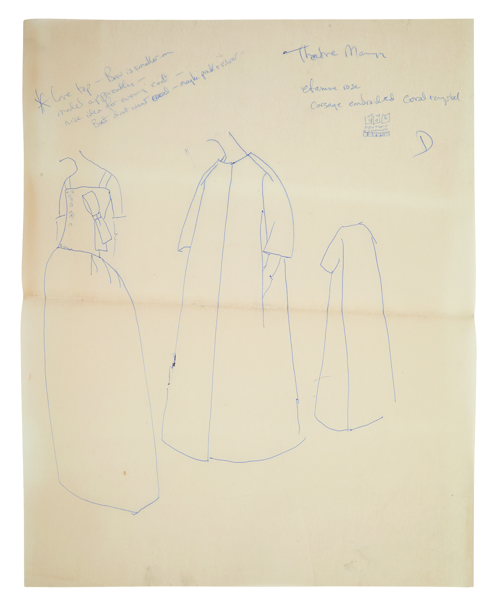
What you see: A Karl Lagerfeld fashion drawing, done in the 1960s while he was working for the House of Tiziani. Palm Beach Modern Auctions sold it in April 2019 for $6,500, a record for a Karl Lagerfeld fashion drawing.

The expert: Rico Baca, auctioneer for Palm Beach Modern Auctions.

How rare are Karl Lagerfeld fashion drawings? We can start by talking about how rare fashion drawings are, period. Anytime you talk about fashion houses, you have people on staff producing [the drawings]. None are able to retain them for themselves. They belong to the house. It’s even more rare when you find someone signed their name to it. The drawings [Lagerfeld did for] Tiziani weren’t his. Because he worked for Tiziani, they were property of the house.

Are you aware of any other Karl Lagerfeld fashion drawings that he did for other houses? That I don’t know. I don’t have access to that information. But Lagerfeld was quoted as saying he saved none of his sketches. When they [the fashion house] started production, he’d throw them away. He’s been quoted saying that.

How did these Karl Lagerfeld fashion drawings for Tiziani emerge and survive? The consigner inherited them from his partner. The partner had been in a relationship with Tiziani. When it passed to the consigner, I went to the apartment Tiziani owned. He had saved several boxes of sketches. There were sketches Lagerfeld signed and he hadn’t signed.

How could you tell which unsigned drawings were by Lagerfeld? The style. Karl Lagerfeld would finish [them]. He’d put a face on [the model] with makeup and hair. He would finish the hands sometimes, and he might finish a foot with a shoe. Some had fabric attached to the sketches. It was easy to see which was his.

What’s the difference between the Lagerfeld drawings you sold in 2014 and the ones you sold in 2019? I think there were more sketches in the first group. There was more of a variety of finished product, and some had signatures. The second sale had no [drawings with] signatures. And Lagerfeld knew when we had the first auction. He would tweet as his cat, Choupette, and his cat tweeted, “If you want some of Daddy’s early drawings, they’re at Palm Beach Modern Auctions on Saturday.” If there were any questions about the authenticity of the drawings, Lagerfeld would have done it [spoken up] then.

When did the House of Tiziani close? I know the designer worked until the 1980s. These designers never stop. [Laughs]

Is it possible to know how many of the Lagerfeld drawings for Tiziani went to auction with you? Was it everything? You never know. They haven’t been under lock and key since the 1960s.

Do the two sales represent a good chunk of those drawings? It’s hard to know how many sketches are still out there. If you research fashion houses, you get a sense of the volume they do. Today they do even more than they did then, when they had two lines, one for each season. Now they put out lines every three weeks. It’s incomprehensible what they have to produce to maintain the houses.

What was Lagerfeld’s role at Tiziani? Was he the right-hand man? I don’t know, but he had to be high in the food chain. He helped Tiziani design for Elizabeth Taylor, and he helped him when he was working on movies for Elizabeth Taylor. He certainly wasn’t the person who brought in the tassels. He was there.

An early Karl Lagerfeld fashion drawing, done in the 1960s for the House of Tiziani. It shows a woman in an evening gown posing with her hands on her hips and looking to the left. A swatch of brown, semi-opaque fabric is attached to the right side of the drawing.

What do these drawings tell us about Lagerfeld’s skills? These were more than just sketches. They were works of art. And you really get that feeling when you look at the dresses. The reason they became sought-after sketches–look at that dress. It’s a beautiful dress. It’s timeless. This stuff is good. There’s nothing not to like about it. The quality is there.

A detail of an early Karl Lagerfeld fashion drawing, done in the 1960s for the House of Tiziani. It shows the upper part of the dress, which has a plunging neckline bordered by ruffles.

Do the sketches hint at the career that Lagerfeld had ahead of him? What you see in his sketches is his attention to detail is painstaking. I can’t imagine seeing that attention to detail in other sketches [by other people]. He took his time and gave thought to it. He’s doing a whole look when he’s doing these sketches.

If these drawings couldn’t be attributed to Lagerfeld, would they still be valuable? I wouldn’t go that far. Since then [the first auction], we’ve had James Galanos, who is a greater designer than Lagerfeld. We had eight folders of his sketches, and they only hammered for $2,000. [“Hammered” is the raw final price, without any premiums.] Not everyone reached Lagerfeld’s pinnacle. No one stays relevant to their death. They peak, they wane, they retire. What makes Lagerfeld unique is he was famous and relevant until he died.

What can you tell me about the sketch from the April 2019 sale pictured in lot 101? Do we know why it was commissioned, and for who, and who the model might have been? No. [Laughs] I wish I could give you a story that makes it more interesting. If you look at the sketch, it’s classic, and the colors are right. It’s a great dress.

What is the sketch like in person? It doesn’t really stand out to me from any of the other sketches. It’s just a beautiful dress.

Why did this particular sketch do well enough to set the world auction record for a Lagerfeld fashion sketch? That’s the mystery of an auction. All you need are two people who want the same thing. Who knows? Maybe it was two brides who thought that was the perfect dress. Part of what happened is we knew Lagerfeld had died. [He succumbed to pancreatic cancer in February 2019.] That was our only indication there might be more interest, but you don’t know how much until it happens.

So, before the sale, you would not have singled this one out as a likely record-setter. I wouldn’t have put my money on it. I did speak to a lot of people who bought them as gifts. Mothers bought them for daughters, daughters bought them for mothers, friends bought them for friends. Many bought two or three.

A fabric swatch was attached to this drawing. To what extent, if at all, did its presence drive the bidding? I think it did. Very few of them had cloth swatches.

You were the auctioneer at the sale. What do you recall of the experience? I generally do 60 lots an hour. I thought I’d be at the podium two hours max. Max. I had bronchitis and a cold. I got an inhaler and cough drops and thought, “I can do this.” It ended up going five hours. I opened the bidding up and it kept going and going. The last hour, I kept using the inhaler to get through it. It [the sale results] was good news, but it was a real surprise.

How long did it take you to recover? Quite a few days.

What do you remember of the experience of the sale? It was a pleasant one even though I was ill. [Laughs].

Were you hanging on to the podium for dear life? A little bit, but when the numbers are happening, it’s easy to walk through. It’s showtime. Run up to the podium and do your thing.

How long do you think this record will stand? Do you expect a drawing sold at one of your two auctions to come back eventually and meet or beat the $6,500 sum? The original sale had a number of sketches done on larger media. They were really finished pieces and they had signatures. At the same time, maybe Lagerfeld’s relevance will dim. I’m always amazed today about famous peoples’ relevance, and how it really does wane in today’s world. We move on so quickly.

How to subscribe to The Hot BidClick the trio of dots at the upper right of this page. You can also follow The Hot Bid on Instagram and follow the author on Twitter.

Palm Beach Modern Auctions is on Instagram.

Images are courtesy of Palm Beach Modern Auctions.

Would you like to hire Sheila Gibson Stoodley for writing or editing work? Click the word “Menu” at the upper right for contact details.

SOLD! The First Lady Jackie Kennedy-Oleg Cassini Archive Sold for (Scroll Down to See)

Fashion drawing done for First Lady Jackie Kennedy by a member of the House of Cassini.

Update: The Oleg Cassini-First Lady Jackie Kennedy archive sold for $3,125.

What you see: An image from an archive of more than 40 original drawings, letters, clippings, and other materials from the early 1960s that show how designer Oleg Cassini and his team developed fashions for First Lady Jacqueline Kennedy. Doyle estimates it at $4,000 to $6,000.

The expert: Peter Costanzo, senior vice president at Doyle as well as its executive director for books, autographs, and photographs; coins, bank notes, and postage stamps; and estate and appraisal services.

How rare is it for something like this archive to survive? Is there anything similar between the First Lady and another fashion designer that dates to the White House years? It’s hard for me to say. It is a special archive. It’s Oleg Cassini’s workroom archive, and it shows a working relationship. It was ephemeral then, and it’s ephemeral now. The clothes were the final goal. This was how they did it in the analog age, by drawing everything out. They sat with Mrs. Kennedy and homed in on what she needed for her appearances and her events. Cassini made over 300 pieces for Mrs. Kennedy.

Wow, so he was really her go-to guy. Yes.

How did this archive survive? The archives usually remain with the fashion houses if they’re not discarded. This is a rare opportunity because material like this is seldom on the market.

What does this archive reveal about the working relationship between the First Lady and Cassini’s team? Mrs. Kennedy was highly involved in the process. She provided ideas and made her own drawings. She went through fashion magazines and newspapers and noted what she liked and didn’t like, and they would react to it. She would draw [fashion sketches] and write little comments on fabrics she liked and didn’t like. And she would comment on accessories–this needs a bag or a coat to match. The lot includes contact sheets–Cassini had models that wore Mrs. Kennedy’s size. She would annotate the pictures of the models. She’s very honest in her comments to him and very forthcoming. She felt very comfortable in the relationship and felt it went very well.

Fashion drawings done in blue ink the early 1960s by First Lady Jackie Kennedy, showing six figures in long dresses.
Fashion drawings by First Lady Jacqueline Kennedy, from lot 22 in the Doyle auction.

Are you aware of any other archive that’s come to auction that contains fashion drawings in Mrs. Kennedy’s own hand? We sold a similar fashion archive a few years ago. [It sold in November 2017 for $11,875.] It’s related to the same workshop, from the same period, and was retained by one of the workshop employees at the time. This is similar.

And Cassini stored it all this time? It comes directly from his estate. It was in his home in Oyster Bay, New York.

What was Jacqueline Kennedy’s relationship with Oleg Cassini like? It was extremely intimate. He was the one putting clothes on her back when she was the most-photographed woman on the planet. It has to be considered a collaboration with a wonderful public figure who embraced and acknowledged her role. I think that’s what we see with Cassini and Mrs. Kennedy.

And we know this archive stops in 1962 because… that’s the latest-dated item in it? I have something equally of note in the sale, but selling separately: Lot 14, a detailed workroom ledger of the Kennedy White House years. I know the record book starts in 1961. Page 14 is dated March 1963. The last entry before the assassination is November 13, 1963. There’s something somewhat ominous [mentioned in the ledger]–a pink costume dress and jacket. I think it’s poignant that the last entry before the assassination ends with a pink item.

What condition is the archive in? I think it’s in very good condition from the time of use until now. In the time it was used, it was handled, folded, mailed, and written on. There are some handling creases and torn corners, but it’s very well-preserved overall. The handling is original with its use.

Fashion drawing, with handwritten notes, done by First Lady Jackie Kennedy in the early 1960s. It shows three headless figures.
Another fashion drawing by the First Lady, with handwritten annotations.

What is it like to handle this material? It puts you in the moment with them. You feel like you’re in the room–that’s been my experience. It’s wonderful to feel like you’re in a workroom with Oleg Cassini and Mrs. Kennedy as they produced clothing that became iconic. The designs really became emblematic of the beginning of the 1960s–the Jet Set era, the Jackie look.

Why will this lot stick in your memory? Because it’s highly primary material. It’s a rare opportunity to engage with high-quality First Lady material, let alone the White House years known as Camelot, which doesn’t seem to recede from memory at all. It’s remarkable to view these items. That’s why they’ll stick with me.

How to bid: The Cassini-Kennedy archive is lot 22 in The Estate of Oleg Cassini, a sale taking place at Doyle on June 27, 2019.

How to subscribe to The Hot BidClick the trio of dots at the upper right of this page. You can also follow The Hot Bid on Instagram and follow the author on Twitter.

Images are courtesy of Doyle.

Doyle is on Twitter and Instagram.

Would you like to hire Sheila Gibson Stoodley for writing or editing work? Click the word “Menu” at the upper right for contact details.

Oleg Cassini’s Archive of White House-era Jacqueline Kennedy Material Could Command $6,000 at Doyle

Fashion drawing done for First Lady Jackie Kennedy by a member of the House of Cassini.

What you see: An image from an archive of more than 40 original drawings, letters, clippings, and other materials from the early 1960s that show how designer Oleg Cassini and his team developed fashions for First Lady Jacqueline Kennedy. Doyle estimates it at $4,000 to $6,000.

The expert: Peter Costanzo, senior vice president at Doyle as well as its executive director for books, autographs, and photographs; coins, bank notes, and postage stamps; and estate and appraisal services.

How rare is it for something like this archive to survive? Is there anything similar between the First Lady and another fashion designer that dates to the White House years? It’s hard for me to say. It is a special archive. It’s Oleg Cassini’s workroom archive, and it shows a working relationship. It was ephemeral then, and it’s ephemeral now. The clothes were the final goal. This was how they did it in the analog age, by drawing everything out. They sat with Mrs. Kennedy and homed in on what she needed for her appearances and her events. Cassini made over 300 pieces for Mrs. Kennedy.

Wow, so he was really her go-to guy. Yes.

How did this archive survive? The archives usually remain with the fashion houses if they’re not discarded. This is a rare opportunity because material like this is seldom on the market.

What does this archive reveal about the working relationship between the First Lady and Cassini’s team? Mrs. Kennedy was highly involved in the process. She provided ideas and made her own drawings. She went through fashion magazines and newspapers and noted what she liked and didn’t like, and they would react to it. She would draw [fashion sketches] and write little comments on fabrics she liked and didn’t like. And she would comment on accessories–this needs a bag or a coat to match. The lot includes contact sheets–Cassini had models that wore Mrs. Kennedy’s size. She would annotate the pictures of the models. She’s very honest in her comments to him and very forthcoming. She felt very comfortable in the relationship and felt it went very well.

Fashion drawings by First Lady Jacqueline Kennedy, from lot 22 in the Doyle auction.

Are you aware of any other archive that’s come to auction that contains fashion drawings in Mrs. Kennedy’s own hand? We sold a similar fashion archive a few years ago. [It sold in November 2017 for $11,875.] It’s related to the same workshop, from the same period, and was retained by one of the workshop employees at the time. This is similar.

And Cassini stored it all this time? It comes directly from his estate. It was in his home in Oyster Bay, New York.

What was Jacqueline Kennedy’s relationship with Oleg Cassini like? It was extremely intimate. He was the one putting clothes on her back when she was the most-photographed woman on the planet. It has to be considered a collaboration with a wonderful public figure who embraced and acknowledged her role. I think that’s what we see with Cassini and Mrs. Kennedy.

And we know this archive stops in 1962 because… that’s the latest-dated item in it? I have something equally of note in the sale, but selling separately: Lot 14, a detailed workroom ledger of the Kennedy White House years. I know the record book starts in 1961. Page 14 is dated March 1963. The last entry before the assassination is November 13, 1963. There’s something somewhat ominous [mentioned in the ledger]–a pink costume dress and jacket. I think it’s poignant that the last entry before the assassination ends with a pink item.

What condition is the archive in? I think it’s in very good condition from the time of use until now. In the time it was used, it was handled, folded, mailed, and written on. There are some handling creases and torn corners, but it’s very well-preserved overall. The handling is original with its use.

Fashion drawing, with handwritten notes, done by First Lady Jackie Kennedy in the early 1960s. It shows three headless figures.
Another fashion drawing by the First Lady, with handwritten annotations.

What is it like to handle this material? It puts you in the moment with them. You feel like you’re in the room–that’s been my experience. It’s wonderful to feel like you’re in a workroom with Oleg Cassini and Mrs. Kennedy as they produced clothing that became iconic. The designs really became emblematic of the beginning of the 1960s–the Jet Set era, the Jackie look.

Why will this lot stick in your memory? Because it’s highly primary material. It’s a rare opportunity to engage with high-quality First Lady material, let alone the White House years known as Camelot, which doesn’t seem to recede from memory at all. It’s remarkable to view these items. That’s why they’ll stick with me.

How to bid: The Cassini-Kennedy archive is lot 22 in The Estate of Oleg Cassini, a sale taking place at Doyle on June 27, 2019.

How to subscribe to The Hot BidClick the trio of dots at the upper right of this page. You can also follow The Hot Bid on Instagram and follow the author on Twitter.

Images are courtesy of Doyle.

Doyle is on Twitter and Instagram.

Would you like to hire Sheila Gibson Stoodley for writing or editing work? Click the word “Menu” at the upper right for contact details.

SOLD! Edward Gorey’s Cat Fancy Cover Illustration Sold For (Scroll Down to See)

A New Yorker cover by the late Edward Gorey. It depicts two tuxedo cats looking at each other on an oversize bed, fitted with ruffles, shams, and pillows festooned with intricate yellow flowers.

Update: The Edward Gorey Cat Fancy cover illustration for The New Yorker sold for $16,250.

What you see: Cat Fancy, a cover illustration created for The New Yorker magazine by the late Edward Gorey. Swann Auction Galleries estimates it at $10,000 to $15,000.

The expert: Christine von der Linn, specialist in art books and original illustration at Swann Auction Galleries.

Do we know why Gorey only did two covers for The New Yorker, and why the commissions came so late in his life? He seems like a good fit for a cover illustrator for that magazine. Was he considered too well-known to commission? Gorey’s relationship with The New Yorker was a long and curious one. His first real review and introduction to the wider public, and certainly the New York cultural elite, appeared in the magazine’s pages in its December 26, 1959 issue. The great literary critic, Edmund Wilson, an admirer of Gorey’s work, wrote an appreciation titled The Albums of Edward Gorey. His relative obscurity, he felt, was due to his working mainly to amuse himself. In 1950, around the time of his first commissions, when he was drawing for the Harvard Advocate and smaller humor magazines, Gorey actually submitted his work to The New Yorker. Then-Cartoon Editor Frank Modell rejected it, suggesting that “less eccentric drawings might draw a more enthusiastic audience.” It would take 43 years before the sensibilities and ironic humor of the magazine, under Tina Brown’s editorship, finally embraces his irreverent, camp-goth style.

How did the magazine use the artwork commissioned from Gorey under Tina Brown’s editorship? Lot 188 is among the three pieces he submitted in 1993. Instead of being used as a cover, it was used as a memorial postscript in The New Yorker when he died in 2000.

Why was this Gorey illustration, Cat Fancy, not used by The New Yorker until 2018? Art editor Françoise Mouly explained in her Cover Story that The New Yorker’s editor, David Remnick, asked if they had any unpublished work by Gorey in their archives to accompany an appreciation of him by Joan Acocella for their December 10th issue. Mouly was delighted to find a file of this original artwork and used it on the cover. The original artworks were sent back to Gorey’s agent, John Locke, after they had been digitized.

Do we know why The New Yorker didn’t use it back when they commissioned it, in the early 1990s? There’s no indications about why they didn’t use it, but in general, The New Yorker doesn’t like to use the same illustrator in a calendar year. They did one in December 1992, the first time Edward Gorey was on the cover, of a fantastic image of a denuded, stick-like Christmas tree with a family enthusiastically wrapping it with holiday-themed wallpaper. Maybe other covers came in, and it sunk to the bottom of the pile.

How often do Edward Gorey originals come up at auction? Pieces do come up a few times a year. We’ve handled upwards of 60 originals.

So, they’re out there, but at any given time, what’s out there might not be the Goreys you’d want most. That’s true, and Gorey appeals to people in different ways. Some like his Goth style. They want Dracula, and they want anything related to his Mystery! drawings for PBS. Those two works tend to set the highest prices.

You’ve got eight Goreys in the June 4 sale. Is that an unusually high number? We’ve had as many as 12 in a single sale. It varies. We’ve had sales with no Goreys, and sales with three to four. Three to four is more typical.

What’s the record for an original work by Gorey? In March 2017, we sold a piece I named Skeletons and Hiding Figures. We believed it’s an illustration for PBS’s Mystery! series, circa the 1980s. It’s not terribly large and it’s unsigned, but it’s clearly in Gorey’s hand and it contains all his types–obelisks, hiding figures, mustachioed men in a garden setting. It sold for $18,750.

Where are most of Gorey’s originals? Are they in a library or another institution? The majority of his pieces are owned by the Edward Gorey Charitable Trust. When Gorey died, anything in his possession became property of the trust. It has them at an off-site property and loans them to the Edward Gorey House in Yarmouth Port, Massachusetts.

Cat Fancy looks elaborate. Do we have any notion of how long it might have taken him to finish? His attention to detail is so strong, I imagine it took him several days. He drafted parts of it in pencil, then he went over it with ink, and then he colored it in with watercolors.

Could we talk about how this piece will appeal to Gorey collectors? What details does it have that Gorey collectors prize? First and foremost, its subject is cats. Gorey adopted several in his lifetime and thought of them as family, and as kindred spirits. They served as artistic inspiration, and sometimes he referred to them as people. His signature “Gorey Cat” pranced on the scene in 1972 with the publication of Amphigorey, his first anthology. Other works featuring cats include The Sopping Thursday, Category, Fletcher and Zenobia, T. S. Eliot’s Old Possum’s Book of Practical Cats, and his famous ballet cats. Their style changed throughout the years, but they remain among his most popular. Cat Fancy also reflects his love of Victorian and Edwardian interiors—the overstuffed fussiness and detailed fabrics. It shows his skill and love of line work, much of which was influenced by Japanese Ukiyo-e woodcuts, the Surrealists, and the ink work of English artists like Aubrey Beardsley and Edward Ardizzone. His favorite colors were lemon yellow, olive green, and lavender, and this piece contains them in varying hues. In short, it hits on all cylinders.

Are there aspects of the illustration that the camera doesn’t quite capture? When you get up close to the artwork, you can see the flowers contain little insects. Not all of them–here and there throughout the quilt. Gorey loved insects. He often worked insects into his artwork.

Are there other aspects the camera doesn’t pick up? It draws you in. The composition, while incredibly complicated and busy, but part of its enchantment is that you find yourself, like the cats, getting lost in that big, soft bed.

Why will this illustration stick in your memory? I had an inkling where the two New Yorker pieces were, and I am thrilled to be able to be able to shepherd them from one appreciative owner into the hands of new, excited collectors. And I’m a Gorey groupie. I’m a book person, I adore cats, and lounging places, and it has my favorite color, so you’re making me want to bid on it! [Laughs]. It’s a terrific piece.

How to bid: Edward Gorey’s Cat Fancy is lot 187 in the Illustration Art auction taking place at Swann Auction Galleries on June 4, 2019.

How to subscribe to The Hot BidClick the trio of dots at the upper right of this page. You can also follow The Hot Bid on Instagram and follow the author on Twitter.

Swann Auction Galleries is on Instagram and Twitter.

Image is courtesy of Swann Auction Galleries.

Christine von der Linn has appeared before on The Hot Bid, speaking about a spellbinding 1938 Wanda Gág illustration for Snow White and the Seven Dwarfsan Arthur Rackham illustration of Danaë and the Infant Perseusa Rockwell Kent-illustrated edition of Moby Dick and original Erté artwork for a 1933 Harper’s Bazaar cover.

The Edward Gorey House has a website.

Would you like to hire Sheila Gibson Stoodley for writing or editing work? Click the word “Menu” at the upper right for contact details.

Edward Gorey’s Original Cat Fancy Cover Illustration Could Sell for $15,000 at Swann


A New Yorker cover by the late Edward Gorey. It depicts two tuxedo cats looking at each other on an oversize bed, fitted with ruffles, shams, and pillows festooned with intricate yellow flowers.

What you see: Cat Fancy, a cover illustration created for The New Yorker magazine by the late Edward Gorey. Swann Auction Galleries estimates it at $10,000 to $15,000.

The expert: Christine von der Linn, specialist in art books and original illustration at Swann Auction Galleries.

Do we know why Gorey only did two covers for The New Yorker, and why the commissions came so late in his life? He seems like a good fit for a cover illustrator for that magazine. Was he considered too well-known to commission? Gorey’s relationship with The New Yorker was a long and curious one. His first real review and introduction to the wider public, and certainly the New York cultural elite, appeared in the magazine’s pages in its December 26, 1959 issue. The great literary critic, Edmund Wilson, an admirer of Gorey’s work, wrote an appreciation titled The Albums of Edward Gorey. His relative obscurity, he felt, was due to his working mainly to amuse himself. In 1950, around the time of his first commissions, when he was drawing for the Harvard Advocate and smaller humor magazines, Gorey actually submitted his work to The New Yorker. Then-Cartoon Editor Frank Modell rejected it, suggesting that “less eccentric drawings might draw a more enthusiastic audience.” It would take 43 years before the sensibilities and ironic humor of the magazine, under Tina Brown’s editorship, finally embraces his irreverent, camp-goth style.

How did the magazine use the artwork commissioned from Gorey under Tina Brown’s editorship? Lot 188 is among the three pieces he submitted in 1993. Instead of being used as a cover, it was used as a memorial postscript in The New Yorker when he died in 2000.

Why was this Gorey illustration, Cat Fancy, not used by The New Yorker until 2018? Art editor Françoise Mouly explained in her Cover Story that The New Yorker’s editor, David Remnick, asked if they had any unpublished work by Gorey in their archives to accompany an appreciation of him by Joan Acocella for their December 10th issue. Mouly was delighted to find a file of this original artwork and used it on the cover. The original artworks were sent back to Gorey’s agent, John Locke, after they had been digitized.

Do we know why The New Yorker didn’t use it back when they commissioned it, in the early 1990s? There’s no indications about why they didn’t use it, but in general, The New Yorker doesn’t like to use the same illustrator in a calendar year. They did one in December 1992, the first time Edward Gorey was on the cover, of a fantastic image of a denuded, stick-like Christmas tree with a family enthusiastically wrapping it with holiday-themed wallpaper. Maybe other covers came in, and it sunk to the bottom of the pile.

How often do Edward Gorey originals come up at auction? Pieces do come up a few times a year. We’ve handled upwards of 60 originals.

So, they’re out there, but at any given time, what’s out there might not be the Goreys you’d want most. That’s true, and Gorey appeals to people in different ways. Some like his Goth style. They want Dracula, and they want anything related to his Mystery! drawings for PBS. Those two works tend to set the highest prices.

You’ve got eight Goreys in the June 4 sale. Is that an unusually high number? We’ve had as many as 12 in a single sale. It varies. We’ve had sales with no Goreys, and sales with three to four. Three to four is more typical.

What’s the record for an original work by Gorey? In March 2017, we sold a piece I named Skeletons and Hiding Figures. We believed it’s an illustration for PBS’s Mystery! series, circa the 1980s. It’s not terribly large and it’s unsigned, but it’s clearly in Gorey’s hand and it contains all his types–obelisks, hiding figures, mustachioed men in a garden setting. It sold for $18,750.

Where are most of Gorey’s originals? Are they in a library or another institution? The majority of his pieces are owned by the Edward Gorey Charitable Trust. When Gorey died, anything in his possession became property of the trust. It has them at an off-site property and loans them to the Edward Gorey House in Yarmouth Port, Massachusetts.

Cat Fancy looks elaborate. Do we have any notion of how long it might have taken him to finish? His attention to detail is so strong, I imagine it took him several days. He drafted parts of it in pencil, then he went over it with ink, and then he colored it in with watercolors.

Could we talk about how this piece will appeal to Gorey collectors? What details does it have that Gorey collectors prize? First and foremost, its subject is cats. Gorey adopted several in his lifetime and thought of them as family, and as kindred spirits. They served as artistic inspiration, and sometimes he referred to them as people. His signature “Gorey Cat” pranced on the scene in 1972 with the publication of Amphigorey, his first anthology. Other works featuring cats include The Sopping Thursday, Category, Fletcher and Zenobia, T. S. Eliot’s Old Possum’s Book of Practical Cats, and his famous ballet cats. Their style changed throughout the years, but they remain among his most popular. Cat Fancy also reflects his love of Victorian and Edwardian interiors—the overstuffed fussiness and detailed fabrics. It shows his skill and love of line work, much of which was influenced by Japanese Ukiyo-e woodcuts, the Surrealists, and the ink work of English artists like Aubrey Beardsley and Edward Ardizzone. His favorite colors were lemon yellow, olive green, and lavender, and this piece contains them in varying hues. In short, it hits on all cylinders.

Are there aspects of the illustration that the camera doesn’t quite capture? When you get up close to the artwork, you can see the flowers contain little insects. Not all of them–here and there throughout the quilt. Gorey loved insects. He often worked insects into his artwork.

Are there other aspects the camera doesn’t pick up? It draws you in. The composition, while incredibly complicated and busy, but part of its enchantment is that you find yourself, like the cats, getting lost in that big, soft bed.

Why will this illustration stick in your memory? I had an inkling where the two New Yorker pieces were, and I am thrilled to be able to be able to shepherd them from one appreciative owner into the hands of new, excited collectors. And I’m a Gorey groupie. I’m a book person, I adore cats, and lounging places, and it has my favorite color, so you’re making me want to bid on it! [Laughs]. It’s a terrific piece.

How to bid: Edward Gorey’s Cat Fancy is lot 187 in the Illustration Art auction taking place at Swann Auction Galleries on June 4, 2019.

How to subscribe to The Hot BidClick the trio of dots at the upper right of this page. You can also follow The Hot Bid on Instagram and follow the author on Twitter.

Swann Auction Galleries is on Instagram and Twitter.

Image is courtesy of Swann Auction Galleries.

Christine von der Linn has appeared before on The Hot Bid, speaking about a spellbinding 1938 Wanda Gág illustration for Snow White and the Seven Dwarfsan Arthur Rackham illustration of Danaë and the Infant Perseusa Rockwell Kent-illustrated edition of Moby Dick and original Erté artwork for a 1933 Harper’s Bazaar cover.

The Edward Gorey House has a website.

Would you like to hire Sheila Gibson Stoodley for writing or editing work? Click the word “Menu” at the upper right for contact details.

SOLD! Original D for Delinquent Pulp Paperback Cover Art Fetched (Scroll Down to See)

The cover art for the 1958 pulp novel D for Delinquent shows a nubile blonde in jeans and a yellow sweater leaning against the doorway of a shack. Inside, a tough-looking teen with greased black hair and a cigarette dangling from his mouth locks eyes with her.  Behind him, two couples grapple.

Update: The original cover art for D for Delinquent sold for $6,875.

What you see: Original cover art for D for Delinquent, a 1958 juvenile delinquent-themed pulp paperback. Heritage Auctions estimates it at $5,000 to $7,000.

The expert: Meagen McMillan, junior specialist and cataloger for illustration art and American art at Heritage Auctions.

First, could you talk about how rare it is for any original pulp cover art to survive at all? Most often, when an artist created a cover for a pulp or a paperback magazine, they’d send in the artwork and never see it again. The publisher used it for publication and then threw it away, or gave it to friends, or sold it at charity events. The majority of art from this period was thrown in the trash. These come up extremely rarely.

How did this particular piece of art evade the trash bin? It was most likely due to Charles Martignette [pronounced Martin-etty]. While he was collecting he actively went to publishing houses to buy directly–stacks of art for bulk prices. I don’t know if this one was bought that way.

The lot notes call this “the finest single example of the juvenile delinquent genre from the estate of Charles Martignette”. What makes it so? It’s just got the classic [details]–the blonde bombshell with the overly tight sweater and the greaser character, in an abandoned house. It perfectly contains what you want to see from this genre.

What makes it an effective pulp novel cover? It’s immediately dynamic. The print version has a large D in D for Delinquent, and the D is yellow. It draws your eye directly to the blonde.

Do we know who the artist is? We don’t know who the artist is. It’s similar to a lot of different artists’ works. It’s similar to James Avati. It’s similar to Raymond Pease. It’s similar to Norman Saunders. But we don’t know who did this. The publishing house didn’t have records. Back then, it was something done quickly, and they didn’t acknowledge who did these incredible covers. It makes it special. While we can’t assign it to a specific artist, it’s so well-done that it still has value. Normally, if you can’t assign it to an artist, it cuts its value. It’s valuable by the image alone.

I realize we don’t know who did this, but what would have been the typical way to create images like these? Would the artist have used models, or shot reference photos, or just imagined the scene? It depends on each individual artist. Gil Elvgren used models and photos. Norman Rockwell used [models and] photos. Others used their imaginations. It’s really hard to tell what the process would have been [here].

This image was used for an American paperback in 1958 and a British one two years later. Does that speak to its power as an image? It was actually very common. Paperbacks were released in the U.S., the U.K., and maybe Australia. Sometimes they had different covers, and sometimes they re-used the covers. The artist didn’t own the image. They gave it to the publisher and they could use it as many times as they wanted.

What condition is the artwork in, given that it was created as a piece of functional art? It’s actually in surprisingly wonderful condition. The margins might have been trimmed at one point.

Does it show any wear from having passed through several hands at the publishing house? I’d have to unframe it to be certain, but I can give you an example of unframed cover art. Lot #71317 has all sorts of writing and dings to the edges. [You might have to click on the alternate image, which is  shown below the main shot.]

How did you arrive at the estimate? Have you sold this piece of art before? I believe we did sell it before, when it was in the Martignette collection. We handled the Martignette estate. We sold it previously in 2011 for $7,170, with an estimate of $4,000 to $6,000. The market showed the value is there, though there is no artist associated with it. We look at it and see what we’re all looking for–a beautiful girl, a dangerous guy, action, the setting, and it’s a published cover. If it was an interior [a piece of art used inside the book, rather than on the cover]. or we couldn’t prove it was published, it goes down [in value].

What is the piece like in person? Are there aspects that the camera does not pick up? I guess the only difference is really, when you see it in person, it evokes something in you–an emotional response and a sense of presence. This definitely has it.

And this image was painted at a larger size than it would have appeared as on a pulp cover, yes? A paperback cover is four inches by six inches. This is 24.75 inches by 16 inches. It’s definitely larger.

Do we know what the auction record is for original pulp cover art for a juvenile delinquent-themed book, or would we have to look at pulp cover art in general? We’d have to be more broad. We sold a piece of pulp cover art in 2009 by James Avati, called Goodbye to Berlin, for $26,290. You have to do it [search for auction records] by artist. Doing it by pulp covers is nearly impossible.

Might this piece set a record for original pulp cover art by an unknown artist? It could, but I don’t know that anyone keeps that data point.

Why will this piece stick in your memory? The rarity of it, for sure. I’ve handled probably thousands of pieces of illustration art per year. I’m a big fan of pulp art. When you have a piece come across your desk where you don’t know who the artist is, and it doesn’t matter–that’s rare. It’s still amazing. It’s going to do well, no matter what. It’s an image that speaks for itself.

How to bid: The D for Delinquent art is lot #71185 in the Illustration Art Signature Auction at Heritage Auctions on April 23, 2019.

How to subscribe to The Hot BidClick the trio of dots at the upper right of this page. You can also follow The Hot Bid on Instagram and follow the author on Twitter.

Heritage Auctions is on Twitter and Instagram.

Image is courtesy of Heritage Auctions.

Would you like to hire Sheila Gibson Stoodley for writing or editing work? Click the word “Menu” at the upper right for contact details.

Will Original Pulp Paperback Cover Art for D for Delinquent Soar to $7,000 at Heritage Tomorrow?

The cover art for the 1958 pulp novel D for Delinquent shows a nubile blonde in jeans and a yellow sweater leaning against the doorway of a shack. Inside, a tough-looking teen with greased black hair and a cigarette dangling from his mouth locks eyes with her.  Behind him, two couples grapple.

What you see: Original cover art for D for Delinquent, a 1958 juvenile delinquent-themed pulp paperback. Heritage Auctions estimates it at $5,000 to $7,000.

The expert: Meagen McMillan, junior specialist and cataloger for illustration art and American art at Heritage Auctions.

First, could you talk about how rare it is for any original pulp cover art to survive at all? Most often, when an artist created a cover for a pulp or a paperback magazine, they’d send in the artwork and never see it again. The publisher used it for publication and then threw it away, or gave it to friends, or sold it at charity events. The majority of art from this period was thrown in the trash. These come up extremely rarely.

How did this particular piece of art evade the trash bin? It was most likely due to Charles Martignette [pronounced Martin-etty]. While he was collecting he actively went to publishing houses to buy directly–stacks of art for bulk prices. I don’t know if this one was bought that way.

The lot notes call this “the finest single example of the juvenile delinquent genre from the estate of Charles Martignette”. What makes it so? It’s just got the classic [details]–the blonde bombshell with the overly tight sweater and the greaser character, in an abandoned house. It perfectly contains what you want to see from this genre.

What makes it an effective pulp novel cover? It’s immediately dynamic. The print version has a large D in D for Delinquent, and the D is yellow. It draws your eye directly to the blonde.

Do we know who the artist is? We don’t know who the artist is. It’s similar to a lot of different artists’ works. It’s similar to James Avati. It’s similar to Raymond Pease. It’s similar to Norman Saunders. But we don’t know who did this. The publishing house didn’t have records. Back then, it was something done quickly, and they didn’t acknowledge who did these incredible covers. It makes it special. While we can’t assign it to a specific artist, it’s so well-done that it still has value. Normally, if you can’t assign it to an artist, it cuts its value. It’s valuable by the image alone.

I realize we don’t know who did this, but what would have been the typical way to create images like these? Would the artist have used models, or shot reference photos, or just imagined the scene? It depends on each individual artist. Gil Elvgren used models and photos. Norman Rockwell used [models and] photos. Others used their imaginations. It’s really hard to tell what the process would have been [here].

This image was used for an American paperback in 1958 and a British one two years later. Does that speak to its power as an image? It was actually very common. Paperbacks were released in the U.S., the U.K., and maybe Australia. Sometimes they had different covers, and sometimes they re-used the covers. The artist didn’t own the image. They gave it to the publisher and they could use it as many times as they wanted.

What condition is the artwork in, given that it was created as a piece of functional art? It’s actually in surprisingly wonderful condition. The margins might have been trimmed at one point.

Does it show any wear from having passed through several hands at the publishing house? I’d have to unframe it to be certain, but I can give you an example of unframed cover art. Lot #71317 has all sorts of writing and dings to the edges. [You might have to click on the alternate image, which is  shown below the main shot.]

How did you arrive at the estimate? Have you sold this piece of art before? I believe we did sell it before, when it was in the Martignette collection. We handled the Martignette estate. We sold it previously in 2011 for $7,170, with an estimate of $4,000 to $6,000. The market showed the value is there, though there is no artist associated with it. We look at it and see what we’re all looking for–a beautiful girl, a dangerous guy, action, the setting, and it’s a published cover. If it was an interior [a piece of art used inside the book, rather than on the cover]. or we couldn’t prove it was published, it goes down [in value].

What is the piece like in person? Are there aspects that the camera does not pick up? I guess the only difference is really, when you see it in person, it evokes something in you–an emotional response and a sense of presence. This definitely has it.

And this image was painted at a larger size than it would have appeared as on a pulp cover, yes? A paperback cover is four inches by six inches. This is 24.75 inches by 16 inches. It’s definitely larger.

Do we know what the auction record is for original pulp cover art for a juvenile delinquent-themed book, or would we have to look at pulp cover art in general? We’d have to be more broad. We sold a piece of pulp cover art in 2009 by James Avati, called Goodbye to Berlin, for $26,290. You have to do it [search for auction records] by artist. Doing it by pulp covers is nearly impossible.

Might this piece set a record for original pulp cover art by an unknown artist? It could, but I don’t know that anyone keeps that data point.

Why will this piece stick in your memory? The rarity of it, for sure. I’ve handled probably thousands of pieces of illustration art per year. I’m a big fan of pulp art. When you have a piece come across your desk where you don’t know who the artist is, and it doesn’t matter–that’s rare. It’s still amazing. It’s going to do well, no matter what. It’s an image that speaks for itself.

How to bid: The D for Delinquent art is lot #71185 in the Illustration Art Signature Auction at Heritage Auctions on April 23, 2019.

How to subscribe to The Hot BidClick the trio of dots at the upper right of this page. You can also follow The Hot Bid on Instagram and follow the author on Twitter.

Heritage Auctions is on Twitter and Instagram.

Image is courtesy of Heritage Auctions.

Would you like to hire Sheila Gibson Stoodley for writing or editing work? Click the word “Menu” at the upper right for contact details.

SOLD! Wanda Gág’s Study for The Poisoned Apple Commanded (Scroll Down to See)

The Poisoned Apple, a study by Wanda Gág [pronounced 'Gahg'] for an illustration in a 1938 edition of Snow White and the Seven Dwarfs.

Update: Wanda Gág’s study for The Poisoned Apple sold for $5,000.

What you see: The Poisoned Apple, a study by Wanda Gág [pronounced ‘Gahg’] for an illustration in a 1938 edition of Snow White and the Seven Dwarfs. Swann Auction Galleries estimates it at $5,000 to $7,000.

The expert: Christine von der Linn, specialist in art books and original illustration at Swann Auction Galleries.

How did this Snow White book project come about? Was it a reaction to the Disney film Snow White and the Seven Dwarfs? It is, it absolutely is. 1937 was the Disney film. While it was popular and became an iconic film, the depiction of the witch frightened children. Because of that, one year later, Anne Carroll Moore, a writer, reviewer, and critic of children’s books and an advocate for children’s libraries, wanted to go back to the original Brothers Grimm and soften some of the elements that Disney portrayed.

How did the 1938 version achieve what Moore wanted? It keeps more of the folkloric charm of the original. You asked if the fact that Gág translated it herself, if it shaped the story–it did. Gág’s father was from Bohemia, and they moved to Minnesota. She grew up with those fairy tales and stories. She understood folklore and fairy tales, and she knew the language. She was able to translate it and come up with a more accurate version of the Brothers Grimm tale.

The study for The Poisoned Apple is far more elaborate than the same scene in the Disney movie. Can you talk about how Wanda Gág approached this scene, and how she chose certain details? In the original Grimm, the queen made four attempts to kill Snow White…

It sounds kind of like the Michael Palin character in A Fish Called Wanda trying to kill the old lady and accidentally killing her dogs instead. Exactly! Exactly. The queen tries her damnedest. She comes to the door as a corset peddler. The dwarfs told Snow White was told she was not supposed to answer the door to anyone. The queen puts her in a corset and ties her in so tightly that she passes out. The dwarfs find her and revive her. Next, she went as a comb vendor. The different attempts to disguise herself are discarded on the floor [the pile of masks and clothes at the left of the illustration]–the peddler didn’t work, the comb didn’t work. She gets her with the poisoned apple. Snow White was hesitant to take it. She had the good sense to be wary. The queen makes the apple half poison and half safe, and takes her bite out of the apple pulp side, the safe side. I love that Gág is showing the recipe, how she created the poisoned apple to give to her stepdaughter. It looks kind of delightful until you look at the elements and realize how dark they really are.

The late 1930s were a time when the notion of “better living through chemistry” wasn’t laughable. Nylon had been invented a few years earlier. Do you think that the positive view of chemical breakthroughs shaped how Gág approached this illustration? The Disney scene has the witch standing over the traditional cauldron, but this scene is half lab, half kitchen. It’s an interesting connection to make, but I’m not sure if I’d 100 percent go there. Domestic science came in the teens. By 1937 and 1938, it was established. You definitely have those elements to it.

How different is the study from the illustration that appears in the book? Not terribly. It takes you a while to realize the differences. The composition is almost identical. In the book version, she defines the elements more. The vapors coming off the apple look more like a corona. It’s interesting to see the subtleties of how she directs the eye.

I don’t have the Brothers Grimm version of Snow White in front of me, and I can’t recall it, but wouldn’t it have been harsher than the Disney version? It was. In the movie, the dwarfs dance around her and love Snow White. It’s symbiotic. In the book, they’re almost like little opportunists:”You can stay here and we will help keep you protected if you become our housekeeper.” They’re in the more classic tradition of dwarfs as mischievous and devious. They’re going to use her services. In the movie, when she falls under the spell, they put her in a glass coffin. In the book, the prince decides to take Snow White to a better resting place and attempts to move her to his castle, and one of his carriers trips. An act of clumsiness dislodges the apple from her throat and wakes her. She and the prince then decide to get married. In dark, grim fashion, the prince reveals to Snow White that the queen tried to murder her. They make the queen wear molten hot dance shoes and in a messed up Circus Maximus scene, they make her dance until she dies and they carry on with the rest of the wedding. Gág kept it. It’s still a violent image, but she kept it.

Is this the first piece of art from the Snow White book to come to auction? I didn’t find any others when I searched the Swann online archives. It is our first Snow White. Her other work does come up. She was a printmaker and a very skilled lithographer. The record-keeping for her work is really erratic. We seem to have the top price for a fine art work by her [an undated print, titled Outside Looking In, which sold in September 2008 for $6,480]. Skinner sold an ink on paper of a cat in a laundry basket in May 2016. That could be the top price for a Wanda Gág illustration.

Where are the rest of Wanda Gág’s illustrations for the Snow White book? The rest reside in the Kerlan collection at the University of Minnesota. Minnesota is where she grew up. A couple of studies have entered the market. The provenance for this piece is it was acquired by a German rare book and manuscripts dealer, Walter Schatzki. He had them and then he sold them in the early 1970s to another dealer, Justin G. Schiller. It went from Schiller to the current owner. That’s one of the reasons why the price is higher. It’s her best-known work outside of Millions of Cats. It’s a crucial scene from the book, and you can’t acquire [the final illustration] because it’s in the Kerlan collection.

What are the odds that The Poisoned Apple will set a new record for Wanda Gág at auction? The estimate straddles the price of Outside Looking In. It might, it might. I’d like to see it set a record. We’re still celebrating the 80th anniversary of the movie and the publication of the book. It’s one of her most important and defining creations. And this is its first time at auction. With enough luck and enough bidders, we’ll see it set a new record.

Why will this Wanda Gág piece stick in your memory? [Laughs] A couple of reasons. I like it because, in general, I love food and fairy tale images. For me, it’s a two-in-one. I’m the vice president of a local farmer’s market. I often deal with farmers and apples. I love any illustration that’s food- and fairy tale-based. I also like that it’s cartoon-like. The dark, thick lines lend that element to it.

How to bid: The study for The Poisoned Apple is lot 22 in Swann Auction Galleries‘s Illustration Art sale on December 6, 2018.

How to subscribe to The Hot BidClick the trio of dots at the upper right of this page. You can also follow The Hot Bid on Instagram and follow the author on Twitter.

Swann Auction Galleries is on Instagram and Twitter.

Image is courtesy of Swann Auction Galleries.

Christine von der Linn has appeared before on The Hot Bid, speaking about an Arthur Rackham illustration of Danaë and the Infant Perseusa Rockwell Kent-illustrated edition of Moby Dick and original Erté artwork for a 1933 Harper’s Bazaar cover.

Would you like to hire Sheila Gibson Stoodley for writing or editing work? Click the word “Menu” at the upper right for contact details.

Snow White Couldn’t Resist the Queen’s Poisoned Apple. Bidders Could Push Wanda Gág’s Spellbinding 1938 Study for “The Poisoned Apple” Past $7,000 at Swann


The Poisoned Apple, a study by Wanda Gág [pronounced 'Gahg'] for an illustration in a 1938 edition of Snow White and the Seven Dwarfs.

What you see: The Poisoned Apple, a study by Wanda Gág [pronounced ‘Gahg’] for an illustration in a 1938 edition of Snow White and the Seven Dwarfs. Swann Auction Galleries estimates it at $5,000 to $7,000.

The expert: Christine von der Linn, specialist in art books and original illustration at Swann Auction Galleries.

How did this Snow White book project come about? Was it a reaction to the Disney film Snow White and the Seven Dwarfs? It is, it absolutely is. 1937 was the Disney film. While it was popular and became an iconic film, the depiction of the witch frightened children. Because of that, one year later, Anne Carroll Moore, a writer, reviewer, and critic of children’s books and an advocate for children’s libraries, wanted to go back to the original Brothers Grimm and soften some of the elements that Disney portrayed.

How did the 1938 version achieve what Moore wanted? It keeps more of the folkloric charm of the original. You asked if the fact that Gág translated it herself, if it shaped the story–it did. Gág’s father was from Bohemia, and they moved to Minnesota. She grew up with those fairy tales and stories. She understood folklore and fairy tales, and she knew the language. She was able to translate it and come up with a more accurate version of the Brothers Grimm tale.

The study for The Poisoned Apple is far more elaborate than the same scene in the Disney movie. Can you talk about how Wanda Gág approached this scene, and how she chose certain details? In the original Grimm, the queen made four attempts to kill Snow White…

It sounds kind of like the Michael Palin character in A Fish Called Wanda trying to kill the old lady and accidentally killing her dogs instead. Exactly! Exactly. The queen tries her damnedest. She comes to the door as a corset peddler. The dwarfs told Snow White was told she was not supposed to answer the door to anyone. The queen puts her in a corset and ties her in so tightly that she passes out. The dwarfs find her and revive her. Next, she went as a comb vendor. The different attempts to disguise herself are discarded on the floor [the pile of masks and clothes at the left of the illustration]–the peddler didn’t work, the comb didn’t work. She gets her with the poisoned apple. Snow White was hesitant to take it. She had the good sense to be wary. The queen makes the apple half poison and half safe, and takes her bite out of the apple pulp side, the safe side. I love that Gág is showing the recipe, how she created the poisoned apple to give to her stepdaughter. It looks kind of delightful until you look at the elements and realize how dark they really are.

The late 1930s were a time when the notion of “better living through chemistry” wasn’t laughable. Nylon had been invented a few years earlier. Do you think that the positive view of chemical breakthroughs shaped how Wanda Gág approached this illustration? The Disney scene has the witch standing over the traditional cauldron, but this scene is half lab, half kitchen. It’s an interesting connection to make, but I’m not sure if I’d 100 percent go there. Domestic science came in the teens. By 1937 and 1938, it was established. You definitely have those elements to it.

How different is the study from the illustration that appears in the book? Not terribly. It takes you a while to realize the differences. The composition is almost identical. In the book version, she defines the elements more. The vapors coming off the apple look more like a corona. It’s interesting to see the subtleties of how she directs the eye.

I don’t have the Brothers Grimm version of Snow White in front of me, and I can’t recall it, but wouldn’t it have been harsher than the Disney version? It was. In the movie, the dwarfs dance around her and love Snow White. It’s symbiotic. In the book, they’re almost like little opportunists:”You can stay here and we will help keep you protected if you become our housekeeper.” They’re in the more classic tradition of dwarfs as mischievous and devious. They’re going to use her services. In the movie, when she falls under the spell, they put her in a glass coffin. In the book, the prince decides to take Snow White to a better resting place and attempts to move her to his castle, and one of his carriers trips. An act of clumsiness dislodges the apple from her throat and wakes her. She and the prince then decide to get married. In dark, grim fashion, the prince reveals to Snow White that the queen tried to murder her. They make the queen wear molten hot dance shoes and in a messed up Circus Maximus scene, they make her dance until she dies and they carry on with the rest of the wedding. Gág kept it. It’s still a violent image, but she kept it.

Is this the first piece of art from the Snow White book to come to auction? I didn’t find any others when I searched the Swann online archives. It is our first Snow White. Her other work does come up. She was a printmaker and a very skilled lithographer. The record-keeping for her work is really erratic. We seem to have the top price for a fine art work by her [an undated print, titled Outside Looking In, which sold in September 2008 for $6,480]. Skinner sold an ink on paper of a cat in a laundry basket in May 2016. That could be the top price for a Wanda Gág illustration.

Where are the rest of Wanda Gág’s illustrations for the Snow White book? The rest reside in the Kerlan collection at the University of Minnesota. Minnesota is where she grew up. A couple of studies have entered the market. The provenance for this piece is it was acquired by a German rare book and manuscripts dealer, Walter Schatzki. He had them and then he sold them in the early 1970s to another dealer, Justin G. Schiller. It went from Schiller to the current owner. That’s one of the reasons why the price is higher. It’s her best-known work outside of Millions of Cats. It’s a crucial scene from the book, and you can’t acquire [the final illustration] because it’s in the Kerlan collection.

What are the odds that The Poisoned Apple will set a new record for Wanda Gág at auction? The estimate straddles the price of Outside Looking In. It might, it might. I’d like to see it set a record. We’re still celebrating the 80th anniversary of the movie and the publication of the book. It’s one of her most important and defining creations. And this is its first time at auction. With enough luck and enough bidders, we’ll see it set a new record.

Why will this Wanda Gág piece stick in your memory? [Laughs] A couple of reasons. I like it because, in general, I love food and fairy tale images. For me, it’s a two-in-one. I’m the vice president of a local farmer’s market. I often deal with farmers and apples. I love any illustration that’s food- and fairy tale-based. I also like that it’s cartoon-like. The dark, thick lines lend that element to it.

How to bid: The study for The Poisoned Apple is lot 22 in Swann Auction Galleries‘s Illustration Art sale on December 6, 2018.

How to subscribe to The Hot BidClick the trio of dots at the upper right of this page. You can also follow The Hot Bid on Instagram and follow the author on Twitter.

Swann Auction Galleries is on Instagram and Twitter.

Image is courtesy of Swann Auction Galleries.

Christine von der Linn has appeared before on The Hot Bid, speaking about an Arthur Rackham illustration of Danaë and the Infant Perseusa Rockwell Kent-illustrated edition of Moby Dick and original Erté artwork for a 1933 Harper’s Bazaar cover.

Would you like to hire Sheila Gibson Stoodley for writing or editing work? Click the word “Menu” at the upper right for contact details.