Yousuf Karsh Plucked Winston Churchill’s Cigar From His Mouth and Made This Immortal Photo. Heritage Could Sell It for $5,000

Yousuf Karsh's famous black and white 1941 portrait of Winston Churchill shows the British prime minister scowling directly at the camera, with one hand on his waist and the other resting on the head of a cane. It is the scowl to end all scowls, designed to reduce offenders to a gibbering mess.

What you see: A vintage gelatin silver print of a portrait of Winston Churchill, taken by Yousuf Karsh in 1941 and printed in the 1940s or 1950s. Heritage Auctions estimates it at $3,000 to $5,000.

The expert: Nigel Russell, photographs director at Heritage.

I wanted to start by talking about how this photo came about. Could you tell the story of how Karsh got this image? He set up a studio in Ottawa in the early 1930s. He was friendly with the Canadian prime minister Mackenzie King. He had a reputation in Canada, but he wasn’t that well-known. Churchill was doing a tour during World War II. He came to Washington and then Ottawa to get support for the war. He gave an electrifying speech in Ottawa. The Canadian Prime Minister asked Karsh to take a picture of Churchill, but apparently, no one told Churchill he was going to have his picture taken. He was annoyed to begin with. He lit a cigar, puffed away, and said, “OK, you can quickly take the picture,” very angrily. Karsh held out an ashtray [so Churchill could] take the cigar out of his mouth. He didn’t. He ignored him. Karsh made his final settings [on his camera] and just before taking the picture, he said, “Excuse me, Sir,” and took the cigar out of his mouth. That’s why you get a scowling look in the picture.

This image made Karsh’s reputation. How soon did he know the strength of what he had? When he took the photo, he knew it was good and important, but he didn’t know how important it would be. He went from a Canadian photographer to an international photographer. It launched his career of photographing heads of state and important people around the world.

I was thinking about that act–plucking the cigar from Winston Churchill’s mouth–and I’m not sure I’d be brave enough to do it… Karsh was a rather small man, and Churchill was an imposing figure who wasn’t paying any attention to him. He felt the need to get his attention and probably felt he didn’t have much to lose. He was not a very important photographer at the time, so he just did it. There is another photo that’s not very well-known because it’s just not the same, where Churchill is smiling. I think Churchill was actually impressed with what Karsh did, and let him take another picture.

When I think of Winston Churchill, I think of this photo. That’s the image that winks into my head. What makes it so effective? It’s exactly the way you picture him giving powerful speeches in World War II–a powerful, no-nonsense person. It’s one of those few instances where the portrait is what you imagine the personality of the person [to be] and conveys something more than a plain portrait. It makes you feel you have an idea that you can understand the person better.

How is the image a testament to Karsh’s talent? A couple of things make Karsh the most important portrait photographer of the mid-20th century. From a technical point of view, he was excellent–impeccable technique, fantastic lighting, print quality, all of that. The Churchill portrait marked a turning point. From then on, he’d try to get the subject to make a unique expression that shows their inner power, or shoot them in such a way that you wouldn’t normally see.

We know he took the photo in 1941, but I don’t see anything about the date when he printed this one. Can we pin that down? We don’t know exactly when he printed this particular one, but we are listing it as a vintage print. It’s an early print. Karsh did early prints at different sizes, 8 1/2 by 11 inches or 11 by 14 inches. We know it was early because he signed it in white ink, which he seemed to stop doing sometime in the 1950s. It has silver mirroring, which a photograph doesn’t get unless it’s quite old. It’s an oxidation of the silver in the print. If you hold it at an angle, there’s a silvery sheen to the darker areas of the print. Usually it takes 50 years or so to show up. Another indication of age is the print is warm in tone. It’s printed on cream paper, where later prints were on white paper.

The secondary market for photographs didn’t evolve until the 1970s. For whom would Karsh have made this gelatin silver print of his Churchill portrait? I think you have to look at it a little differently. Though the fine art photography market wasn’t created until the 1970s, there was a market for portraits of statesmen and celebrities. People would buy a portrait of someone they admired and hang it in their study. Karsh didn’t make a huge amount of money [from these prints] but you see early prints of Einstein, Charles De Gaulle, Dwight Eisenhower… even though the market for fine art photography didn’t exist, there was a market for this kind of portraiture earlier.

And it was not part of a limited edition? Right. Not until you get to the 1970s, to the fine art market, does he start making larger sizes and start doing editions.

How often does this pre-1970s print show up in auction records? I did a search in general of all different Karsh Churchill prints. There have been 187 up for auction since 1987, so about five or six a year, of which maybe one is vintage, or maybe less than that. [Standard reminder: 187 auction results doesn’t mean 187 individual prints went to auction. Some might have been the same print, consigned twice or more.]

And to be clear–because there was demand for portraits of statesmen before the 1970s, there would be more vintage prints of Karsh’s Churchill portrait floating around than you’d get for other types of vintage prints. Yes. I would say from a vintage point of view it’s fairly popular.

How involved would Karsh have been in physically making the print? From what I’ve read, he printed in the darkroom with assistants. He might have been supervising. It’s not clear if he handmade each print himself or if he told his assistants what to do. He was certainly not like some photographers who let their assistants do [the work] and never entered the darkroom. He was very much hands-on.

Is the world auction record for a Karsh photograph a Churchill photograph? And if so, what is it? It’s interesting. I did a search and it turns out the auction record for any Karsh is this image, and it was set at a Beijing auction house by a vintage 8 by 10 in 2015. That was kind of the peak of the Chinese art market auctions. It sold for $39,713. The next-highest result is for a vintage 16 by 20. It’s unusual because he didn’t [normally] make vintage prints that big. It would have been a special order in that size. It sold at Sotheby’s in 2008 for $20,000. Later on, once the photography art market got going, he made 16 by 20s and 20 by 24s.

Of all the collectible photographs of Churchill, is this the one that collectors want most? Oh yeah, by far. If someone’s looking for a Churchill portrait by any photographer, they gravitate toward this one. It’s one of the few where we do have crossover appeal to people who collect Churchilliana, people who collect World War II in general, and people who want a nice Churchill portrait.

Do collectors care if the portrait is vintage or not? A lot of the people who want this picture like it in the later, larger size. We sold a 20 by 24 for $11,300.

What condition is the print in? Silver mirroring is noticeable at an angle, and there are a few small spots of retouching. It’s in overall good condition.

How many Karsh Churchill portraits have you had at Heritage? In all, we’ve sold 11 since we’ve been having photograph auctions [the house began holding them in 2004]. Of those, three were vintage.

As we speak I’m looking at a digital version of the print. What is it like in person? Again, it gets into the realm of connoisseurship. Later black and white prints reproduce fine digitally. They’re what you kind of expect. With vintage prints, there’s a color to them, a warmth to them. The paper often has a bit of texture to it that you can’t see [in a digital reproduction]. It’s really nice to see them in person. They have a certain presence that you don’t get in later prints.

How to bid: The vintage print of Yousuf Karsh’s 1941 portrait of Winston Churchill is lot #73197 in the Photographs Signature Auction at Heritage Auctions in New York on April 6, 2019.

How to subscribe to The Hot BidClick the trio of dots at the upper right of this page. You can also follow The Hot Bid on Instagram and follow the author on Twitter.

Heritage Auctions is on Twitter and Instagram.

Image is courtesy of Heritage Auctions.

Would you like to hire Sheila Gibson Stoodley for writing or editing work? Click the word “Menu” at the upper right for contact details.
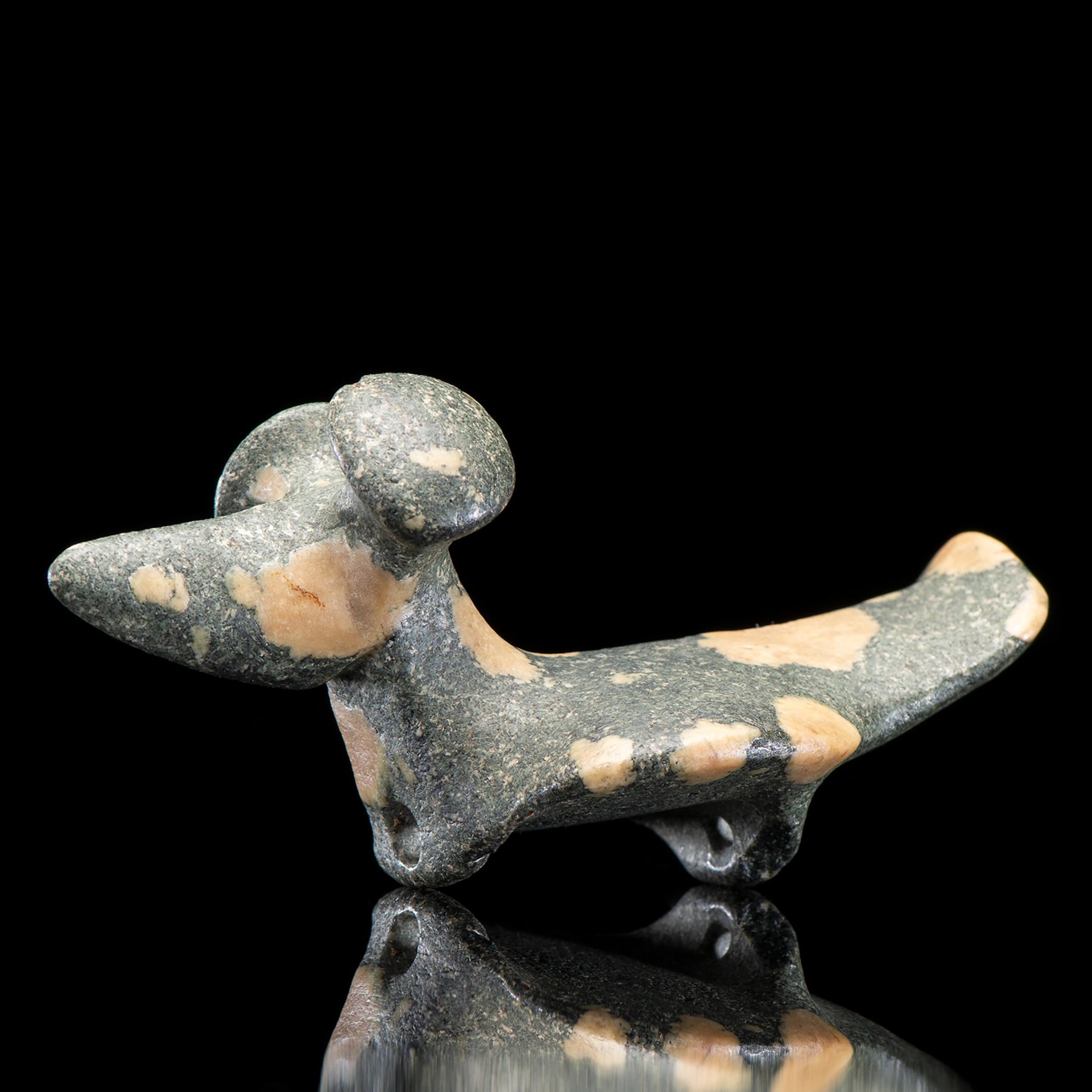
A Porphyry Popeye Fantail Birdstone Could Soar to $350,000

A porphyry popeye fantail birdstone, created by the people of the Glacial Kame Culture sometime between 3,000 and 500 BCE in what is now DeKalb County, Indiana. It looks like a small dog, except it has two loops where the front and back feet should be. It is slate gray with pale cream-colored blobs of varying sizes across its body. It has two wide nailhead-like protuberances where its ears should be, but the protuberances are called "eyes".

What you see: A porphyry popeye fantail birdstone, created by the people of the Glacial Kame Culture sometime between 3,000 and 500 BCE in what is now DeKalb County, Indiana. Cowan’s Auctions estimates it at $250,000 to $350,000.

The expert: Erin Rust, specialist in the department of American Indian Art at Cowan’s.

What is a birdstone, and what do we know about how the Glacial Kame Culture people might have used it? It’s an effigy, usually carved from a softer stone, and it’s kind of unclear what, exactly, the artifacts were used for. They’re usually field finds. This was found in a potato field in northern Indiana. It was possibly an atlatl [pronounced at-el-at-el] weight–a throwing device used to achieve a higher power when throwing.

Kind of like a counterweight on a trebuchet? It’s an extension of the arm throwing a spear. Harder and faster and for high-powered hunting. We don’t really find them in archeological contexts. It’s up for conjecture what they were actually used for.

How were birdstones made? They were expertly carved, chipped away from a larger block of stone. They roughed out the form in the shape they wanted, then polished it into the final form.

Sounds like a lot of work. Especially if it’s a hard, granite-type stone.

How hard is it to carve porphyry? It’s pretty difficult. It’s a hard hard stone. They’d typically use banded slate, which is a lot easier to carve. There are not as many porphyry birdstones. They’re much more labor-intensive, and much more rare. About 10 percent of the known birdstones are carved out of porphyry.

Would the cream-colored splotches have drawn the carver to the stone, and influenced how they carved it, in the way that jade carvers in China work with rust-colored inclusions in the stone? Exactly. They would look at the material and decide to carve it based on the cream-colored splotches, which are called phenocrysts.

And why is it called a birdstone? This one, to me, looks more like a dog than a bird. It could be a dog, it could be a bird, but it’s commonly called a birdstone. Some look like bears, some look like birds, some look like dogs. It’s the interpretation of the viewer. “Birdstone” is the general term for it.

And the things protruding from the head are called eyes? I thought they were ears. They’re called eyes, but whether they’re actually ears or eyes is open to interpretation as well.

Is it made to be held in the hand? It is small, but because of the perforations on the ridges at the bottom, it [was probably] meant to be attached to something like an atlatl rather than held.

To be clear–if birdstones were found in an archeological context, they’d be more likely to be considered jewelry. Because they’re found in fields, it’s more likely they were attached to an atlatl with a sinew and maybe the sinew broke. It could be jewelry, but they’re found in fields. We don’t really find them in an archeological context.

Cameron Parks, who owned this piece, deemed it the finest birdstone in the world. Is it? What makes it so? This piece is regarded as one of the top five examples of Popeye porphyry birdstones. What makes it unique is the blue hue to the stone. Porphyry can be quite dark. The blue hue with the cream phenocrysts make it pop and makes it unique. Also, the popeyes are large on the top of his head, and the form tapers into his head. And the bodies are usually long and slender, but with this, the body expands into a circular form, and a tail that widens to a fantail, and tips up.

This birdstone was found in 1950. Was the mid-20th century a time when many birdstones were being discovered? Among the top five greatest birdstones, this piece was discovered the latest. The Smithsonian birdstone was discovered in 1882. The majority of them had been discovered by 1950.

What condition is it in, and what does “condition” mean when we’re talking about something that’s thousands of years old? As old as this piece is, it’s in exceptional condition. With these, the head breaks off, the tail breaks off, the eyes or ears break off. On this, nothing has broken off. It has two small nicks, one on the bottom near a perforated ridge, and one on the top edge of the left eye. The fact that it’s never broken and it’s as old as it is is pretty amazing.

The lot notes say it retains its original polish. What does that mean here? This piece did not spend time buried in acidic soil. It has not deteriorated. The polish is the same as it was when it went in the ground. The surface is very smooth. There’s no pitting to it. It’s incredible.

So, it being made of porphyry made it more resilient? Birdstones made from banded slate lose their polish faster and the ground erodes them quicker. Porphyry ones are less likely to erode.

Has this piece been auctioned before? It’s been in the same family for 70 years. They have offered it before at auction, probably eight years ago.

What does the Cameron Parks provenance add to the piece? Cameron Parks had one of the largest and better collections [of artifacts] in the country. That makes artifacts from his collection are more sought-after.

What’s the record for a birdstone at auction? Very few, if any birdstones of this caliber have been offered at public auction. They have been offered privately, but not at auction. We had a very nice collection of 30 to 35 birdstones, but not of this caliber. We sold them starting in 2017 and finishing in September 2018. That was a very large collection of birdstones, but normally when they come up there are one or two, not 30 to 35.

What is it like in person? He’s small, but he’s pretty mighty. [Laughs] I call him “he”. It has a very strong presence to it. The craftsmanship of it is absolutely incredible. Very few [other birdstones] compare to this piece because of its craftsmanship, the material, everything about it.

What is it like to hold it in your hand? It fits perfectly in your hand, but it doesn’t feel like something [designed] to hold on to. The perforations at the bottom makes it sit oddly in the hand. That’s why it might have been used with an atlatl.

Is there anything that the camera doesn’t pick up? The camera really emphasizes its presence. When you first see it, you think, “Whoa, he’s kinda small.” Then you handle it, and its aura is magnificent. I think the photographer really captured the presence in this piece.

Why will this piece stick in your memory? It’s a rare opportunity to have close access to such a high-level artifact. I probably won’t have the opportunity to see this caliber of birdstone come through the door again. It’s pretty remarkable.

How to bid: The porphyry popeye fantail birdstone is lot 22 in the American Indian and Western Art: Premier Auction taking place at Cowan’s Auctions on April 5, 2019.

How to subscribe to The Hot BidClick the trio of dots at the upper right of this page. You can also follow The Hot Bid on Instagram and follow the author on Twitter.

Cowan’s is on Twitter and Instagram.

Image is courtesy of Cowan’s.

Would you like to hire Sheila Gibson Stoodley for writing or editing work? Click the word “Menu” at the upper right for contact details.
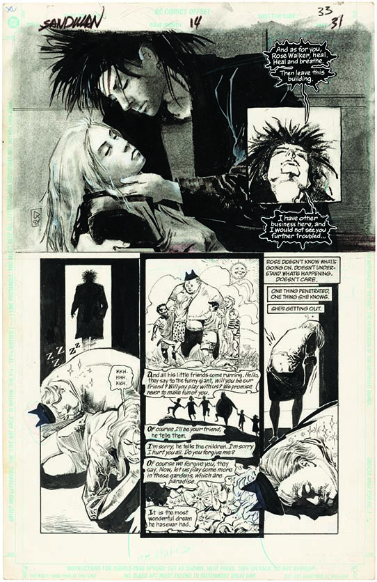
SOLD! Original Art from Neil Gaiman’s The Sandman Sold For… (Click to See)

Original artwork for page 33 of the Volume 2, Number 14 issue of The Sandman, which was released in March 1990. It was penciled by Mike Dringenberg and inked by Malcolm Jones III. At the top we see a splash page featuring Rose Walker and Dream. Fun Land appears in some of the lower panels. The page depicts Dream planting dreams in the characters' heads, and we see the dream he planted in Fun Land's head. The page is rendered in black and white.

Update: The page sold for $14,278–a new record for artwork from the original series of The Sandman.

What you see: Original artwork for page 33 of the Volume 2, Number 14 issue of The Sandman, which was released in March 1990. Penciled by Mike Dringenberg and inked by Malcolm Jones III, Hake’s Americana & Collectibles estimates it at $5,000 to $10,000.

The expert: Alex Winter, President of Hake’s Americana & Collectibles.

How often do original pieces of art from the Sandman series of comic books come to auction? The Sandman is its own universe at this point. The basis of The Sandman is the 75 [issues] plus one special that ran between 1989 and 1996. [There are also two later series.] Upwards of 2,000 original pieces of art could come from that series. We don’t know how many have come on the market, but we’ve had two. It’s safe to say it’s a fraction of what was created for the comic book.

I see three images with the lot. Is that what the winning bidder gets, or are some of the images there solely for context? You just get the first piece [the piece on the left of the three shown with the lot]. The next image is a detail of the panel, and the next is the cover of the comic book it was published in.

The lot notes says there are seven panels in the original art, but I only see five. Where are the two that I missed? The middle panel of the bottom three panels, the Fun Land panels, has three different narrative scenes in it. [It looks like one panel, but it counts as three.]

The lot notes say the artwork contains a “splash panel.” What is a splash panel, and why might the artist have used one here? In the beginning stages, it meant a full page of art. As it evolved [it came to mean] a bigger than normal panel. A true splash is one full page, one scene, almost like a cover.

The illustration at the top, of Dream holding Rose Walker, is the splash panel? Yes.

Why might Dringenberg have used a splash panel here? That’s a question for the artist, but what’s interesting about The Sandman is the different artists he [Neil Gaiman] used, and their styles are all incorporated with the comic book. He worked closely with the artists and co-created with the artists. The Sandman series let them do different things no one had seen in comic books before. It was a groundbreaking series. Gaiman picked artists with very different styles for different story lines. There were no rules. Every artist was very distinct, and not every artist did a complete story line. The Doll’s House story line [depicted in this panel] ran from issues nine to 16.

The art comprises two boards that together measure 11 inches by 17 inches. Is that typical for art created for comic books? No, it’s never been a typical practice. Usually there’s one sheet and that’s that. It’s not like it’s never been done by anybody before, but it’s not the norm, no.

Why might Dringenberg have done that here? I guess it’s his artistic process. Maybe it was easier for him to do this and put it on the page. I would think the effect [of the splash page] is the reason why it was done the way it was done.

And Dringenberg did the watercolor effect we see behind Dream and Rose Walker? It’s all him. It’s not penciled in by anybody else. This is a guy who did many different things, unlike a comic book artist. Usually, comic book artists who paint just paint, and those who draw just draw. He mixed media together, which is why his art is well liked. It’s different and quite striking. What makes the page so nice is that top panel.

Could you explain why most comic books have a pencil artist and an ink artist? Many times an artist does pencil and another does ink. Sometimes one does it all. You look for a team that works together and makes a page look cohesive. Here, Dringenberger did the penciling and Malcolm Jones III came in over the top of the penciling [with ink] and made it more detailed.

What is happening on this particular page? What is happening in the story? The Sandman is a very tough series to describe. It’s very deep, very literate. It won awards that no comic book had won before. It’s on another level in many different ways. There might have been stand-alone issues, but most were multi-story arc issues, with three to four [storylines] in an issue. Some comic books can be summed up as “Batman beats Superman.” With The Sandman, you can’t say that.

The page shows three characters from The Sandman–Dream, Rose Walker, and Fun Land. Which one do collectors most want to see? Dream is the lead character of the series. His official name is Morpheus, but he’s also called Dream and The Sandman. Every time you have the Sandman, it’s desirable. The top splash panel makes it unique. As a collector, it’s what you look for.

Dream is depicted planting dreams in the other characters’ heads. Does that make the original artwork more interesting to collectors than panels or pages that show Dream doing other things? It’s something he was known to do, yes. It’s more interesting. As a Sandman fan, it’s an element that I like.

Did Neil Gaiman have veto power over the artwork that was created for The Sandman comic book? I don’t know his work process, but I think he would have been right there with the artist every step of the way. I think he picked artists who he knew would work well. It was a collaborative process.

Is there any indication that Gaiman asked for changes or edits to the artwork that we see in this panel? No, there’s no indication of it here.

Do collectors of original comic book art for The Sandman have a preference for a specific era within the series, or do they go after everything and anything because so little has come to auction? It’s a combination of it being so rare, and I don’t think you’ll find Sandman fans who don’t like the entire run. It had a definite story line. It didn’t go on and on. It was very much Neil Gaiman’s creation. People who love Neil Gaiman love everything he did. Some fans of Sandman go for one page from every artist associated with the series. Then it comes down to the fact that relatively few pages have come to market.

Where are the rest of the hundreds of pieces of art used to create the original 75-plus-one-special series of The Sandman? Are they with the artists who made them, or with DC Comics, which published the series, or with Neil Gaiman…? That’s a question probably everybody is asking, because there are so few pages that have come up. One of the other artists on the series, Jill Thompson, she had some Sandman art herself and sold it. It’s a combination of Neil Gaiman probably kept some art and the artists certainly kept some art. DC, I don’t know. It’s one of the great questions–where is it, who has it.

The owners have generally been closed-mouthed? Typically, if the artist has the art, it’s not a big secret. I don’t know if it’s a well-kept secret or if the question has never really been asked of the right people. There could be plenty in the hands of private collectors that we don’t know about, either.

How did this panel come to you? This and another killer piece, the Rob Liefeld Deadpool, came from the same person. He passed away, and the family liquidated. The story from the family is he bought it at a comic book convention in the early 90s. I don’t know if he bought it from a dealer or the artist. It’s been off the market since it was created. That makes it more desirable. It is, as they say, fresh to market.

The lot notes describe the panel as “clean.” What does “clean” mean here, when we’re talking about a functional piece of art that wasn’t created to be collected? It’s a term that lets you know it was well cared for. The art has no notable defects or blemishes.

What’s the current auction record for an original piece of comic book art for The Sandman? It’s a hard thing to track down because some auction houses don’t track results. Heritage Auctions sold the paperback cover art to Sandman: Preludes & Nocturnes for $26,290 in 2017, but it’s technically not from the original run. The next result Heritage had happens to be from page 30 of Number 14, the same issue we have. It sold for $13,145 in 2014. That was five years ago, and the market has changed dramatically. I’d love to say we’ll exceed what they got. The fact that it’s already at $6,000 bodes well, but it’s hard to predict where it will end up. [The Heritage example] didn’t have a splash, but it had Dream in every panel, and it’s very distinct.

Yes, let’s talk about how the lot is doing. We’re conducting this interview on February 26, 2019. The online bids are just above $6,000, with 15 days to go until the auction closes. Is that meaningful? To have a piece jump off to where it is already does bode well. I personally like to see an item take off early. Usually, it translates to more action in the later days, but not always. A lot of art guys are used to bidding feverishly in the final hours.

What is this piece like in person? You definitely get the impact of it. The splash takes it to a different dimension.

How does this panel from The Sandman compare to the other two sold at Hake’s? The other two we had were very nice. The Jill Thompson brought $7,000 in 2014, and the Sam Kieth featured a character, John Constantine, who existed [In the DC Comics world] previous to The Sandman. There was no Sandman character, but it still brought $3,500 in 2015.

Why will this piece stick in your memory? The splash art at the top makes it different from the run of the series. This one you look at and boom, you focus on the top panel. Even if you’re a fringe comic book person, if you see it hanging somewhere, you think, “Oh, that’s Sandman.” There was stunning art through the whole run. As much as The Sandman was about the writing, the artwork is spectacular. With comic books, sometimes the art is great but the story is just ok, or the art is just ok but the story is great. With this, all 75 issues plus the special are great. It never jumped the shark. I’m a lifelong comic book geek. If someone came in and asked me, “What should I read?” I’d hand them The Sandman.

How to bid: The original comic book art from The Sandman is item 1112 in Hake’s Americana & Collectibles Auction #226, which ends on March 14, 2019.

How to subscribe to The Hot BidClick the trio of dots at the upper right of this page. You can also follow The Hot Bid on Instagram and follow the author on Twitter.

Hake’s Americana & Collectibles is on Twitter and Instagram. Neil Gaiman is on Twitter and Instagram as well.

Image is courtesy of Hake’s.

Alex Winter spoke to The Hot Bid previously about a record-setting 1978 Obi-Wan Kenobi action figure and a 1939 copy of Batman’s comic book debut, which ultimately sold for almost $570,000.

Learn more about The Sandman comic book on the DC Vertigo site.

Would you like to hire Sheila Gibson Stoodley for writing or editing work? Click the word “Menu” at the upper right for contact details.

Emma Amos’s Let Me Off Uptown Could Sell for $60,000

Emma Amos's mixed-media work Let Me Off Uptown is a large, square piece that showcases a dancing couple who hold hands. The black, besuited gentleman dancer tips his hat to the light-skinned woman, who has black stiletto heels and a spaghetti-strap red dress that falls to the knee. A green circle behind the couple draws the eye to them. Tiny figures appear across the background. All are jubilant. Most are dancing. All races and ages are represented, and there's at least one dancing dog.

What you see: Let Me Off Uptown, which measures 80 inches by 78 7/8 inches and was created by African-American artist Emma Amos between 1999 and 2000. It incorporates several media, including oil and photo transfer on linen canvas, metallic paint, glitter, collage, and African fabric borders. Swann Auction Galleries estimates it at $40,000 to $60,000.

The expert: Nigel Freeman, director of Swann’s African-American fine art department.

The lot notes say Let Me Off Uptown is “a significant work from Emma Amos’s important series of paintings on fabric from the late 1990s that celebrate African-American women”. How big is the series? Is it still ongoing? She did a large group of work in the 90s where images of women were painted on canvas not on stretcher bars [a traditional treatment for paintings] but on hanging cloth. It extended to the mid-2000s. She’s not working on it now.

What do we know about how Amos made the mixed media work? Artists like Emma Amos and Faith Ringgold, when they came up in the 1960s and 1970s, the gallery system was very difficult for women to get any representation. Male abstract painters predominated. There were few spaces in the art world for empowering images of African-American women. She was very much a part of the African-American movement and the women’s movement. She took all those elements in the 1980s and 1990s and found a way to paint the imagery and make it her own–large figurative subjects about women, the bodies of women, and the roles women had in society. This is more celebratory. It’s about African-American culture and about jazz. It shows how jazz brings different people together.

Is the woman in red a self-portrait? Is she Amos? I don’t believe so.

Why did she name the work Let Me Off Uptown? It’s a reference to Harlem. That was where you got off the train to listen to jazz music.

Did she use models for the main figures or any of the smaller figures? I don’t know precisely her practice, but I would think it’s a variety of sources. [The man] could be someone she knows, I really can’t say, but it’s not portraiture. It’s not important who these people are–it’s what they represent. For centuries, images of African-Americans in art were either put on the sidelines, completely secondary, or they were caricatures. Since the Harlem Renaissance, [African-American artists have] taken over the representation of their figures and made a viable language. Like other contemporary artists, Amos has focused on the figure, and has embraced making figurative art that shows African-Americans doing things. In her case, they have larger symbolic meanings. They speak to a larger discourse about how we view African-Americans and African-American figures in our art. She wants to change the way we look at art.

The lot notes say Amos “has long sought to deconstruct traditional representations of beauty”. How does she do that here? With these images of celebratory figures and dancers [she asks] what is a beautiful figure? Can an African-American woman stand in for other figures that traditionally represent women and ideals of beauty? That is where she’s coming from. The classical models from art history are Eurocentric. Black bodies, shapes and colors and the way they look, are not necessarily considered ideal in art. She makes ordinary people heroic. These [the two main figures] are painted six feet high, at a scale and size that are almost lifelike, if not lifelike. She says they are people we should celebrate.

Do any of the smaller figures carry meanings that might not be immediately obvious? When you first look at it, it looks like lots of fun, dancing figures, but a lot of them are subversive. Some are unclothed. Different races and genders together. Music and freedom. At the beginning of the 20th century, jazz was revolutionary. It represented freedom and improvisation. She’s definitely tapping into that here. It’s a great party of twirling figures, having a great time.

What details stand out to you? The fun thing about her work is the different levels it works on. It’s a really strong image of a dancing couple, but as you look at it, little details show her sense of humor and intelligence. Look at her [the main female figure’s] dress. The bodice is covered with smiling lips. [laughs] It’s a cheeky, fun thing. You don’t notice it at first, and it’s all very seamless. She really integrates everything well. It comes from her great sense of material–from her fabric and printmaking and painting, which she brings together in works from the 1990s and 2000s.

Amos included this work in her 2000 application for a Pollock-Krasner Foundation fellowship, which she won. Does that affect collectors’ interest in the work, or its value, at all? I think it’s a nice plus. It certainly shows the reputation of her work strongly.

I’d been calling her a fabric artist but it seems like “mixed media artist” is better… She’s really a painter, a collage artist, and a printmaker. It’s a bit simplistic to call her a fabric artist. That’s one element of her work. Sometimes she paints on textile, but she’s a multimedia artist, absolutely.

What is Let Me Off Uptown like in person? It has a human scale to it. It’s about six feet high. What you can’t necessarily see in the catalog is there’s a wonderful variety of texture. The surface has a wonderful shimmer. There’s a richness to it. It doesn’t just have a flat, uniform surface.

Are her works usually this colorful and lively? Let Me Off Uptown is not an anomaly. Her works are often dynamic and brightly colored, with large figures taking up the whole picture plane.

How rarely do pieces by Amos appear at auction? We’ve been selling her work in our auctions since the start of our African-American Fine Art auctions in 2007. Primarily they were prints and works on paper. Then last year [in October 2018], we sold Arched Swimmer, the first large, unique painting we had of hers. It was estimated at $10,000 to $15,000 and, with the buyer’s premium, sold for $40,000 and set an auction record for her. That painting set the stage for this one. It’s quite possible this work will set a new record. Her work is in people’s minds. That’s why it felt like a good time to bring this to auction now.

Why might Let Me Off Uptown beat the sum achieved by Arched Swimmer? First of all, it’s a larger, more complex piece. Arched Swimmer was 30 inches by 32 inches, and it was a stretch canvas. It was not one of the larger hanging pieces, and it’s a quarter of the size of the work we’re selling now. I think we’ll have a lot of interest in it.

Why will this piece stick in your memory? I think it’s a fantastic image of dance and jazz. It’s a joyous image, and it’s what her work is all about.

How to bid: Let Me Off Uptown is lot 163 in the African-American Fine Art sale taking place at Swann Auction Galleries on April 4, 2019.

How to subscribe to The Hot BidClick the trio of dots at the upper right of this page. You can also follow The Hot Bid on Instagram and follow the author on Twitter.

Swann Galleries is on Instagram and Twitter.

Nigel Freeman has appeared on The Hot Bid many times before, talking about a set of Emperor Jones prints by Harlem Renaissance artist Aaron Douglas, a story quilt that Oprah Winfrey commissioned Faith Ringgold to make about Dr. Maya Angelou, an Elizabeth Catlett painting, and a Sargent Johnson copper mask. The Ringgold and the Johnson set records for the respective artists.

Emma Amos has a website. She’s represented by the Ryan Lee Gallery.

Image is courtesy of Swann Auction Galleries.

Would you like to hire Sheila Gibson Stoodley for writing or editing work? Click the word “Menu” at the upper right for contact details.

SOLD! The Berlin Wall Segment Sold For (Scroll Down to See)

An original four-piece segment of the Berlin Wall, standing almost 12  almost eight feet deep, and spanning more than 15 feet (including the base slabs). It once belonged to the Parliament of Trees memorial in Berlin. The German phrase stencil-graffitied on the section, spoken by then-German president Richard von Weizsäcker, translates as: "To Unite Means to Learn to Share". It is gray, with black lettering, and was photographed outdoors against a blue sky.

Update: The segment of the Berlin Wall offered by Summers Place in lot 22 sold for £15,000, or about $19,700. The smaller segment offered in lot 23 fetched £6,250, or about $8,200.

What you see: An original four-piece segment of the Berlin Wall, standing almost 12 feet high, almost eight feet deep, and spanning more than 15 feet (including the base slabs). It once belonged to the Parliament of Trees memorial in Berlin. The German phrase stencil-graffitied on the section, spoken by then-German president Richard von Weizsäcker, translates as: “To Unite Means to Learn to Share”. Summers Place Auctions estimates it at £12,000 to £18,000 ($15,600 to $23,400).

The expert: James Rylands, director of Summers Place.

For those who don’t remember the Berlin Wall, let’s talk about it–why did it go up? Why was it notorious? Why was its dismemberment celebrated? The Berlin Wall was one of the most defining things of the 20th century, from a physical and a psychological point of view. It went up in 1961, and a huge amount of East Germans fled to the west by the time it went up. Something like 20 percent of the population fled to the west. It was put up by the German Democratic Republic, which is an oxymoron–it was an Eastern Bloc Soviet state that restricted movement, and personal movement. Barbed wire went up overnight, and over 10 to 15 years, they refined the wall. It became more elaborate and secure. Literally overnight, families were divided.

How many people tried to breach the Berlin Wall? About 5,000 did. We don’t know [exactly] how many died [in their attempt to escape], but it was about 150.

Do you remember where you were when the Berlin Wall came down? I remember it very well. I’m 60, and I remember it so clearly. Through the Cold War years, we thought we would all die in our beds [from a nuclear bomb dropped by the USSR]. Total obliteration. When the wall came down, it was just huge. Scenes of euphoria. The Berlin Wall was a very obvious physical manifestation of the regime. It went from people attacking it as a symbol of oppression to being attacked by souvenir hunters. It became an instrument of capitalism, people chipping off sections and selling souvenirs. In the news section of our site, we have a story about 16 places around the world where sections of the Berlin Wall ended up–South Korea, the Vatican, Schengan in Luxembourg–it’s worth reading. The Berlin Wall ran for 96 miles, and most of it was turned to rubble and used to build highways.

The fall of the Berlin Wall is one of those ‘where were you when’ moments, but it’s unusual for being a happy moment. Most of those moments–Pearl Harbor, the Kennedy Assassination, 9/11–are tragic. This isn’t. You’re right. It rarely gets concrete.

Literally! Exactly.

It must have been a heck of a party when the Berlin Wall came down. Can you imagine the hangovers after that?

I see in the lot notes that the Berlin Wall section in lot 22 stands almost 12 feet tall, but what does it weigh? It’s in four sections, and each bit weighs just under four tons. All together [with the base slabs] it’s about 15 tons, total.

The dimensions note that the section is more than 15 feet wide “overall.” What does that mean here? [In the photo ] you can see a bit that hasn’t been painted–

Like a stand? Yes. The same thing goes out on the other side. Front to back.

So the wall section sits on slabs? Yes. It’s not an easy thing to hop over, especially considering it [the vertical surface] would have been smooth, and it had things [deterrents] on the top as well. To get over that was quite a feat.

And this was once part of the Parliament of Trees monument in Berlin, but it was deaccessed? When? Artist Ben Wagin painted on it in 1990, when it became part of the Parliament of Trees. They [the stewards of the monument] built out at that stage and sold it or disposed of it [to reshape the monument]. The consigner acquired it literally after they sold it [later in 1990].

So the section was part of the Parliament of Trees very briefly, and then it was released? I think it was. With the Parliament of Trees, parts were moved because they were putting up other buildings on it [the site].

How did Wagin choose the von Weizsäcker quote–“To Unite Means to Learn to Share”–to stencil on this segment of the wall? Von Weizsäcker was then president of Germany, commenting on gathering and sharing. West Germany was one of the few countries that could afford to make that happen, to underwrite the whole of East Germany. It was only 45 years since World War II, and then it underwrote a whole new country.

Do you know how many other pieces of the Berlin Wall have gone to auction? I’ve been doing sales for 30 years. I started four years before the wall came down. This is the first time I’ve seen or been aware of a large section going up for sale.

How did you set the estimate? That was the most difficult thing of all. Most things in an auction have an intrinsic value. With something like this, I’m selling chunks of concrete. What price do you put on the provenance and the history? I think it’s a modest estimate. If it [and its consecutive sister lot] fetch £100,000, I’d be pleased and not surprised.

Were the two lots of Berlin Wall segments consigned by the same person? Yes.

What is the segment with the Von Weizsäcker quote on it like in person? It’s powerful. It’s got a real wow factor. We’ve got seven acres on the Summers Place grounds. We only managed to stand one section up. [They had crane issues.] A point I should make is it’s equally at home outside as inside. In a modern building, a corporate building, a museum with a glass atrium, it will look stunning. It really will. Brutalism and urban street art–it combines the two.

How will you sell the Berlin Wall segment on the day? I take it you won’t do the auction outdoors in England in March… Bear in mind that a lot of what we sell is very big. In the sale room, each lot will go up on a TV screen.

Who do you think is going to buy this? Who is the audience? In a way, that’s what makes it a rich man’s lot. It’s going to be an institution or someone with a sufficient indoor-outdoor space. And I don’t preclude selling this to the Russians. We sell quite a lot to Russians. I just pray, and this is me taking off my auctioneer hat here, I hope it ends up in a public institution.

What about an ex-East German? People who were young when it came down… Berlin is a rich city now. What a wonderful thing, to buy it back.

How to bid: The segment of the Berlin Wall is lot 22 in the Garden and Natural History sale on March 12, 2019 at Summers Place Auctions.

How to subscribe to The Hot BidClick the trio of dots at the upper right of this page. You can also follow The Hot Bid on Instagram and follow the author on Twitter.

Summers Place Auctions is on Twitter and Instagram.

Image is courtesy of Summers Place Auctions.

Would you like to hire Sheila Gibson Stoodley for writing or editing work? Click the word “Menu” at the upper right for contact details.

A Brass Sleeve Holdout–A Device for Cheating at Cards–Could Sell for $6,000

This brass sleeve holdout device by Will & Finck, dating to the 1880s, allowed the wearer to cheat at cards. When the player received a valuable card they wanted to save for a later hand, they'd touch the button that extends the device, surreptitiously tuck the choice card into the gripper, and then hit another button that pulled the card back up their sleeve. The card cheat would wear the device strapped to the underside of an arm, hidden beneath clothing. The photograph shows the device upside down.

What you see: A brass sleeve holdout device by Will & Finck, dating to the 1880s. Potter & Potter estimates it at $4,000 to $6,000.

The expert: Gabe Fajuri, president of Potter & Potter.

Are Will and Finck real people, or are they made-up names, seeing as the company made gear for gamblers who want to cheat? And did the company make straightforward products, too? I assume they are [real people]. It was a pretty well-known business in San Francisco. They were best known as knife-makers.

How does a sleeve holdout work? Let’s say you play a hand and you see a card that will be useful down the line. The clip [shown above, holding the King of Spades card], which is called a thief, you pop it out of your sleeve with pressure on the lever [in the photo above, it is attached to the cuff and has a cross-hatch pattern on one end] and take it for later. You put it in the thief and it goes back in your sleeve. Let’s say you need the card. You put pressure on the lever. It will activate the device, and the tongs will come out of your sleeve. The knobs are where you attach the elastic [which eases the movement of the device]. One is directly behind the lever, and one is on the tongs themselves.

It looks uncomfortable to wear. Was it? It certainly required some getting used to. I imagine it might be like wearing an artificial leg–you strap a metal device to yourself with a tether under your clothes. In a way, it’s like a third hand. In some instances later in the 20th century, the sleeve holdout is called a third hand. I think we have an example in the auction. [Yes indeed, Potter & Potter have a circa 1960 holdout in the sale lineup.]

And the user would wear the device under his forearm? It depended on what you were wearing. It’s tough if you wear a shirt that has buttons on it [on the cuff]. You have to have clear passage out of your shirt. It’d have to be a bare arm under a jacket, or, and I don’t know anyone who did this, a shirt under a jacket. [Later Fajuri clarified: There were plenty of people who wore them over a shirt and under a jacket, but they had strategies to get the device to clear the cuff of the shirt or the opening of their sleeve.] It’s got to move swiftly and silently without hanging up or you’re a dead man, literally. [To point out something that might not be inherently clear–the photograph shows the device upside down.]

Did people use holdouts during card games? Yes. In many ways, it takes more guts and skill to use a holdout than to deal from the bottom of the deck. If you’re caught with a holdout, you have no defense. You literally have no defense.

Did anyone actually get caught using a holdout, for real? Plenty of people have used them. The technology has improved somewhat from what you see here. There are plenty of books filled with gambling lore, and stories of people being caught in the act of using a holdout are numerous. I saw a guy who did it professionally, and it took my breath away. If you’re skilled at using one of these things, it’s a miracle. Personally, I think you’ve got to have nerves of steel.

Did anyone running a card game pat players down before dealing? Seldom does the man exist who has the guts to use one of these things. If someone was particularly suspicious, yeah, you could do that. But anyone who takes the time and effort to use one of these things would take the time and effort to sneak it into a game. The amount of energy people expend to beat the system, cheating at cards, dice, et cetera–it boggles the mind. The ingenuity is considerable. Isn’t there an easier way to make a buck?

Are people using holdouts to cheat at cards today, right now? Where there’s a will, there’s a way. Absolutely. I guy I knew once said, “I have to commit three felonies a week to keep my family fed.” He was an expert when it came to using a holdout.

Have you tried it on? No.

How long has the concept of the sleeve holdout been around? Does it predate the 1880s? I believe it does, but I’m not a subject matter expert. I’d have to defer to someone else. I don’t have an exact date in mind when something like this existed. Lot 151 in the auction, a rare book by F. R. Ritter, is the first to show a Jacob’s ladder-style sleeve holdout [like the one pictured above]. The book has sold for as much as $19,000. And it doesn’t hurt that all of these cheating strategies have been mythologized by movies set in the old West. Hollywood has done its part in creating the stories around dodges and subterfuges.

How rarely do antique sleeve holdouts appear at auction? We do them on the regular, but that doesn’t mean they’re common. Once you cross the 1900 mark, they’re slightly more available, which is not to say that any of it is easy to find. In our auctions, they appear about once a year, generally speaking.

How unusual is it to find one of this vintage that’s original and intact, as this one is? Is it rare? We sold a Will & Finck holdout last year for $10,000. [It was lot 249 in the May 19, 2018 auction.] In all our years of gambling auctions, it was the first Will & Finck we’ve sold. Their name is like sterling on silver–the highest quality. I’ve seen one or two others in personal collections.

The lot notes say this sleeve holdout was pictured in the section on cheaters in Time-Life’s 1978 Old West series of books, on page 124. How does that affect its value? A hardcore collector has that book and has ogled it for how long now? We’ve been fortunate to sell [items] from the book. It’s a lot of fun seeing things you’ve been dreaming of for decades and being the one to bring it back to market after all that time. [This is as close as I was able to get to finding a reproduction of page 124 online.]

How to bid: The Will & Finck brass sleeve holdout is lot 448 in Gambling Memorabilia: Featuring the Collection of Tom Blue, taking place March 30, 2019 at Potter & Potter.

How to subscribe to The Hot BidClick the trio of dots at the upper right of this page. You can also follow The Hot Bid on Instagram and follow the author on Twitter.

Follow Potter & Potter on Instagram and Twitter.

Gabe Fajuri is a favorite on The Hot Bid. He’s talked about a Snap Wyatt sideshow banner advertising a headless girl, a record-setting stage-worn magician’s tuxedo; a genuine 19th century gambler’s case that later sold for $6,765; a scarce 19th century poster of a tattooed man that fetched $8,610; a 1908 poster for the magician Chung Ling Soo that sold for $9,225; a Golden Girls letterman jacket that belonged to actress Rue McClanahan; and a 1912 Houdini poster that set the world record for any magic poster at auction.

Image is courtesy of Potter & Potter.

Would you like to hire Sheila Gibson Stoodley for writing or editing work? Click the word “Menu” at the upper right for contact details.

SOLD! A George Nelson Ball Wall Clock Commanded (Scroll Down to See)

George Nelson's ball wall clock is a mid-century design icon. It resembles a sun with rays streaming from it. Each of the twelve "rays" ends with a ball that represents an hour. This particular version featured balls that had different colors: black, green, yellow, white, and orange.

Update: The George Nelson ball wall clock sold for $704.

What you see: A George Nelson ball wall clock, designed for the Howard Miller company and dating to 1949. Rago Arts and Auctions estimates it at $250 to $450.

The expert: Michael Ingham, Rago’s COO and director of its Unreserved department.

The Howard Miller company produced the ball wall Clock from 1948 to 1969. Do we know how many it made? There are no records that I know of. They made them for 21 years. That shows you how much people liked them. They were very popular and remain so today.

So the clock was a hit from day one? From the day it arrived on the market. 1948 was right at the beginning of the atomic age. The Trinity test was July of 1945, and by August 1946, we dropped Little Boy at Hiroshima. Americans were feeling pretty powerful at that point.

Why was it such a hit right away? It was the end of the war and the beginning of a great boom in America. It was considered radically modern–it was the first clock not to have numbers on the face. That was a big departure. And it looked perfect on a kitchen wall.

Howard Miller offered the clock in six different versions. How popular is the multi-color example coming up for sale at Rago? I call it polychrome. They were, in my opinion, the most popular model, and the one we’ve seen the most of.  The runner up is the black ball version, which looks a bit sleeker. The polychrome version is the epitome of the design, and it’s what people look for. [Vitra creates reproductions of all six versions of the clock.]

George Nelson didn’t personally design everything that bears his name. Did he design this clock, or did someone else in his studio do it? Nelson was not the designer of this. Nelson felt it was important, as a branding thing, that he get the credit in the public arena. He would name the designers in technical journals. That’s how Nelson chose to run his firm. It was not a secret that others made the designs, it just wasn’t out for public consumption. Irving Harper designed this. He was a famous guy in his own right.

Officially, the name of this timepieces is “Clock 4755.” A quick glance makes clear why people call it “The Ball Clock,” but do we know when and how it got its popular name? The model number is the driest name possible. I don’t know how it got the name “The Ball Clock.” It was possibly a savvy marketer at Howard Miller. But in my 20 years here, no one has referred to it as anything but.

The original run of this clock was long, and while we don’t know exactly how many were made, we know there had to be a whole honking lot of them. What does it take for a mass-produced object to remain popular enough to command a three-figure auction estimate seventy years after it left the factory? Most of the 20th century design market was made for mass production, but good design is always good design. Fifty years ago, it was a good design, and now, it’s still a good design.

The ball clock is definitely of its era, and yet it manages not to look old. How does it pull off that neat little trick? It definitely references a specific period in history, and I think people like that. Speaking as an older guy, I can remember them hanging on the walls of parents’ houses as a kid. It’s a very clean, modern design. It is radically modern in its way. It’s so clean, you can project what you want onto it. And it’s small. It’s not a big commitment. It’s not like buying a giant sofa. It’s like buying a throw pillow, in the design world.

What condition is it in? And do collectors tend to be fussy about these clocks, given that there’s so many from the original run still out there? People can be very fussy. This one is not in the greatest of condition. The hands are a little bit loose. The enamel on the body of the clock got stained and chipped over time. The enameling on the balls is pretty good, and these are good colors. This particular one is electric, and is meant to plug into a wall.

What condition issues do you tend to see with the Ball wall clocks? The hands often are a bit bent because [the metal] is very thin and very soft. The balls can often be repainted. Most auction houses don’t sell them guaranteed to function. I’ve never plugged it in, so I don’t know if it functions.

How often do original-run George Nelson Ball wall clocks come up at auction? We’ve handled at least one for every year I’ve worked here. Probably closer to 25.

How did you arrive at the estimate? It’s a pretty standard item for us. This particular model, in this particular condition, should go in the $250 to $300 range. A really, really pristine one would get $600 to $800. The dirty little secret of auctions is that estimates should be a little bit enticing, they should be a tad lower. If I can get you to raise your hand once, I can get you to raise your hand again.

What’s the auction record for a George Nelson Ball wall clock? The early 2000s were the hottest moment for these things. The record was $1,527 at at Los Angeles Modern Auctions (LAMA) in June 2004.

When I think of George Nelson, I think of his marshmallow sofa, and this clock. Why has it come to symbolize his work? It was right at the beginning of his career. It was considered radically modern at the time, and it summed up a period of time [in America]. A lot of what Nelson did was square, with clean lines. And Nelson designs are clever. Not that they’re funny, but they make you smile. This clock has that same sort of feeling to it.

How to bid: The George Nelson Ball Wall clock is lot 1530 in the Rago Unreserved auction at Rago on February 24, 2019.

How to subscribe to The Hot BidClick the trio of dots at the upper right of this page. You can also follow The Hot Bid on Instagram and follow the author on Twitter.

Rago Auctions is on Twitter and Instagram.

Image is courtesy of Rago Auctions.

Special thanks to Shannon Loughrey at Los Angeles Modern Auctions (LAMA) for digging into auction records that aren’t online to confirm the record sale price for the ball clock.

Would you like to hire Sheila Gibson Stoodley for writing or editing work? Click the word “Menu” at the upper right for contact details.

Fans of Neil Gaiman and Comic Books, Rejoice. Hake’s Has an Original Page From The Sandman That Could Fetch $10,000

Original artwork for page 33 of the Volume 2, Number 14 issue of The Sandman, which was released in March 1990. It was penciled by Mike Dringenberg and inked by Malcolm Jones III. At the top we see a splash page featuring Rose Walker and Dream. Fun Land appears in some of the lower panels. The page depicts Dream planting dreams in the characters' heads, and we see the dream he planted in Fun Land's head. The page is rendered in black and white.

What you see: Original artwork for page 33 of the Volume 2, Number 14 issue of The Sandman, which was released in March 1990. Penciled by Mike Dringenberg and inked by Malcolm Jones III, Hake’s Americana & Collectibles estimates it at $5,000 to $10,000.

The expert: Alex Winter, President of Hake’s Americana & Collectibles.

How often do original pieces of art from the Sandman series of comic books come to auction? The Sandman is its own universe at this point. The basis of The Sandman is the 75 [issues] plus one special that ran between 1989 and 1996. [There are also two later series.] Upwards of 2,000 original pieces of art could come from that series. We don’t know how many have come on the market, but we’ve had two. It’s safe to say it’s a fraction of what was created for the comic book.

I see three images with the lot. Is that what the winning bidder gets, or are some of the images there solely for context? You just get the first piece [the piece on the left of the three shown with the lot]. The next image is a detail of the panel, and the next is the cover of the comic book it was published in.

The lot notes says there are seven panels in the original art, but I only see five. Where are the two that I missed? The middle panel of the bottom three panels, the Fun Land panels, has three different narrative scenes in it. [It looks like one panel, but it counts as three.]

The lot notes say the artwork contains a “splash panel.” What is a splash panel, and why might the artist have used one here? In the beginning stages, it meant a full page of art. As it evolved [it came to mean] a bigger than normal panel. A true splash is one full page, one scene, almost like a cover.

The illustration at the top, of Dream holding Rose Walker, is the splash panel? Yes.

Why might Dringenberg have used a splash panel here? That’s a question for the artist, but what’s interesting about The Sandman is the different artists he [Neil Gaiman] used, and their styles are all incorporated with the comic book. He worked closely with the artists and co-created with the artists. The Sandman series let them do different things no one had seen in comic books before. It was a groundbreaking series. Gaiman picked artists with very different styles for different story lines. There were no rules. Every artist was very distinct, and not every artist did a complete story line. The Doll’s House story line [depicted in this panel] ran from issues nine to 16.

The art comprises two boards that together measure 11 inches by 17 inches. Is that typical for art created for comic books? No, it’s never been a typical practice. Usually there’s one sheet and that’s that. It’s not like it’s never been done by anybody before, but it’s not the norm, no.

Why might Dringenberg have done that here? I guess it’s his artistic process. Maybe it was easier for him to do this and put it on the page. I would think the effect [of the splash page] is the reason why it was done the way it was done.

And Dringenberg did the watercolor effect we see behind Dream and Rose Walker? It’s all him. It’s not penciled in by anybody else. This is a guy who did many different things, unlike a comic book artist. Usually, comic book artists who paint just paint, and those who draw just draw. He mixed media together, which is why his art is well liked. It’s different and quite striking. What makes the page so nice is that top panel.

Could you explain why most comic books have a pencil artist and an ink artist? Many times an artist does pencil and another does ink. Sometimes one does it all. You look for a team that works together and makes a page look cohesive. Here, Dringenberger did the penciling and Malcolm Jones III came in over the top of the penciling [with ink] and made it more detailed.

What is happening on this particular page? What is happening in the story? The Sandman is a very tough series to describe. It’s very deep, very literate. It won awards that no comic book had won before. It’s on another level in many different ways. There might have been stand-alone issues, but most were multi-story arc issues, with three to four [storylines] in an issue. Some comic books can be summed up as “Batman beats Superman.” With The Sandman, you can’t say that.

The page shows three characters from The Sandman–Dream, Rose Walker, and Fun Land. Which one do collectors most want to see? Dream is the lead character of the series. His official name is Morpheus, but he’s also called Dream and The Sandman. Every time you have the Sandman, it’s desirable. The top splash panel makes it unique. As a collector, it’s what you look for.

Dream is depicted planting dreams in the other characters’ heads. Does that make the original artwork more interesting to collectors than panels or pages that show Dream doing other things? It’s something he was known to do, yes. It’s more interesting. As a Sandman fan, it’s an element that I like.

Did Neil Gaiman have veto power over the artwork that was created for The Sandman comic book? I don’t know his work process, but I think he would have been right there with the artist every step of the way. I think he picked artists who he knew would work well. It was a collaborative process.

Is there any indication that Gaiman asked for changes or edits to the artwork that we see in this panel? No, there’s no indication of it here.

Do collectors of original comic book art for The Sandman have a preference for a specific era within the series, or do they go after everything and anything because so little has come to auction? It’s a combination of it being so rare, and I don’t think you’ll find Sandman fans who don’t like the entire run. It had a definite story line. It didn’t go on and on. It was very much Neil Gaiman’s creation. People who love Neil Gaiman love everything he did. Some fans of Sandman go for one page from every artist associated with the series. Then it comes down to the fact that relatively few pages have come to market.

Where are the rest of the hundreds of pieces of art used to create the original 75-plus-one-special series of The Sandman? Are they with the artists who made them, or with DC Comics, which published the series, or with Neil Gaiman…? That’s a question probably everybody is asking, because there are so few pages that have come up. One of the other artists on the series, Jill Thompson, she had some Sandman art herself and sold it. It’s a combination of Neil Gaiman probably kept some art and the artists certainly kept some art. DC, I don’t know. It’s one of the great questions–where is it, who has it.

The owners have generally been closed-mouthed? Typically, if the artist has the art, it’s not a big secret. I don’t know if it’s a well-kept secret or if the question has never really been asked of the right people. There could be plenty in the hands of private collectors that we don’t know about, either.

How did this panel come to you? This and another killer piece, the Rob Liefeld Deadpool, came from the same person. He passed away, and the family liquidated. The story from the family is he bought it at a comic book convention in the early 90s. I don’t know if he bought it from a dealer or the artist. It’s been off the market since it was created. That makes it more desirable. It is, as they say, fresh to market.

The lot notes describe the panel as “clean.” What does “clean” mean here, when we’re talking about a functional piece of art that wasn’t created to be collected? It’s a term that lets you know it was well cared for. The art has no notable defects or blemishes.

What’s the current auction record for an original piece of comic book art for The Sandman? It’s a hard thing to track down because some auction houses don’t track results. Heritage Auctions sold the paperback cover art to Sandman: Preludes & Nocturnes for $26,290 in 2017, but it’s technically not from the original run. The next result Heritage had happens to be from page 30 of Number 14, the same issue we have. It sold for $13,145 in 2014. That was five years ago, and the market has changed dramatically. I’d love to say we’ll exceed what they got. The fact that it’s already at $6,000 bodes well, but it’s hard to predict where it will end up. [The Heritage example] didn’t have a splash, but it had Dream in every panel, and it’s very distinct.

Yes, let’s talk about how the lot is doing. We’re conducting this interview on February 26, 2019. The online bids are just above $6,000, with 15 days to go until the auction closes. Is that meaningful? To have a piece jump off to where it is already does bode well. I personally like to see an item take off early. Usually, it translates to more action in the later days, but not always. A lot of art guys are used to bidding feverishly in the final hours.

What is this piece like in person? You definitely get the impact of it. The splash takes it to a different dimension.

How does this panel from The Sandman compare to the other two sold at Hake’s? The other two we had were very nice. The Jill Thompson brought $7,000 in 2014, and the Sam Kieth featured a character, John Constantine, who existed [In the DC Comics world] previous to The Sandman. There was no Sandman character, but it still brought $3,500 in 2015.

Why will this piece stick in your memory? The splash art at the top makes it different from the run of the series. This one you look at and boom, you focus on the top panel. Even if you’re a fringe comic book person, if you see it hanging somewhere, you think, “Oh, that’s Sandman.” There was stunning art through the whole run. As much as The Sandman was about the writing, the artwork is spectacular. With comic books, sometimes the art is great but the story is just ok, or the art is just ok but the story is great. With this, all 75 issues plus the special are great. It never jumped the shark. I’m a lifelong comic book geek. If someone came in and asked me, “What should I read?” I’d hand them The Sandman.

How to bid: The original comic book art from The Sandman is item 1112 in Hake’s Americana & Collectibles Auction #226, which ends on March 14, 2019.

How to subscribe to The Hot BidClick the trio of dots at the upper right of this page. You can also follow The Hot Bid on Instagram and follow the author on Twitter.

Hake’s Americana & Collectibles is on Twitter and Instagram. Neil Gaiman is on Twitter and Instagram as well.

Image is courtesy of Hake’s.

Alex Winter spoke to The Hot Bid previously about a record-setting 1978 Obi-Wan Kenobi action figure and a 1939 copy of Batman’s comic book debut, which ultimately sold for almost $570,000.

Learn more about The Sandman comic book on the DC Vertigo site.

Would you like to hire Sheila Gibson Stoodley for writing or editing work? Click the word “Menu” at the upper right for contact details.

WHOA! An Andrew Clemens Patriotic Sand Bottle Fetched (Scroll Down to See)

Andrew Clemens created this example of bottled sand art in 1887. It has a patriotic theme that showcases a flying eagle and a streaming American flag. Clemens developed his own techniques for arranging the layers and sections of colored sand to create elaborate, distinct imagery.

Update: The 1887 Andrew Clemens bottle sold for $102,000–more than double its high estimate.

What you see: A patriotic-themed sand bottle by Andrew Clemens, dated 1887. Cowan’s Auctions estimates it at $35,000 to $45,000.

The expert: Wes Cowan, founder, Cowan’s Auctions.

Did Clemens invent this form of sand art? We don’t know entirely, but near McGregor, Iowa, there’s what is now a state park, Pikes Peak State Park. There’s a sandstone formation where different colored sand is exposed in layers. At some point, some enterprising person in McGregor collected sand and put it into bottles. I don’t think Clemens was the guy who invented it, but he took it to a level others could only dream of. Once Clemens started to do it, others imitated him.

So the artistic sand bottles made before Clemens appeared were what, just stacked colors of sand? I think so. The McGregor Historical Society has examples of bottles made by other folks–stacked colors or very simple geometric designs. They don’t look anything like Andrew Clemens bottles.

How did Clemens make these artistic bottles of sand? I think a large part of Clemens’ genius was he spent a lot of time preparing the sand–sorting it, sifting it, and he may have ground it so it could be packed. The sand granules coming out of the deposit are not the same size. It’s an advantage to make it as uniform as you can to arrange it in the bottle.

What tools did he use to arrange the grains of sand? He’d use tiny scoops to add sand to the bottle where he wanted it to be. He’d manipulate the colors with what looked like little hooks. And he would pack the sand–imagine a wooden tamping tool inside the bottle to pack the sand.

Did he or anyone else document his methods in detail? There are contemporary accounts that describe the process, but they’re not detailed enough to provide information on it. The bottom line is he practiced and practiced and became expert at doing this. That’s the secret of his work.

What challenges did he face in creating these artistic bottles? It was not physically difficult to do at all. Obviously, it was mentally challenging. The fact that he was deaf [means he] had no outside distractions. [Clemens came down with encephalitis at the age of five, and lost the ability to speak as well.] That’s part of the genius of this guy. [His deafness] allowed for intense levels of focus or concentration. By the end of his career, he could make them with relative ease. An upside-down bottle took him two days to make. He came up with techniques to make bottles faster and more efficiently.

Did he sell the bottles? Apparently, he got so good, and was recognized as such, that he printed a price list. He said he could do any design inside a bottle. I’ve seen a piano, an angel, a horse’s head, and a house. This is a standard spread-wing eagle with an urn and flowers on the other side. There are trains and steamboats, but the eagle [motif] is most common.

The other side of the bottle is dated. Is that typical? I wouldn’t say it’s typical. I would say sometimes the side with the floral urn would have a presentation: “To Clara, 1873.” He’d do anything you wanted. Sometimes it’s block letters, sometimes it’s script. [The third photo in the series of images below the main lot shows the other side of the bottle.]

Did he work alone, or did he train others to help him? Newspaper accounts from the time suggest his brother helped by going to Pikes Peak to get sand. But he did it by himself. He didn’t train anyone else. There are no pictures of himself in his studio with his bottles, and there are no pictures of him working. That doesn’t mean they don’t exist. It means no one has come up with any so far.

So when he died, the knowledge went with him? I don’t know that you could teach anybody [how to do what he did]. He was a self-taught genius. He mastered the technique and no one ever came close.

And he didn’t use any glue when making these bottles? Zero. It’s all hand-packed sand.

Where did he get the bottles? An apothecary supplier? I’m sure he ordered apothecary bottles eventually. He had a thriving business. McGregor is a town on the Mississippi River. There was no problem shipping to McGregor.

Because they were alive at the same time, I should ask–was Andrew Clemens related to the author Samuel Clemens (aka Mark Twain)? No, he was not related to Samuel Clemens.

How was Clemens’s work received in his day? He was incredibly well-regarded. He was recognized as a genius then and now. Anyone who holds a bottle in their hands is flabbergasted.

How did he choose his subject matter? His earliest bottles were strictly geometric, block shapes. I don’t know how he was inspired to create the spread-winged eagle, but it could have had to do with the centennial. But he wasn’t making these things up. He saw things in brochures and copied them. Eighty percent of them [the bottles] are eagles with flags and floral urns.

Do we have a notion of how many bottles he made? If he kept records, we don’t know where they are. He worked for 15, 16 years. Assuming he could make a bottle once every two days, or three to four a week, my guess is he made between 1,500 and 2,000 bottles. Maybe 150 are known to exist today, and they keep popping up. People curated these because they recognized the genius needed to make them, and how fragile they are. I’ve handled about 40, publicly and privately. I think I played a role in rediscovering the bottles when taping an episode of Antiques Roadshow in Hot Springs, Arkansas 17 years ago. It was the first seen outside of McGregor. People in Iowa knew who he was. No one had really done too much research on him.

What was that experience like, 17 years ago, when you saw that Clemens bottle? As an auctioneer, it’s rare to see something that you’ve absolutely never seen before. I think I was at the folk art table with representatives from Christie’s and Sotheby’s, thinking, “What? Where did this come from? How have we never heard of this?” It was pretty fun. I was able to Google his name and find a very primitive website where there were a few bottles and a bio. I thought, “Oh, he’s not unknown, he’s just unknown to us.” I think we [Cowan’s] were the first auction house to promote him nationally. The first bottle brought $11,000 or $12,000 and I think I estimated it at $3,500 to $4,500. It’s gone up and up since then.

How does this bottle compare to other bottles of his that you’ve handled? It’s an outstanding example of his late period work, but he didn’t make any crappy examples [laughs]. The only thing that happens is if they’re put out in the sun, the color might fade a bit. This one is very vibrant.

This bottle has an 1887 date. Clemens died in 1894. Do collectors prefer specific periods or eras of his work? No. The collectors I know are happy to get one.

What’s the world auction record for a Clemens sand bottle? And was it similar to this bottle? It was $132,000. It’s on the site. [The record was set at Cowan’s Auctions in October 2018]. It was a typical eagle. There just happened to be two people who really wanted it. That’s all that was.

What’s it like to hold the bottle in your hands? Is it substantial? It probably weighs about a pound, a pound and a half. The bigger they are, the more substantial they get. This is not by any means the biggest bottle he made. That’s in the State Historical Museum of Iowa. It took him two years to make, and he made it for his mom. It’s remarkable. [Scroll down a bit to see both sides of that bottle.]

And what’s it like to hold it in your hands and examine it? You hold one of these bottles and just marvel at the genius who made it. That’s the real reward. But the real story here is not necessarily the genius of the guy, It’s about a guy who had a disability in the 19th century [Clemens was a deaf-mute] who found a way to make a living.

How to bid: The Andrew Clemens 1887 sand bottle is lot 815 in the Fine and Decorative Art, Including Americana auction on February 23, 2019 at Cowan’s.

How to subscribe to The Hot BidClick the trio of dots at the upper right of this page. You can also follow The Hot Bid on Instagram and follow the author on Twitter.

Cowan’s is on Twitter and Instagram.

Speaking of Antiques RoadshowSeason 22 began in January 2019 and continues through late May. I’m one of several who live-tweet new episodes of the show with the #antiquesroadshow hash tag at 8 pm EST. See you there on Twitter?

Image is courtesy of Cowan’s.

Would you like to hire Sheila Gibson Stoodley for writing or editing work? Click the word “Menu” at the upper right for contact details.