SOLD! The Steinlen Cat Poster with Two Progressive Prints Sold for (Scroll Down to See)
Update: The 1894 Steinlen cat poster, offered with two progressive prints, sold for $5,000.
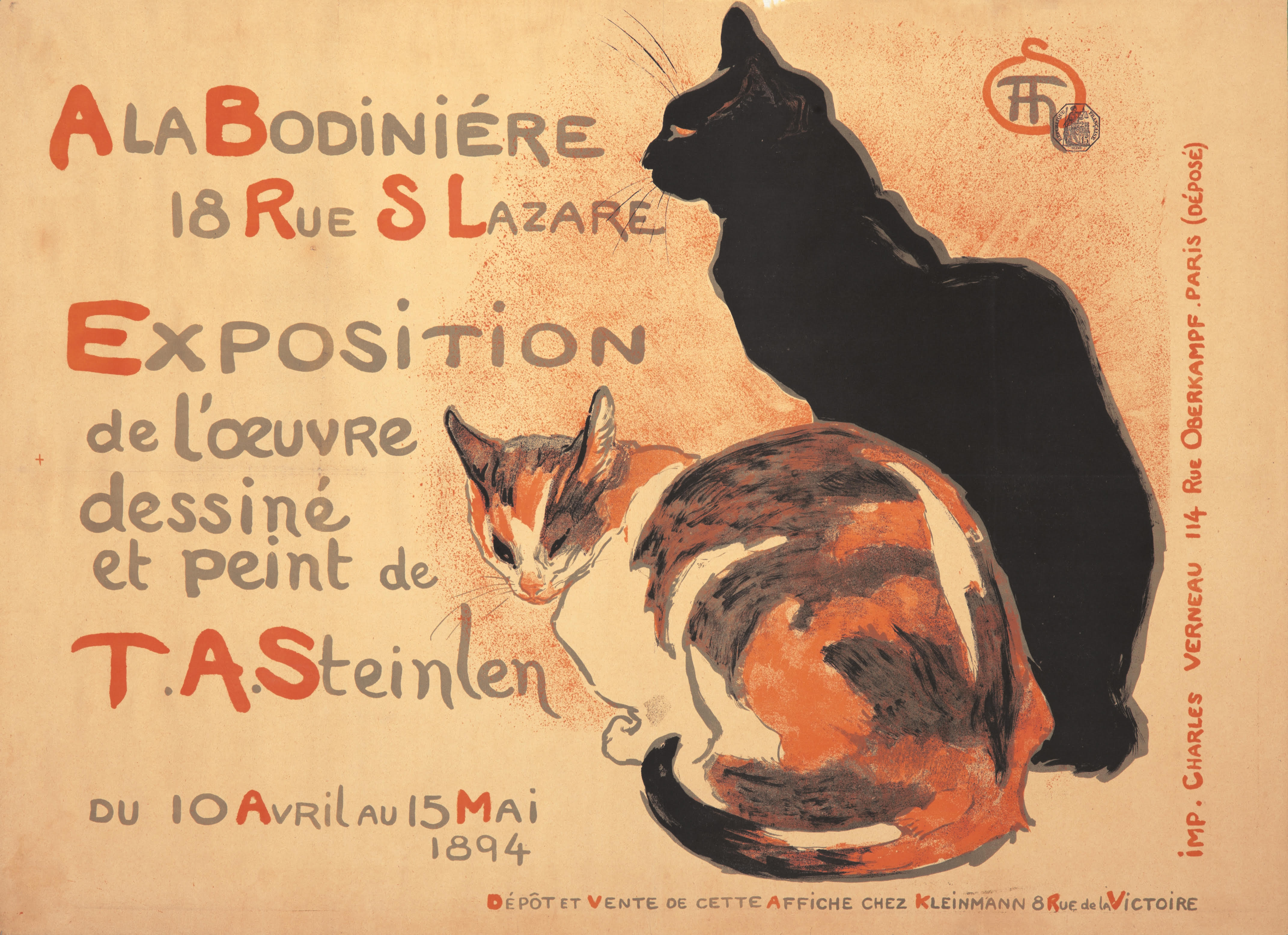
What you see: An 1894 poster by Théophile-Alexandre Steinlen, advertising a show of his work at the Bodiniére gallery. It also includes two progressive prints of the lithographic poster (scroll down to see them). Rennert’s Gallery estimates the group at $14,000 to $17,000.
The expert: Jack Rennert of Rennert’s Gallery.
I realize to some extent that all posters are advertisements for an artist’s skills, but how unusual is it to see a poster as literal as this one, which advertises Steinlen’s first gallery show in Paris? He did this for an exhibition at Bodiniére. It’s not a reproduction of a poster or a painting [in the show]. It’s an actual design, integrated with text, and he designed the text. It’s completely his poster.
What does it say about him that when choosing the image for this poster–which is intended to lure people to the gallery to buy his artworks–he chose to depict cats? Cats are one of his most iconic and popular images. He loved cats, and had a house full of them. People say you could tell where he lived within five blocks of his house.
The lot notes describe the pair shown on the poster as “his cats.” Might we know which of his cats modeled for this? Did they have names? Or were these imaginary cats? He had dozens of stray cats that he brought into his home in Paris. He didn’t need to imagine them. He had his models right there in his home. Lot 450, the following lot, is maybe his most famous poster of all, and it has his daughter, Colette, and three cats. It was for sterilized milk. She’s testing it before she gives it to them. Of the three cats, the two at the front could be the same two in the Bodiniére exhibit poster. He did them two years apart.
Are the cats in the Bodiniére exhibition poster shown at around life size? The poster is 32 inches wide by 23 inches high, so yeah, pretty much life size. They take up half the entire image of the poster.
The poster is horizontal. Is that unusual for this era? Yes. Ninety percent of the posters of the 1890s were vertical posters, meant to go on vertical spaces, like hoardings. It could have been that this Bodiniére exhibit poster was never meant to be an outdoor advertisement. It could have been in store windows.
Do I sense Japanese influence here? It kind of reminds me of Japanese woodcuts. Japanese art was very popular and influential with many artists in the 1890s, especially in Paris. You can see some of that in the treatment here, especially in the coloring of the cats. But I wouldn’t put too much stock in that. This is Steinlen and his way of drawing.
Do we have any notion of how many of these posters were printed, and how many survive? We don’t know, and I’ve spent a lifetime trying to find out. I would guess that since it was a one-time exhibit, for one month, in one place and one city, I don’t think he would have had more than 200 or 300 copies made. There was no need for more.
This example of the poster comes with two progressive prints of the design, which show lithographic color passes. How do the prints give insight into how the poster was made? It’s stone lithography, so first, they’d do just the gray area, then overprint it with black in a few areas, giving it a solid, deep black look. The third color plate is red, which gives a nice color to the cat and the lettering. It’s unusual to show the final product and how it was arrived at.
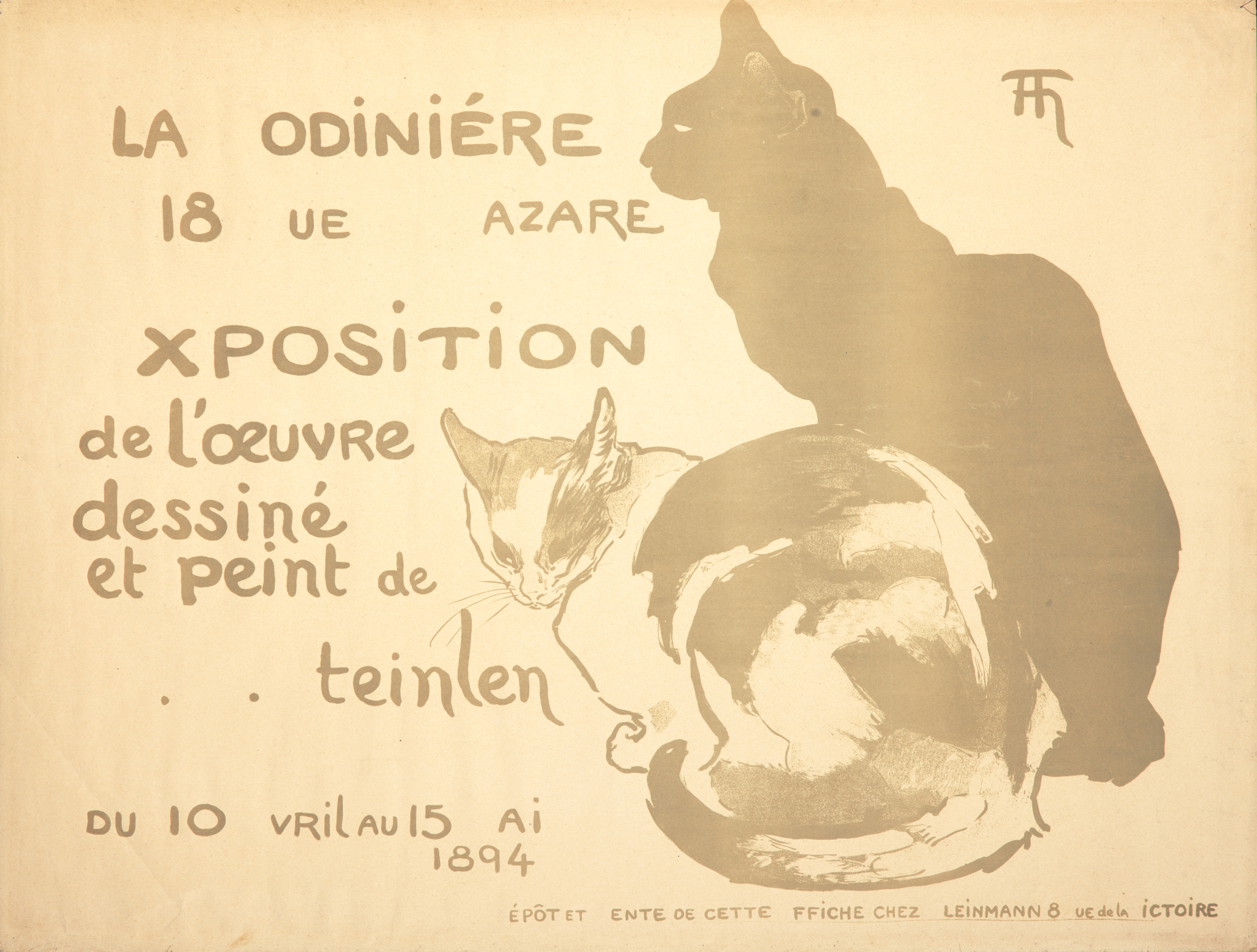
Do we have any idea how this example of the poster survived with two related progressive prints? I’d say it’s more likely that it came from the archive of Charles Verneau, his favorite printer. There’s no reason for someone outside of a printing plant to have them. Every now and then you do see progressive prints for a poster, and inevitably, they come from printers’ storage. They’re rare.
How many times have you handled the Steinlen Bodiniére Exposition poster? Over the last 50 years, I’ve handled it ten to 12 times.
And how rare is it to see any poster with progressive prints, never mind a poster as iconic as this Steinlen? It’s extremely rare. Only real passionate poster collectors care enough to even want it. There’s nothing pretty about them. They’re incomplete works. But they appreciate seeing what went into the final [lithographic] stone.
In your 50 years in the business, how often have you seen a poster with progressive prints come up? I’ve probably had a couple dozen instances of that. Once every two or three years, I get a series.
So the Steinlen plus progressive prints will be of more interest to a museum or an institution? Absolutely. I expect museums, galleries, and foundations to have a special interest in them.
How did the presence of the progressive prints affect the estimate? It obviously increases it, but not by a hell of a lot. The poster often sells for $10,000. I estimated this in the $14,000 to $17,000 range because of the prints.

What’s the world auction record for this Steinlen poster? Was it set with you? The highest at our auctions was $9,200 in 2006. [This seems to be the world record, not just a house record.]
What makes this a successful poster? Why does it still sell for thousands of dollars more than a century after it was printed? It’s very appealing. It catches your attention. Cat people have an additional reason to be enamored of it. It’s one of the favorite posters by one of the most famous poster artists of the period. It was an important exhibition for him. It established him in the artistic community.
So the 1894 show did well? It was a successful show for him. He sold all his works. I won’t say it was because of the poster, but maybe it takes some of the credit.
How to bid: The 1894 Steinlen Bodiniére Exposition poster is lot 449 in the PAI-LXXVIII: Rare Posters auction taking place at Rennert’s Gallery on June 23, 2019.
How to subscribe to The Hot Bid: Click the trio of dots at the upper right of this page. You can also follow The Hot Bid on Instagram and follow the author on Twitter.
Rennert’s Gallery is on Instagram and Twitter.
Image is courtesy of Rennert’s Gallery.
Would you like to hire Sheila Gibson Stoodley for writing or editing work? Click the word “Menu” at the upper right for contact details.


